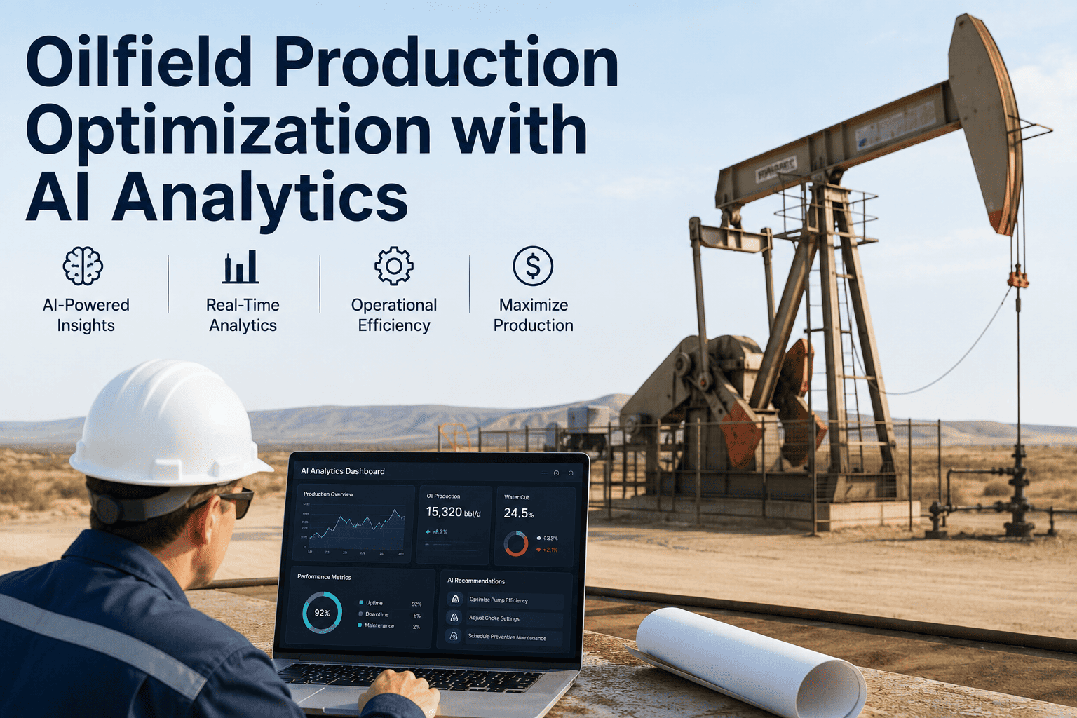
Ask five different roles at an upstream operator where to check well performance and you will likely get five different answers: SCADA for real-time rates, a rod pump controller portal for stroke data, an ESP vendor dashboard for motor health, a separate spreadsheet for chemical injection logs, and a production accounting system for the numbers that actually reach the P&L. None of those systems talk to each other, and the well itself does not care which tool is easiest to log into. A single AI-powered dashboard that unifies every well metric in one view removes that fragmentation entirely, and you can book a demo to see your own well data pulled into a single screen.
Every Well Metric, Every Well, One Screen — Powered by AI
Production rate, water cut, GOR, ESP health, rod pump performance, and chemical injection data unified into a single AI-scored dashboard per well, so engineers stop switching between five systems to answer one question.
Six Systems, One Well, and a Production Engineer Stuck Toggling Between Tabs
The average production engineer covering a mid-size well portfolio does not lack data, they are drowning in it, scattered across systems that were never designed to be viewed together. Diagnosing a single underperforming well often means logging into a SCADA historian for flow and pressure trends, a separate ESP monitoring portal for motor amperage and vibration, a rod pump controller dashboard for stroke and fillage data, and a spreadsheet someone updates manually for chemical injection rates. By the time all the data is assembled, the diagnosis window has often already closed.
What Belongs on a Unified Well Performance View
A well dashboard earns its place on an engineer's screen only if it answers the questions they actually ask throughout the day. The six categories below cover the core of what determines whether a well is performing to plan, declining as expected, or quietly developing a problem that will show up as a production loss weeks later if nobody catches it first.
Production Rate
Oil, gas, and water rates trended against forecast and prior periods, with automatic flagging when actual production drifts outside the expected decline curve band.
Water Cut
Rising water cut trended per well and compared against offset wells in the same reservoir zone, often the earliest signal of water breakthrough or mechanical integrity issues.
Gas-Oil Ratio
GOR trends that flag early signs of reservoir pressure depletion or gas coning, tracked alongside choke and wellhead pressure data for context.
ESP Health
Motor amperage, vibration, intake pressure, and temperature combined into a single health score that flags degrading pumps before a trip or failure event.
Rod Pump Performance
Dynamometer card shape, stroke rate, and fillage percentage analyzed automatically to flag pump-off conditions, gas interference, and rod or tubing wear patterns.
Chemical Injection
Corrosion inhibitor and scale inhibitor injection rates cross-referenced against actual well chemistry results to confirm dosing is neither under- nor over-applied.
What Changes When Every Metric Lives in One AI-Scored View
The comparison below reflects the practical difference between a production engineer checking six separate systems and one dashboard where the AI has already correlated the data and surfaced what needs attention.
| Workflow Step | Fragmented Systems | Unified AI Dashboard |
|---|---|---|
| Detecting Underperformance | Manual review, often reactive | Automatic flagging against baseline |
| Cross-System Correlation | Engineer assembles manually | AI correlates automatically |
| Portfolio-Wide Prioritization | Well-by-well, time-permitting | Ranked by dollar impact |
| Time to Full Well Picture | 45-90 minutes | Under 2 minutes |
Stop Reassembling the Same Well Picture Every Shift
iFactory's AI pulls production, ESP, rod pump, and chemical injection data into one scored view per well across your entire portfolio. Book a demo and see your own wells on a single screen.
From Scattered Data Sources to One Well Screen in Four Stages
Building a unified well dashboard is not a single integration project, it is a layered process that starts with connecting existing systems as they are and ends with AI actively scoring and prioritizing well health across the full portfolio.
Connect Existing Data Sources
SCADA historians, ESP monitoring portals, rod pump controllers, and chemical injection logs are connected through existing APIs and protocols without requiring new field hardware.
Normalize and Align by Well
Data from every source is matched to the correct well identifier and normalized into consistent units and timestamps, resolving the naming mismatches that block most manual integration attempts.
Apply AI Scoring and Correlation
The AI establishes expected baselines per well and flags deviations across production, mechanical, and chemical metrics, correlating signals that would otherwise be reviewed in isolation.
Deliver a Ranked, Single-Screen View
Engineers see every well ranked by urgency and dollar impact in one dashboard, with drill-down into any individual metric when deeper investigation is needed.
How a Fragmented View Delays Detection on a Real Well
Consider a well that begins showing early signs of gas interference on its rod pump, visible in the dynamometer card shape days before it becomes obvious in the daily production report. Under a fragmented system setup, the rod pump controller portal flags an unusual card shape, but that alert sits in a system a production engineer may only check every few days across a portfolio of 200 wells. Meanwhile, water cut on the same well begins trending upward in the SCADA historian, a separate signal that, viewed in isolation, does not look urgent enough to investigate immediately.
By the time an engineer manually cross-references both signals, typically during a periodic well review rather than in real time, four to six days have often passed since the first indicator appeared. Production loss during that window is frequently avoidable, since the combination of gas interference and rising water cut together suggests a specific, addressable mechanical condition rather than either signal alone.
With both metrics unified and correlated automatically, the same well surfaces on the ranked dashboard within hours of the pattern first appearing, with the AI flagging the correlation explicitly rather than requiring the engineer to notice it across two separate systems.
What to Have Ready Before Connecting Your First Wells
A unified dashboard rollout goes faster when the groundwork below is in place before the first system integration begins.
System Inventory
A list of every SCADA, ESP monitoring, rod pump controller, and chemical injection tracking system currently in use, including vendor and version where known.
Well Identifier Mapping
A reference list mapping how each well is named across different systems, since naming inconsistencies are the most common source of integration delay.
Priority Well Segment
A defined starting segment of wells, typically the highest-value or most operationally troublesome group, to validate the dashboard before expanding portfolio-wide.
Baseline Performance Expectations
Documented expected production ranges per well or well type, so the AI has a meaningful baseline to score deviations against from the first day of connection.
What a Unified View Adds Once the Immediate Fires Are Handled
Once a production team moves past reactive detection and into a steady state of catching issues early, the same unified data becomes valuable for a different purpose: identifying slower, structural patterns that never show up clearly in any single system's alerts. Comparing water cut trends across wells in the same reservoir zone can reveal a shared water breakthrough pattern that no individual well alert would ever surface on its own. Comparing ESP health scores across a fleet of similar pump models can flag a batch-level reliability issue tied to a specific vendor or installation vintage well before it shows up as a wave of individual failures.
This kind of cross-well, portfolio-level analysis is essentially unavailable when data lives in separate systems, since it requires comparing metrics across dozens or hundreds of wells simultaneously rather than reviewing one well at a time. Once the dashboard is in place, this analysis becomes a natural extension of the same unified dataset rather than a separate data science project requiring its own integration work.
Common Questions From Production Engineers About Unified Well Dashboards
See Your Own Well Portfolio on One Screen
Connect your existing SCADA, ESP, rod pump, and chemical injection systems into a single AI-scored dashboard, ranked by the wells that need attention first.