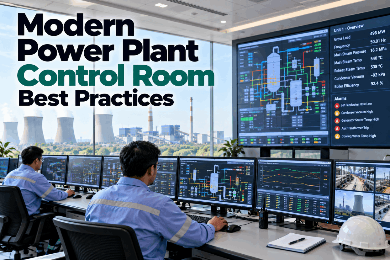
An operator scans a control room screen crowded with red, green, blue, and yellow shapes, and somewhere in that noise a genuine deviation is trying to get noticed. It doesn't, because on a legacy console everything is colored all the time, so nothing that is colored stands out when it actually matters. That single design flaw, not a lack of operator skill, is behind a large share of delayed responses, missed early warnings, and abnormal situations that escalate further than they should have. ISA-101 exists specifically to fix this, and the fix is measurable rather than cosmetic. You can walk through what a properly structured console looks like by choosing to book a demo with our team.
Your Control Room Screens Were Never Designed for the Moment They Matter Most
Most industrial HMIs were built to look impressive during a demo, not to help an operator find the one abnormal reading among two hundred normal ones during an upset. ISA-101 rebuilds that priority from the ground up, and iFactory applies it as a practical overlay on the SCADA and DCS systems you already run.
Screen Clutter Is Not an Aesthetic Complaint, It Is a Response-Time Problem
Every extra color, gradient, and decorative pipe fitting on an operator screen adds a fraction of a second to how long it takes to answer one question: is the process normal right now. Multiply that fraction across hundreds of scans in a shift and across every operator on every panel, and the accumulated delay becomes the gap between catching a deviation early and catching it after it has already become a trip, a quality excursion, or an unplanned shutdown.
Legacy consoles were typically built by control engineers translating piping and instrumentation diagrams directly onto a screen, which produces a display that mirrors how the engineer understands the process rather than how an operator perceives it under pressure. ISA-101 replaces that instinct with a display philosophy built on human factors research, and the difference shows up first in how quickly a genuine alarm gets noticed against a screen that is otherwise deliberately quiet.
The cost rarely shows up as a single line item in a maintenance budget, which is exactly why it survives for years without being addressed. It shows up instead as a slightly longer mean time to detect a deviation, a slightly higher rate of nuisance alarms drowning out genuine ones, and a slightly slower ramp-up for every new operator who has to learn the plant partly through tribal knowledge rather than through the screen in front of them. None of those individually looks urgent on a report, but together they are frequently the largest hidden drag on an otherwise modern automation investment.
Four Habits Baked Into Older HMI Screens That Quietly Slow Every Response
None of these habits were intentional mistakes. Each one made sense in isolation to the engineer who added it, and each one adds a small tax on operator attention that compounds badly the one time it matters most, during a genuine upset rather than a routine shift.
How ISA-101 Organizes a Screen From Plant-Wide Status Down to Root-Cause Detail
The core structural idea in ISA-101 is a four-level hierarchy, where each level answers a progressively narrower question and drilling down never requires the operator to re-orient themselves. Skipping a level, most often building Level 2 as a catch-all that absorbs both overview and deep detail, is the single most common reason HMI projects built before this discipline was formalized ended up cluttered again within a year.
The levels are not a strict staircase that must be climbed in order. An operator can jump straight from a Level 1 alarm indicator into the relevant Level 3 equipment screen without passing through a Level 2 unit view first, as long as the navigation model is designed so that jump does not leave the operator disoriented about where they are in the plant. That consistency of navigation, more than any single screen's layout, is what determines whether a hierarchy actually holds up once it meets a real, high-pressure shift.
Why a "Boring" Gray Screen Is Deliberately the Most Effective One
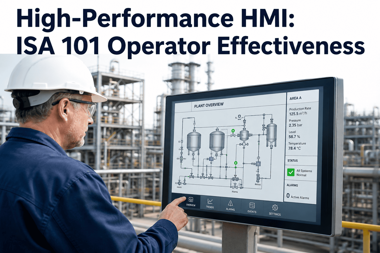
The most visible mark of an ISA-101 display, and the feature most often mistaken for an unfinished design, is how muted it looks. Backgrounds are gray, equipment in a normal state is rendered in low-contrast neutrals, and color is held in reserve almost entirely for deviation states. This is a direct application of a simple principle from cognitive science: color only carries meaning if it is not competing with dozens of other colors doing the same job. It also addresses a factor engineers rarely account for when a screen is first specified: roughly eight percent of male operators experience some degree of color blindness, so a design that depends on color alone to distinguish a running pump from a stopped one is quietly unreliable for a meaningful share of the workforce reading it every shift.
See ISA-101 Applied to Your Own SCADA Tags, Not a Generic Demo Screen
iFactory audits your existing tag structures, alarm configuration, and display hierarchy, then applies ISA-101 principles as an overlay, so you keep your control system and transform the screen operators actually watch.
The Same Process, Two Very Different Screens
The underlying control system and the tags behind the screen are frequently identical between a legacy console and an ISA-101 console. What changes is entirely the presentation layer, and that presentation layer is what determines how fast an operator can answer the only question that matters during an upset: what changed, and where.
| Design Element | Legacy Mimic HMI | ISA-101 High-Performance HMI |
|---|---|---|
| Background and Equipment Color | Saturated color used constantly for status, running equipment in green, stopped in red | Neutral gray base, color reserved exclusively for abnormal or operator-action states |
| Screen Hierarchy | One long screen mixing overview and deep equipment detail together | Four navigable levels, from plant overview down to diagnostic and trend data |
| Numeric Values | Raw digital readouts with no visible normal range or trend direction | Values embedded with trend sparklines and limit markers showing direction and proximity to a limit |
| Graphics Style | Detailed piping and instrumentation style mimics with flanges, fittings, and 3D icons | Simplified process symbols showing only what the operator needs to make a decision |
| New Operator Ramp-Up | Heavy reliance on tribal knowledge passed down informally from senior operators | Self-documenting layout that is largely consistent across every unit in the facility |
A Four-Phase Path That Does Not Require Replacing Your Control System
Retrofitting an existing plant to ISA-101 principles is engineering-intensive but does not require ripping out the underlying DCS or SCADA platform. It is applied as a display and alarm-logic overlay, phased so that operators see improvement in weeks rather than waiting months for a single, all-at-once cutover.
The Measurable Difference Operators Report After Moving to ISA-101
These outcomes reflect what facilities consistently report once a properly rationalized alarm system is paired with a grayscale-first, hierarchy-driven display, rather than a cosmetic reskin of the same cluttered layout. None of these gains require new field instrumentation, they come entirely from how the same underlying data gets presented.
Questions Plant and Automation Leaders Ask Before an ISA-101 Redesign
Stop Asking Operators to Find the One Alarm That Matters Inside a Fully Colored Screen
iFactory applies ISA-101 display hierarchy and grayscale-first design as a practical overlay on the control system you already run, so operators detect and respond to abnormal conditions faster from day one.