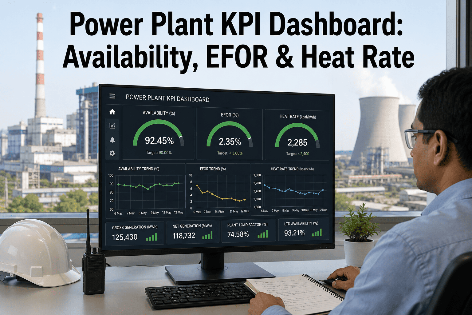
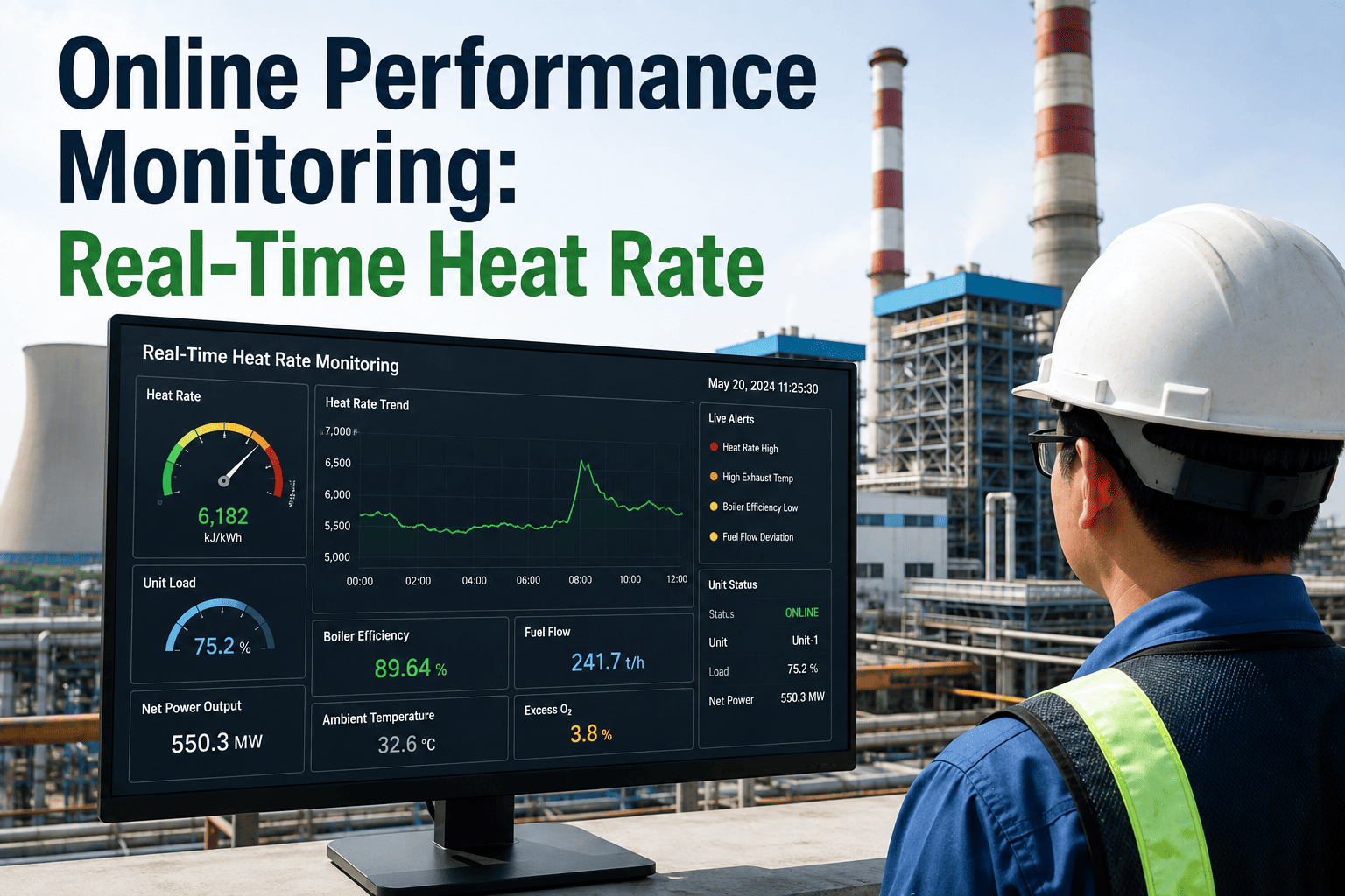
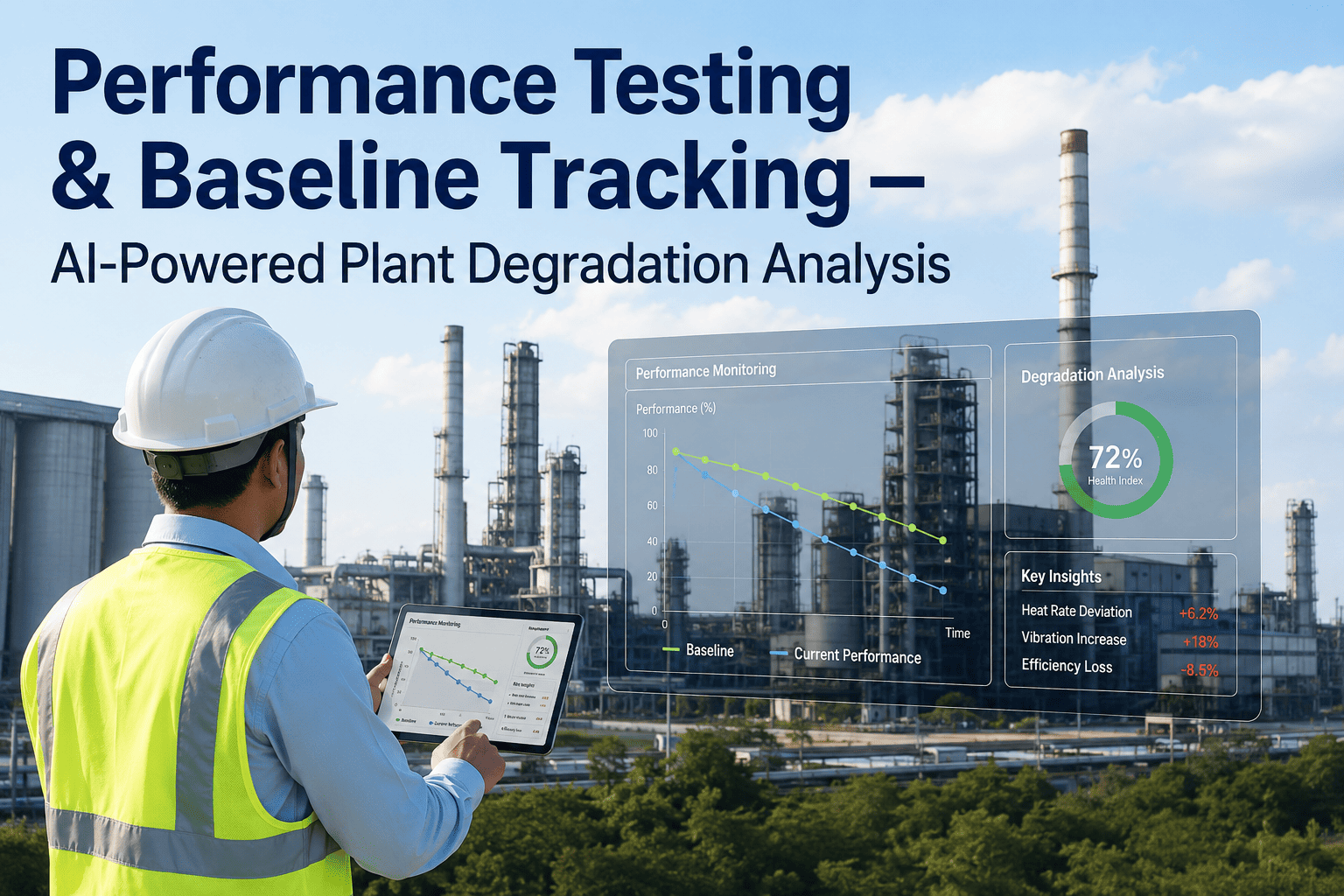
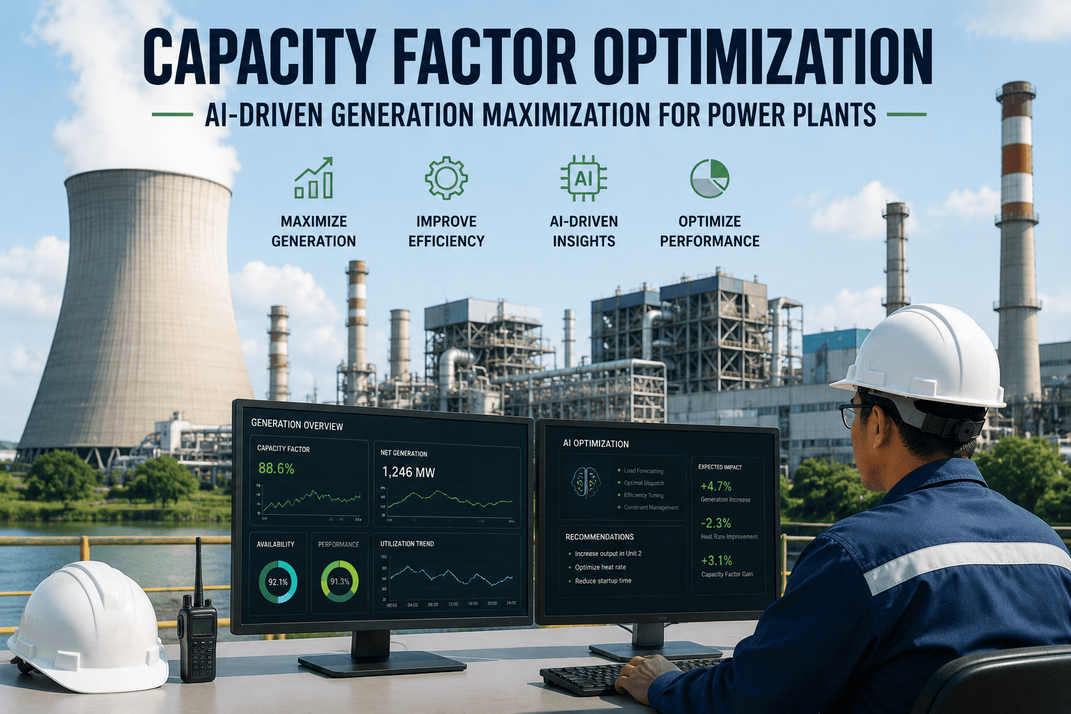
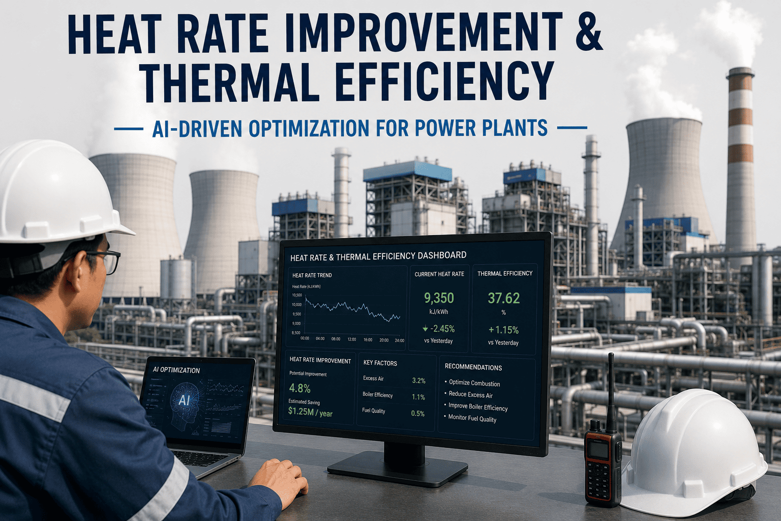
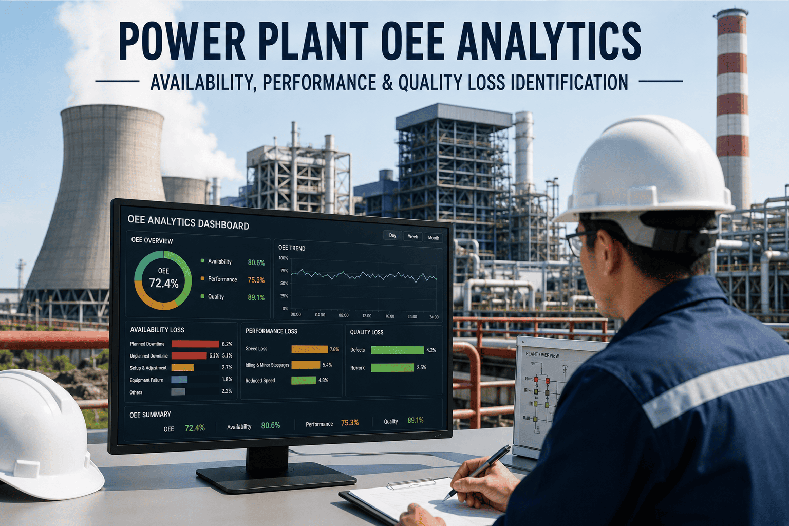
Ask five people at the same power plant how the unit performed last month and you'll often get five different answers, not because anyone's wrong, but because the plant manager is looking at availability, the operations team is watching heat rate, finance is tracking EFOR against a budget target, and safety is reviewing incident counts in a completely separate report that never quite makes it into the same conversation. A KPI dashboard built around role-based views, rather than one generic screen everyone's expected to interpret differently, is what actually gets a plant's leadership, operators, and maintenance teams looking at the same underlying numbers with the context each of them actually needs. If your current reporting still means pulling four separate spreadsheets before a Monday morning meeting, our team can show you what a unified view looks like during a free dashboard walkthrough.
Workforce & Digital
One Number Means Something Different to Everyone in the Room
A well-built KPI dashboard doesn't just display availability, EFOR, heat rate, and safety metrics, it shows the right combination to the right person, so operators, planners, and executives are all working from the same reality.
The Five Metrics Every Plant Dashboard Should Anchor On
Availability
Percentage of time the unit was capable of generating, regardless of whether it was actually dispatched
EFOR
Equivalent forced outage rate, capturing both full and partial forced outages as a single reliability figure
Heat Rate
Fuel energy input required per unit of electrical output, the core efficiency metric for thermal generation
Capacity Factor
Actual output over a period compared to maximum possible output, reflecting both availability and dispatch
Safety Metrics
Recordable incidents, near-miss reports, and days since last incident, tracked alongside operational KPIs rather than separately
Why the Same Dashboard Doesn't Work for Everyone
A dashboard designed to satisfy every possible audience at once usually ends up satisfying none of them well, cramming too many metrics into a single view that overwhelms an operator trying to make a quick decision mid-shift while still not providing the drill-down depth a reliability engineer actually needs. Role-based dashboard design solves this by starting from the question each audience is actually trying to answer, then building the view around that question specifically, rather than starting from a list of available data points and displaying all of them everywhere.
Operators
Question: Is anything trending toward an issue on my shift right now?
Focus: real-time equipment status, active alarms, and short-term trend indicators, minimal historical depth
Maintenance Planners
Question: What needs attention before it becomes an unplanned outage?
Focus: EFOR contributors, open work orders, and condition-based maintenance flags by equipment
Plant Managers
Question: Are we hitting our monthly and quarterly targets?
Focus: availability, EFOR, and heat rate trended against budget and prior-year comparisons
Executives
Question: How is the fleet performing overall, and where are the outliers?
Focus: fleet-wide rollups, unit-to-unit comparison, and financial impact of underperformance
See Role-Based Dashboards Built From Your Own Data
We can connect to your existing historian and CMMS data and show you what operator, planner, manager, and executive views would actually look like for your fleet.
How EFOR Gets Calculated, and Why It's Often Misreported
These distinctions matter more than they might seem, because a plant that miscounts even one category consistently will show an EFOR trend that looks meaningfully better or worse than reality, which then feeds into everything from maintenance budget justifications to performance-based compensation calculations. Building the EFOR calculation directly into the dashboard's automated data pipeline, sourced consistently from the same tagged outage event log every time, removes the risk of manual reporting error that creeps in when different people calculate the same metric slightly differently from spreadsheet to spreadsheet.
Turning Historian Data Into a Live Dashboard
1
Historian and CMMS connection
Read-only connections pull real-time and historical tags from the plant historian alongside work order and outage event data from the CMMS.
2
Standardized KPI calculation layer
Availability, EFOR, heat rate, and capacity factor are calculated using a single consistent methodology across every unit and every reporting period.
3
Role-based view configuration
The same underlying data is surfaced differently depending on the logged-in user's role, from real-time operator screens to executive fleet rollups.
4
Automated alerting and reporting
Threshold-based alerts and scheduled report generation replace manual spreadsheet compilation for recurring reporting obligations.
Safety Metrics Belong on the Same Screen
Safety reporting often lives in a completely separate system from operational KPIs, reviewed in a different meeting with a different audience, which unintentionally sends the message that safety performance is disconnected from operational performance rather than deeply related to it. In practice, the two are closely linked: a unit running through a stretch of high forced outage activity often sees elevated safety risk too, as maintenance crews work under time pressure and unfamiliar failure conditions during unplanned repairs. Bringing recordable incident counts, near-miss reports, and days-since-last-incident onto the same dashboard as availability and EFOR, visible to the same audience at the same time, reinforces that connection and gives plant leadership a genuinely complete picture of how the unit and the people running it are actually doing, rather than two separate stories that only get compared informally, if at all.
15-25%
Typical reduction in manual reporting time after dashboard automation
1-2%
Reported availability improvement from faster identification of recurring EFOR contributors
4 roles
Typical minimum role-based view set: operator, planner, manager, and executive
Designing Views That Get Used, Not Ignored
A dashboard's real test isn't whether it technically displays the correct numbers, it's whether people actually open it and act on what they see instead of falling back to the spreadsheet habits that predate it. The dashboards that get adopted consistently share a few practical traits: they load fast enough that checking them doesn't feel like a chore, they highlight what changed since the last visit rather than requiring the user to spot the difference themselves, and they limit each view to the handful of metrics that role actually needs rather than trying to be comprehensive. Plants that involve the actual future users, operators, planners, and managers, in reviewing the dashboard design before full rollout consistently see better long-term adoption than plants that build the dashboard purely from a specification document and hand it over as a finished product. Getting feedback early, even on a rough prototype, tends to surface exactly which metrics matter most to each role and which ones were assumed to matter but actually go unused once the dashboard is live.
Frequently Asked Questions
How is EFOR different from simple availability, and why do we need both?
Availability tells you what percentage of time the unit was capable of running, while EFOR specifically captures unplanned reliability issues, including partial derates that availability alone might not fully reflect. A unit can show reasonably high availability while still carrying a concerning EFOR trend if it's experiencing frequent partial capacity reductions rather than full outages. Tracking both together gives a much more complete reliability picture than either metric alone, which is why most standardized reporting frameworks require both. Our team can help clarify how these metrics apply to your specific reporting requirements through a
free consultation.
Can we build role-based dashboards using our existing historian without a major IT project?
In most cases, yes. If your plant already has a historian and a CMMS with reasonably consistent tagging, a role-based dashboard can typically be built as a read-only layer on top of existing systems rather than requiring a ground-up data infrastructure overhaul. The bigger effort is usually in standardizing the KPI calculation methodology across units and defining what each role actually needs to see, rather than in the underlying data connectivity itself. Reach out to
our support team to review what your current systems can support.
How do we avoid dashboards that look impressive but nobody actually uses day to day?
The most common cause of low adoption is building a dashboard around what data is available rather than around the specific decisions each role needs to make, resulting in a screen that's comprehensive but not actually useful for quick, in-the-moment decisions. Involving actual future users in reviewing early prototypes, rather than only gathering requirements upfront and delivering a finished product, consistently produces better adoption outcomes. Keeping each role's default view limited to a handful of genuinely decision-relevant metrics, with deeper drill-down available but not forced on the main screen, also helps considerably.
Should safety metrics really be combined with operational KPIs on the same dashboard?
Yes, and plants that make this combination consistently report better visibility into how operational stress, like a stretch of frequent forced outages, correlates with elevated safety risk during subsequent maintenance activity. Keeping safety reporting entirely separate from operational reporting can unintentionally reinforce the idea that the two are unrelated, when in practice they're often closely connected. A combined view doesn't replace dedicated safety reporting processes, but it does give plant leadership a more complete single reference point for overall unit health.
How long does it typically take to go from historian data to a live, role-based dashboard?
Timelines vary based on how many units and roles are in scope and how consistent existing data tagging already is, but most plants can expect a functioning initial version within a matter of weeks rather than months, with role-specific refinements continuing over the following few months as user feedback comes in. Starting with a single high-value role, often plant managers or maintenance planners, and expanding from there tends to produce faster, more focused results than trying to launch every role's view simultaneously. Book a
free demo to get a realistic timeline for your specific fleet.
Stop Reconciling Five Spreadsheets Before Every Review Meeting
Our team can show you what a unified, role-based KPI dashboard looks like built from your own historian and CMMS data, no manual spreadsheet work required.