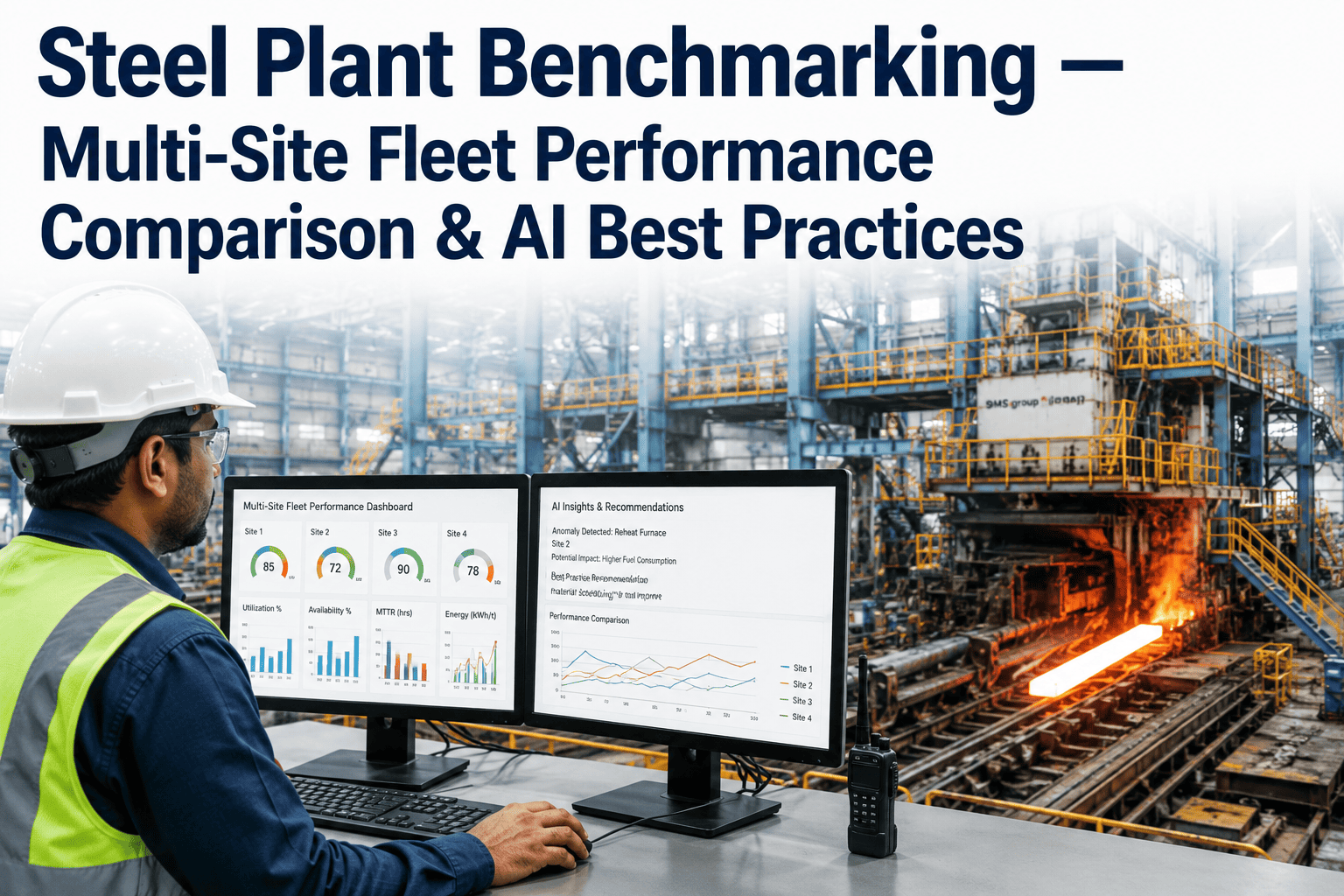
Steel Plant Benchmarking — Multi-Site Fleet Performance Comparison & AI Best Practices
By James Smith on July 28, 2026
Two blast furnaces built to the same drawing, running the same grade mix, can post a 12-15% swing in coke rate and campaign productivity within the same group — and for years the gap sits there unexplained because nobody is comparing the two furnaces on the same terms at the same time. Multi-site steel producers carry this problem across every asset class: one rolling mill yields two points higher than its sister mill, one plant's energy bill per tonne is stubbornly above the group average, one maintenance team spends 30% more on the same equipment family. The plants know something is different. What they rarely know, without a structured benchmarking layer, is what specifically to copy from the best performer and apply everywhere else. AI-driven fleet benchmarking closes that gap by standardizing metrics across sites, ranking performance automatically, and surfacing the operating practices that separate the top quartile from the rest — turning "we should compare notes" into a repeatable, data-backed program. iFactory's fleet performance platform is built for exactly this kind of cross-site comparison.
iFactory Multi-Site Benchmarking
Steel Plant Benchmarking Across Every Facility, in One View
Compare BF productivity, rolling mill yield, energy consumption, and maintenance cost across your entire fleet with AI-normalized metrics, and find out exactly which practices the top-performing plant is running that the rest are not.
Most multi-site steel groups already try to benchmark — usually through a monthly spreadsheet that someone at each plant fills in by hand. The problem is not effort, it is structure. Every plant defines "downtime" slightly differently, every site pulls energy figures from a different meter boundary, and by the time the numbers are consolidated, reconciled, and presented, the operating month they describe is already over. Rankings built this way are backward-looking, inconsistent, and too slow to change anything before the next reporting cycle repeats the same gap.
Manual Spreadsheet Rollups
Each plant defines metrics differently, so comparisons are not apples-to-apples
Data is consolidated weeks after the month it describes
Rankings show the gap but never explain the operating cause
Best practices stay local because nobody has time to dig into why one site wins
AI Fleet Benchmarking
Metrics are normalized automatically to the same definitions and boundaries
Rankings update continuously as production data streams in
Gap analysis links the ranking to the specific process parameters behind it
Best-practice playbooks are generated and routed to the plants that need them
The Fleet Scoreboard, Visualized
A benchmarking program only earns trust once every plant manager can see exactly where their site stands, on which metric, against which peer. The chart below illustrates how AI normalization turns four dissimilar plants' raw numbers into one ranked, comparable view across a single KPI family.
Rolling Mill Yield — Normalized Comparison Across Four Sites
Plant A leads the fleet by over 5 points; AI flags the specific pass-schedule and tension-control settings behind that gap for the other three sites to review.
What Gets Benchmarked Across the Fleet
Fleet benchmarking is only useful when it covers the metrics that actually drive plant economics, spanning the full production chain from ironmaking through finishing, plus the cost and reliability layers that sit underneath every one of them.
BF Productivity
Hot metal per day per cubic meter of working volume, coke rate, and fuel injection rate compared across every furnace in the group.
Rolling Mill Yield
Finished tonnage against charged tonnage, tracked by product family so mills running different mixes are still compared fairly.
Energy Consumption
Gigajoules per tonne of crude steel, normalized for route (BF-BOF versus EAF) so the comparison reflects real efficiency, not just process type.
Maintenance Cost
Spend per tonne and per equipment class, separating planned from reactive work to show which sites are managing assets versus firefighting them.
Asset Availability
Uptime against the theoretical calendar for every major line, with unplanned stoppage minutes broken out by root cause category.
Quality Yield
First-pass quality and rework rate by product grade, showing which plant's process discipline is converting into fewer downgrades.
Curious what your own fleet's normalized scoreboard would look like? Book a 30-minute walkthrough and we'll map it against your actual site data.
From Raw Numbers to a Ranked, Explained Gap
Ranking a plant last on a metric is only half the job — the other half is explaining why, in terms an operations team can act on. iFactory's approach layers root-cause analysis under every ranking, so a benchmarking report becomes an action list instead of a leaderboard nobody knows how to respond to.
How a Benchmark Becomes an Action
1
Normalize
Metrics from every site are converted to shared definitions and boundaries
2
Rank
Sites are ordered on each KPI, continuously, as new data arrives
3
Diagnose
AI links the gap to the process parameters and practices behind it
4
Replicate
The winning practice is packaged as a playbook for lagging sites
Sample Benchmark Table — BF Fleet Snapshot
A normalized table is often the clearest way to see the fleet at a glance. The example below shows how four blast furnaces in the same group compare once every metric is put on the same footing, making outliers immediately visible.
Furnace
Productivity (t/m³/day)
Coke Rate (kg/thm)
Availability
Rank
Furnace 1
2.38
398
96.1%
1
Furnace 2
2.21
412
94.8%
2
Furnace 3
2.05
431
91.3%
3
Furnace 4
1.94
447
89.7%
4
What Fleet-Wide Visibility Delivers
The value of benchmarking is not the ranking itself, it is what happens after: the lagging sites close the gap, and the group's average performance rises without building a single new asset. These are the outcomes plants report once cross-site comparison becomes routine.
Fleet-Wide
Average lift
lagging sites close toward top-quartile performance
Faster
Root-cause identification
gaps explained in days, not next quarter's review
Shared
Best practice library
winning settings and procedures documented once, reused everywhere
One
Live scoreboard
every plant manager sees the same numbers, updated continuously
Ready to see your own sites ranked and explained side by side? Talk to our benchmarking team about connecting your fleet.
Frequently Asked Questions
Our plants run different equipment vintages — can they still be benchmarked fairly?
Yes, and this is one of the core problems the normalization layer solves. Rather than comparing raw output, the system adjusts for design capacity, route type, and product mix so a 1990s furnace and a modern one are compared on efficiency relative to their own theoretical potential, not on absolute tonnage alone. That keeps the ranking meaningful even across a fleet with very different asset ages, and it is what makes the gap analysis credible to plant managers who would otherwise dismiss an unfair comparison.
How is this different from the group KPI reports we already produce?
Traditional KPI reports summarize each plant in isolation and usually arrive weeks after the period they describe, which makes them useful for the record but not for changing behavior in real time. Fleet benchmarking instead compares plants against each other continuously, on shared metric definitions, and pairs every ranking with a root-cause explanation, which is the piece a static report never provides. The output is closer to a live coaching tool than a monthly scorecard.
Will plant managers see this as a scorecard used against them?
Most groups introduce it the opposite way, as a tool that surfaces what the top performer is doing right so every other site can copy it, rather than a mechanism for blame. Because the system explains the operating cause behind every gap instead of just publishing a ranking, plant managers get a specific, actionable reason for where they stand, which tends to build buy-in rather than resistance once teams see the practice recommendations attached to it.
How long does it take to get our fleet onto one normalized scoreboard?
Timelines depend on how many sites and data sources are involved, but most groups start seeing normalized rankings for a first KPI family within the initial weeks of connecting historian and MES data, with the full metric set following as additional data sources are integrated. The rollout is typically staged by metric family rather than attempted all at once, which keeps each phase manageable for the plant IT and operations teams involved.
Can this integrate with the historians and MES systems we already run at each site?
Yes — the platform is designed to connect to the process historians, MES, and maintenance systems already running at each plant rather than requiring a replacement of existing infrastructure. Data is pulled from those sources, normalized centrally, and reflected back into the fleet scoreboard, so individual sites keep their existing systems of record while the group gains the comparative layer on top.
Stop Comparing Notes. Start Comparing Data.
See Your Fleet Ranked, Explained, and Ready to Act On — in 30 Minutes
Bring your production and maintenance data from two or more sites. We'll show how AI normalizes the metrics, ranks the plants, and surfaces the specific practices your top performer is running that the rest of the fleet is not.