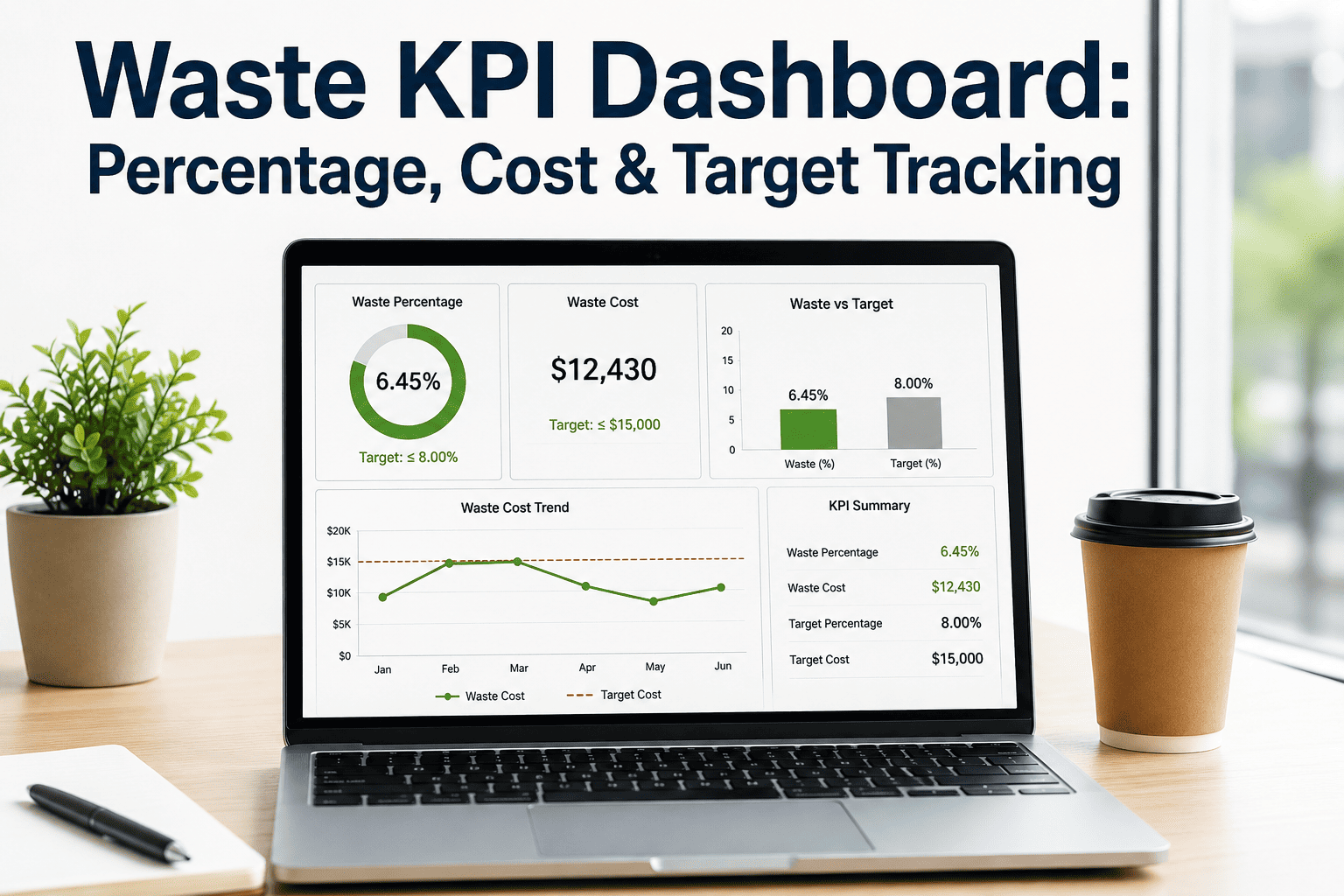
A waste percentage number on its own tells a plant manager almost nothing useful — 4 percent waste in cutting could be a normal week or a crisis, depending entirely on what the target is and what last month looked like. A waste KPI dashboard fixes that by putting percentage, cost, and target side by side for every department, so a number becomes a signal instead of an isolated statistic. Most mills already collect waste data somewhere — scrap logs, shift reports, ERP scrap postings — but that data sits scattered across departments and rarely gets compared against a target in near real time, which means waste creep gets caught at month-end review instead of the shift it started on. This guide covers which waste KPIs actually matter, how to structure a dashboard by department, how to calculate waste cost per unit correctly, and how target tracking turns a waste report into a waste reduction program. Mills building or upgrading a waste tracking system can book a 30-minute demo to see how iFactory rolls up department-level waste percentage and cost into one live dashboard.
Waste KPI Dashboard — Percentage, Cost & Target Tracking
How to structure a waste dashboard that tracks percentage by department, waste cost per unit, and target variance in one view, so waste creep gets caught on the shift it starts rather than at month-end review.
The Three Numbers a Waste Dashboard Actually Needs
Waste Percentage
Scrap or rejected material as a share of total material input, tracked separately by department rather than blended into a single plant-wide figure that hides which stage is actually driving the loss.
Waste Cost Per Unit
The rupee or dollar value of scrap generated per unit of good output produced, which converts a percentage into a number finance actually budgets against and makes department comparisons fair across different fabric or yarn values.
Target Variance
The gap between actual waste and the department's set target, tracked as a trend over time rather than a single snapshot, since a department sitting exactly on target this week could be trending upward for three weeks straight.
Why Department-Level Breakdown Matters More Than a Plant-Wide Average
A plant-wide waste percentage is the number that ends up in an executive summary, but it's close to useless for actually fixing anything, because it averages together departments with very different waste drivers and very different costs per unit of scrap. A spinning department running 2 percent waste on relatively cheap fiber can generate less financial loss than a cutting department running 3 percent waste on finished, dyed fabric that already carries every upstream processing cost. Blending those two numbers into one plant average hides exactly where the money is actually being lost.
| Department | Typical Waste Driver | Relative Cost Impact per % Waste |
|---|---|---|
| Spinning | Yarn breaks, count variation, roving waste | Lower — raw fiber value only |
| Weaving / Knitting | Loom stops, thread breaks, fabric faults | Moderate — carries spinning cost forward |
| Dyeing & Finishing | Shade rejects, batch failures, process faults | High — carries all upstream cost plus wet processing |
| Cutting | Marker efficiency, fabric flaws, layout waste | Highest — full finished fabric value at risk |
| Sewing / Packing | Rework, rejected garments, trim waste | Highest — full garment value including labor |
A dashboard that ranks departments only by waste percentage will systematically under-prioritize downstream departments where the same percentage waste destroys far more value — cost per unit has to sit next to percentage for the ranking to mean anything.
Calculating Waste Cost Per Unit Correctly
The most common mistake in this calculation is using raw material cost instead of fully loaded cost — a meter of dyed, finished fabric scrapped in cutting carries the cost of every process it already passed through, not just the original grey fabric cost. Using raw cost alone systematically understates the real financial impact of waste generated later in the value stream, which skews improvement priorities toward the wrong departments.
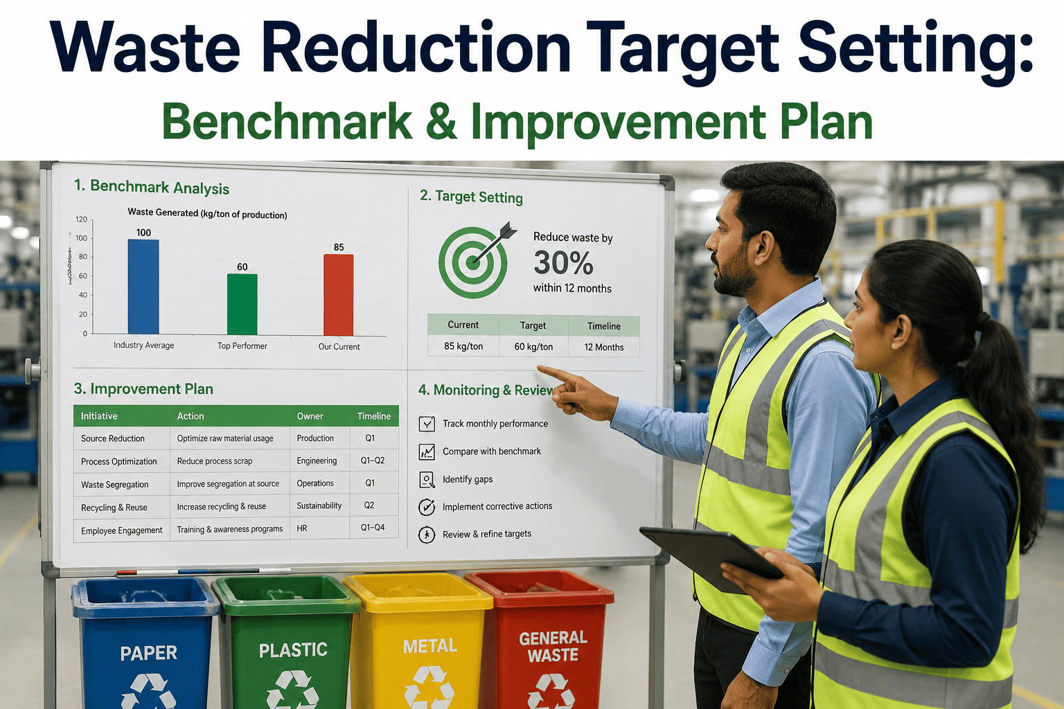
Setting Targets That Actually Drive Behavior
Baseline against the department's own trailing history first. A target pulled from an industry benchmark without checking it against a department's actual recent performance risks being either meaninglessly easy or immediately demoralizing.
Set a step-down target, not a single fixed number. A department at 6 percent waste asked to hit 2 percent immediately has no credible path there — a staged target of 5, then 4, then 3 percent creates achievable checkpoints.
Review variance weekly, not monthly. A monthly review cycle means a bad trend can run for three or four weeks before anyone with authority to act even sees it on a dashboard.
Tie the target to a named owner per department. A target with no individual accountable for it functions as a reporting exercise rather than an improvement mechanism.
Frequently Asked Questions
Why does the same waste percentage matter more in some departments than others?
Because waste percentage measures loss relative to that department's own material input, not the actual rupee value of what was lost. A percentage of scrap in cutting or sewing is destroying finished, fully processed fabric that already carries every upstream cost, while the same percentage in spinning is only losing raw fiber value. A dashboard that ranks departments purely on percentage without pairing it with cost per unit will consistently misdirect improvement effort toward lower-impact areas. Contact iFactory Support for help setting up cost-weighted waste rankings across departments.
How often should a waste dashboard actually be reviewed?
Weekly at minimum for operational teams, with a monthly summary for leadership review. A monthly-only review cycle means a negative trend can run unaddressed for three or four weeks before anyone with the authority to intervene even sees the data, by which point the financial loss has already compounded well past what a weekly catch would have allowed. Real-time or shift-level dashboards close that delay even further for departments with historically volatile waste rates.
What's the most common error mills make when calculating waste cost per unit?
Using raw material cost instead of fully loaded cost at the point of scrap. A meter of dyed and finished fabric rejected in cutting carries the cost of spinning, weaving, dyeing, and finishing already invested in it, not just the value of the original grey fabric — valuing that scrap at raw material cost significantly understates the real loss and can make a high-cost department look artificially inexpensive to fix. Book a demo to see fully loaded cost calculation applied automatically by department and process stage.
Should every department have the same waste reduction target?
No — targets should be set from each department's own trailing baseline and staged down in achievable steps rather than applying one flat number across the whole plant. A department already running near best-practice waste levels has very little room left to improve, while a department significantly above benchmark has real headroom, and a single flat target treats both situations identically, which either sets an unreachable bar for one or a meaningless one for the other.
Does a waste KPI dashboard need to be tied to a named owner per department?
Yes — a target or KPI with no individual accountable for acting on it tends to function as a reporting artifact rather than an actual improvement driver, since nobody's performance review or daily priorities are affected by whether the number moves. Assigning ownership doesn't need to mean blame; it means someone has explicit authority and expectation to investigate a variance and drive a corrective action when the trend moves the wrong direction. Contact iFactory Support for help setting up owner-level accountability views on a waste dashboard.
Waste data scattered across departments can't drive a reduction program.
iFactory brings waste percentage, cost per unit, and target variance together into one live dashboard by department and shift, so a bad trend gets caught while it's still cheap to fix. A 30-minute demo builds a live view against your own waste data.