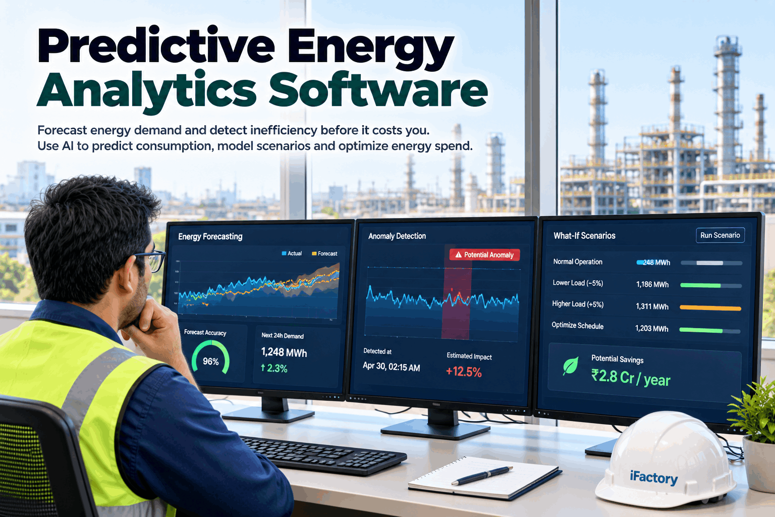
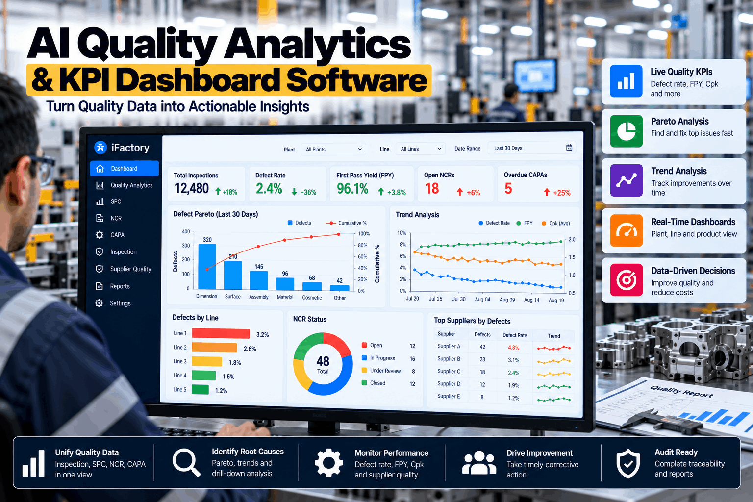
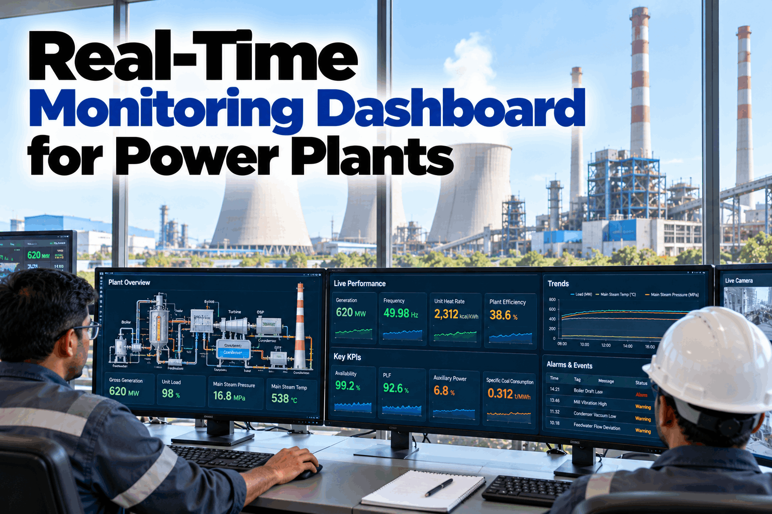
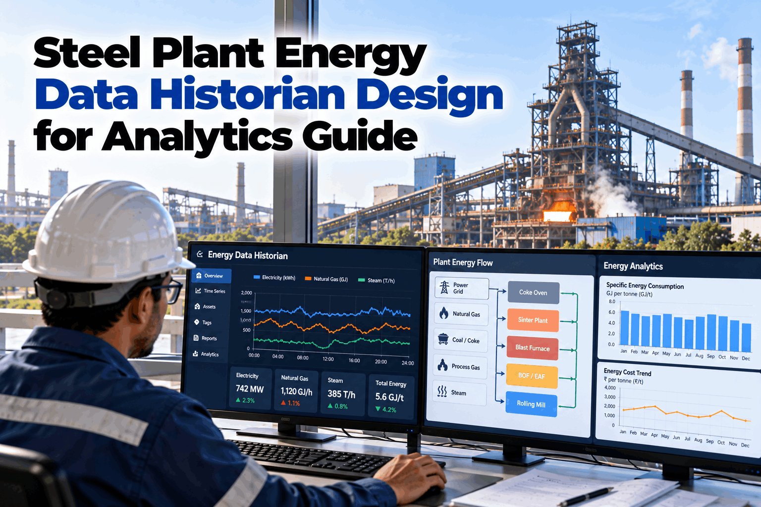
Most plants have more energy data than ever, and less time to read it. Meters log every fifteen minutes, but the monthly report still arrives late, built by hand in a spreadsheet. iFactory's Real-Time Energy Dashboard turns those readings into live screens for the people who run the plant, and reports that write themselves. To see it on your own meters, book a dashboard demo.
Energy Monitoring Dashboards and Reports
Live energy screens for operators, weekly views for plant managers and one-page reports for executives, all from the same meters and all produced automatically.
- Six rules for an energy dashboard people actually use
- Three audiences, three screens, one set of data
- Reports from shift summary to annual review, on schedule
The campaign studied commercial buildings, not factories. It is the largest public evidence we found on what energy monitoring software saves.
What a Good Energy Dashboard Shows
Not more charts. Fewer numbers, each one compared with something.
Many energy dashboards fail the same way. They show raw kilowatts on a dozen gauges, and nobody can tell whether a number is good or bad. A useful dashboard answers one question for one person, quickly, and points to what to do next. The six rules below are what separate a screen people check from one they ignore. Our support team can review your current screens against them.
Always show expected
A number means little alone. Show it beside what it should have been.
Divide by output
Energy per tonne or per unit, so busy and quiet days compare fairly.
One screen, one audience
Operators, managers and executives ask different questions. Give each their own view.
Click down to the cause
From site to building, line and machine, in a few clicks.
Rank by money
Show the biggest gaps first, in cost as well as kWh.
End with an action
Every highlighted gap should say who looks at it next.
A dashboard with forty values is a report, not a dashboard. Pick the three or four numbers that drive decisions for each audience. Keep everything else one click away, rather than on the front screen.
Nobody stares at an energy screen all shift. The dashboard should come to people instead: a short message when a line runs above expected for more than a set time, or when equipment keeps running after production stops. The screen is where they go to see why.
Three Audiences, Three Screens
The same meters. Different questions, different time spans.
An operator needs to know what is happening now. A plant manager needs to know how the week compares. An executive needs to know whether the year is on track. One data set can serve all three, if each screen is built for its reader and shows only what that reader can act on. To design yours, book a design session.
Above expected since 13:10. The line is idle with motors still running.
Wednesday's grade change cost the most. Monday to Friday shown.
On track. Carbon per tonne 3% lower than last year.
Illustrative screens. The highlighted bar on each is the one the reader should look at.
From Meter to Board Report
Thousands of readings a day go in. A handful of numbers come out, each one compared with what it should be. That reduction is the whole job of a dashboard.
Automated Reports, on Schedule
Reports that arrive on time, every time, without anyone building them.
The monthly energy report is often a day of copying, pasting and checking. It is late, it is different each month, and errors creep in. The platform produces each report from the same data as the dashboards, on a fixed schedule, as a PDF or spreadsheet. Ask our reporting specialists which reports you could stop building by hand.
The report built by hand
- Exported from several systems into a spreadsheet
- Arrives days after the month ends
- Layout and formulas drift from month to month
- Numbers rarely match the dashboard exactly
The report built by the platform
- Produced from the same data as every screen
- Sent on the first working day, every month
- Same layout, so months compare at a glance
- Every figure traceable to its meters
Sustainability rules such as the EU's climate standard under CSRD, known as ESRS E1, ask for total energy use and how much is renewable. Auditors then ask where the numbers came from. Reports built from metered data, with each figure traceable to its meters, answer that question quickly.
Energy KPIs Worth a Place on the Screen
Six numbers cover most of what a plant needs to decide.
KPIs should match decisions. If nobody would act differently when a number moves, it does not belong on the front screen. These six are a sound starting set for most manufacturing plants. To agree your own set, book a KPI workshop.
Energy per unit
kWh per tonne, per part or per batch. The core efficiency number for every line.
Actual against expected
Energy used against what output and weather called for. Shows waste, not just activity.
Base load share
Energy used when nothing is being made. Often the easiest saving on site.
Peak demand
The highest interval of the month, which often sets a large part of the power bill.
Energy cost per unit
Energy per unit priced at your real tariff, including time-of-day rates.
Carbon per unit
Energy converted to CO2 with the emission factors you choose. For targets and reporting.
A plant making a heavy product mix in a hot month will use more energy per unit than one making light products in spring, with no waste at all. Expected values that account for product mix and weather keep the KPIs honest, so teams are judged on what they control.
The Data Behind the Dashboard
A dashboard is only as good as the meters and the production data under it.
Energy alone tells half the story. The other half is what the plant made, when, and on which line. The platform joins meter readings with production counts, shift patterns, tariffs and weather, and checks the data before it reaches a screen. It runs on a server inside your network. Our integration team can confirm what your systems already provide.
What it reads
- Main meters and sub-meters for power, gas, steam and water
- Building and utility control systems
- Production counts from MES, ERP or line systems
- Tariffs, time-of-day rates and emission factors
- Outside temperature, for heating and cooling loads
Checks before it reaches a screen
- Gaps where a meter stopped sending
- Readings that jump or stay flat for too long
- Sub-meters that no longer add up to the main meter
- Production counts missing for a shift
- Each fault flagged, never quietly filled in
Questions to ask any energy dashboard software
One set of data, every view
- Operators. Live power against expected on their own line.
- Managers. Weekly energy per unit, with causes.
- Executives. Monthly cost and carbon against target.
Each person sees the screens and reports their role allows, on a desktop, a control room display or a phone.
Turnkey AI: Delivered, Connected and Live in 6–12 Weeks
You do not build this. It arrives ready.
iFactory ships as a pre-configured NVIDIA AI server, racked and ready, with the software pre-loaded. Rack it, plug in power and Ethernet, and the AI is live on your network.
Our team handles cabling, network setup, PLC and SCADA integration, operator training and 24×7 remote monitoring. The server sits inside your own network, so energy and production data stay on site. For a scope matched to your plant, request a turnkey quote.
Ship, network and data
Server installed. Meters, control systems and production counts connected. Meter gaps listed.
Model training and pilot
Expected energy learned from your history. First screens and reports built with the people who will use them.
Go-live and training
All screens and scheduled reports live. Users trained by role. 24×7 remote monitoring begins.
Frequently Asked Questions
What should an energy dashboard show?
A few numbers that drive decisions, each compared with what it should be: energy against expected, energy per unit of output, and the biggest gaps ranked by cost. Different people need different screens, so operators, managers and executives each get their own.
How real-time is real-time?
As fast as your meters report. Many plant meters log every fifteen minutes, and some sub-meters or control systems report every few seconds. The dashboard shows each at its own rate, and alerts as soon as a reading lands outside its expected range.
Can reports be sent automatically?
Yes. Shift, daily, weekly and monthly reports are produced on a schedule and sent as PDF or spreadsheet files to the people you choose. Each is built from the same data as the dashboards, so the numbers always match. Recipients and timing can be changed by your team without help from us.
Do we need new meters?
Usually not to start. Main meters, existing sub-meters and control system data are enough for a first dashboard. The platform shows where an extra sub-meter would explain the most energy, so new meters go where they pay back. Many plants find that a handful of well-placed sub-meters on compressors, chillers and large lines explains most of their energy.
Does it help with ISO 50001 and ESG reporting?
It supplies the measured data both rely on: baselines, energy indicators, energy use and mix, with each figure traceable to its meters. Your management system, targets and disclosures remain your organisation's responsibility.
Can we design our own screens?
Yes. Screens are agreed with your team during the pilot and can be changed later. We recommend starting with a few simple views and adding detail only where people ask for it. Screens that nobody opens after a month are worth removing, to keep attention on the ones that matter.
How long does it take to go live?
Six to twelve weeks from delivery. We need a place for the server with power and Ethernet, read access to meters and production counts, and an hour with each group of users to agree their screens. To check your set-up first, contact our team.
Bring Last Month's Energy Report
In thirty minutes we look at the report your team builds today, and show what the same month looks like as live screens and a one-page summary. You keep the mock-up whether or not you go further with iFactory.
- 1Last month's energy report, as it is today
- 2A list of your meters and sub-meters
- 3Monthly production figures for the same period
- 4Your energy tariff, with any demand charge
- 5Who reads the report, and what they do with it