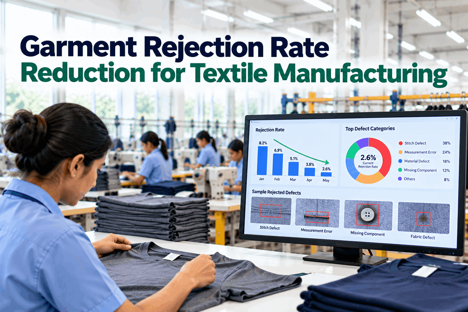
Every rejected garment has a cause, and most rejection problems are really a handful of causes repeating. The difficulty is that rejections are counted at the end, at end-of-line checking and final audit, while their causes sit upstream in fabric, cutting, sewing, finishing and trims. When rejection data is recorded as a single number with no source, the only response is more checking. This article sets out how to measure rejection properly, how to map rejections to root causes across the process, how AQL final inspection math works, and a practical playbook for reducing rejections at the source. To see rejection data traced back to its causes, book a short walkthrough.
Garment Rejection Rate Reduction: Trace Every Reject to Its Root Cause
Rejections tagged at the source, grouped by cause and tracked through to the fix, so quality improves upstream instead of being inspected in at the end.
Why Inspecting More Does Not Reduce Rejections
When rejection rates rise, the usual response is more checking: extra checkers at the end of the line, tighter audits, more rework. That catches more defects, but it does not make fewer of them. The rejection rate on paper may improve while the cost of quality keeps climbing, because every defect is still made and then fixed.
Real reduction comes from the source. A skipped stitch fixed at the machine, a shade problem fixed in the dyehouse, a measurement drift fixed in the cutting room: each removes a whole stream of future rejections. To do that, each rejection must carry its cause, and the causes must be ranked so effort goes where it counts.
Cost is the other reason to move upstream. Rework takes operator time, delays shipments and can damage garments further, and a failed final audit adds re-inspection and sometimes air freight.
Fabric deserves a special look. A widely cited textile research survey notes that about 85% of defects found in the garment industry trace back to fabric, which makes incoming fabric data part of any rejection program. We can review your rejection records with you on a call.
Rejection Metrics and What Each One Tells You
Different metrics describe different parts of the problem. Using them together avoids chasing the wrong number.
As one practical guide to DHU explains, the difference between defects and defectives matters: one defective garment may carry more than one defect. Tracking both shows whether problems are spread thinly or concentrated in a few badly made pieces.
The last metric in the list is the one most factories miss. Raising the share of source-tagged rejects is the first goal of any rejection program.
Mapping Rejections Back Through the Process
A garment rejection can start at any stage. Mapping the stages makes it clear where to look for each type.
Weaving, knitting and dyeing defects, shade variation between rolls.
Mis-cut panels, shade mixing in lays, marker errors.
Skipped stitches, open seams, puckering, misaligned parts.
Washing changes, pressing marks, stains, untrimmed threads.
Missing labels, buttons or tags, wrong versions.
Many rejections are found at a later stage than where they start. A shade mismatch found at final audit started in cutting or in the dyehouse. A measurement failure found after washing may have started in fabric shrinkage. Recording the stage where a defect was found and the stage where it started, separately, is what makes the map useful.
When fabric rolls carry their inspection data and garments carry their bundle and line, the map fills itself in. That linkage is shown in a short demo.
Ranking Rejection Causes With a Pareto
Once rejections carry causes, a Pareto shows which few account for most of the loss. Here is an illustrative month from a shirt factory.
Illustrative data. Sewing and fabric causes account for 72% of rejections, so the month’s work starts with the top sewing operations and incoming fabric checks.
The next step is to split the top bar. Sewing defects by operation might show that two seams account for half of all sewing rejects. Fabric defects by supplier might show one mill behind most of them. The second-level chart is where the action becomes specific.
Ranking by rework hours or cost instead of counts often changes the order, because some defects take much longer to repair. Both views are available in the analytics.
From Ranked Cause to Lasting Fix
A ranked cause still needs a disciplined method to find why it happens and to prove the fix works.
State the defect, where it is found, where it starts and how often, using tagged data.
Split by line, operation, machine, shift, style and supplier to narrow the source.
Use a fishbone and 5 whys on the narrowed source; check each idea against the data.
Change the process, machine, material or method, not only the inspection.
Track the same cause over the following weeks to confirm it falls and stays down.
Involve the people closest to the problem. Operators, mechanics and line leaders usually know several likely causes before any analysis starts, and the data is best used to test their ideas quickly rather than replace them.
Verification is where most programs slip. A fix that holds for a week and then fades usually treated a symptom. Keeping each action linked to the cause it targets makes the before-and-after visible to everyone.
Actions, owners and results sit in one log linked to the rejection data, so progress is reviewed in the same place the problem was found. Ask our team for an example log.
How AQL Sampling Decides Whether a Lot Passes
Most orders end with a final inspection using AQL sampling under ISO 2859-1 or ANSI/ASQ Z1.4. Understanding the numbers shows why in-line quality matters so much.
Figures follow the example in QIMA’s AQL guidance. Critical defects typically carry an AQL of 0, so a single critical finding fails the lot.
Two lessons follow. First, the margin is small: one extra major defect in 200 pieces can turn a pass into a fail, with re-inspection, rework and delay. Second, the sample reflects the whole lot. If in-line data shows the line running near the accept number, the audit is close to a coin toss, and the time to act is before it starts.
Sampling also cuts both ways: a lot can pass with defects the sample missed, and those reach the customer.
In-line data can estimate the audit outcome before the auditor arrives, which gives time to act. That forecast is part of the audit view.
A Practical Rejection Reduction Playbook
The checklist below brings the pieces together into a playbook most factories can start within weeks.
None of these steps needs a large project. They need consistent data and a weekly rhythm, which the software provides from day one.
How iFactory Delivers Rejection Rate Reduction
Every reject recorded with stage, operation, machine and bundle.
Sewing, measurement and component checks where defects start.
Roll inspection and shade data carried into cutting.
Rejections ranked by count, rework hours and cost.
Owners, dates and verification linked to each cause.
Final inspection outcome estimated from in-line data.
It connects to your production tracking, ERP and buyer audit records. See rejection data traced to its causes in a session.
Trace Your Rejections Back to Their Causes
Start with one line and one buyer. We tag rejections at the source, add AI checks at the top operations and show the cause Pareto and audit forecast for the pilot period.
End-of-line data shows 9 major defects in the equivalent of a 200-piece sample. Accept number is 10.
An Audit Risk Caught Before the Auditor Arrives
This exchange shows how a factory quality manager might use iFactory ahead of a final audit.
iFactory ships as a pre-configured NVIDIA AI server, racked and ready with the garment defect detection and root cause analytics models loaded. Rack it, plug in power and Ethernet, and the AI is live on your network. Our scope covers cameras and lighting on sewing, measurement and packing stations, PLC/SCADA and ERP integration, cabling and network setup, operator and QC team training, and 24×7 remote monitoring.
Server installed, cameras and lighting mounted, historical inspection and defect records loaded.
Models trained on your own fabrics and styles, then piloted on one line with your QC team reviewing every call.
Rollout to the agreed lines, inspector and supervisor training, ERP hand-off and 24×7 remote monitoring in place.
Cameras, server, software and integration come as one package. For pricing on your lines, contact our sales team.
Frequently Asked Questions
Tag every rejection with its source, rank the causes with a Pareto, fix the top causes where they start, and verify each fix over time. Adding inline checks at the operations that cause most rejections moves detection closer to the source.
The rejection rate counts rejected garments; DHU counts defects per hundred garments. Because one garment can carry several defects, DHU is usually higher and shows how concentrated the problems are.
The lot size and inspection level set a sample size and accept and reject numbers. For example, a 4,000-unit lot at general level II gives a 200-piece sample, accepted at AQL 2.5 with up to 10 major defects.
Sewing defects, fabric defects, measurement errors, missing or wrong components and shade mismatch. The ranking differs by factory and product, which is why source-tagged data matters.
Yes. When in-line checks use the same defect classes as the final audit, the defect rate can be converted into an expected result, giving time to act before the auditor arrives.
A typical rollout takes 6–12 weeks: source tagging and data links first, then inline checks and a pilot on one line, then go-live and training. Plan it with our engineers.
Make Fewer Rejects, Not Just Find More
iFactory tags every rejection at its source, ranks the causes and tracks each fix, so rejection rates fall because problems stop, not because inspection grows.
Every rejection is tagged at the source, so fixes go to the right department.