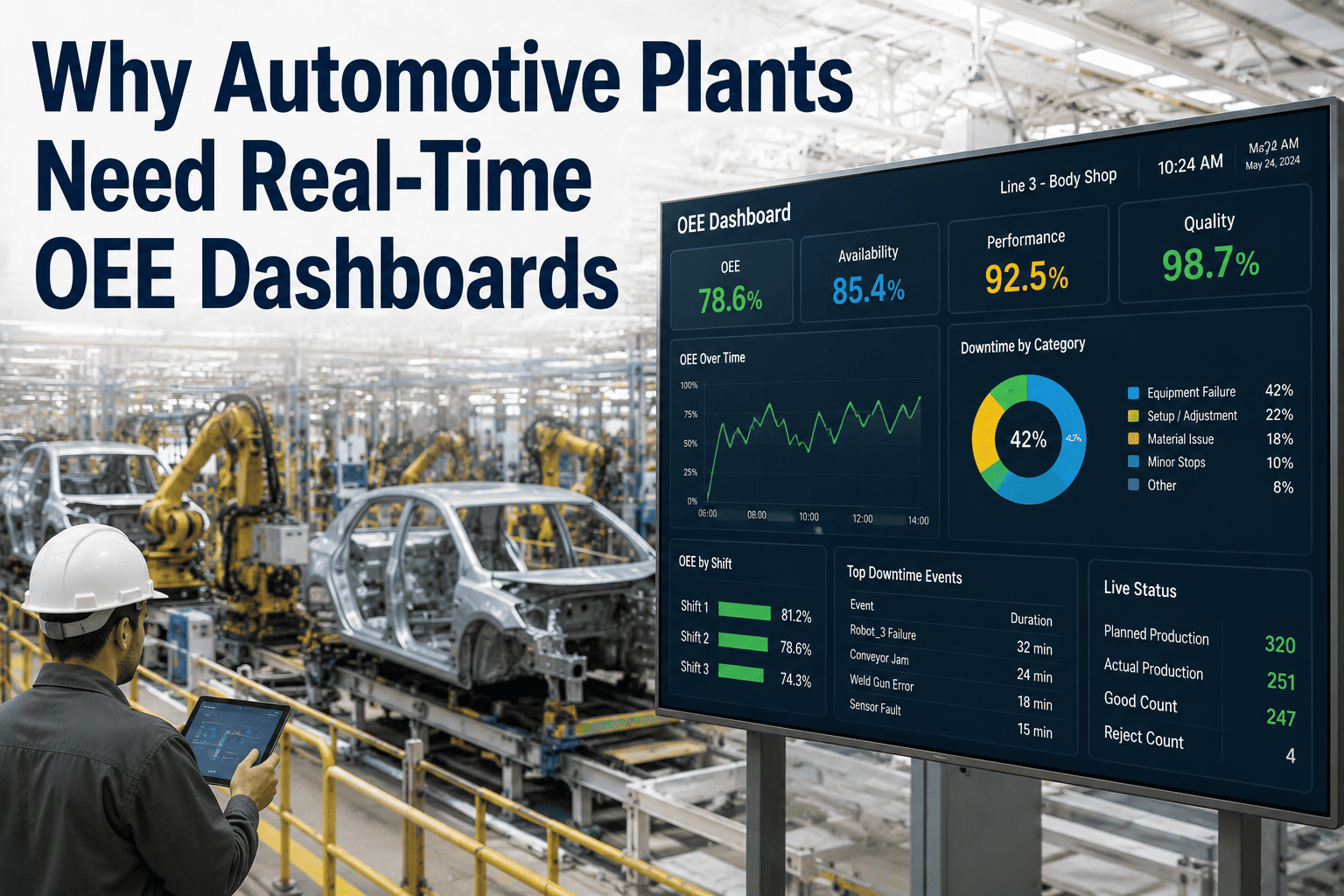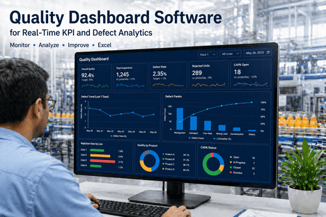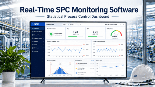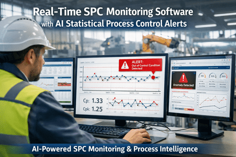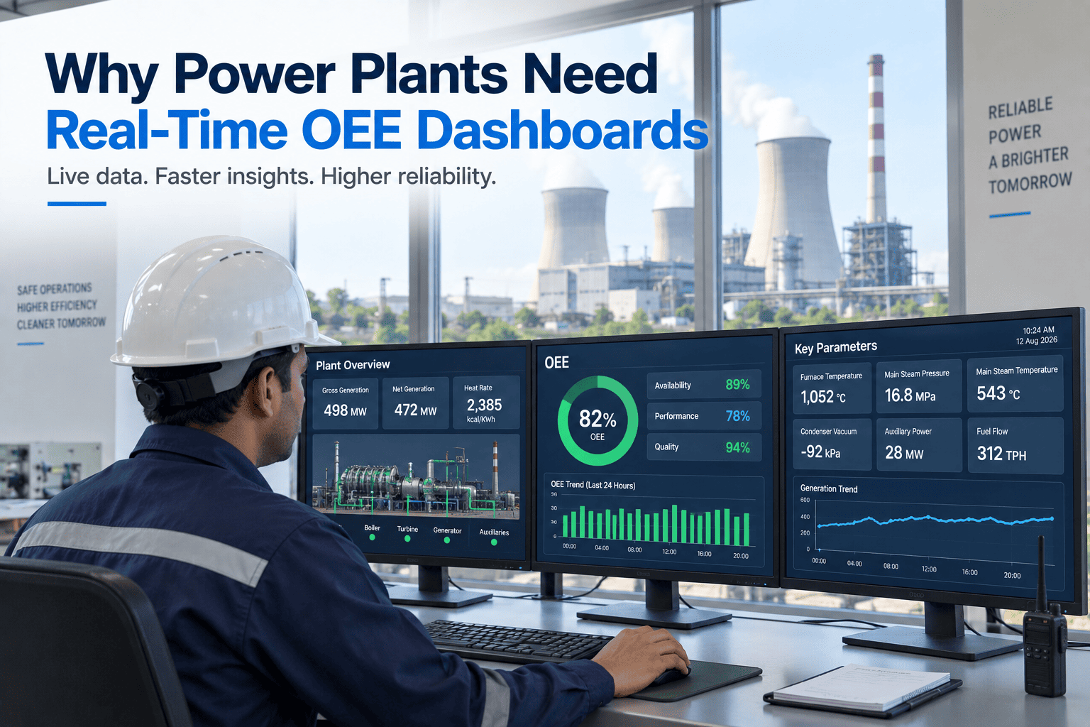
A power plant already knows its numbers cold — availability factor, forced outage rate, heat rate, capacity factor. The problem isn't which metrics to track; it's when the plant finds out. In most plants these are compiled monthly for the NERC GADS submission, so the report describing a heat-rate creep or a recurring derate lands weeks after the fuel and the megawatt-hours were already lost. By then the outage it reflects is history and the money is gone. A real-time OEE dashboard doesn't change what you measure — it collapses the lag between the event and the awareness, so the plant acts on a trend while it's still forming. You can book a demo to see your units live on one screen.
Your Reliability Metrics Are Right. They're Just Weeks Too Late.
Availability, forced outage rate, and heat rate calculated monthly for GADS describe losses already spent. A real-time dashboard surfaces them as they form — so a derate or a heat-rate creep becomes an action today, not a line in next month's report.
A Report Compiled Weeks Later Is a Record, Not a Control
The GADS submission is built for reliability benchmarking and regulatory reporting, and it's excellent at that — a standardized, IEEE 762-based record of how the fleet performed. But an operations team can't run a unit on a number that arrives after the month is over. The lag turns every reliability metric into a rear-view mirror: it tells you precisely what you lost, long after the moment you could have prevented it. That gap between measurement and awareness is where the recoverable money lives.
It's worth being precise about why the monthly cadence exists at all: GADS reporting was designed as a benchmarking and reliability-analysis system, aggregating outage records across the industry into a database used for long-run trend studies, not as a shift-level operations tool. That's the right cadence for its purpose — you don't need real-time data to benchmark a fleet over years. The mistake is letting the reporting cadence become the operating cadence by default, so the plant only ever sees its own performance at the frequency the regulator needs it, rather than the frequency the control room needs it. A real-time dashboard simply decouples the two: keep the monthly submission for GADS, and give operations a live view for running the plant.
A unit runs 15 MW below capability for days because of a fouling condenser or a fuel-quality shift. On a monthly rollup it's a small dent in capacity factor; caught live, it's a same-day fix worth every one of those megawatt-hours.
Efficiency drifts a few hundred BTU/kWh over weeks as equipment degrades. Averaged into a monthly heat-rate figure it's nearly invisible — but every BTU is fuel burned for no extra output, and it compounds daily until someone sees the trend.
The same auxiliary fault trips the unit three times in a month, logged as three separate events on three separate shifts. Without live loss classification, the pattern never surfaces as one recurring root cause worth fixing.
Hand-kept outage logs miss short trips and brief deratings, so the reported forced outage rate looks better than reality. Plants moving to automated capture routinely find 15 to 20 percent more unplanned stops than the logs showed.
The Three Questions a Power-Plant Dashboard Has to Answer Live
Classic manufacturing OEE — availability times performance times quality — doesn't map cleanly onto a generating unit, so a power dashboard tracks the generation equivalents: is the unit available, is it producing at its rated capability, and is it converting fuel efficiently. Together these are the real-time picture of whether the plant is turning fuel into revenue as well as it should.
Availability factor and equivalent availability factor — the share of period hours the unit was able to generate. Best-in-class conventional units sit around 90 percent and the fleet averages near 91.5 percent, but the operational value is watching it move in real time, not confirming it monthly.
Forced outage rate — forced outage hours divided by forced outage plus service hours — is the metric that most directly kills revenue, because it's unplanned. Best-in-class gas plants hold FOR below 2 to 3 percent. Live tracking turns a rising FOR from a monthly surprise into an early warning about a specific asset.
Capacity factor and derating tracked against rated output show whether the unit is delivering the megawatts it can. A sustained derate is lost generation that a real-time view flags immediately, rather than letting it average quietly into the monthly number.
Heat rate — BTU per kWh — is the efficiency backbone. Industry average runs near 10,300, supercritical units reach 9,000, and best-in-class combined cycle drops below 7,000. Because a 1 percent improvement is worth roughly $580K a year at a 500 MW unit, catching heat-rate creep early is pure margin.
See Availability, FOR, and Heat Rate Move in Real Time
iFactory pulls these metrics straight from your SCADA and historian and shows them live per unit — so a slipping number is an alert on the shift it happens, not a line item weeks later.
The Same Metrics, Weeks Apart — and Why the Weeks Cost Money
The difference isn't the metric, it's the moment you see it. A number that arrives in the monthly review can only be explained; the same number on a live dashboard can be acted on. Here's how the two diverge on the events that actually move generation and cost.
| Event | Monthly GADS Report | Real-Time Dashboard |
|---|---|---|
| A sustained derate | A dent in next month's capacity factor | Flagged the shift it starts, fixed live |
| Heat-rate degradation | Averaged away, invisible for weeks | Trend caught while it's still small |
| A recurring auxiliary trip | Three separate log entries | One Pareto'd pattern with a root cause |
| Rising forced outage rate | Confirmed after the fact | Early warning on a specific asset |
| A short trip and restart | Often missed by manual logs | Captured automatically, counted in FOR |
| GADS submission itself | Days of manual compilation | Generated from the same live data |
Break Down Every Lost MWh, Then Fix the 20% Causing 80%
A live dashboard is only useful if it turns a slipping number into a specific action. That means decomposing every lost megawatt-hour into its cause and ranking them, so the plant works the handful of failure modes responsible for most of the loss rather than chasing everything at once. This is where real-time capture and Pareto analysis pay off.
Scheduled outages are necessary, but tracked live against plan they reveal overruns — the maintenance window that ran two days long is captured as it happens, not rationalized later.
Unplanned trips are the highest-value loss to attack. Automated root-cause classification groups them so the recurring one rises to the top of the Pareto instead of hiding across shifts.
Partial-capability running is the loss most often missed, because the unit is still online. A live view against rated output makes every derated MWh visible and attributable to a cause.
Heat-rate degradation is lost money even at full output, because it's fuel burned for no extra generation. Trending it live turns a slow, invisible bleed into a fixable, dated event.
The Faster You See It, the Cheaper It Is to Fix
Every reliability and efficiency loss follows the same economics: it costs more the longer it runs unseen. The entire case for a real-time dashboard is compressing the time from onset to awareness, because that compression is what converts a monthly write-off into a same-shift correction. This is what the speed actually buys.
- Losses discovered after a full month of accrual
- Heat-rate creep buried in a monthly average
- Recurring faults logged as unrelated one-offs
- FOR understated by missed short events
- GADS filing is days of manual compilation
- Every fix is a post-mortem, never a save
- A slipping metric alerts on the shift it happens
- Heat-rate trend visible while still small
- Recurring faults Pareto'd into one root cause
- Short trips and derates captured automatically
- GADS reports generate from the live data
- Most losses become a correction, not a record
Live Metrics From the SCADA You Already Run
iFactory reads the data your plant already generates and turns it into a live, per-unit reliability picture — availability, FOR, capacity, and heat rate updating in real time, decomposed into losses, and formatted to drop straight into your GADS reporting. It's an intelligence layer over your existing controls, not a replacement for them.
What Power Plant Operations Teams Ask About Real-Time OEE
Stop Reading Your Plant's Post-Mortem Every Month
iFactory turns availability, forced outage rate, capacity, and heat rate into a live per-unit dashboard from your existing SCADA — so losses surface as they form, the Pareto is always current, and GADS reporting generates itself.