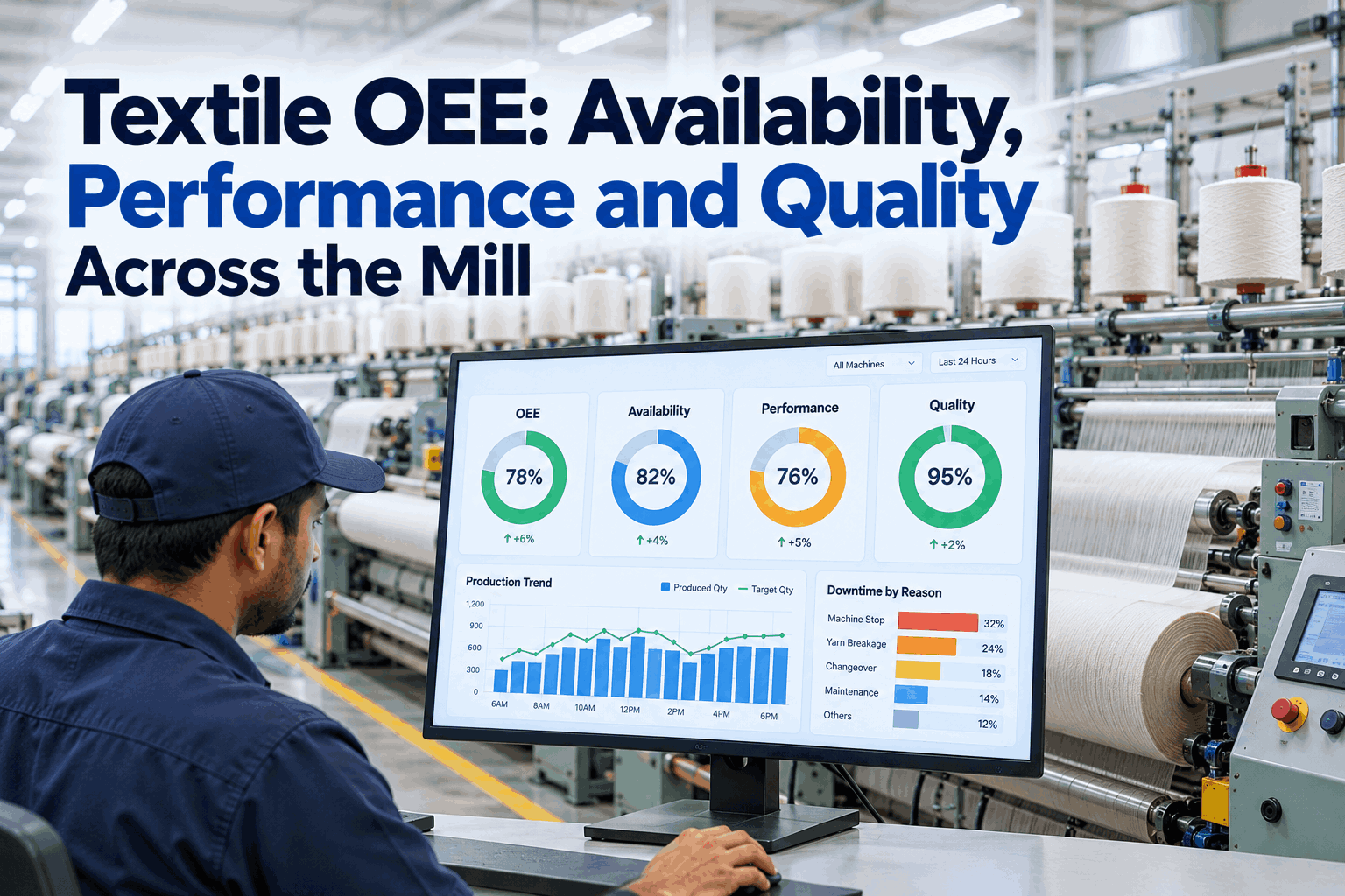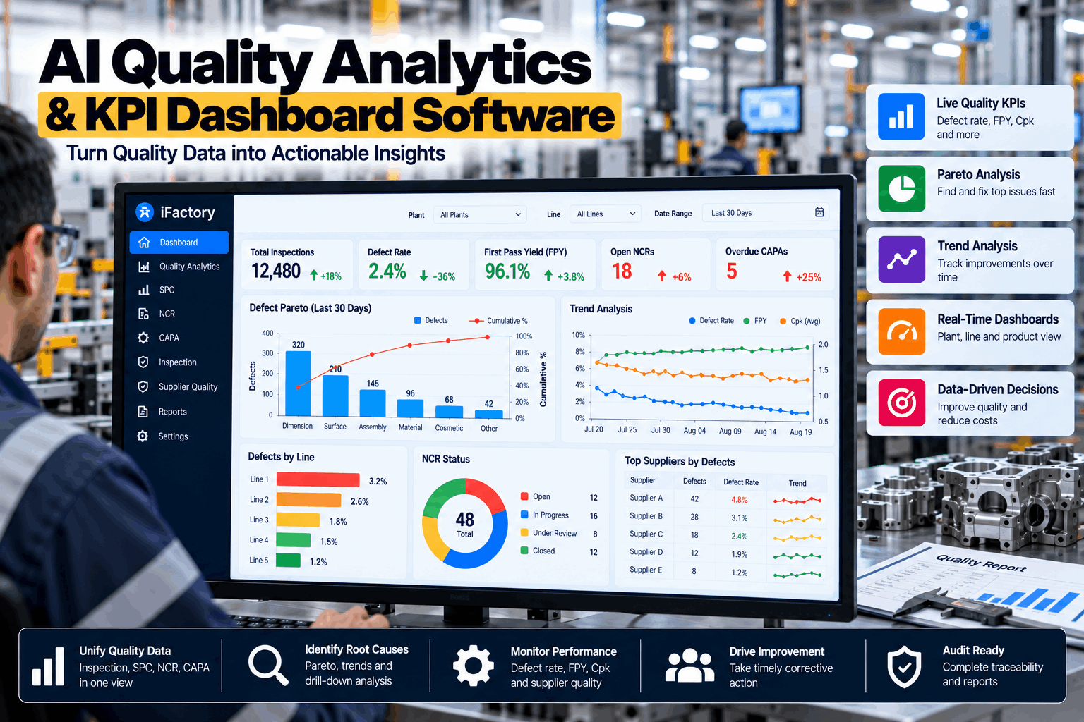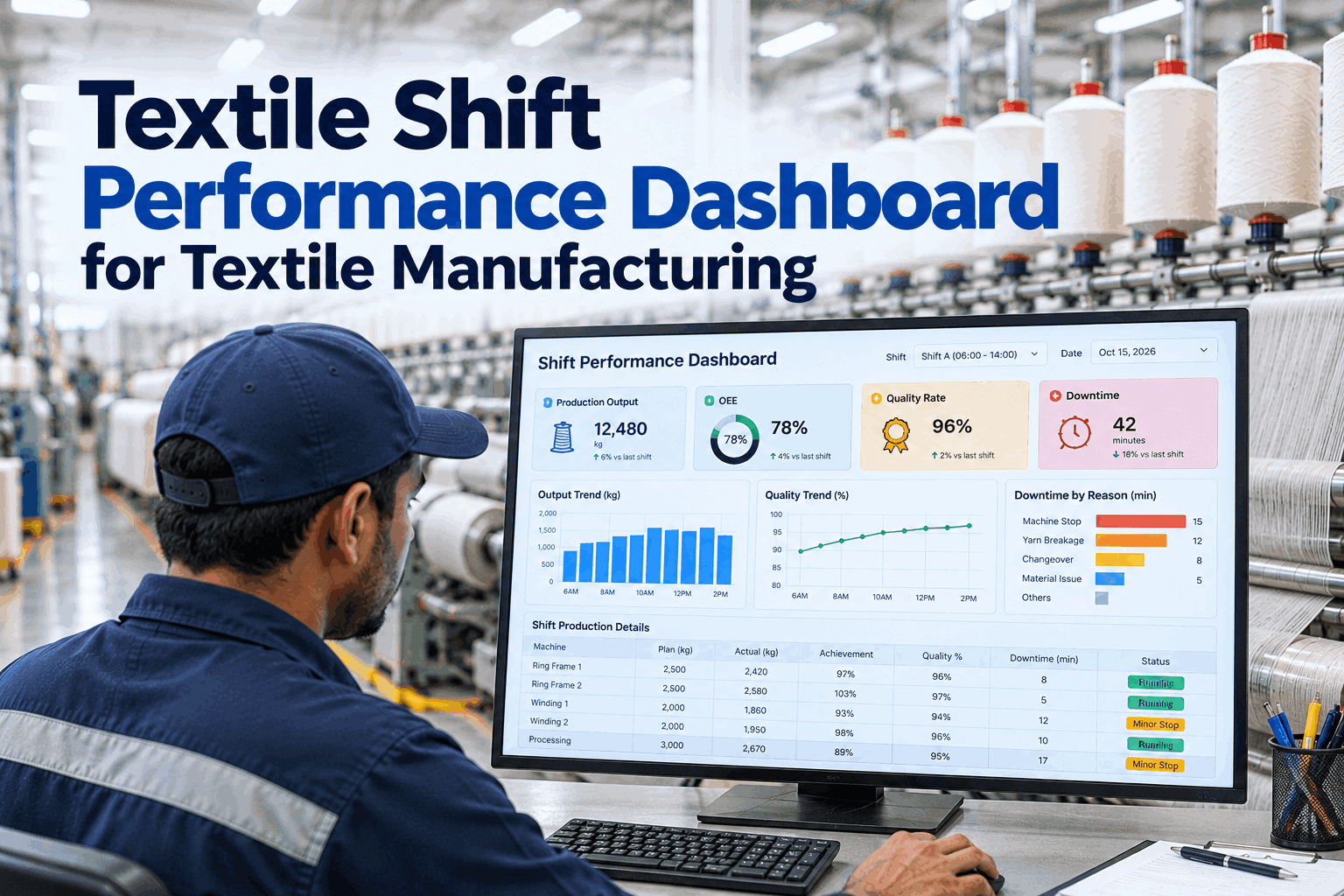
In a three-shift textile mill, each shift hands the next a set of machines, a list of problems and a production number. Too often the comparison between shifts comes down to output alone, with no account of which counts or styles were running, what broke down or how much went to seconds. A shift performance dashboard puts output, efficiency, quality and losses side by side on fair terms, and you can see one running in a short live demo.
See Every Shift's Output, Quality and Losses on One Fair Screen
iFactory builds the shift dashboard from machine data, not hand-written reports. It compares shifts on like-for-like terms, shows live progress against target and gives each handover the facts the next shift needs.
Four Questions a Shift Dashboard Should Answer in Seconds
A good shift dashboard isn't a wall of numbers or a copy of the monthly management report. It answers the few questions supervisors and managers actually ask, quickly and without argument. If it can't answer these four, more charts won't help. Our support team can help you define the questions for your mill.
Eight Shift KPIs for Textile Mills
Keep the shift view focused. Most mills already collect far more data than a supervisor can use in a shift. These eight measures cover output, efficiency, quality and losses for spinning, weaving and knitting without overwhelming supervisors. Each one should be defined once and calculated the same way on every shift, so the numbers are never the subject of the conversation. We can map your current reports to this set in a working session.
What Each Department's Shift View Should Emphasize
The core KPI set is shared, but each department has one or two measures that matter most during a shift. Putting those front and centre makes the dashboard feel built for the people using it. Our support team can help tailor views for each department.
Comparing Shifts Without Starting an Argument
Shift comparisons go wrong when one shift ran an easy style and another ran a heavy one, or when one shift absorbed a beam change or a breakdown that wasn't its fault. Night shifts also often run with fewer maintenance staff on call, which affects how quickly breakdowns are fixed. Fair comparison adjusts for what each shift was given before judging what it achieved. Done well, it turns comparison from blame into learning. You can see adjusted comparisons on your own data in a short demo.
Ask Why a Shift Fell Behind and Get the Real Reason
iFactory explains each shift's result from machine data: what ran, what stopped, why, and how it compares with other shifts running the same products.
Shift Targets That Follow the Product Being Run
A shift target is only fair if it reflects what the machines were asked to make. A single kilograms or meters target per shift penalizes shifts that ran heavy fabrics or fine counts and flatters those that ran easy ones. Building targets from standard rates for each product makes every shift's goal achievable and comparable. We can help you build standard rates from your own history in a working session.
How to Lay Out a Shift Dashboard Supervisors Will Use
A shift dashboard is read in seconds, often from across the floor or on a phone while walking between machines. Put the most urgent information where the eye lands first, keep each zone to one job and save detail for drill-downs. Large numbers, a few colours used consistently and plain labels work better on a noisy, busy floor than detailed charts. Our support team can help design screens for your departments.
Use the Dashboard to Run a Better Shift Handover
The handover is where problems either get passed on clearly or get lost, especially in mills running three shifts without overlap. When both supervisors look at the same dashboard, the conversation starts from facts and covers the things that matter. A short structured handover takes a few minutes and saves hours of confusion on the next shift. Recording it alongside the dashboard also gives managers a history of recurring problems that keep being passed from shift to shift. You can see a dashboard-led handover in a guided demo.
Why Real-Time Data Changes What a Shift Can Do
An end-of-shift report tells a supervisor what went wrong after it is too late to fix. By the time it is compiled and read, the next shift has already inherited the problem. A live dashboard shows a machine falling behind or a break rate climbing while there is still time to act. The difference is not more data. It is earlier data, delivered to the person who can act on it. Our support team can show you what live data looks like for your machines.
- Compiled by hand after the shift
- Short stops underreported
- Problems discovered by the next shift
- Comparisons argued over
- Numbers available hours later
- Built automatically from machine data
- Every stop captured with its reason
- Problems visible while they can be fixed
- Comparisons adjusted and explained
- Numbers available the moment the shift ends
Four Ways Shift Dashboards Fail
Many mills have put screens on the floor that nobody looks at after a few weeks. The screens are rarely the problem. The design and the data behind them usually are. These are the usual reasons. Each one is easy to avoid with a little design discipline. You can see how good design avoids them in a short session.
Dashboards, Machine Connectivity and AI Server in One Package
iFactory delivers shift performance dashboards as a turnkey bundle. A pre-configured NVIDIA AI server ships racked and ready with the software pre-loaded. You rack it, plug in power and Ethernet, and the AI is live. To scope it for your mill, request a turnkey quote.
- Pre-configured NVIDIA AI edge server, racked and ready
- Connectivity to frames, looms, winders and knitting machines
- Shift KPIs and targets configured by count and style
- Cabling and plant network setup
- Floor screens, desktop and mobile views
- Training for supervisors and managers
- 24×7 remote monitoring
Server installed, machines connected, KPIs and targets agreed.
One department runs the dashboard, and results are checked against shift reports.
All departments live, handover routine started, teams trained.
Shift Dashboards Built From Machine Data
iFactory gives every shift the same accurate picture, live, and explains the differences between shifts instead of just ranking them. Supervisors spend their time fixing problems rather than compiling reports. Our support team can review your current shift reporting before a pilot.
What Textile Production Managers Ask About Shift Dashboards
Give Every Shift the Same Clear Picture
Show live output, quality and losses for every department, compare shifts on fair terms and hand over with facts instead of memory. The full system is delivered turnkey and goes live in 6 to 12 weeks.