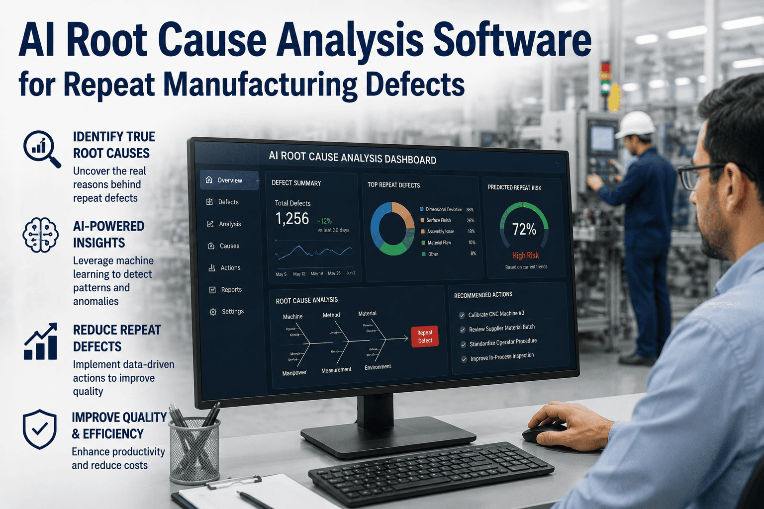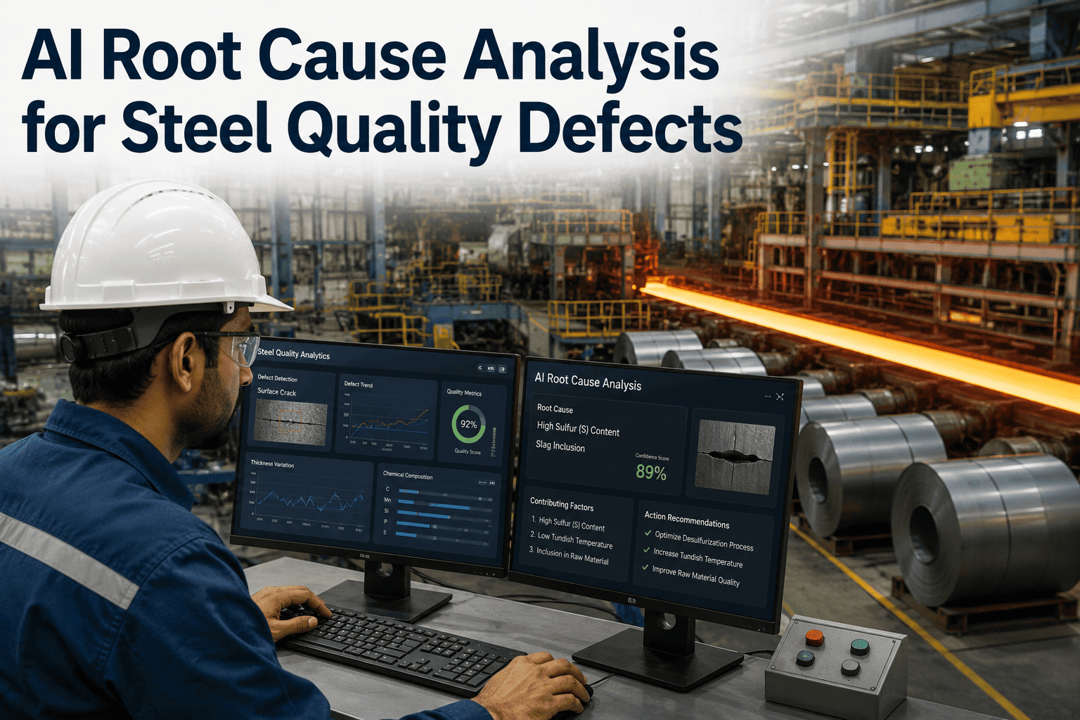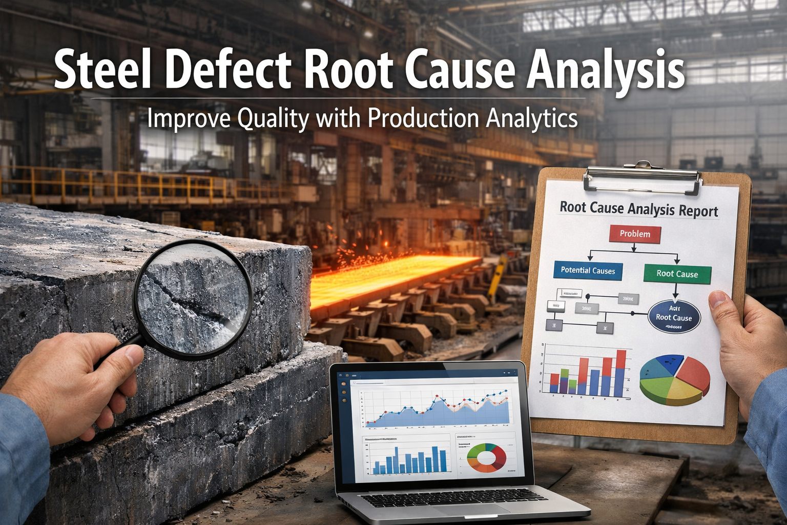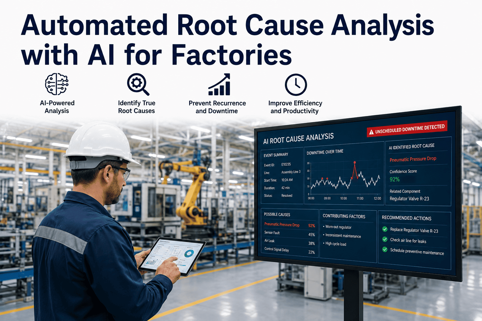
A control chart flags an out-of-control condition at 6:14 AM on a Tuesday. By 6:16 AM, the production supervisor has been notified. By 6:30 AM, the line has been stopped. And then the real work begins — the part that takes not two hours but two weeks: sitting down with shift logs, material traceability records, equipment calibration histories, and operator assignment data to find the variable that changed before the defect appeared. This is the gap that destroys quality programmes. The detection is fast. The attribution is not. Book a session with the iFactory quality analytics team to see how automated correlation compresses root cause from weeks to minutes.
Quality Engineering · SPC & Root Cause Analytics
Automated Root Cause Analysis: From Defect Signal to Cause Identified in Minutes, Not Weeks
A Quality Manager's technical reference for AI-driven root cause correlation — covering detection architecture, multivariate attribution, change-point analysis, and the evidence packages that make corrective action fast, defensible, and permanent.
2–4 wk
Typical manual root cause cycle time per incident
<30 min
AI-driven correlation time for the same incident
73%
Of quality escapes traceable to a process parameter that changed before the defect appeared
$18K–$240K
Cost per day of delayed containment on a mid-volume production line
The Attribution Gap
Why Fast Detection Without Fast Attribution Is a Half-Solved Problem
Statistical process control has been the manufacturing quality standard for four decades. Modern SPC software has become genuinely capable at the detection problem — Western Electric rules, CUSUM charts, EWMA, and adaptive control limits can reliably flag out-of-control conditions within seconds of a signal. What SPC software has never solved is the attribution problem: given that a control chart signal fired at time T, which of the 40 to 400 process variables under continuous measurement actually changed before T, and which of those changes has a statistically defensible correlation with the defect observed?
Without Automated Attribution
Quality engineer reviews shift logs manually — 2–6 hours to assemble data for one event
Fishbone diagram built from team memory, not correlated data — hindsight bias dominates
Correlation limited to variables the team already suspects — unknown causes stay unknown
Root cause confirmed 10–18 days after the event — containment decisions made blind
CAPA document references narrative, not statistical evidence — difficult to defend in audits
With AI Attribution
Correlation engine queries historian, MES, and LIMS simultaneously at signal time
Multivariate analysis ranks all measured variables by correlation strength with the defect signal
Change-point detection identifies which variable shifted before the defect, not after
Evidence package delivered in under 30 minutes with ranked hypotheses and supporting data
CAPA references statistical attribution report — audit-ready from day one
The Cause-Chain Architecture
How AI Moves from Signal to Hypothesis to Evidence in a Single Workflow
Automated root cause analysis is not one algorithm. It is a pipeline of five sequential steps, each narrowing the hypothesis space. Understanding the pipeline is what allows quality teams to configure it correctly, trust its outputs, and know when to intervene with domain expertise.
01
Signal Detection
A quality signal is generated — from an SPC control chart, an inline vision inspection rejection, a manual inspection failure rate threshold, or a customer return. The signal carries a timestamp, the product or part number, the process route, and the defect classification. This becomes the anchor for all subsequent correlation work.
Inputs: SPC, vision inspection, MES, CMM, LIMS
02
Window Definition
The correlation engine defines the look-back window — typically 4 to 24 hours before the signal, adjusted for material lead time and process cycle time. For a slow chemical process, the window might extend 72 hours. For a high-speed stamping line, 90 minutes may be sufficient. Correct window definition is the step most often configured wrong in early deployments.
Parameters: process cycle time, material lot size, lead time from raw to defect station
03
Variable Harvesting
Within the defined window, every available process variable is pulled from connected data sources — temperature, pressure, humidity, torque, speed, vibration, tool offset, operator ID, shift, material lot, supplier, machine ID, fixture ID, and any other parameter tagged to the affected parts. On a connected line, this typically returns 80 to 400 variables.
Sources: historian, MES, ERP material traceability, maintenance CMMS, operator schedules
04
Correlation Ranking
A multivariate correlation engine scores every harvested variable against the defect signal. Pearson correlation for continuous variables, chi-squared for categorical. SHAP (SHapley Additive exPlanations) values assign each variable a contribution score that is both statistically grounded and interpretable to a non-data-science audience. The output is a ranked list: "Variable X has a 0.87 correlation with defect rate. Variable Y has 0.71. Variable Z has 0.22."
Methods: Pearson, chi-squared, SHAP attribution, change-point detection (PELT algorithm)
05
Causal Hypothesis & Evidence Package
The top-ranked variables are presented as hypotheses, not answers. The AI cannot confirm causality — only correlation. But it generates an evidence package that a quality engineer can use to confirm or reject each hypothesis in minutes rather than days: time-series overlays showing the variable change before the defect signal, statistical confidence intervals, and recommended experimental tests to confirm the causal direction.
Output: ranked hypothesis report, time-series overlays, CAPA pre-population, audit trail
Defect Attribution Dimensions
The Four Variable Families AI Correlates Simultaneously
Manual root cause processes have a structural weakness: they correlate in one dimension at a time. The team checks materials. Then equipment. Then operators. Then process parameters. By the time they reach the fourth dimension, the first three have been re-assembled from memory. AI correlation is simultaneous across all four — which is where multi-factor interactions, the hardest failure modes to diagnose, become visible for the first time.
Process Parameters
Temperature, pressure, speed, torque, humidity, flow rate, pH, viscosity — every continuous process variable tied to the affected production window. Change-point detection identifies the moment a parameter drifted outside its historical operating range before the defect appeared.
Examples: oven temperature drift, coolant pressure drop, spindle speed deviation
Equipment & Tooling
Machine ID, tool age, maintenance history, calibration date, fixture wear state, servo error logs. AI cross-references defect onset against maintenance events — a tool change, a calibration that was overdue, a bearing replacement that changed machine vibration signature.
Examples: tool wear at cycle 45,000, fixture pin wear, calibration 12 days overdue
Material & Supplier
Lot number, supplier ID, incoming inspection results, certificate of conformance data, storage conditions, shelf age. Material attribution is the dimension most likely to generate a supplier SCAR — and the one that requires the clearest evidence trail to defend.
Examples: lot 4471 from Supplier B, incoming Rockwell hardness 1.8 HRC above spec
Operator & Shift
Operator ID, shift, time of day, day-of-week, training recency, workstation assignment. Operator attribution is the most politically sensitive dimension — but also one of the most actionable, because the resolution is usually retraining or procedure clarification rather than personnel action.
Examples: defect rate 3.2× higher on Night Shift B, station 4 operator rotation pattern
See It on Your Data
iFactory Correlates Your Defect History Against Every Process Variable — Starting with Your Worst Recurring Defect
Most quality teams have a backlog of unresolved or re-opened CAPAs where the root cause was documented as "undetermined" or "operator error." iFactory's correlation engine runs against your historical defect data and process historian to generate ranked attribution hypotheses for those cold cases — in the first session.
SPC Integration
How Automated RCA Connects to Your Statistical Process Control Layer
Root cause automation does not replace SPC — it extends it. The control chart provides the signal; the correlation engine provides the attribution. The relationship between them defines the quality response workflow.
| SPC Signal Type | What It Tells You | What It Cannot Tell You | AI Attribution Adds |
|---|---|---|---|
| Rule 1 violation — single point beyond 3σ | A statistically extreme event occurred | Whether it is a measurement error, a process spike, or a sustained shift | Correlation against all measured variables at event time; change-point verification |
| Rule 2 — 9 consecutive points same side | Process mean has shifted | When the shift started, and which variable caused it | Change-point algorithm identifies the exact shift onset across all correlated variables |
| Cpk trending down over 4 weeks | Process capability is degrading | Whether degradation is drift, increased variation, or a combination | Multivariate trend correlation identifies the variable(s) whose spread is widening in sync |
| CUSUM cumulative sum signal | A small persistent offset is accumulating | Source of the offset — material, equipment wear, or parameter creep | Drift attribution model compares offset trajectory against tool wear curve and material lot boundary |
| Vision inspection defect rate spike | Visual defect frequency increased | Root location in process — is defect created upstream or at station? | Spatial-temporal correlation maps defect appearance to process station combination |
Process Capability Analytics
CPK, RTY, and FPY — The Three Numbers AI Closes the Loop On
Process Capability — Cpk
Target: ≥1.33
Cpk measures how well a process fits within specification limits relative to its natural variation. A Cpk below 1.33 means more than 64 defects per million opportunities. A Cpk below 1.0 means the process is producing out-of-spec parts by definition, regardless of operator care. AI root cause analysis identifies which specific process variable is widening the distribution or shifting the mean — converting a Cpk problem from a measurement into a diagnosis.
First Pass Yield — FPY
Target: >97%
FPY measures the percentage of units that complete a process without any rework or rejection. The hidden cost inside FPY is the rework labor that is invisible to a simple throughput measure. AI correlation maps FPY drops to specific stations, shifts, and process conditions — allowing quality teams to target improvement at the exact source rather than addressing an average across the line.
Rolled Throughput Yield — RTY
Target: >95%
RTY multiplies the FPY of every process step — and the result is almost always a shock. A ten-step process where every step runs at 98% FPY produces an RTY of 81.7%. AI attribution across the full process route identifies the two or three steps whose FPY improvement would have the greatest leverage on RTY, rather than spreading improvement effort uniformly across all ten.
Defect Analytics Framework
From Pareto to Heatmap to Correlation — The Three Layers of Defect Intelligence
A defect Pareto tells you what is failing most often. A defect heatmap tells you where it is failing and when. A correlation matrix tells you why. Most quality systems stop at the Pareto. AI-driven analytics closes the loop through all three layers.
Layer 1
Defect Pareto
Frequency-ranked defect classification. Answers "what is failing most." Useful for resource prioritisation but provides no causal information. Every quality system has this. The problem is that teams stop here and assume the most frequent defect is the highest-priority one — but frequency without cost weighting and without attribution leads to effort spent on symptoms, not causes.
Limitation: shows frequency. Does not show cost, cause, or which defects share a root cause.
Layer 2
Defect Heatmap
Spatial and temporal distribution of defects across the process route, shift, and time period. Reveals patterns invisible in a frequency table — a defect cluster at Station 7 on Night Shift C every Tuesday points directly to a process variable or operator pattern. Heatmaps are the bridge between the symptom count and the causal investigation because they narrow the hypothesis space before the correlation engine runs.
Limitation: shows where and when. Does not confirm the variable that explains the pattern.
Layer 3
AI Correlation Matrix
The full multivariate analysis that connects the heatmap pattern to the process variable that explains it. The correlation matrix scores every measured variable against the defect pattern identified in Layer 2. The output is a ranked evidence list: the variable at the top is the strongest statistical candidate for root cause, with a confidence score, a time-series overlay showing its deviation before the defect appeared, and the recommended test to confirm causality.
Limitation: statistical correlation. Human engineering expertise still required to confirm causality and design the corrective action.
Practitioner Perspective
“
The 8D process was designed in an era when data collection was manual and analysis was done with graph paper. It is not that the structure is wrong — Define, Contain, Root Cause, Corrective Action — the structure is sound. The problem is that Disciplines 4 and 5, root cause identification and corrective action selection, were always designed to take the majority of the 8D timeline. And they do — not because engineers are slow, but because assembling the process data, cross-referencing it with material traceability and shift records, and building a defensible correlation manually is genuinely difficult and time-consuming work. When AI reduces that assembly from twelve days to forty minutes, you do not just get faster root cause. You get more honest root cause. Engineers stop anchoring on the first plausible explanation — the one that fits the data they happened to have on their desk — and start examining the full ranked list of what the data actually says. That is a fundamentally different quality culture, and it is accessible today without replacing your SPC system or your 8D process.
Marcus Chen, CQE, CSSBB
Certified Quality Engineer & Certified Six Sigma Black Belt · 21 years in automotive and aerospace quality systems · Former Director of Quality Engineering at a Tier-1 automotive supplier · Independent quality systems consultant
Quality Team Questions
Automated Root Cause Analysis — Frequently Asked
How is AI-driven root cause analysis different from the fishbone diagrams and 5-Why process we already use?
A fishbone diagram and 5-Why process are hypothesis-generation tools that depend entirely on the knowledge and memory of the team in the room. They are valuable for structuring thinking but have a critical weakness: they can only surface causes the team already suspects. A chemical contamination from a rarely-used secondary supplier, a fixture wear pattern that developed over six months, a subtle interaction between ambient humidity and adhesive cure time — none of these appear in a fishbone if nobody in the room is thinking about them. AI correlation runs against every measured variable in the look-back window regardless of team assumptions. It finds correlations the team would not think to look for. The correct model is to use AI correlation to generate a ranked hypothesis list, then use 5-Why and engineering judgment to confirm the causal direction and design the fix. They are complementary, not competing. For a demonstration running against your existing process data, book a session with the iFactory analytics team.
What process data does automated root cause analysis actually need to work?
The minimum viable dataset is: a defect signal with a timestamp and product identifier, at least one historian or MES data source with time-series process parameters linked to the production run, and a traceability record connecting parts to the production conditions under which they were made. This is a lower bar than most quality teams expect. Plants with a process historian, an MES logging work order data, and any form of material lot traceability typically have everything needed for useful correlation in the first session. The more dimensions available — material lot, equipment ID, operator, tooling history, calibration records — the richer the attribution. iFactory connects to historians, MES platforms, ERP material records, and CMMS maintenance logs as separate data sources. For a data readiness assessment against your current systems, reach out to the iFactory support team.
Can AI root cause analysis distinguish correlation from causation, or does it just produce a long list of correlated variables?
AI correlation produces ranked statistical associations — it does not confirm causality, and it should not claim to. What it does that manual analysis cannot is apply change-point detection to determine the temporal ordering: it identifies which variable changed before the defect appeared, not just which variable correlates with the defect overall. Temporal precedence — the correlated variable changing before the outcome — is a necessary but not sufficient condition for causation, and it dramatically narrows the hypothesis list. The confirmed causal link requires an engineering test: change the candidate variable intentionally and observe whether the defect rate responds. What AI provides is a ranked, time-ordered hypothesis list with confidence scores that makes that engineering test the last step of a short investigation rather than the result of a weeks-long search for where to look.
How does this system integrate with our existing CAPA and quality management documentation process?
iFactory's root cause module generates a structured attribution report that maps directly to the D4 and D5 sections of an 8D report — root cause statement, supporting evidence, and contributing factor ranking. This report can be exported as a structured document that populates your existing CAPA template or pushed directly to a connected quality management system. The audit trail embedded in the correlation output — data sources queried, time window used, statistical method applied, confidence scores — satisfies the evidence requirements for IATF 16949, AS9100, ISO 13485, and FDA 21 CFR Part 11 documentation standards. For a walkthrough of the CAPA integration workflow, book a demonstration with the iFactory quality analytics team.
What happens when the defect cause involves an interaction between two or three variables rather than a single root cause?
Multi-factor interactions are the most common failure mode that manual root cause processes miss — precisely because investigating one variable at a time makes interaction effects invisible. The correlation engine uses multivariate methods that naturally surface interactions: two variables that individually show weak correlation with the defect but show strong combined correlation are flagged as interaction candidates. SHAP attribution values also decompose interaction contributions explicitly, showing not just that both variables matter but how much of the observed defect rate is attributable to their combination versus each variable in isolation. The practical implication is that your corrective action addresses the combination — a tighter temperature control specification that is only applied when the material lot is from a specific supplier, for example — rather than a single-variable fix that leaves the interaction in place and produces a repeat escape.
From Signal to Evidence in Under 30 Minutes
Stop Writing CAPAs Backed by Memory. Start Writing CAPAs Backed by Data.
iFactory's automated root cause analysis module connects to your existing historian, MES, and quality system — no data migration, no system replacement. The first correlation session typically surfaces at least one ranked hypothesis for your most persistent open CAPA that your team has not yet investigated. That is what automated attribution does: it finds the causes the team was not looking for.