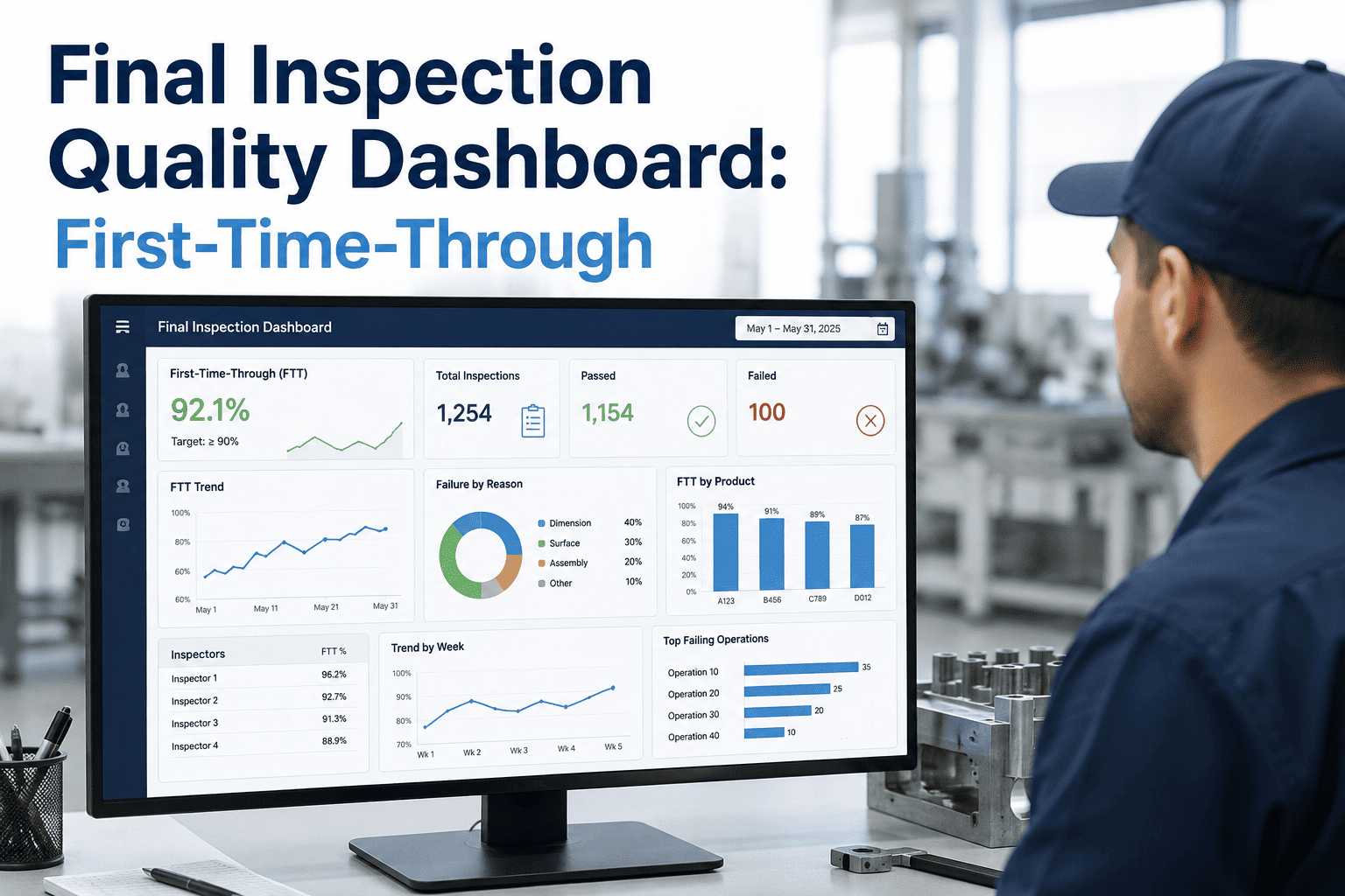
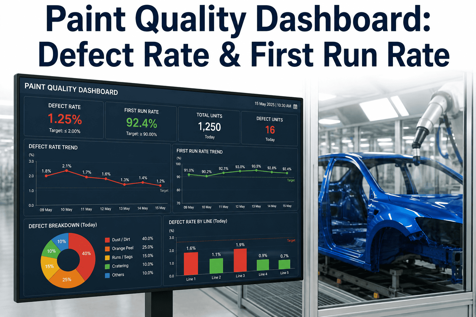
First-time-through rate is one of those metrics that sounds simple in a meeting and turns out to be surprisingly hard to see clearly on a plant floor, because the raw data behind it — station-by-station pass and fail results, rework routing, repeat defects on the same VIN — usually lives scattered across separate inspection systems that were never built to talk to each other. A quality team that can only see a single blended FTT number for the whole line is flying without the detail that actually explains why the number moved. The plants getting real value from final inspection data build a dashboard that breaks FTT down by station and defect type, not just a single headline percentage. iFactory's inspection analytics platform is built to surface that detail without a custom reporting project for every request.
Final Inspection Dashboards
Building a First-Time-Through Dashboard That Actually Explains the Number
A single blended FTT percentage hides more than it reveals. See how station-level and defect-level breakdowns turn a headline metric into an actionable one.
Why a Single FTT Number Isn't Enough
First-time-through rate measures the share of vehicles that pass every inspection station without needing rework, and it's a genuinely useful summary metric — but a plant-wide FTT number by itself cannot tell a quality manager whether the drop last week came from paint, electrical, or fit and finish. Without that layer of detail, teams end up debating which station is responsible instead of looking at data that already has the answer.
128
Repeat Defects This Week
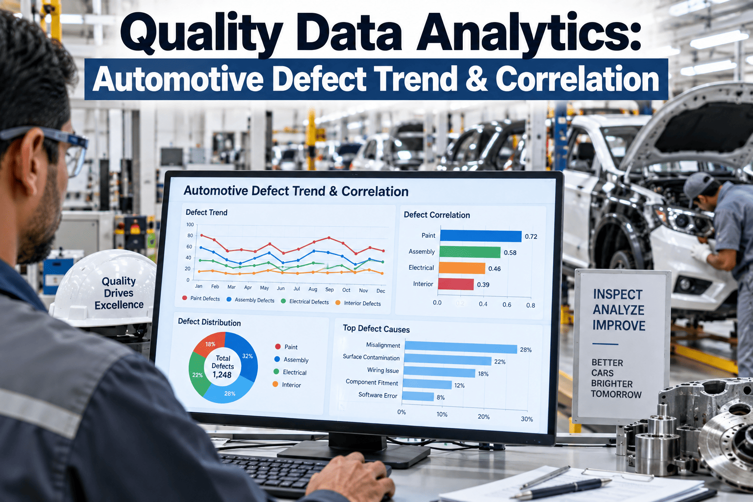
Defect Pareto: Where to Look First
A Pareto view of defects — ranked from most to least frequent — is usually the fastest way to focus a quality team's attention, since it's common for a small number of defect categories to account for the majority of rework across the whole line.
Illustrative defect Pareto — the top two categories here account for over half of all recorded rework events.
What Belongs on a Station-Specific Quality Display
Station FTT Trend
Each station's individual pass rate tracked over time, not blended into the plant-wide average.
Defect Type Breakdown
Which specific defect categories are driving fails at that station, ranked by frequency.
Repeat VIN Flags
Vehicles failing the same station more than once, a signal that rework itself may not be resolving the root cause.
Shift and Time Patterns
Whether fails cluster around specific shifts or times of day, pointing toward process or staffing factors.
From Raw Inspection Data to a Working Dashboard
1
Connect Sources
Pull results from every inspection station into one unified dataset by VIN
2
Standardize Categories
Normalize defect naming across stations so a Pareto view is actually comparable
3
Build Views
Plant-wide, station-level, and shift-level views layered from the same underlying data
4
Alert on Drift
Automated flags when a station's FTT trend moves outside its normal range
Want to see what a dashboard like this would look like built on your own inspection data? Talk to our team about a data assessment.
Dashboard View Comparison
| Dashboard View | Primary Audience | Refresh Frequency |
|---|
| Plant-wide FTT summary | Plant leadership | Daily |
| Station-level breakdown | Line supervisors, quality engineers | Real time / shift |
| Defect Pareto by category | Quality engineering, process teams | Daily / weekly |
| Repeat VIN and rework trend | Root-cause investigation teams | Real time |
What a Connected Dashboard Changes
Faster
Root-cause identification when FTT drops at a specific station
Clearer
Accountability tied to the station and shift where issues originate
Fewer
Repeat defects once root causes are visible and tracked
Frequently Asked Questions
What's a good first-time-through target for a final inspection line?
Targets vary by vehicle complexity and program maturity, so the more useful exercise is tracking your own trend over time rather than benchmarking against a generic industry number that may not reflect your specific process. A dashboard that shows the trend clearly makes the target-setting conversation with leadership much more grounded.
Our team can help think through what's realistic for your line.
How is a defect Pareto different from just counting total defects?
A Pareto view ranks defect categories by frequency so the team can see at a glance which few categories are driving the majority of rework, rather than treating every defect type as equally worth investigating. That prioritization is what usually turns a defect list into an actual action plan.
Can this dashboard pull from multiple different inspection vendors' systems?
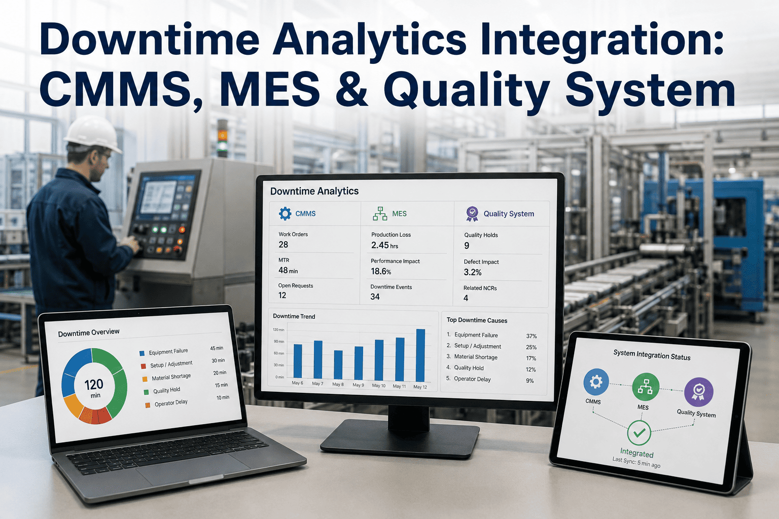
Yes, in most cases, since the goal of the dashboard layer is to normalize and connect data across whatever inspection systems are already running station by station, rather than requiring every station to use the same underlying vendor or software.
How often should station-level data actually be reviewed?
Line supervisors generally benefit from near real-time visibility so issues can be caught within a shift, while quality engineering and leadership reviews of trend data are often more useful on a daily or weekly cadence to avoid reacting to normal day-to-day noise.
Where should a plant start building this kind of dashboard?
Start by inventorying which inspection stations already generate structured data and whether their defect categories are named consistently — that inventory usually reveals how much of the dashboard can be built quickly versus where naming standardization needs to happen first.
Book a demo to see how that process typically works.
A Single FTT Number Won't Tell You What to Fix.
Build a Dashboard That Shows Station and Defect-Level Detail
Bring your current inspection data sources. We'll show you what a connected FTT and defect Pareto dashboard could reveal about your line.