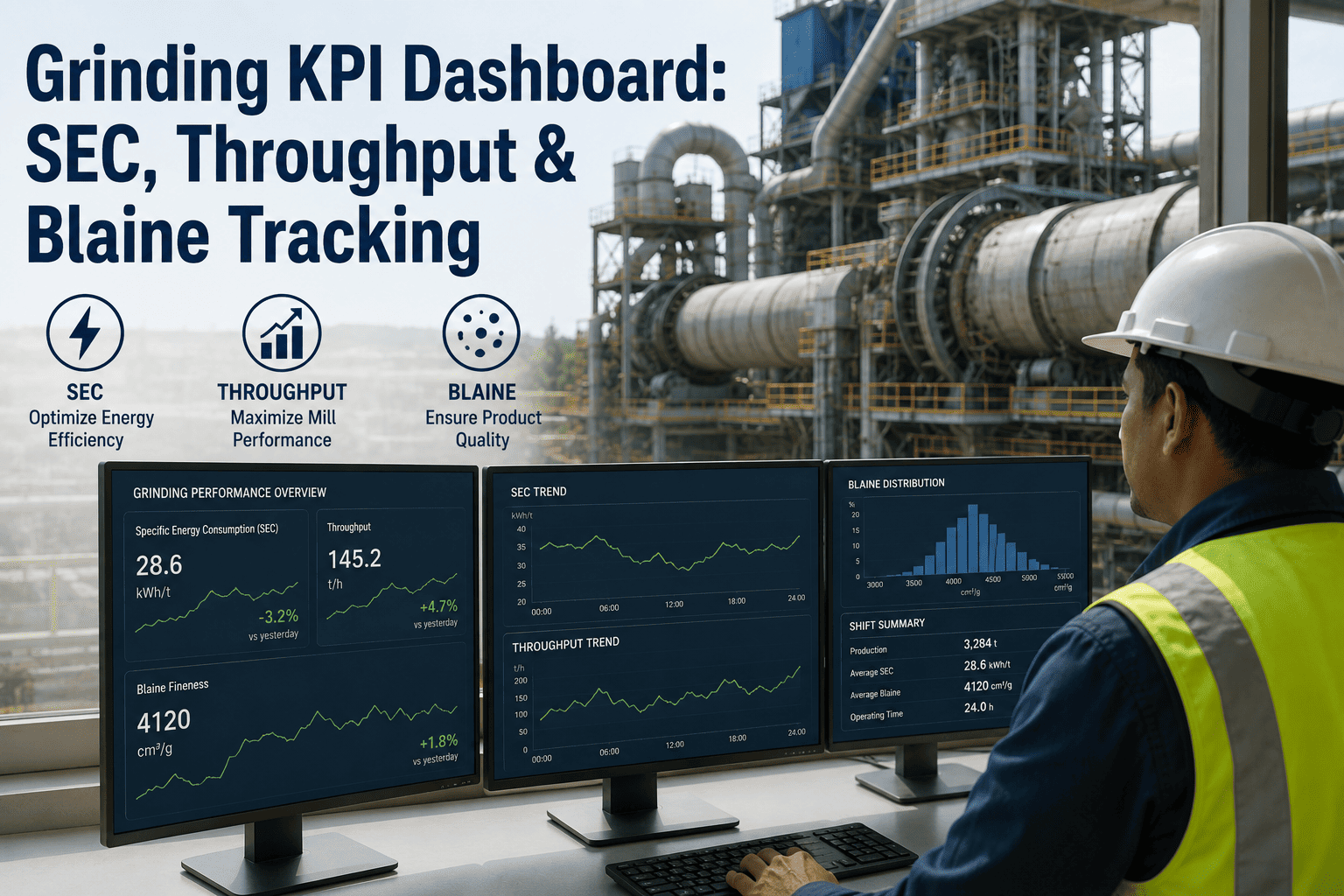
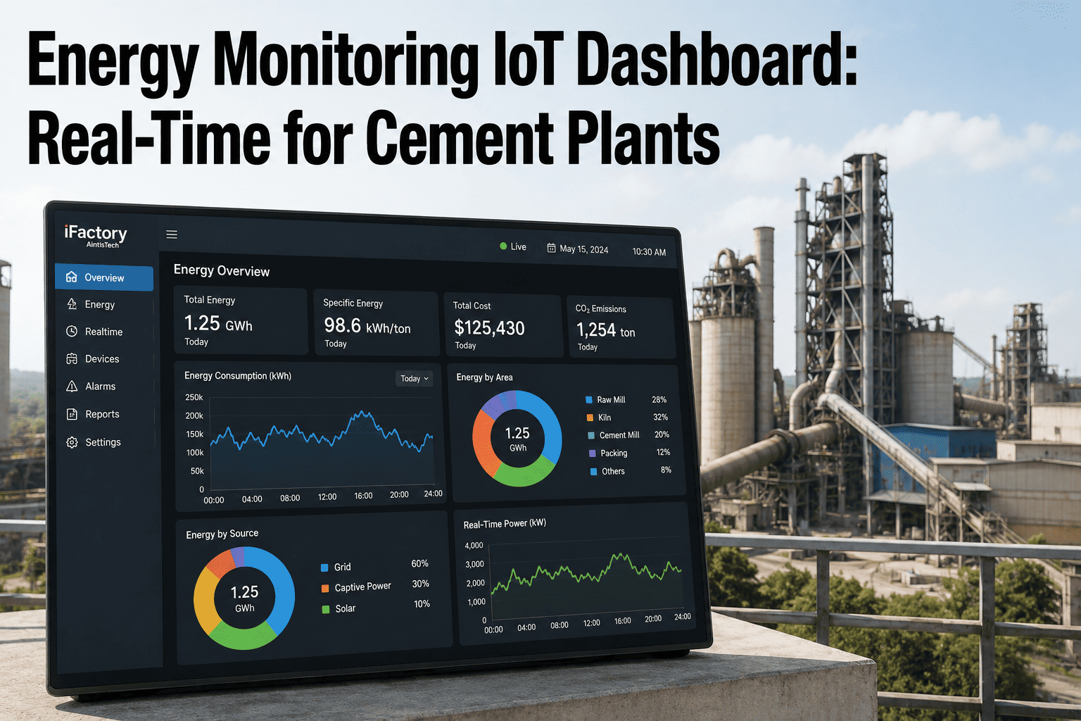
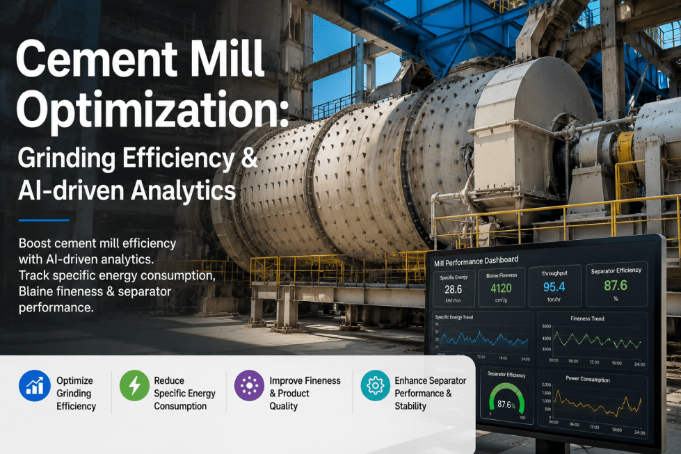
Most cement plants know their grinding numbers. Very few can act on them. The specific energy figure arrives in a monthly report weeks after the month it describes, throughput is reconciled at shift handover from a whiteboard, and Blaine lives in a laboratory logbook that the control room only sees when something has already gone wrong. By then the drift has compounded — a circuit left unwatched can inflate specific energy consumption 8 to 15 percent above its optimised baseline between shutdowns. A grinding KPI dashboard is not a reporting upgrade, it is the difference between finding a loss in 48 hours and finding it in a quarter-end review. See what a live grinding view looks like on your own circuit with the iFactory team.
Cement Grinding Analytics · Live KPIs
Your Grinding Losses Are Already Visible. They Are Just Not On Anyone's Screen Yet.
Real-time SEC, throughput, Blaine and residue tracking against normalised benchmarks — with drift alerts that reach the right role before the tonnes are already made.
of plant electrical energy consumed by cement grinding
12-22%
typical SEC drift above design benchmark when untracked
40+
cement-specific KPIs pre-configured out of the box
60 days
typical time to measurable SEC and OEE improvement
The Reporting Lag That Costs More Than The Losses It Reports
Cement grinding consumes 40 to 45 percent of a plant's total electrical energy, and a well-optimised circuit still loses roughly 1 to 2 percent of its efficiency every month without maintenance attention. Worn liners change ball trajectory. Blocked diaphragm slots alter material flow. Separator rotor blades degrade and bypass rises. Across six months between shutdowns, cumulative neglect can inflate specific energy consumption 8 to 15 percent above baseline — a cost measured in the hundreds of thousands of dollars for a mid-size plant, accumulated entirely in numbers that were technically being collected the whole time.
The failure is not measurement, it is latency and ownership. A monthly SEC report tells you the loss happened. A daily one tells you which week. A live dashboard with a drift threshold tells you the shift, the mill, and usually the asset — while there is still something to do about it. This is why grinding KPIs need to be structured by who acts on them and how fast, not by what is easiest to compile.
Control Room · Seconds To Minutes
Live SEC, feed rate, predicted Blaine, mill load, separator speed and recirculating load. The only tier where a number can still change what the mill is doing right now, so it carries the fewest KPIs and the tightest refresh.
Shift Supervisor · Hourly To Shift
Shift OEE against target, cumulative tonnes against plan, residue and Blaine variance, and any amber drift carried forward. Reviewed at handover so no deviation crosses a shift boundary unowned.
Plant Management · Daily To Monthly
Normalised SEC against benchmark tiers, cost per tonne ground, quality giveaway, and the maintenance actions generated from KPI deviations. This is the tier where money is authorised, so the numbers must already be normalised.
The Six KPIs A Grinding Circuit Actually Runs On
Dashboards fail more often from excess than from absence. A screen carrying forty metrics gets scanned rather than read, and the one number that mattered gets lost in the ones that did not. A grinding circuit runs on six, and everything else is a drill-down beneath them.
Specific Energy (SEC)
kWh/t
The master metric. Target bands sit around 28 to 34 kWh/t for OPC at 3,300 to 3,800 Blaine on a closed-circuit ball mill, and 18 to 26 kWh/t for a VRM. Measured at the motor terminal, not the switchgear.
Throughput Rate
t/h
Tonnes per hour against nameplate and against plan. On its own it flatters a circuit — a mill can hold throughput while quietly consuming more power, which is why it is never read without SEC beside it.
Blaine Fineness
cm²/g
Tracked as a distribution, not a single value. The shaded band is specification; the persistent gap above it is quality giveaway, and grinding to 4,000 cm²/g costs roughly 30 percent more energy than 3,200.
Residue at 45µm
%
The check that stops Blaine being read alone. Two cements can share a Blaine value and behave differently in concrete, so residue holds the particle size distribution honest while separator setpoints are tuned.
Recirculating Load
%
The earliest mechanical warning on the screen. A climbing load with unchanged setpoints points at separator condition, diaphragm blockage or liner wear long before throughput visibly moves.
Circuit Availability
%
Runtime against calendar, with minor stoppages logged rather than absorbed. Short repeated trips rarely appear in monthly availability but show up clearly as SEC penalties from repeated restarts.
Benchmarking: Four Reference Tiers, Not One Target
A single benchmark number is the fastest way to make a dashboard useless. A plant grinding hard limestone to 4,200 Blaine compared against a benchmark derived from soft chalk at 3,600 Blaine produces a gap figure that means nothing, and everyone in the room knows it, which is how benchmark slides stop being discussed. Serious grinding benchmarking uses four reference tiers, each answering a different question.
Your Own Historical Best
Achievable without a single dollar of investment, because you already did it once. The cheapest gap on the list and the first one to close.
Peer Plants, Same Configuration
Comparable technology, raw materials and product mix. Reveals whether the gap is operational practice rather than equipment capability.
Domestic Best Practice
The national leader operating under the same grid costs, regulations and material supply. Usually the most realistic ambition for a three-year plan.
International BAT
Best available technology — the technical floor with current equipment. Defines the capital investment case rather than the operational one.
The tiers only work if the numbers underneath them are normalised. Grinding SEC has to be adjusted for the things that legitimately move it — raw material hardness expressed as Bond Work Index, target Blaine, clinker-to-cement ratio, and ambient conditions. Standardised frameworks such as BEST-Cement, developed by Lawrence Berkeley National Laboratory, exist specifically to make cement plant comparisons defensible. A dashboard that reports raw kWh per tonne without normalisation will be argued with; one that reports normalised SEC gets acted on.
How Each KPI Should Be Defined Before It Goes On A Screen
Half the disputes about dashboard numbers are definition disputes wearing a data costume. Two departments reporting different SEC figures for the same mill are usually both correct and measuring different things. Locking the definition, the sample rate and the normalisation basis before go-live is what stops the dashboard becoming a debating exhibit.
KPI
Definition Basis
Sample Rate
Normalise For
Common Distortion
Specific Energy Consumption
Motor terminal kW divided by tonnes of finished product
Continuous, rolled to hourly
Bond Work Index, target Blaine, clinker factor
Measured at switchgear, including auxiliaries inconsistently
Throughput Rate
Weighfeeder tonnes per running hour
Continuous
Product type and target fineness
Calendar hours used instead of running hours
Blaine Fineness
Laboratory result, plus soft-sensor prediction between samples
Hourly lab, continuous predicted
Product grade specification band
Averaged rather than tracked as variance
Residue at 45µm
Sieve residue percentage from routine sample
Per lab cycle
Cement type and separator setpoint
Reported without the matching Blaine value
Recirculating Load
Reject flow relative to fresh feed
Continuous, from elevator current
Separator configuration
Elevator current drift mistaken for load change
Circuit Availability
Running hours against scheduled hours
Event-logged
Planned outage exclusions
Minor stoppages absorbed and never logged
Where The Excess kWh Per Tonne Actually Goes
When a dashboard shows SEC four kWh per tonne above baseline, the useful next question is not how much it costs but which component it came from. Grinding losses are additive and each one has a different owner and a different fix timeline, which is exactly what a KPI view should expose rather than hide inside a single red number.
Illustrative SEC Gap Decomposition — Closed-Circuit Ball Mill
Over-grindingFineness safety margin above specification carries a 2 to 5 percent energy penalty most plants carry unknowingly
Liner & InternalsA worn chamber liner can push specific consumption up around 6 percent before throughput visibly drops at all
Separator ConditionRotor blade wear and guide vane drift raise bypass and recirculation, adding power at unchanged output
Media GradationDrifted charge distribution from single-size top-ups shifts breakage away from its efficient band
Turnkey Deployment · 12-Week Delivery
Get Your Grinding Dashboard Built On Your Own Tags
Hardware and software as one bundle. A pre-configured AI server ships racked and ready — rack it, plug in power and Ethernet, and the dashboards are live. Cabling, network, DCS and SCADA integration, operator training and 24×7 remote monitoring are all in scope. 1000+ clients, 99.9% platform uptime.
A dashboard nobody is watching at 3am is a dataset. What converts KPI tracking into recovered money is the escalation rule underneath it — a defined threshold, a defined recipient, and a defined time limit before it goes higher. Grinding alerts split cleanly into three tiers by urgency and destination.
Priority 1 · Immediate
Control Room Action Now
Throughput more than 5 percent below shift target
SEC drifting above benchmark band
Blaine trending outside specification
Free lime trending toward the 2 percent limit
Auto-escalates to management if unacknowledged within 15 minutes
Priority 2 · This Shift
Supervisor Review
Throughput 2 to 5 percent below target
Separator efficiency trending down
Clinker factor drifting above plan
SEC above shift benchmark without a trip cause
Carried into the automated shift report and reviewed at handover
Daily · Management
Plant Summary
Shift OEE against target and cumulative plan
Energy consumption against budget
Quality KPI summary and giveaway trend
Maintenance actions raised from KPI deviations
Delivered as an automated daily report with weekly trend analysis
The rule that changes behaviour fastest is the automatic work order. When SEC drifts beyond a defined tolerance — commonly around plus or minus 1.5 kWh per tonne against the locked baseline — the deviation should generate a maintenance task rather than a notification, so investigation is owned by a name and a due date instead of being noticed and forgotten.
Where The Data Comes From
Nothing on a grinding dashboard requires new instrumentation in most plants. The signals already exist and are already being written somewhere — the work is integration and normalisation across vendors, not sensor installation.
DCS & SCADALive setpoints, motor kW, mill load and separator speed
PI HistorianHistorical trends for baselining and drift comparison
Lab LIMSBlaine, residue, strength and free lime results
Power MetersMotor terminal consumption per drive, not per feeder
WeighfeedersFresh feed and reject flow for throughput and load
Maintenance RecordsWork orders and component wear state for root-cause linking
Integration happens over the standard industrial protocols — OPC-UA, Modbus, MQTT and REST APIs — and the platform normalises vendor-specific tag structures into one model so a KPI means the same thing whether the signal came from the mill DCS or the laboratory system. That single-model step is what removes the seven-screens problem where understanding a circuit means opening seven applications and reconciling them by hand.
Deployment: Live Dashboards Before AI
The sequence matters. Dashboards go live before any predictive model runs, because the models are trained on the same normalised data the dashboards expose — and because a plant that has watched its own KPIs behave for a month is in a far better position to judge what a model recommends.
Weeks 1-4
Connect And Normalise
DCS, SCADA, historian and lab systems connected. Tag mapping agreed, KPI definitions locked, and a verified baseline captured across target Blaine levels so every later comparison rests on a number both sides signed off.
Weeks 5-8
Live Role-Based Views
Control room, supervisor and management dashboards deployed with role-based access, alert thresholds configured, escalation paths defined, and automated shift and daily reporting switched on.
Weeks 9-16
Predictive Layer
AI models activate on top of the established data model — soft-sensor fineness prediction, drift detection and root-cause correlation against maintenance history, with automated work order generation on threshold breach.
Reported outcomes across cement dashboard deployment include measurable OEE and SEC improvement within the first 60 days and full return typically inside five to eight months, with real-time benchmarking and AI-driven optimisation delivering 8 to 15 percent SEC reduction. For a plant producing around 1.5 million tonnes per year, reaching domestic best practice is worth in the region of 1.6 million dollars annually in electricity alone — which is why the dashboard is rarely the investment being justified. The baseline it establishes is.
Reading The Board: Three Patterns Worth Knowing By Heart
Once the six KPIs are live and normalised, most diagnostic value comes from reading them in combination rather than one at a time. A single metric moving is ambiguous; two metrics moving in a specific relationship is usually a named condition with a known owner. These three combinations account for a large share of what a grinding dashboard will surface in its first year, and teams that learn to read them stop escalating symptoms and start escalating causes.
SEC upThroughput flatLoad up
Internal Condition Drift
Power rising while output holds steady is the classic mechanical signature — worn liners changing ball trajectory, blocked diaphragm slots restricting flow, or drifted media gradation. It is the pattern that costs most because nothing visible fails; a worn chamber liner can push specific consumption up around 6 percent before throughput moves at all. The correct response is an asset inspection, not a setpoint change.
SEC flatBlaine upResidue flat
Quality Giveaway
Fineness sitting persistently above specification while residue stays comfortable means the circuit is buying insurance nobody asked for. This is the least dramatic pattern on the board and often the most valuable, because the fix is a setpoint decision rather than a maintenance job — and the energy penalty carried by that safety margin typically runs 2 to 5 percent.
Load upBlaine downSEC up
Separator Degradation
Rising recirculation with falling fineness at unchanged separator speed points at classification efficiency rather than grinding capability — rotor blade wear, guide vane drift or seal leakage raising bypass. Read early it is a planned component job; read late it presents as a throughput problem and gets misdiagnosed as a mill issue.
What makes these patterns actionable is the link back to maintenance history. When a KPI deviates, the platform cross-references the asset's recent work orders and component wear records, so the dashboard does not just report that specific energy rose — it flags the overdue separator inspection or the liner measurement that has not been taken since the last outage as a probable cause. That correlation is what closes the loop between a number on a screen and a job with a name against it.
Frequently Asked Questions
Do we need new instrumentation before a grinding dashboard is useful?
In most plants, no. The signals a grinding dashboard needs — motor kW, weighfeeder rates, elevator current, separator speed, mill load and laboratory results — already exist in the DCS, historian and LIMS, and the work is integrating and normalising them rather than installing sensors. The one gap worth checking early is whether power is metered at the motor terminal or only at the switchgear, because switchgear-level readings bundle auxiliaries inconsistently and make SEC comparisons unreliable. If a meter is missing, it is a small and well-understood addition rather than a project. Book a demo and we will map your existing tags against the KPI set.
How is this different from the reports our DCS already produces?
A DCS reports what each system is doing; it does not normalise across them, benchmark the result, or route a deviation to a person with a deadline. Grinding KPIs need to combine process signals, laboratory results and maintenance history in one view, then adjust for the variables that legitimately move energy consumption such as material hardness and target fineness — none of which a control system is designed to do. The practical difference shows up in what happens after a number goes red: a DCS displays it, while a KPI platform correlates it against recent work orders and raises an owned action. Talk to support about your current reporting stack.
How many KPIs should actually be on the grinding screen?
Six on the primary view, with everything else available as a drill-down beneath them. Specific energy, throughput, Blaine, residue, recirculating load and availability cover the circuit completely, and every other grinding metric is a component of one of those six rather than a peer to them. Dashboards carrying thirty or forty top-level metrics get scanned instead of read, and the number that mattered gets lost in visual noise. The platform tracks 40-plus cement-specific KPIs in the background — the discipline is deciding which handful earns a place on the screen a person looks at every hour. Book a walkthrough to see the layered view.
Why does SEC need normalising, and what happens if we skip it?
Raw kWh per tonne moves for reasons that have nothing to do with performance — harder clinker, a finer product grade, a different clinker-to-cement ratio, even ambient conditions. Comparing a raw figure against a benchmark derived from different material or a different fineness produces a gap number that anyone in the room can dismiss, which is precisely how benchmarking loses its authority. Normalising against Bond Work Index, target Blaine and clinker factor turns the comparison into something defensible, and standardised frameworks exist specifically for cement plant comparisons. Skipping it does not produce a wrong dashboard so much as an ignored one. Contact the team to review your normalisation basis.
How quickly should we expect the dashboard to pay for itself?
Reported deployments see measurable OEE and specific energy improvement within the first 60 days, with full return typically achieved inside five to eight months, and the mechanism is straightforward rather than speculative. Most of the early gain comes from eliminating drift that was already happening and simply invisible — over-grinding margin, separator degradation and liner wear that inflate specific energy well before throughput moves. Real-time benchmarking combined with optimisation is associated with 8 to 15 percent SEC reduction, which on a 1.5 million tonne plant is worth roughly 1.6 million dollars a year in electricity. The honest number for your plant depends on the baseline, which is what phase one establishes. Book a demo to size it against your circuit.
1000+ Clients · 99.9% Uptime · Live In Weeks
See Your Grinding Circuit On One Screen Instead Of Seven
Bring your current SEC, throughput and Blaine targets. We will map them against your existing DCS and lab tags, show the normalised benchmark gap on your own numbers, and configure the control room, supervisor and management views before you commit to anything.