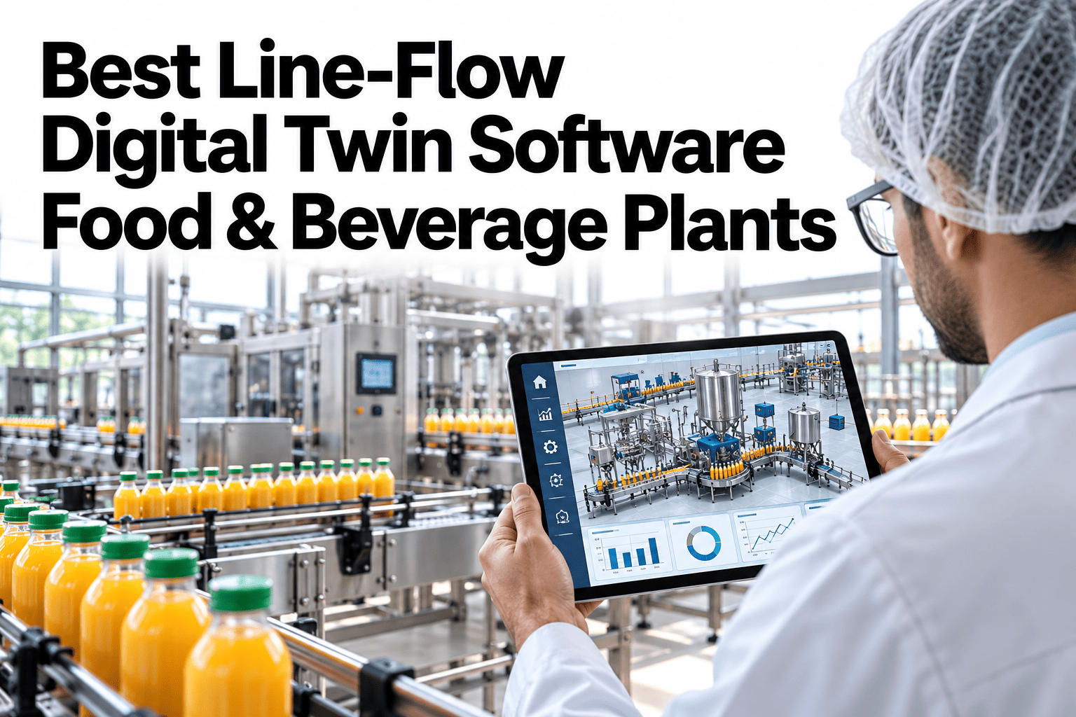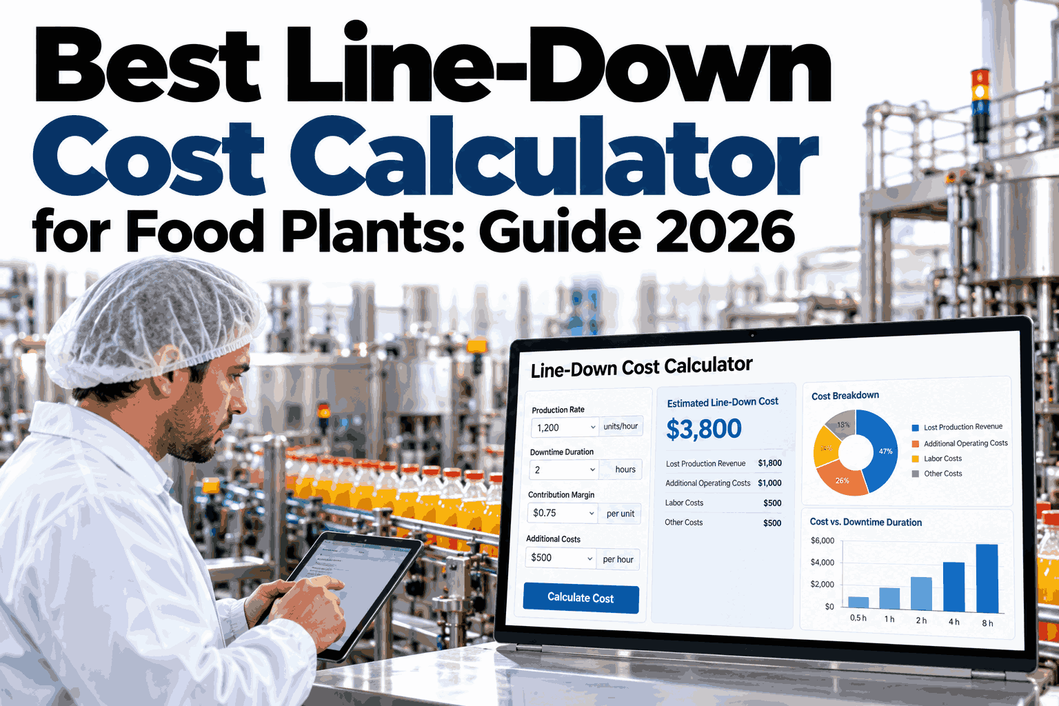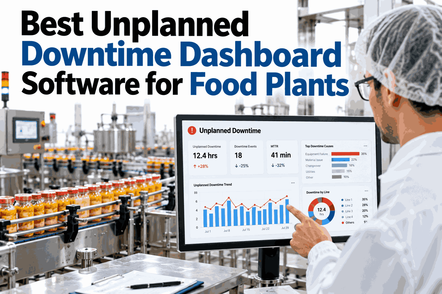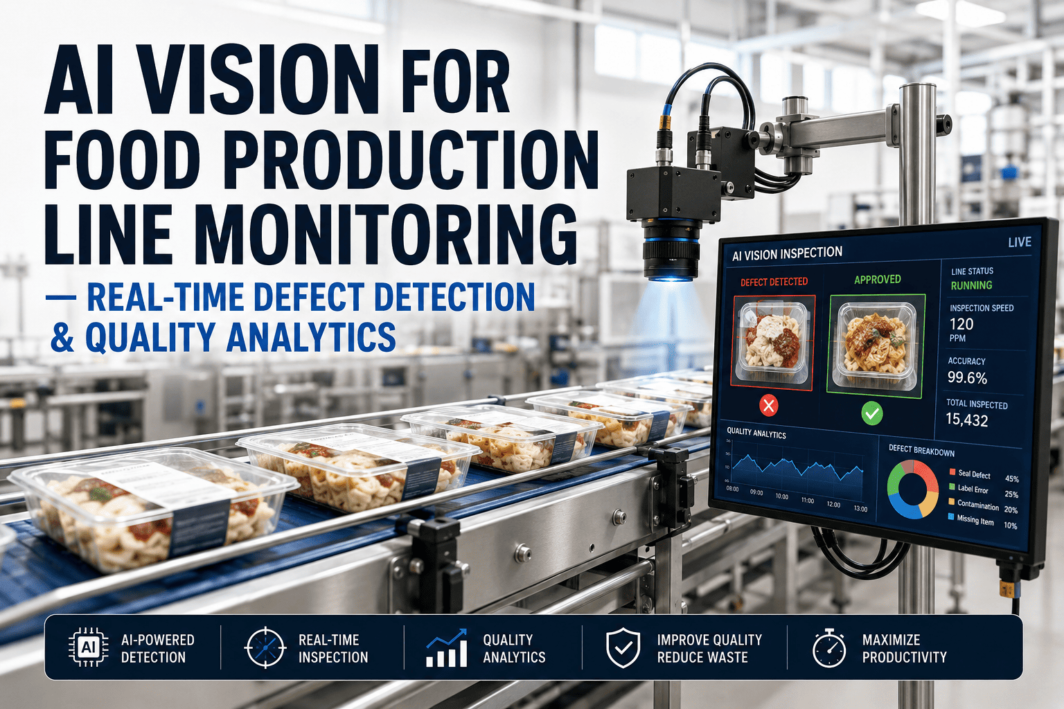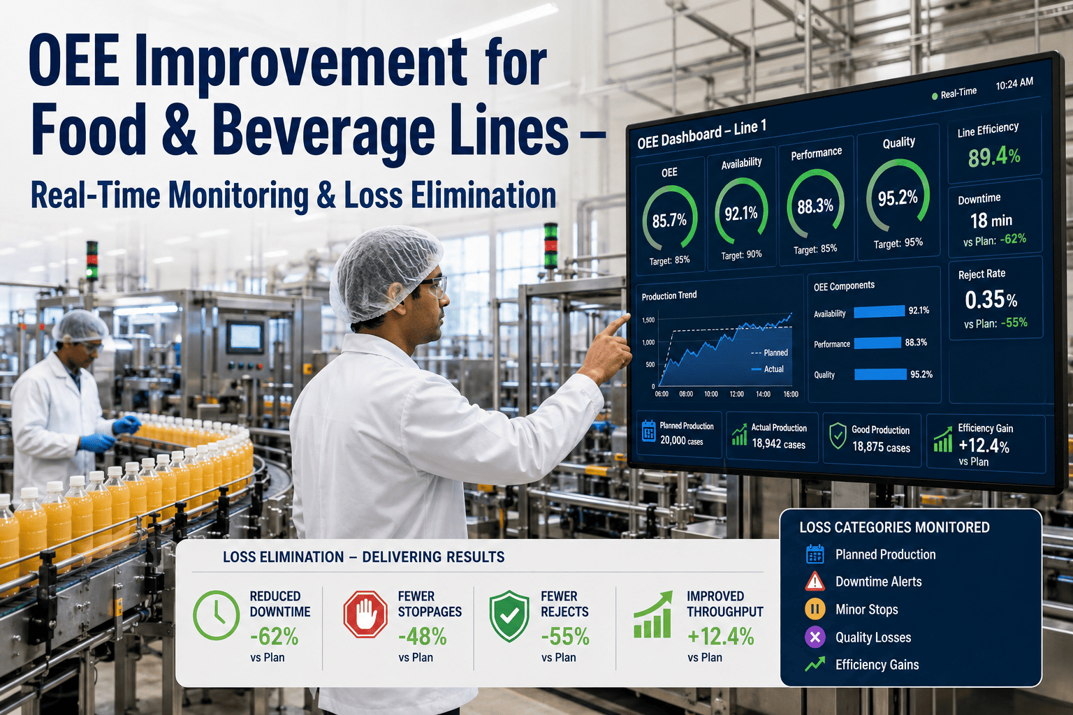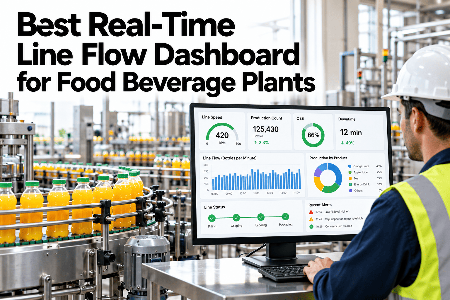
On most food and beverage lines, the real state of production lives in people's heads and phones. A supervisor walks the floor, calls the filler operator, asks packaging how the accumulator looks and then pieces together where the line is losing time. By the time the picture is complete it is already out of date. A live line flow dashboard replaces those rounds with one screen showing every machine state, every accumulator level and every WIP hold. Operations teams can watch a live flow view built from their own line layout and see what the rounds have been missing.
Every Machine, Every Buffer, Every Hold on One Screen
iFactory Line Flow AI shows machine states, accumulator levels and WIP holds in real time, so supervisors manage the flow instead of chasing it by phone.
Phone Rounds vs a Live Flow View
The difference is not just speed. It is whether the supervisor sees the whole line at once or one machine at a time.
Reading the Line at a Glance
Each machine shows its state, and each accumulator shows how full it is. Starvation and blocking become visible before output drops.
Simplified line. Real lines have more machines, buffers and holding points.
Three Things the Screen Must Show
A dashboard earns its place by answering three questions instantly.
What is each machine doing?
Running, starved, blocked, down or in changeover, with time in state
How full is each buffer?
Accumulator and conveyor levels that predict the next stoppage
What is on hold?
WIP waiting for quality release, rework or a downstream slot
A State Legend Operators Can Trust
Consistent states are what make a dashboard readable across shifts.
| State | Meaning | Typical First Action |
|---|---|---|
| Running | Producing at or near target speed | Watch the trend |
| Starved | Waiting for product or packaging upstream | Check the feed and upstream machine |
| Blocked | Cannot discharge, downstream is full | Check the next machine |
| Down | Stopped by fault or stop | Call maintenance |
| Changeover | Planned setup in progress | Compare with the standard time |
See Your Own Line on a Single Screen
Share your line layout and machine list. We will build a live flow view and show what each shift would have seen last week.
How the Data Reaches the Screen
The screen is only as good as the signals feeding it. Four steps keep it trustworthy.
Where Supervisor Time Goes Without a Live View
Much of the day is spent finding out what is happening, not fixing it.
Illustrative split. Your own supervisors can estimate the real one.
Rolling Out the Flow View
Start with the line that loses the most time and widen from there.
What Supervisors Do With the Screen Each Hour
A dashboard is useful when it fits a routine. These four habits turn the view into action.
Start-of-shift scan
Check states and buffers to see how the line was left and where trouble sits
Stoppage triage
Open the affected machine and its neighbors to find the first gap
Shift handover
Walk the incoming supervisor through the last hours using the same screen
Weekly review
Compare time in each state to find the machines that lose the most
Reading Accumulator Levels
Buffer level is an early signal. The pattern matters more than a single reading.
| Level | What It Suggests | Typical Action |
|---|---|---|
| Empty | Downstream is starving or upstream is slow | Check the feeding machine and transfer |
| Low and falling | Upstream is slower than downstream | Watch the trend and prepare a fix |
| Mid and steady | Machines are well matched | No action |
| High and rising | Downstream is slower than upstream | Check the next machine |
| Full | Blocking is imminent or occurring | Clear the downstream constraint |
Alert Levels That Avoid Noise
Too many alerts teach people to ignore them. Grade them so each level has a clear meaning.
What Teams Gain From Seeing the Whole Line
The benefits are practical and show up in the daily routine.
Illustrative benefits. Your own teams can rank them for your plant.
The Supervisor View vs the Manager View
One screen does not suit every role. Tailor what each person sees.
What Experienced Operations Leaders Look For in a Flow View
Frequently Asked Questions
Do we need to replace our PLCs to build a flow view?
Usually not. Most states and buffer levels can be read from existing controllers and sensors. Where a signal is missing, a low-cost sensor or a read from the MES can usually fill the gap, so the first version of the screen can go live without touching your control system. Keep the dashboard read-only at first, so nothing on the screen can change machine behavior, and add controls later only if your safety and engineering teams approve them. Check which signals your line already exposes with our team.
How fresh is the information on screen?
State changes usually appear within seconds. The refresh depends on how signals are collected. The aim is to be faster than a supervisor can walk the line. Slower refresh is fine for trends such as buffer levels, while states that trigger action should update quickly, so each signal is given a refresh rate that matches how it is used. Show a small timestamp near each value, so people can tell at a glance whether they are looking at current data or a connection that has quietly dropped.
Will operators actually use it?
They do when it is accurate and simple. Show states they recognize and let them add reasons for stops. Adoption rises when operators help choose the stop reasons and see their input reflected on the screen, because the dashboard then feels like their tool and not a monitoring system. Short training at the line, using that line's own screen, is usually enough, because the layout mirrors the physical machines people already know. See how operator input is captured on the screen in a short walkthrough.
Can it show WIP holds and quality holds?
Yes, if hold events are recorded in your quality or MES system. The dashboard displays what is waiting, why and for how long, so holds stop being a surprise. Showing the hold reason and the time on hold also helps quality and planning teams see which holds are routine and which are growing into a delay. Where holds are logged on paper today, a simple digital entry at release is enough to start, and richer reason codes can follow once people use the field.
How do we know it is working?
Compare time to find a problem and unplanned stop duration before and after. Pick two or three measures before launch and record a baseline, because without a baseline the improvement is hard to prove and easy to dispute later. Review the numbers together with supervisors after a month, since their explanation of why a number moved is often more useful than the number itself. Plan how to measure those on your line on a short call.
Replace the Phone Rounds With One Live Screen
Bring your line layout and one week of stoppages. We will show how the flow view would have caught them earlier.