Best Unplanned Downtime Dashboard Software for Food Plants

By James Smith on October 10, 2026

best-unplanned-downtime-dashboard-software-food-plants

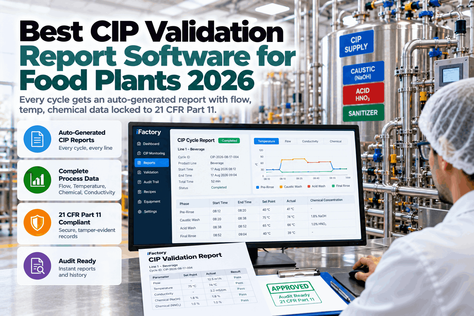
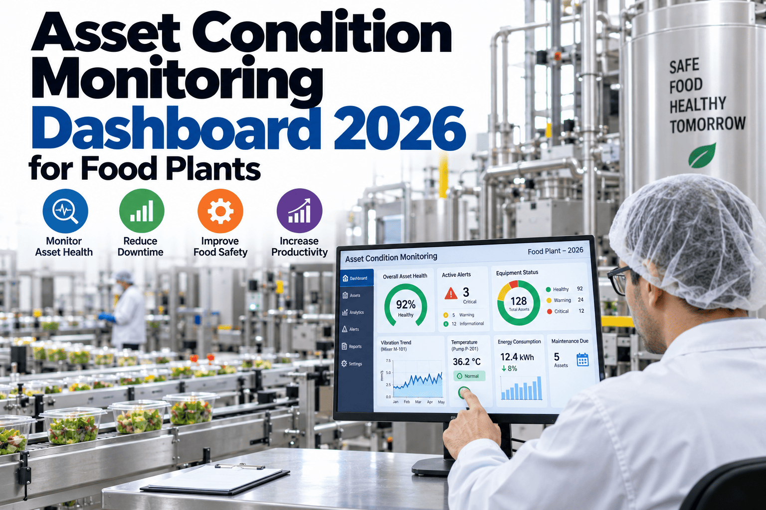
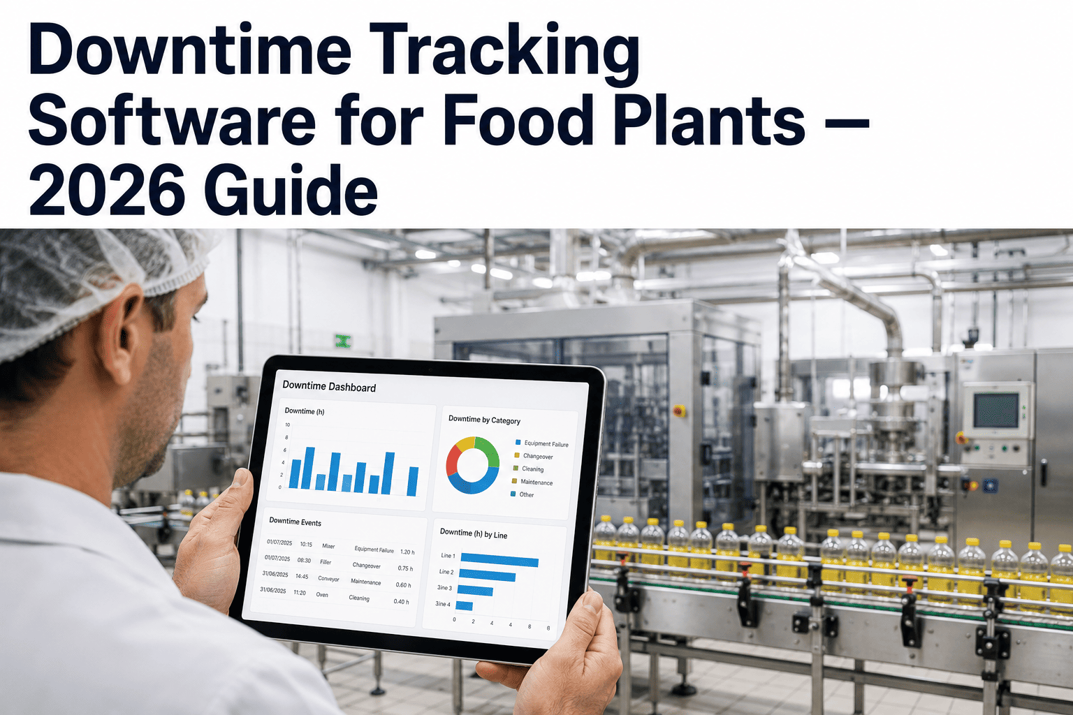
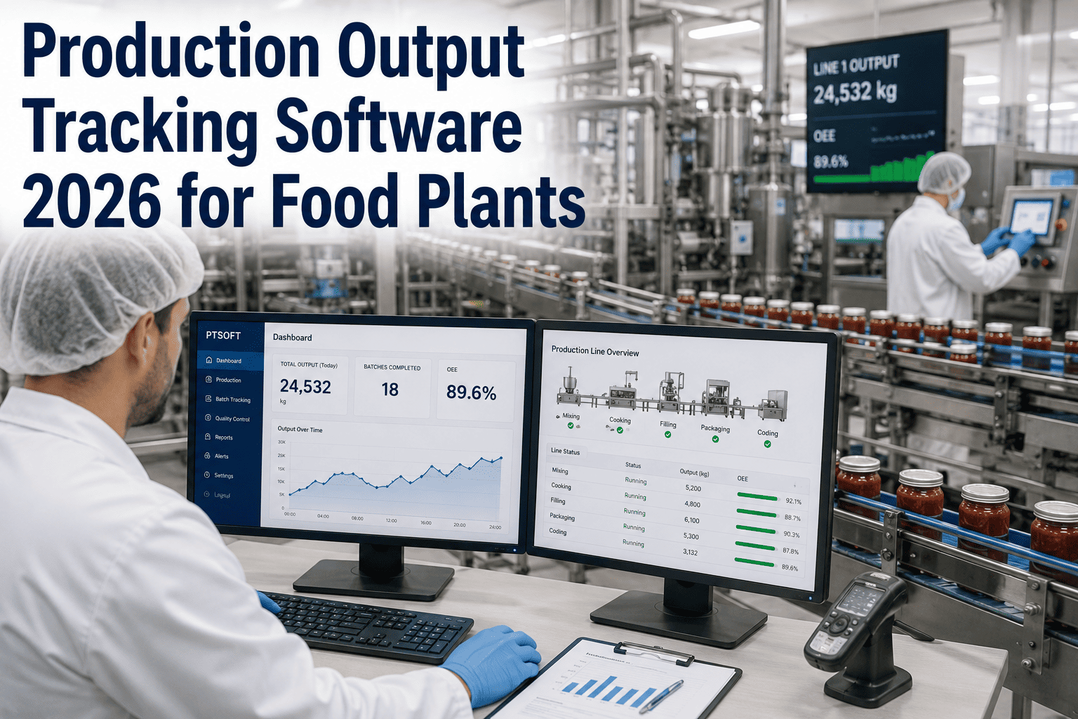
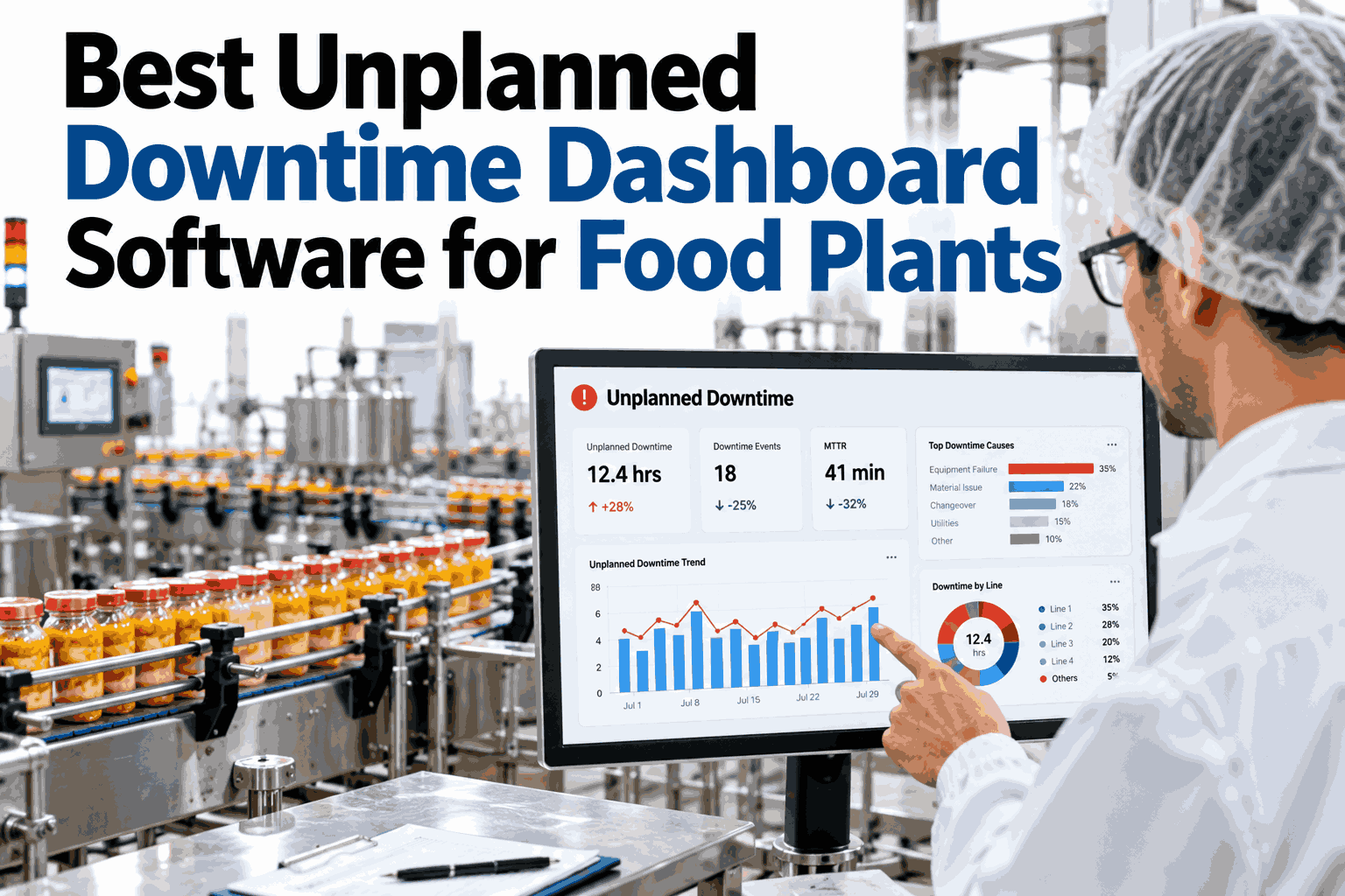
When a filling line or pasteurizer stops without warning, the stoppage itself is only the visible part of the cost. The bigger loss usually comes after, in the twenty minutes spent figuring out which machine actually caused the stop, whether it has happened before, and who should be fixing it right now. Spreadsheets and paper logs can record that a line went down, but they rarely show the pattern behind why it keeps happening. A control room dashboard built for food plants closes exactly that gap, turning scattered downtime notes into one screen everyone can act on. Plants comparing options can see a live downtime dashboard walkthrough built around their own lines.

Downtime dashboard software

One Control Room Screen for Every Unplanned Stop

iFactory AI brings the downtime event stream, cost ticker, asset heat map and next-action queue onto a single live screen, so food plants see root causes instead of guessing at them.

Control room screen preview
Event stream
Cost ticker
Asset heat map
Next-action queue
Why visibility matters

The Stoppage Is Rarely the Biggest Cost on the Line

A ten minute stop on a filling line is easy to count. What is harder to count is the time spent afterward arguing about cause, the second stoppage that happens for the same reason next shift, and the fix that gets delayed because nobody owns the decision.

Stoppage time
Time spent finding the cause
Repeat stoppage from the same cause
Delayed fix while ownership is unclear

This stacked view is illustrative, meant to show how costs build on top of the visible stop rather than measured figures from one plant. The pattern still holds across food lines: the parts you cannot see on a timesheet are usually the most expensive.

Most plants already track that a stop happened. Few can show, on one screen, whether it is the third time this week the same valve caused it.
What the screen shows

Anatomy of a Control Room Downtime Dashboard

A dashboard built for food plants earns its place on the wall by combining four views that normally live in four different places, so operators and managers read the same picture at the same time.

Event stream


A live, timestamped feed of every stop across the plant, tagged with line, machine and reported reason as it happens.
Cost ticker
Shift cost
A running estimate of downtime cost for the shift, so a stoppage is read in terms everyone on the floor understands.
Asset heat map
A grid of machines shaded by how often and how long they stop, so the worst offenders stand out at a glance.
Next-action queue


A short, ordered list of what should be fixed next and who owns it, so attention goes to the highest cost item first.

See These Four Views on Your Own Lines

Bring a recent week of downtime records and we will show how the event stream, cost ticker, heat map and action queue would look on your plant.

Reading the heat map

How to Read an Asset Heat Map in Under a Minute

The heat map is usually the first thing a new shift supervisor checks, because it turns weeks of scattered stop records into one grid that is read by eye, not by filtering a spreadsheet.

Filler 1
Filler 2
Pasteurizer
Capper
Labeler
Palletizer
Conveyor A
Mixer
Rare stops Frequent stops Chronic offender

In this example grid, the pasteurizer carries the darkest shade, which tells a supervisor exactly where to look before anything is read machine by machine.

Before and after

A Shift Change With and Without a Shared Dashboard

The clearest way to see the value of a shared screen is to compare how the same stoppage plays out with and without one in the room.

Without a shared dashboard
Supervisor hears about the stop secondhand, after the shift is already behind.
Cause is reconstructed from memory and a paper log, hours later.
No one is sure if this machine has stopped for the same reason before.
The fix waits for whoever remembers to raise it at the next meeting.
With a shared dashboard
The stop appears on screen the moment it happens, tagged by line and machine.
The cost ticker shows the running impact before the shift meeting even starts.
The heat map shows this is the third stop on the same pasteurizer this week.
The next-action queue already lists it, with an owner assigned.
Evaluating options

What to Check Before You Pick Dashboard Software

Many tools can draw a chart. Fewer are built to hold up on a control room wall, refreshed continuously and trusted by both operators and plant managers.

CapabilityWhy it matters on a food lineRed flag if missing
Live event streamShows stops as they happen, not after a shift report is filedData only updates once a day
Cost tickerTranslates minutes into a number managers act on quicklyNo cost view, only stop counts
Asset heat mapSurfaces the worst offending machines without manual filteringReports require building a new query each time
Next-action queueTurns visibility into an assigned, ordered task listDashboard stops at reporting, with no ownership step
Food line fitHandles wash-down events and changeovers without false alertsBuilt for generic manufacturing, not food specific patterns
Getting it on the wall

A Realistic Timeline for Going Live

A downtime dashboard earns trust once it has run alongside existing habits for a few weeks, not from the first day it is switched on.

Week 1 to 2
Connect and tag
Lines and machines are connected and tagged so stops are attributed correctly from the start.
Week 3 to 4
Run alongside existing logs
The dashboard runs beside paper or spreadsheet tracking so both are compared for accuracy.
Week 5 onward
Make it the shift reference
The screen becomes the shared reference in shift handovers, with old tracking retired.
Frequently asked questions

What Food Plants Ask Before Adding a Downtime Dashboard

Can the cost ticker reflect our own labour and material rates?
Yes, the cost calculation is configured against your own shift rates, line speed and typical product value, so the number reflects real cost rather than a generic estimate. Rates can differ by line or by product run. Walk through your own cost inputs with our team.
Will wash-down and changeover time be counted as downtime by mistake?
Planned events such as wash-down, changeovers and scheduled maintenance are tagged separately so they do not inflate the heat map or the cost ticker. Only unplanned stops feed the root cause view. Ask support how planned events are handled on your lines.
Does the dashboard replace our maintenance team's existing tools?
It is meant to sit alongside maintenance systems, feeding them clearer, tagged downtime data rather than replacing work order or spare parts tracking. The next-action queue can route directly into existing maintenance workflows. See how it fits your maintenance stack on a call.
How many lines can one screen show at once?
A single screen can show one line in detail or a plant wide heat map across many lines, and most control rooms switch between both views depending on the shift. The layout is set up during onboarding to match your floor. Discuss your plant layout with the support team.
What happens to our historical downtime records?
Existing logs and spreadsheets can be imported so the heat map and trend views have history from day one instead of starting empty. This also makes the before and after comparison during rollout more meaningful. Ask about importing your records during setup.
See the cause, not just the stop

Put a Live Downtime Dashboard on Your Control Room Wall

Book a session with iFactory AI to see the event stream, cost ticker, asset heat map and next-action queue running on your own food production lines.
Share This Story, Choose Your Platform!