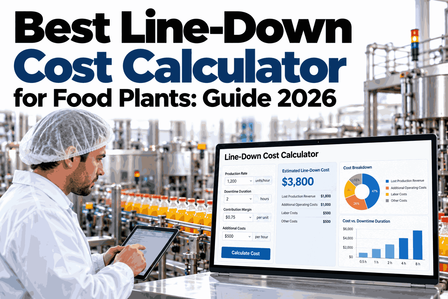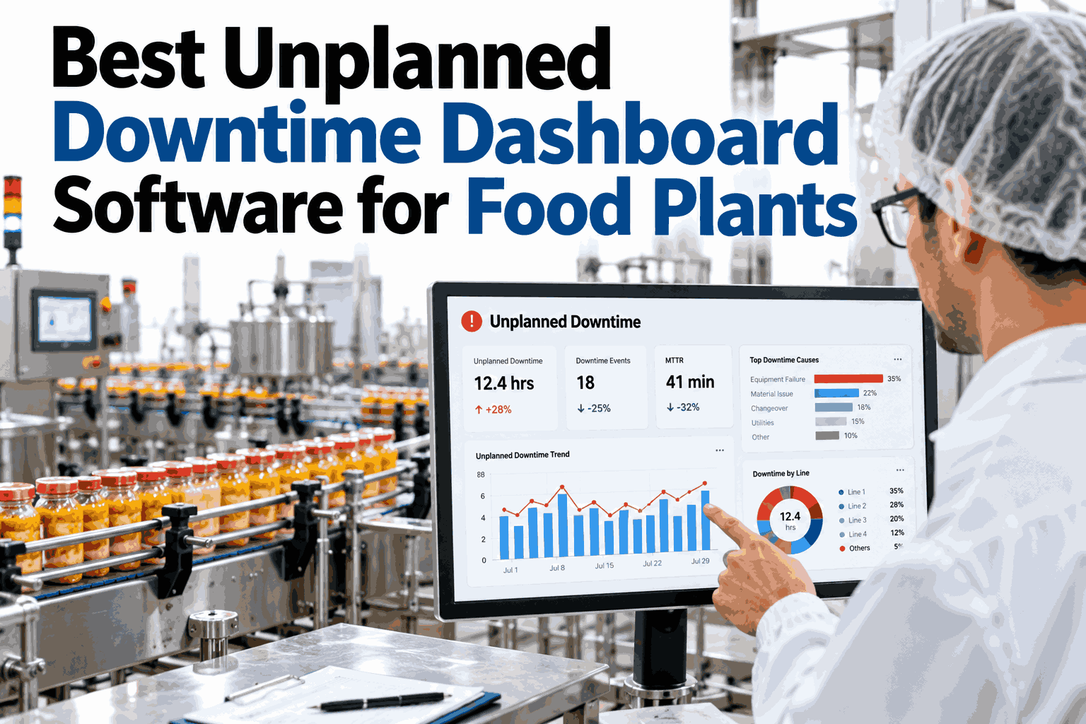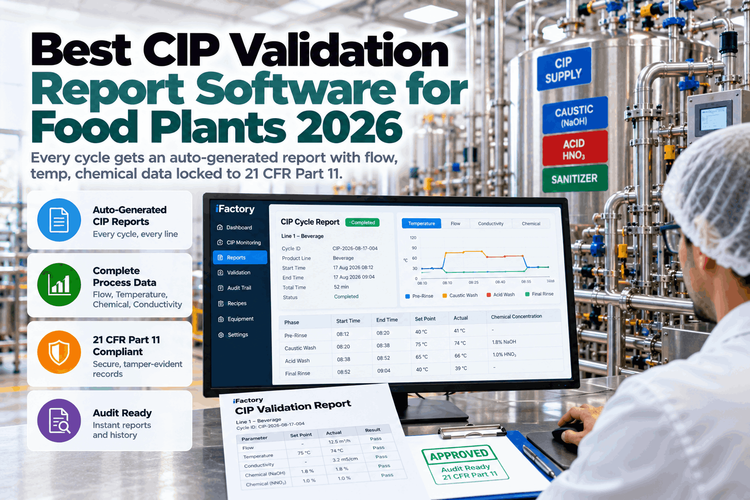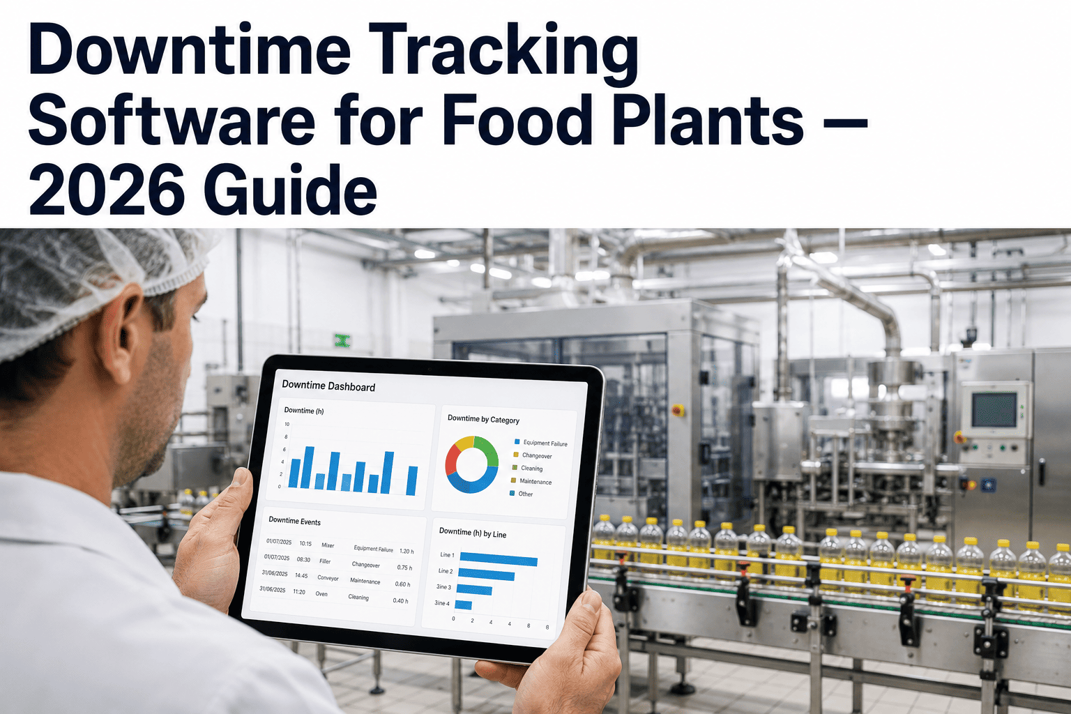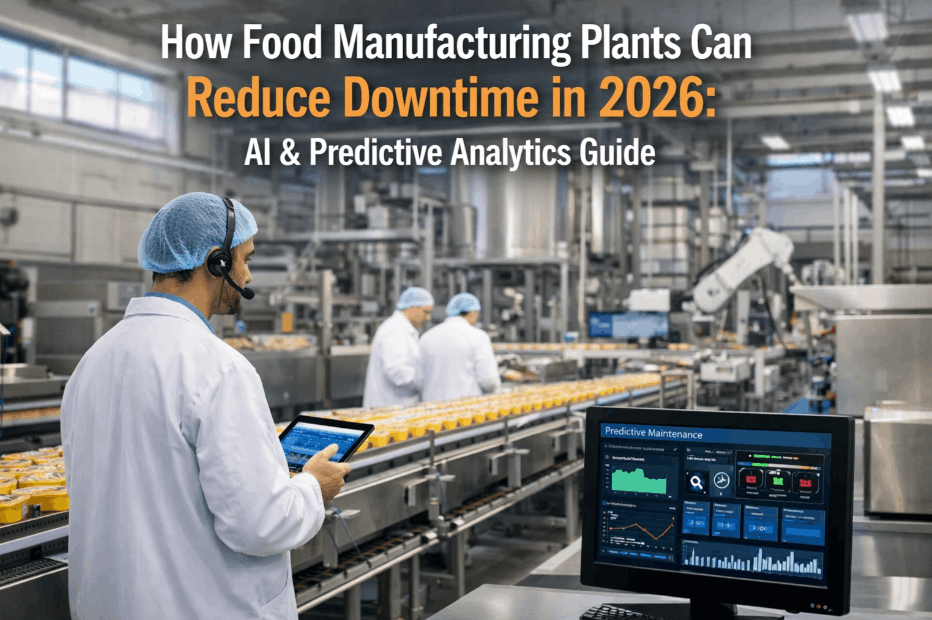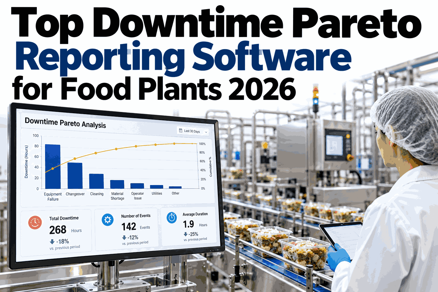
A Pareto chart is only as honest as the events behind it. If fifty small stops on a filler are counted as fifty separate problems, the chart buries the one cause that actually cost you the shift, and if the chart ranks only minutes, it ignores which stops cost the most money. Good downtime Pareto software fixes both by grouping stops into true events, overlaying cost, and attaching a corrective action to every top loss. This article explains what to demand from reporting software in 2026, and you can see a Pareto report built from your own line data before choosing a platform.
Top Downtime Pareto Reporting Software for Food Plants in 2026
True event grouping, cost overlay, and next-week corrective actions attached to every report.
Many Small Stops, One Real Problem
Raw stop logs split one root cause into many rows. Grouping puts them back together.
Top Losses Ranked, With the Running Total
Illustrative loss ranking by downtime minutes. The first few bars usually carry most of the loss.
Why the Ranking Changes When Cost Is Added
A short stop on a high margin line can cost more than a long stop on a slow one.
What a One Page Weekly Report Should Contain
Every Top Loss Gets an Owner and a Date
| Top Loss | Suspected Cause | Action | Owner | Status |
|---|---|---|---|---|
| Filler jams | Worn infeed guide | Replace and re-gap guide | Maintenance | Planned |
| Seal faults | Film tension drift | Recalibrate tension control | Process | In progress |
| Changeover | Unclear checklist | Standardize steps | Production | Open |
Three Rhythms That Keep Reports Useful
What Food Plant Teams Ask About Pareto Reporting
How does the software group stops into events?
Where does the cost overlay come from?
Do reports depend on clean reason codes?
Can actions be tracked inside the report?
How long does it take to get the first report?
Give Every Weekly Meeting a Pareto Worth Acting On
See how iFactory groups events, adds cost, and attaches actions so each report ends with decisions instead of debate.