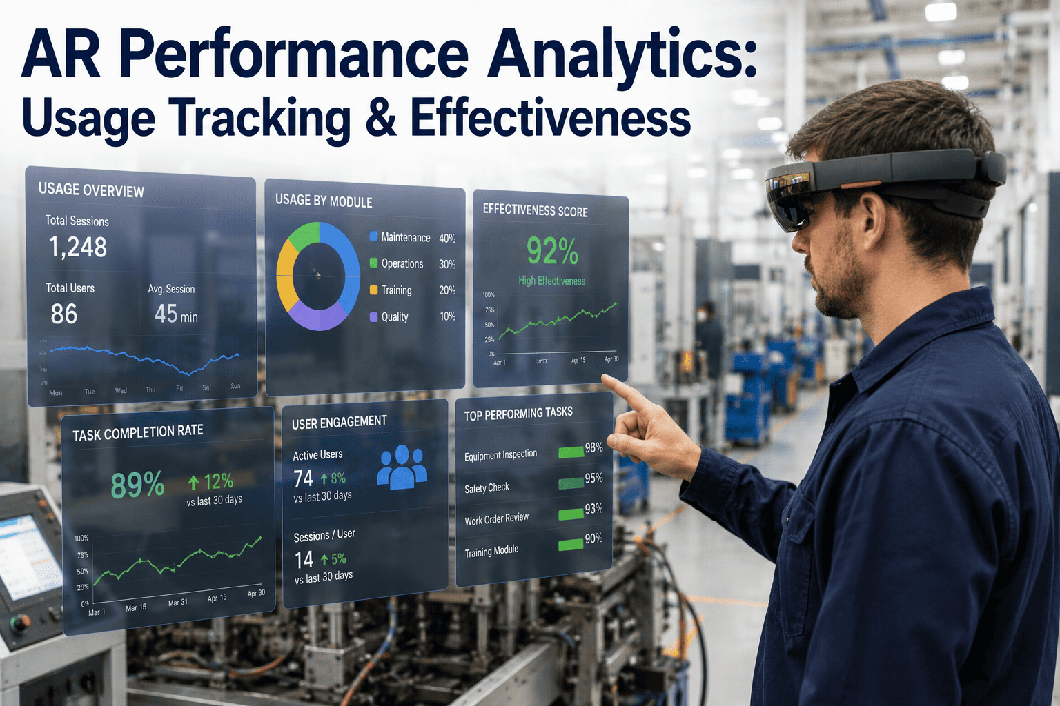
A plant that has deployed AR smart glasses across its maintenance team for six months faces a harder question than whether the headsets work: whether they are actually worth the ongoing cost. Anecdotes from a few enthusiastic technicians are not evidence, and a program that quietly stops being used after the initial novelty wears off is a common outcome that dashboards alone won't catch unless someone is measuring the right things. Performance analytics turns a hunch into a number — usage rate, task completion time, error reduction — so plant leadership can make a real keep-or-cut decision. iFactory's Book a Demo walks through the analytics dashboard behind that decision.
Why Adoption Is the Metric Most Programs Skip
It's tempting to evaluate an AR program purely on the technical capability of the headset — display clarity, battery life, how well it recognizes equipment. Those matter, but they say nothing about whether technicians are actually reaching for the device on a given shift. A program can have flawless hardware and near-zero real-world usage if the workflow around it is clunky, if training didn't stick, or if a handful of vocal early adopters are propping up numbers that look better in a demo than they are on the floor. Usage tracking is the unglamorous metric that catches this early — before a plant has sunk a year of budget into a program nobody is actually using.
Four Metrics That Separate a Working Program From a Stalled One
Percentage of eligible shifts where the headset was actually worn and active, broken down by technician and by task type. A program with strong hardware but a 20% usage rate has an adoption problem, not a technology problem.
Average time from task start to close-out, compared against a pre-AR baseline for the same task type. This is the clearest signal of whether hands-free data access is actually saving time on the floor, not just in theory.
Rework rate, missed checklist steps, and incorrect part installs, tracked before and after AR rollout for the same task categories. A drop here is often the strongest financial argument for continuing the program.
How often a technician needs to pull in a remote expert or supervisor for a task, and how long that escalation takes to resolve compared to a phone call or an in-person walk-over.
The Adoption Curve Most Deployments Follow
AR programs rarely fail on day one — they fail gradually, and the analytics dashboard is what makes the gradual decline visible before it becomes a written-off budget line. Understanding the typical shape of adoption helps a program manager tell the difference between a normal dip and a program in real trouble.
Launch Spike
Usage is high in the first two to three weeks, driven by novelty and close attention from supervisors and the rollout team — this period is a poor predictor of long-term adoption.
Post-Novelty Dip
Usage typically drops as the initial attention fades — the real signal is whether it stabilizes at a workable level or keeps sliding toward zero.
Stabilization
Usage settles around a baseline driven by which tasks the headset genuinely makes easier — this is the number that matters for a real ROI calculation, not the launch-week peak.
Expansion or Contraction
Programs with a strong stabilized baseline typically expand to new task types or shifts; programs that stabilize low are candidates for a workflow redesign or a scoped-down deployment.
Reading Task Completion Time Correctly
Raw completion-time comparisons can mislead if they aren't controlled for task complexity and technician experience level. A junior technician using AR guidance for the first time on a complex repair may still take longer than a senior technician working from memory without any headset at all — that comparison says nothing about the technology. The table below shows how completion time should be segmented to produce a fair, decision-useful comparison.
| Segmentation | Why It Matters | What to Watch For |
|---|---|---|
| By task complexity tier | Simple and complex repairs have different baseline times | Biggest AR gains usually show on complex, low-frequency tasks |
| By technician tenure | Experienced staff have less room to improve than new hires | Largest time savings often appear among newer technicians |
| By shift | Fatigue and staffing levels vary by shift | Night-shift gains can be understated by comparing to day-shift baselines |
| By escalation involvement | Tasks needing remote expert help have longer natural durations | Compare escalation resolution time, not total task time, for this subset |
Building the ROI Case From the Dashboard
A credible ROI case combines the four core metrics into a single narrative rather than presenting them in isolation. Usage rate establishes that the program is actually being used at meaningful scale. Task completion time, segmented correctly, quantifies the labor-hour savings. Error rate reduction translates into avoided rework and scrap cost. Escalation frequency and resolution time capture the harder-to-quantify but very real value of getting the right expertise to the floor faster. Presented together, these four numbers tell plant leadership whether the program is paying for itself — and just as importantly, they tell the program manager exactly where to focus if it isn't yet.
Instrumenting the Program Before Launch, Not After
The most common analytics mistake is treating measurement as something to add once a program is already running into questions about its value. By that point, the pre-AR baseline for task completion time and error rate is usually reconstructed from memory or incomplete records, which weakens every comparison built on top of it. Capturing a clean baseline — actual completion times and error rates for the target task types, measured for a few weeks before any headset goes live — gives the eventual ROI case a real foundation instead of an estimate. The same applies to defining which tasks count toward usage rate before launch, so the number reported in month three is measuring the same thing as the number reported in month one.
Setting Realistic Expectations for the First Quarter
Plants new to AR programs sometimes expect month-one numbers to represent steady-state performance, which sets up a false negative when usage naturally dips after the launch spike described above. A more useful practice is reviewing the dashboard on a fixed cadence — monthly is common — and focusing the conversation on trend direction across that first quarter rather than any single week's reading. A usage rate that dips in week four and climbs back through week ten tells a very different story than one that keeps sliding for the full quarter, and only a consistent measurement cadence makes that distinction visible.
Data Quality Issues That Skew the Numbers
Usage and completion-time analytics are only as trustworthy as the underlying event data feeding them, and a handful of common data quality issues can quietly distort the picture before anyone notices. A headset left powered on but unused between tasks can inflate usage-time totals without reflecting genuine engagement. Task boundaries that aren't clearly defined — when does a "task" start and end — make completion-time comparisons inconsistent across technicians who interpret the boundary differently. And error-rate comparisons that don't control for a concurrent process change, like a new supplier's parts arriving mid-quarter, can misattribute a quality shift to the AR program when the real driver was something else entirely. None of this means the metrics aren't useful — it means the dashboard needs a periodic sanity check against what's actually happening on the floor, not just a trust-the-number default.
Comparing Performance Across Multiple Plants
Operators running AR programs at more than one site often want to rank plants against each other on adoption or ROI, but a direct comparison can mislead if the plants differ meaningfully in task mix, workforce tenure, or how long each site has been live. A newer deployment at one plant will naturally show a lower stabilized usage rate than a mature deployment elsewhere, even if both are performing exactly as expected for their stage. The more useful cross-site comparison tracks each plant against its own adoption curve — how it's trending relative to where it started — rather than against an absolute number pulled from a site with a different starting point and a different task profile.
Frequently Asked Questions
How long should a plant wait before evaluating AR program effectiveness?
Most programs need at least eight to twelve weeks of usage data before the numbers are meaningful, since the first few weeks are typically inflated by launch-period novelty and close supervisor attention. Evaluating too early risks either overestimating success based on a temporary spike or writing off a program during the normal post-novelty dip before it has a chance to stabilize. A useful rule of thumb is to compare the stabilized usage rate — the plateau after the initial dip — against the launch-week peak, rather than treating the launch numbers as the baseline going forward.
What counts as a good usage rate for an AR smart glasses program?
There isn't a single universal benchmark, because usage rate depends heavily on which task types the headset was deployed for — a program scoped to complex, infrequent repairs will naturally show a lower usage percentage than one scoped to routine daily inspection rounds. The more useful comparison is trend direction and consistency across technicians rather than a single target number: a stabilizing or growing usage rate across most of the team is a healthier signal than a high average driven by two enthusiastic users. iFactory Support can help benchmark usage rate against comparable deployments by task type.
Can analytics identify why a technician isn't using the headset?
Usage analytics can flag which technicians have low adoption and for which task types, but the root cause behind that low usage — discomfort with the device, a workflow mismatch, insufficient training, or a personal preference — usually requires a direct follow-up conversation rather than something the dashboard infers on its own. What the data does well is prioritize where that conversation should happen first, pointing supervisors toward the specific technicians or task categories driving a low overall number instead of leaving them to guess.
How is error reduction attributed specifically to the AR program?
Error reduction is measured by comparing rework rates, missed checklist steps, and incorrect part installs for the same task categories before and after AR rollout, ideally holding other variables like staffing levels and part complexity roughly constant across the comparison period. Because other process changes can happen at the same time as an AR rollout, the strongest attribution comes from comparing AR-assisted and non-AR-assisted execution of the same task type during the same period, where both groups are exposed to the same broader plant conditions.
Does the analytics dashboard track individual technician performance for disciplinary purposes?
The dashboard is designed to evaluate the program's effectiveness, not to serve as a performance-management tool aimed at individual technicians, and how any usage data is used internally is a policy decision that belongs to the plant, not something the analytics platform dictates. Most plants get better results treating low individual usage as a training or workflow signal to investigate rather than a metric to discipline against, since punitive use of adoption data tends to suppress honest usage patterns rather than improve them. Teams setting up governance around this can discuss options through Book a Demo.