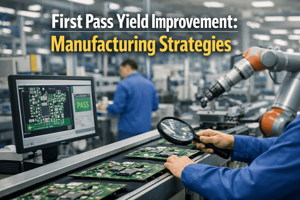
First pass yield is one of the cleanest signals a plant has for how well a line is actually running, since it measures something simple: the percentage of units that pass every inspection point the first time, with no rework, no scrap, and no second pass required. Despite how simple the definition is, most plants still calculate it after the fact, pulling numbers together at shift end or during a weekly review, which means the moment a station starts dragging the number down often goes unnoticed until well after the shift that caused it has already ended. This guide covers how real-time FPY tracking changes that, and how iFactory's team typically helps plants set it up station by station.
Know Which Station Is Costing You Yield While the Shift Is Still Running
Why a Single Plant-Wide FPY Number Hides More Than It Shows
A plant-wide first pass yield of ninety-two percent sounds respectable on a scorecard, but it says almost nothing about where the remaining eight percent is actually being lost. That eight percent could be spread evenly and mostly unavoidable across a dozen stations, or it could be concentrated almost entirely at one station running a marginal process, with every other station performing near perfectly. Without a station-level breakdown, those two very different situations look identical on a summary report, and the corrective action a team would take is completely different depending on which one is actually true.
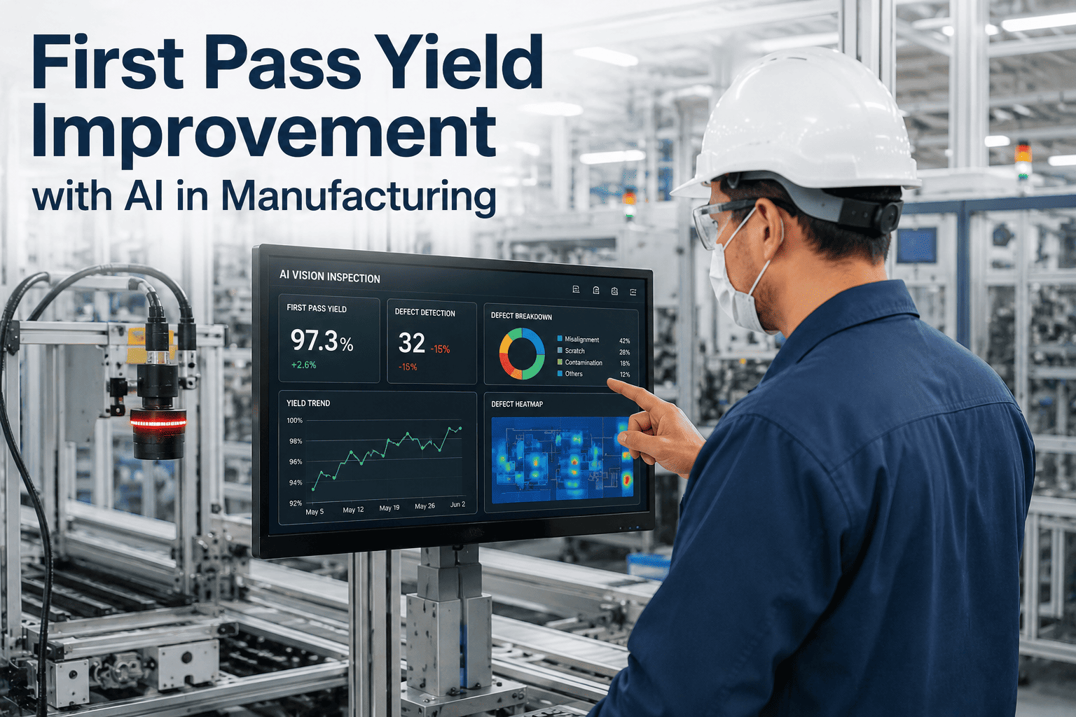
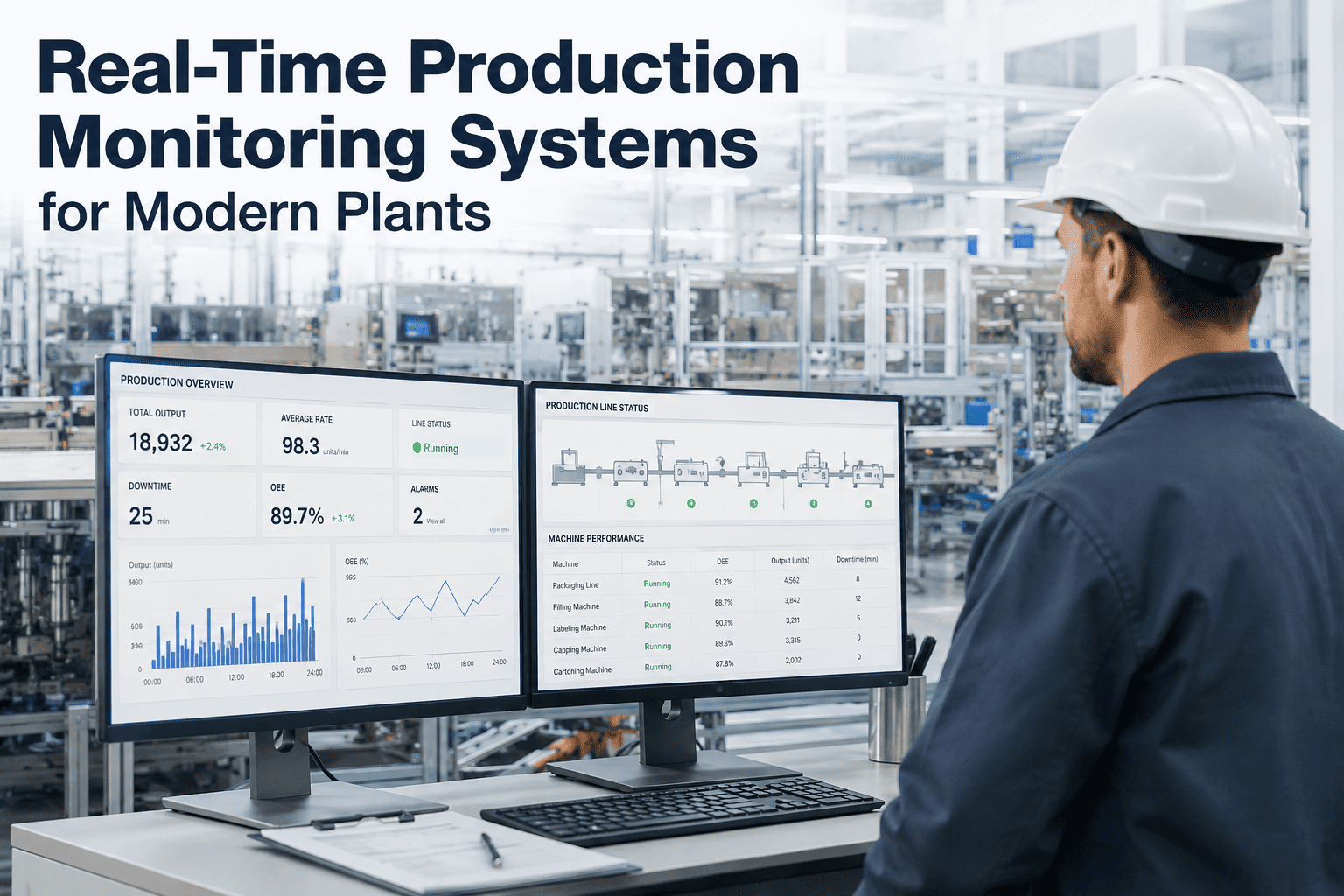
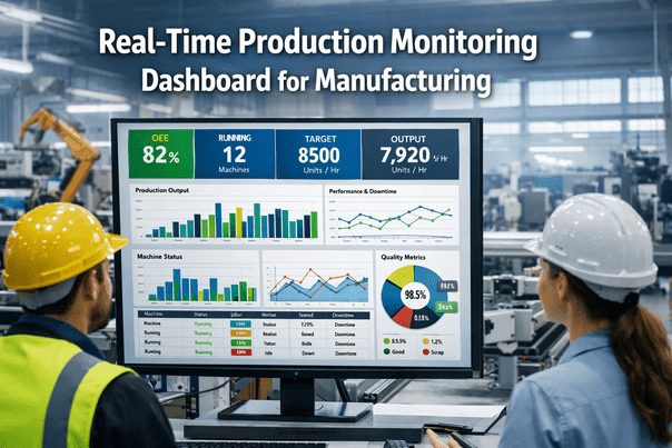
Real-time tracking solves this by calculating yield independently at every inspection point along the line rather than only at final inspection, and by updating that calculation continuously as units move through rather than in a batch review. A supervisor looking at a live station-level view does not need to guess where the problem is concentrated — the dashboard shows it directly, with the lowest-yielding station visually separated from the rest well before the shift ends.
Defect Pareto: Turning a Yield Number Into a Root Cause Starting Point
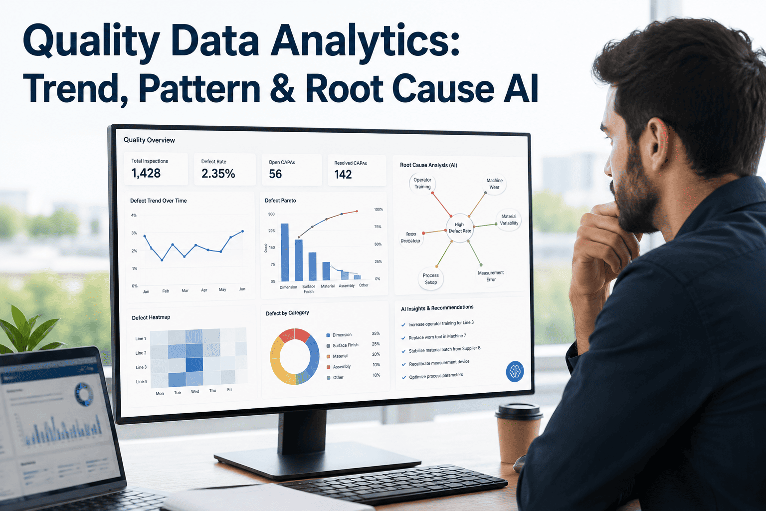
Knowing that a station's yield has dropped is only the first step — the more actionable view is a defect Pareto that breaks down exactly what is failing at that station and how often, updated as continuously as the yield number itself. A vision inspection station running at eighty-four percent yield could be failing mostly on one recurring defect type that has a single, fixable root cause, or it could be failing on a wide spread of unrelated defect types that each need separate investigation. A live Pareto chart, ranked automatically as new failures are logged, points engineering straight at whichever defect category is actually driving the majority of the loss, rather than requiring someone to manually tally failure reasons from a shift's worth of paper records.
Want to see your own station-level Pareto broken down this way? Send us a sample of your defect log and we will build it out.
The Difference Between First Pass Yield and Rolled Throughput Yield
These two metrics get confused often enough that it is worth being precise about the difference, since tracking the wrong one in real time can give a misleading picture of overall line health. First pass yield at a single station measures only what happens at that one inspection point. Rolled throughput yield multiplies the yield of every station in sequence together, which is why a line with five stations each individually running a respectable ninety-five percent yield can still have a rolled throughput yield below eighty percent overall — the compounding effect of multiple stations each losing a small amount adds up fast.
A real-time dashboard that tracks both numbers side by side gives a more complete picture than either alone. Station-level FPY tells a team exactly where to focus improvement effort. Rolled throughput yield tells leadership what that improvement effort is worth in terms of overall line output, and makes visible just how much even small per-station gains compound once multiplied across the full sequence of stations a unit passes through.
| Metric | What It Measures | Best Used For |
|---|---|---|
| Station FPY | Pass rate at one specific inspection point | Pinpointing which station needs attention |
| Rolled Throughput Yield | Combined yield across every station in sequence | Understanding true overall line output loss |
| Scrap Rate | Units that fail and cannot be reworked | Tracking irrecoverable material loss |
| Rework Rate | Units that fail but are corrected and re-passed | Measuring hidden labor cost of failures |
Tracing a Yield Drop Back to Its Actual Cause
A live yield dashboard is most valuable in the moment it shows a number moving in the wrong direction, but the dashboard by itself only tells a team that something changed, not necessarily why. The next step, and the one that determines whether the dip gets corrected quickly or lingers for days, is correlating the yield drop against everything else that was happening on the line at the same time — a shift change, a new lot of incoming material, a tooling swap, or a maintenance event logged an hour earlier. Plants that layer this production context directly onto the same timeline as the yield chart tend to find root cause dramatically faster than those investigating yield and production events as two separate, disconnected records.
This correlation does not need to be complicated to be useful. Even a simple shared timeline showing shift changes, material lot changes, and downtime events lined up against the station-level yield trend is often enough for an experienced engineer to spot the likely trigger within minutes of looking at it, especially when the drop lines up cleanly with one of those events rather than appearing gradually on its own. Building that shared timeline is one of the more overlooked but high-value additions to a real-time yield dashboard, since it turns a diagnostic exercise that used to take an afternoon of cross-referencing separate logs into something closer to an immediate visual match.
Setting Realistic Yield Targets by Station
Once station-level tracking is running, a natural next question is what yield target each station should actually be held to, and the honest answer is that a single blanket target across every station on the line rarely makes sense. A station performing a simple, well-controlled operation with tight process capability should reasonably be expected to run above ninety-eight percent, while a station handling a more complex or inherently variable operation might have a realistic ceiling closer to ninety-two or ninety-three percent even when running well. Setting every station to the same target regardless of what it actually does tends to produce either constant, unproductive alarm at stations that will never realistically hit an unreasonably high number, or complacency at stations that are underperforming relative to what they are actually capable of.
The more useful approach is setting each station's target from its own historical best-demonstrated performance over a representative period, then tracking live performance against that station-specific baseline rather than an arbitrary plant-wide figure. This keeps the live dashboard meaningful for every station individually, and makes a genuine deviation from that station's own normal performance visually obvious rather than lost inside a target that was never realistic for that particular operation to begin with.
What Changes on the Floor Once Yield Is Tracked Live
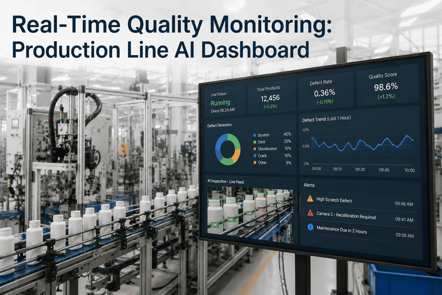
Supervisors describe the biggest shift as no longer needing to wait for the end of shift to know whether the day is on track. A live yield number that starts sliding mid-shift gives enough time to actually intervene — pulling the affected station for a quick check, swapping a worn tool, or adjusting a process parameter — rather than discovering the loss only after the shift's total is calculated and the units already built cannot be un-built. That earlier intervention window is where most of the actual yield improvement comes from, since the underlying process capability has not changed; only how quickly the team can respond to it slipping has.
The other consistent observation is that a live station-level view changes what daily production meetings actually discuss. Instead of a general conversation about yesterday's yield number, the meeting starts from a ranked list of which stations are underperforming and by how much, with the defect Pareto already built for the worst offender. That specificity turns a vague "yield was a bit low yesterday" conversation into a targeted improvement action within the same meeting.
Connecting FPY to the Cost Conversation Leadership Actually Cares About
A yield percentage on its own is useful to the floor team, but it tends to land more persuasively with plant leadership when it is translated directly into cost — scrap material value, rework labor hours, and the downstream risk of a missed defect reaching a customer. A live dashboard that shows the current shift's yield loss converted into an approximate dollar figure, updated continuously alongside the percentage, makes the case for corrective action far more immediately than a yield number alone, since the financial impact of a slipping station is visible in real time rather than surfacing only in a monthly cost report several weeks later.
This translation also helps prioritize which yield improvement projects actually get resourced first. A station running at a slightly lower percentage but processing a high volume of expensive units can represent a larger real cost than a lower-yielding station handling a smaller volume of inexpensive parts, and that distinction is easy to miss when every station is compared purely on percentage alone rather than on the actual dollar value that percentage represents.
Getting Station-Level Tracking Running Without a Full Line Overhaul
Most lines already have enough inspection points generating pass or fail data — vision systems, functional testers, torque verification stations — that station-level FPY tracking is more of an integration and dashboard-building exercise than a new-equipment purchase. The typical starting point is connecting the two or three stations already known to have the most variable yield, since that is where a live view delivers the fastest, most visible improvement and builds the case for extending tracking to the rest of the line.
Defining what counts as a "first pass" correctly across the line's actual workflow matters more than it might seem — a unit that gets manually adjusted before ever reaching a formal inspection point should generally still count against first pass yield, even though no official fail was logged, or the number will read artificially high compared to what the line is actually achieving. Getting this definition right during setup, in conversation with whoever owns the process, avoids a metric that looks good on the dashboard but does not match what the floor actually experiences.