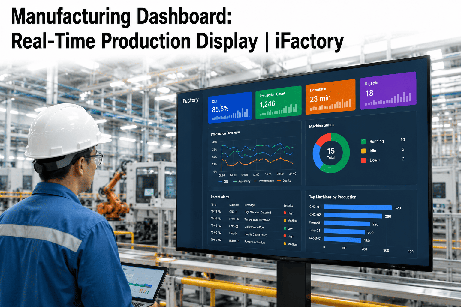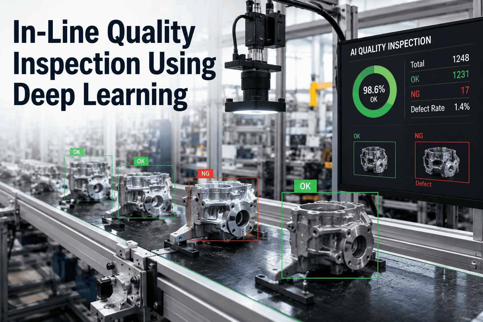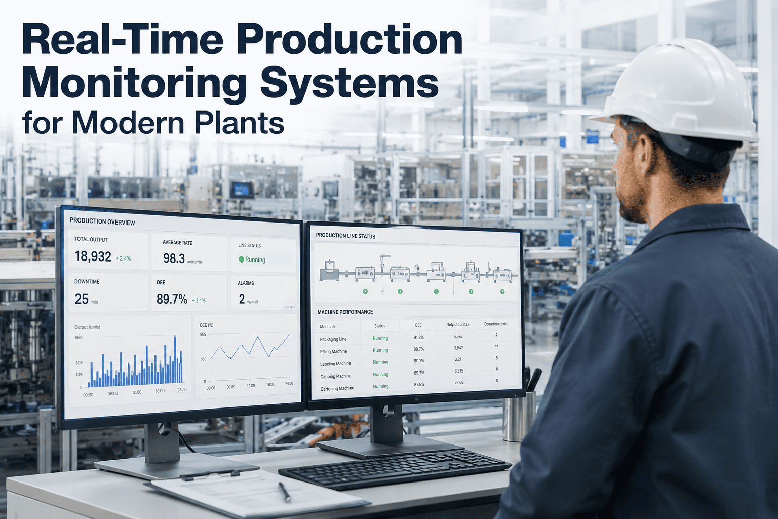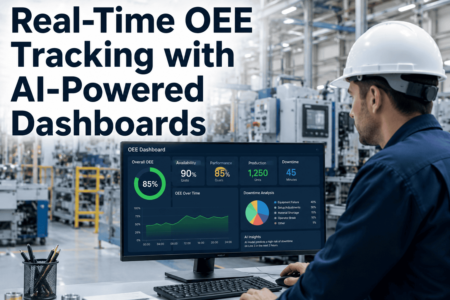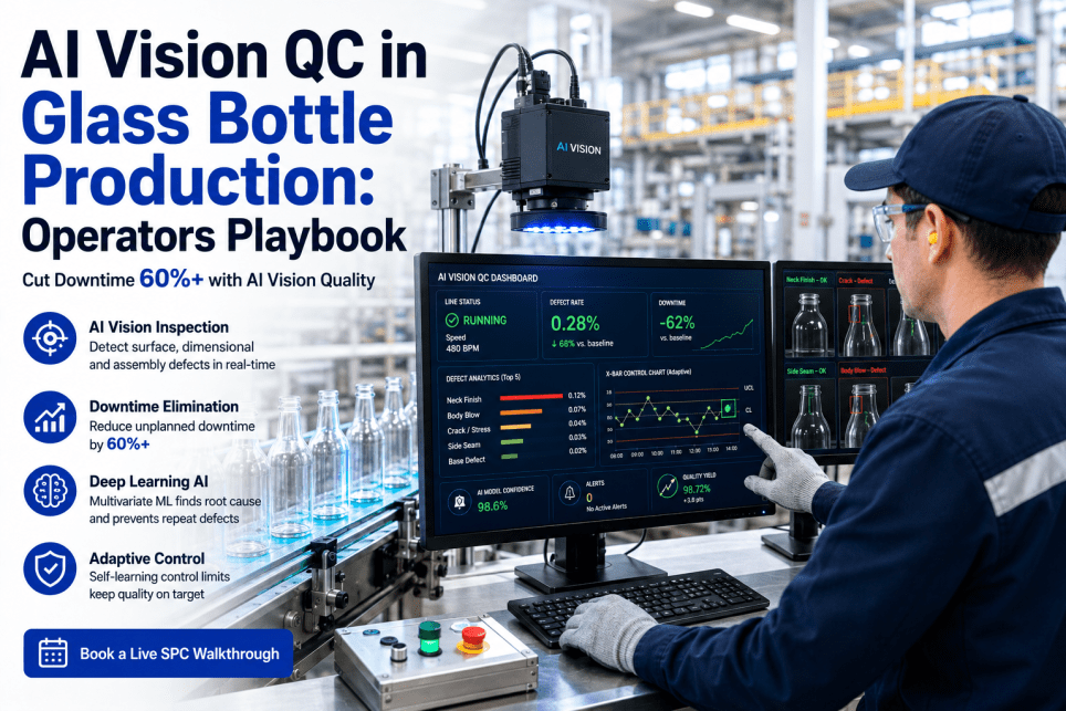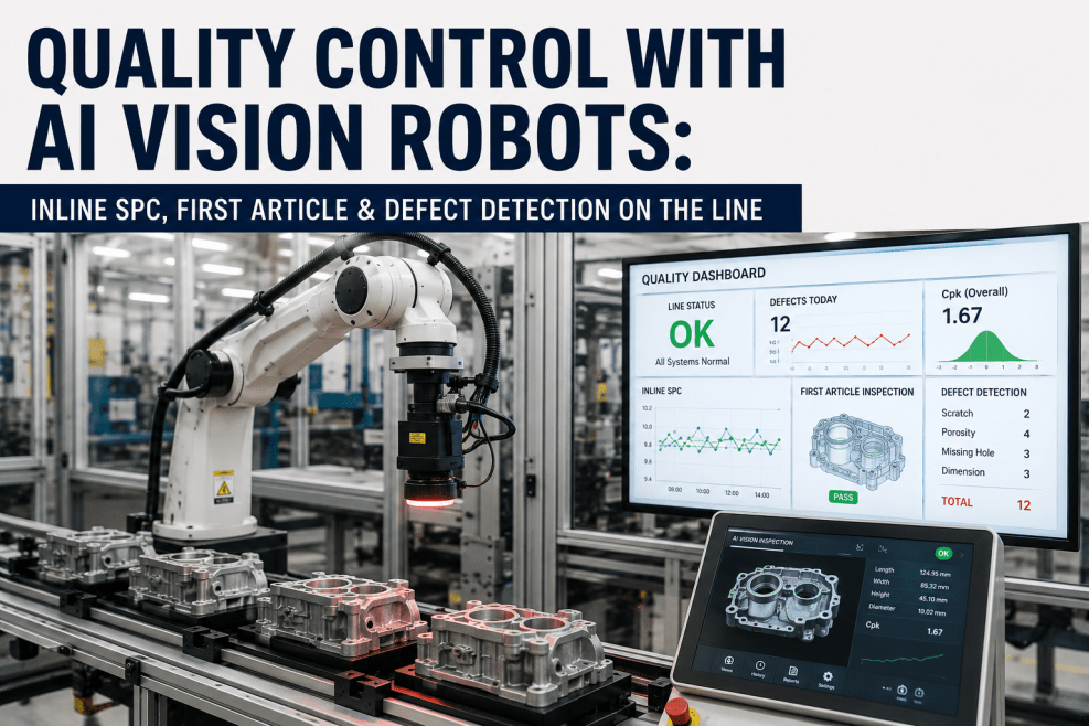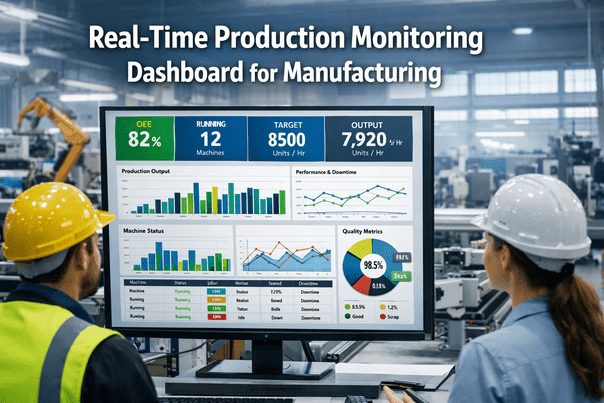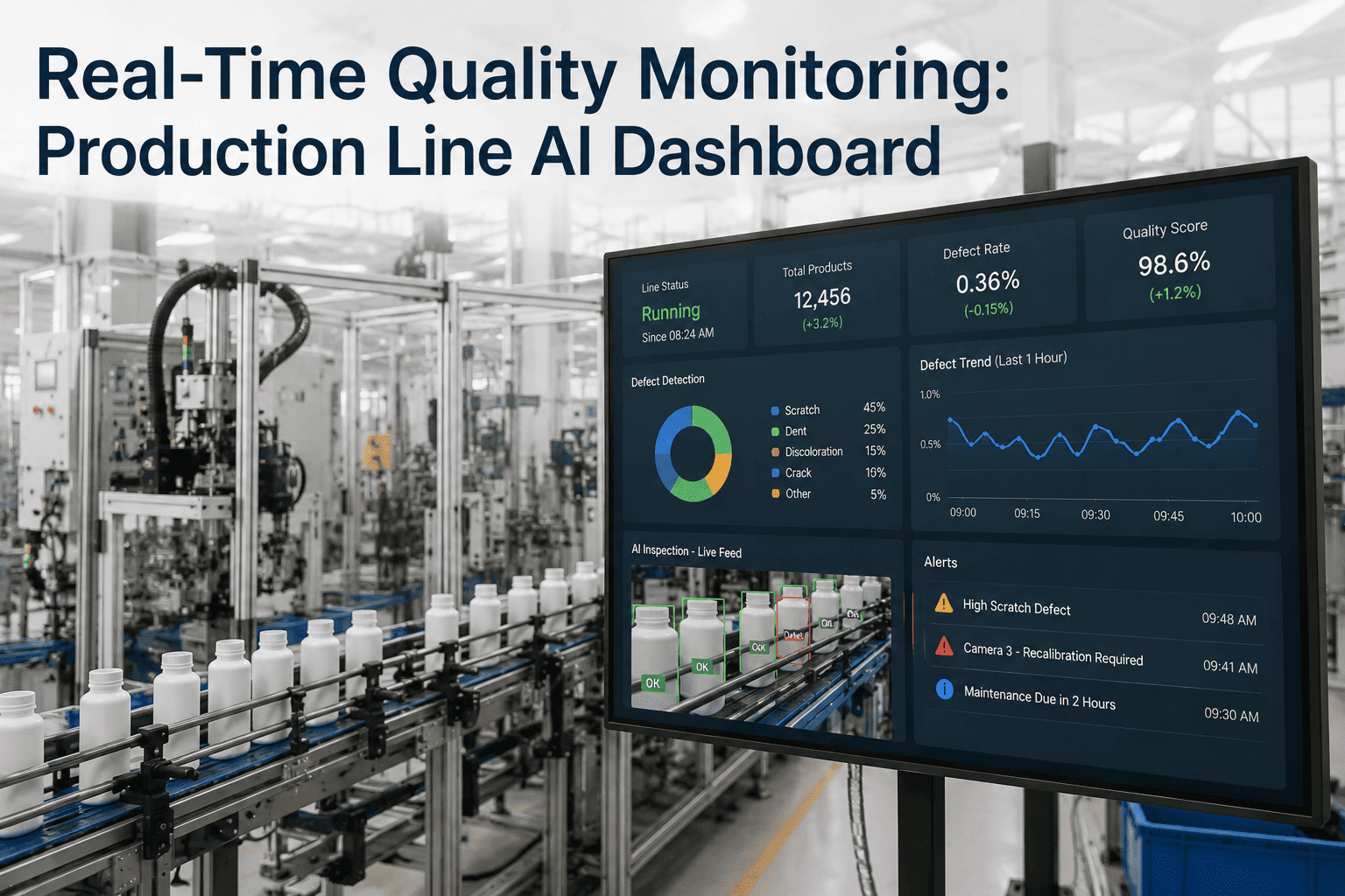
Most plant floors still run quality the same way they did fifteen years ago — a quality technician walks the line with a clipboard, pulls samples on a fixed interval, and enters readings into a spreadsheet that gets reviewed hours or a full shift later. By the time a drifting process shows up in that review, dozens or hundreds of parts have often already moved downstream. A real-time quality monitoring dashboard closes that gap by pulling data straight from line sensors, vision systems, and gauges the moment it is captured, so a supervisor sees a defect rate climbing or a control limit breached within seconds rather than at the next shift meeting. This piece walks through what a production-line dashboard actually shows, how it is typically built out, and how iFactory's quality engineering team approaches a rollout without disrupting a line that is already running.
See Quality Drift the Moment It Starts, Not the Next Morning
Why Quality Reviewed After the Fact Costs More Than It Should
A batch review model treats quality as a paperwork exercise that happens after the line has already made its decisions. A torque station drifting out of specification during the second hour of a shift will keep drifting until someone pulls the log and notices, and every part built in that window is now a disposition problem instead of a caught deviation. The cost of that delay is not just scrap — it is the rework labor, the shipped-part recall risk if the drift went unnoticed past final inspection, and the engineering time spent reconstructing what happened after the fact from incomplete paper records. Real-time monitoring does not change what the process is capable of; it changes how quickly a plant finds out when that process stops behaving the way it should.
The other cost that rarely gets counted is decision fatigue. Quality engineers who only see data in a daily or shift-end report end up spending most of their time investigating things that already happened rather than preventing things that are about to happen. A dashboard that surfaces the deviation the moment it crosses a control limit turns quality engineering from a forensic function into a preventive one, which is a meaningfully different job with meaningfully different outcomes for scrap rate and customer complaints.
What a Real-Time Quality Dashboard Actually Shows
A well-built dashboard is not a single screen crammed with every number a plant collects. It is a layered view — a line-level summary for supervisors walking the floor, a station-level detail view for the operator standing at that station, and a plant-level rollup for the quality manager comparing performance across shifts and lines. Each layer answers a different question, and the value of the dashboard comes from getting the right layer in front of the right person without forcing anyone to dig through data that is not relevant to their decision.
| Dashboard Layer | Primary Audience | What It Shows |
|---|---|---|
| Station View | Line operator | Live reading against tolerance, pass/fail count, immediate out-of-spec flag |
| Line View | Line supervisor | Defect rate trend, active alerts, station-by-station comparison across the line |
| Shift View | Quality engineer | SPC control charts, Cpk by characteristic, deviation history for the shift |
| Plant View | Quality manager | Cross-line yield comparison, top defect categories, shift-to-shift trend |
The Four Data Streams Behind a Live Dashboard
Most real-time quality dashboards are built from four categories of live inputs, each contributing something the others cannot fully replace. Getting all four flowing consistently, rather than relying on just one, is what makes a dashboard trustworthy enough for people to actually change behavior based on what it shows.
Curious what a live dashboard would look like against your own line's data streams? Send a sample data set to our team and we will map it out with you.
SPC Charts That Update Without Anyone Pulling a Report
Statistical process control has always been the right tool for separating normal process variation from a genuine shift worth investigating, but its value has historically been limited by how often the chart actually gets looked at. A control chart that updates once a shift is still reactive by design. A control chart that updates with every new reading, and automatically flags a run of points trending toward a limit, turns the same statistical logic into something that catches a problem while there is still time to adjust the process rather than after the batch is already built. Rule-based detection — a run of seven points on one side of the centerline, two of three points beyond two sigma, a single point outside the control limit — runs continuously in the background and raises the alert itself instead of waiting for a person to notice the pattern by eye.
This matters most for characteristics where the failure mode is gradual rather than sudden. A dimensional measurement drifting slowly due to tool wear will often stay technically within tolerance for a long stretch before it finally crosses the line, and a shift-end review looking only at pass/fail counts will show nothing unusual until the day it does. A live SPC chart shows the drift building well before that crossing point, giving maintenance time to schedule a tool change before a single part actually fails inspection.
What Changes on the Floor Once the Dashboard Goes Live
The most immediate change reported by plants that move to real-time monitoring is not a dramatic new capability — it is a shift in what a supervisor's walk of the floor actually accomplishes. Instead of asking each station how things are going and getting a subjective answer, the supervisor glances at a screen showing current status across every station at once and knows exactly where to stop first. The floor walk becomes targeted rather than generic, and the time saved gets reinvested into actually addressing the flagged issue rather than discovering it.
The second change is in how quality meetings run. A daily quality review that used to start from a blank page, with someone pulling yesterday's numbers together the morning of the meeting, now starts from a dashboard that has already sorted the shift's events by severity. The conversation moves directly to the two or three items that actually need discussion instead of a slow walk through every reading captured. Quality engineers consistently describe this as the change that frees the most time, since meeting prep that used to take an hour each morning becomes close to instant.
Turning Alerts Into a Closed Loop, Not Just a Notification
An alert that fires and disappears into a notification feed with no record of what happened next provides very little long-term value beyond the immediate catch. The plants that get the most out of real-time monitoring treat every alert as the start of a short, documented loop — what triggered it, who responded, what action was taken, and whether the same characteristic drifted again afterward. Over a few months, that closed-loop history becomes its own dataset, showing which stations generate the most recurring alerts and which corrective actions actually held versus which ones needed to be repeated.
This closed-loop discipline is also what separates a dashboard that quality engineers actively use from one that quietly becomes background noise. When an alert closes with a clear resolution logged against it, the next person reviewing that station's history has real context instead of a bare timestamp. That context compounds over time, turning the dashboard into an institutional record of how the line actually behaves rather than just a live status screen.
Rolling Out a Dashboard Without Disrupting the Line
A dashboard rollout works best when it follows the line rather than trying to instrument the entire plant at once. Starting with a single line, or even a single high-value station on that line, lets the team validate that data is flowing accurately and that alert thresholds are tuned correctly before expanding. This staged approach also gives operators time to build trust in the numbers on screen, since a dashboard that shows something operators know to be wrong in the first week will lose credibility that takes far longer to rebuild than the rollout itself.
Connecting existing gauges and vision systems is usually more straightforward than plants expect, since most modern quality equipment already outputs a digital signal that can be tapped without replacing hardware. The bigger integration effort is usually in mapping that raw data to meaningful characteristics and setting the initial control limits against real historical process capability rather than a generic default, which is where a structured planning conversation upfront saves significant rework later.
Choosing What to Instrument First
Not every station on a line needs to feed the dashboard on day one, and trying to connect everything at once is one of the more common reasons a rollout stalls. The stations worth instrumenting first are the ones where a defect is expensive to catch late — a final torque check before a unit ships, a critical dimensional measurement on a component that cannot be reworked, or a vision inspection station that already has a camera in place and just needs its output routed into the dashboard rather than a standalone screen. Starting with these high-consequence points gives the team a fast, visible win that builds the case for expanding coverage to the rest of the line.
A useful way to prioritize is to rank stations by two factors together: how often that station's readings actually drift out of tolerance historically, and how much it costs the plant when that drift goes undetected until final inspection or a customer complaint. A station that rarely drifts but is catastrophically expensive when it does still deserves early coverage, even if a more frequently drifting but low-consequence station might seem like the obvious first candidate. This ranking exercise is usually a short conversation between quality engineering and production leadership, and it tends to produce a clearer instrumentation order than trying to connect stations in the sequence they happen to sit on the line.
What Quality Managers Ask Before Committing to a Rollout
Most quality managers evaluating a real-time dashboard have already been through at least one system rollout that promised more than it delivered, so the questions that come up early tend to focus less on features and more on whether the system will actually get used. Will operators trust the numbers on screen, or will they treat it as one more system to work around. Will the alerts be specific enough to act on, or will they be vague enough that the response is always "someone should look into that eventually." Will the dashboard still be maintained and configured correctly six months in, or will control limits drift out of date the way a spreadsheet template quietly does.
These are fair questions, and the honest answer is that a dashboard's long-term value depends more on the configuration and change-management work during rollout than on the underlying technology itself. A system with accurate control limits, a clear escalation path behind every alert, and operators who were involved in defining what gets flagged tends to stay trusted and used well past the initial launch. A system dropped onto the floor without that groundwork tends to fade into the background within a few months, regardless of how capable the underlying platform is.