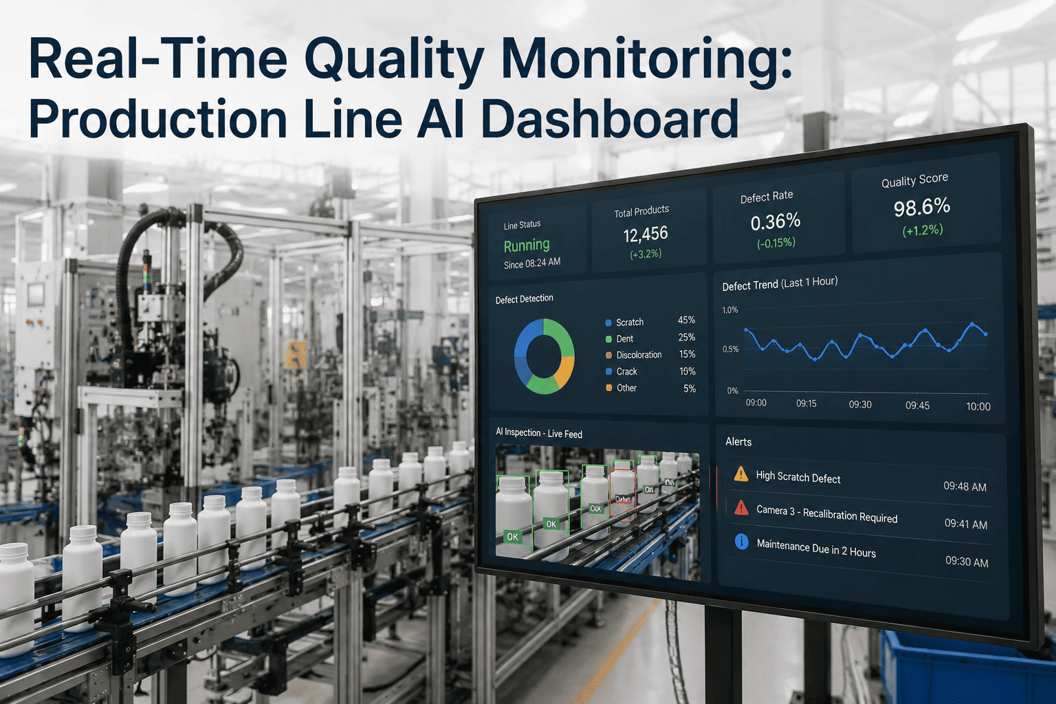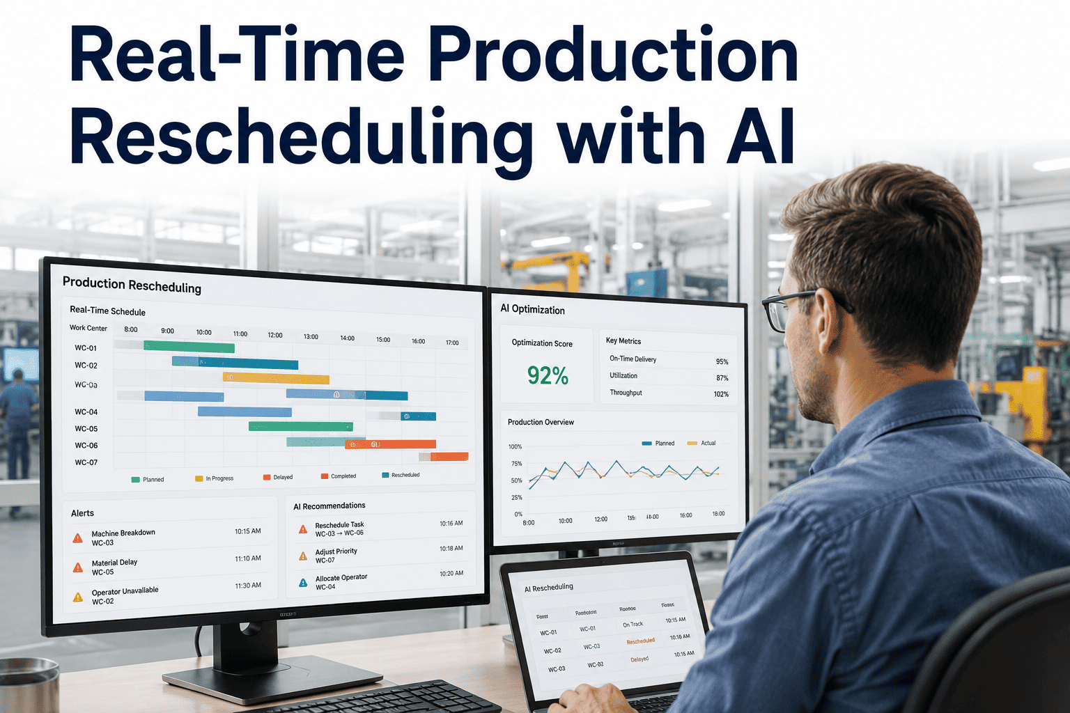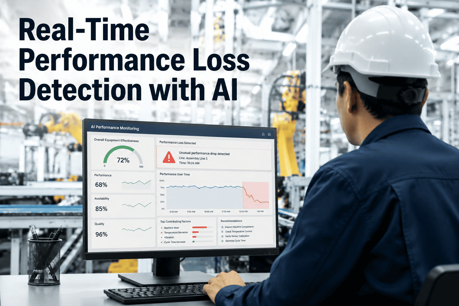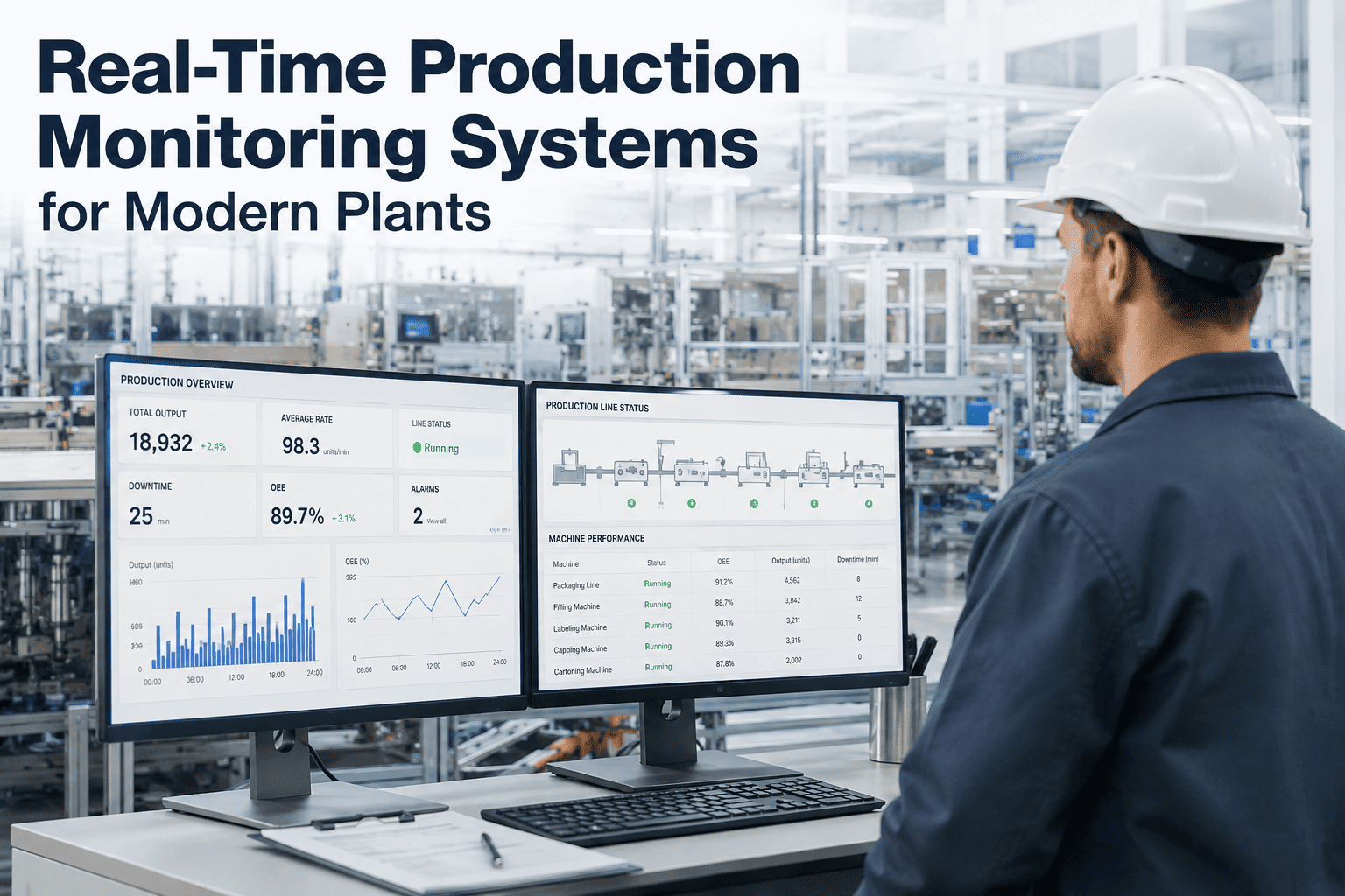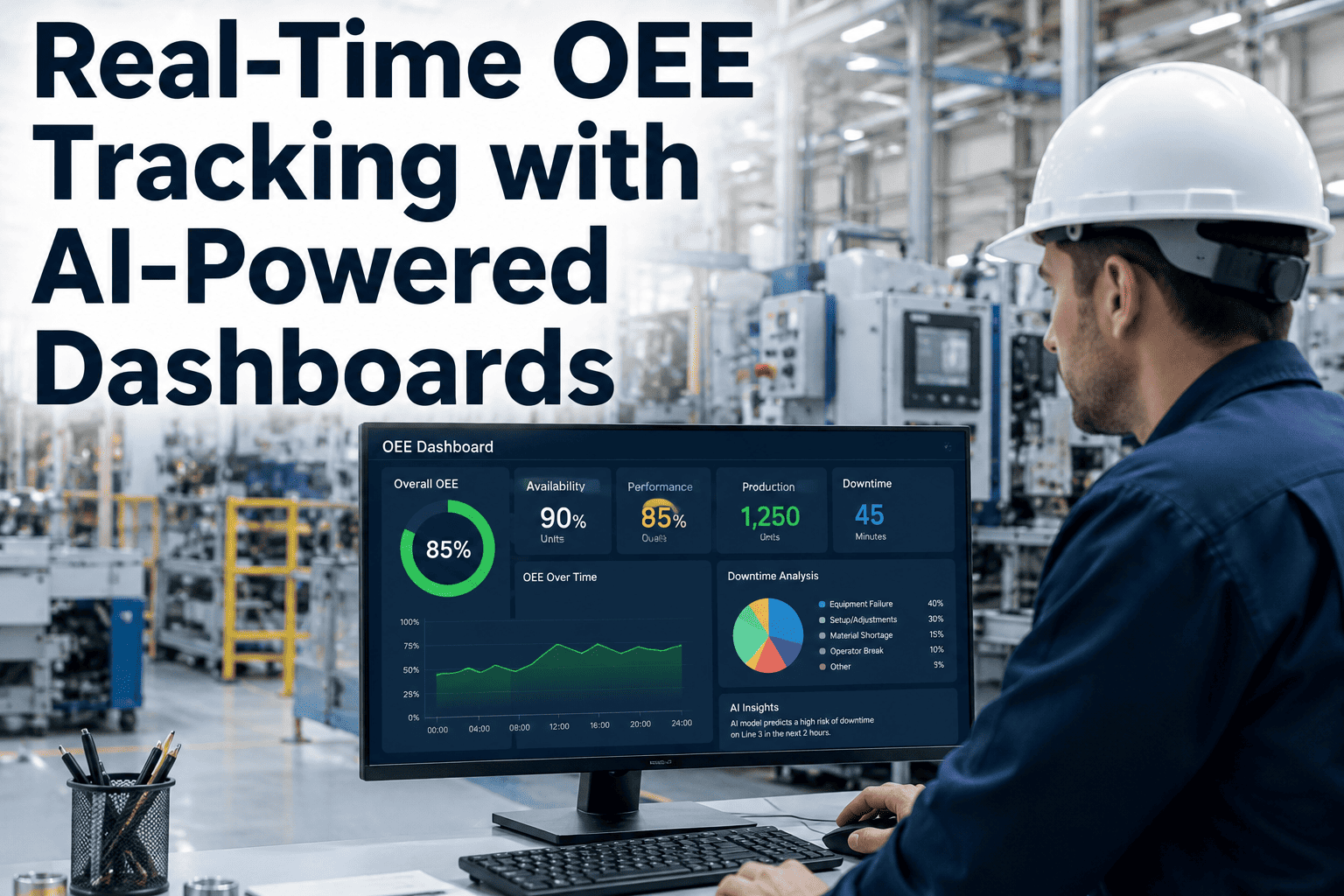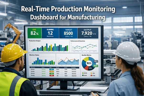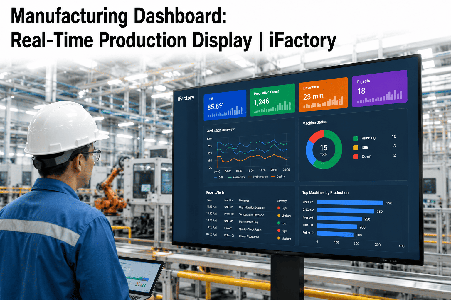
Walk into most plants and you will find at least one screen mounted on the wall showing production numbers that nobody actually looks at anymore. Maybe it refreshes once an hour, maybe the numbers stopped matching what is really happening on line three sometime last quarter, maybe it was built for an audit and never touched since. A dashboard that operators have learned to ignore is worse than no dashboard at all, because it creates the illusion that visibility exists while the plant keeps running on tribal knowledge and a supervisor's gut feel. The difference between that wall-mounted decoration and a display people actually check every few minutes usually comes down to five design decisions, and none of them require ripping out existing equipment or starting from a blank slate. Learn how iFactory builds dashboards operators actually trust at ifactory support.
A Shop Floor Dashboard People Actually Look At, Not Just Walk Past
Live OEE, production counts, quality metrics, and maintenance status pulled directly from the floor and displayed in a format operators can read from across the room in under three seconds, so the screen finally earns the wall space it takes up.
Why Most Shop Floor Screens Stop Getting Used
Dashboards fail for a small, predictable set of reasons, and almost none of them are about the underlying data being wrong. They fail because the screen tries to show everything at once, because the numbers update too slowly to matter, or because the display was designed by someone in an office who never actually stood in front of it during a shift. An operator glancing up from a machine has a few seconds, not a few minutes, to understand whether the line is on plan or falling behind, and a dashboard that requires interpretation in that window has already failed at its one job. The pattern repeats across plant after plant: the screen goes up with genuine enthusiasm, gets checked closely for the first week or two, and then quietly fades into background noise once the gap between what it shows and what the floor already knows starts to widen.
The Five Widgets Every Shop Floor Display Needs
The plants that get shop floor displays right resist the temptation to show every metric they can technically capture, and instead settle on a small, consistent set of widgets that answer the questions an operator or supervisor actually asks throughout a shift. The five below cover status, output, quality, and maintenance in a layout that stays readable whether someone is standing right in front of the screen or glancing at it from the far end of the line. None of these widgets need to be complicated to be effective — the goal is instant comprehension, not visual sophistication, which is why the simplest version of each one is usually the version that survives past the pilot phase.
Watch Your Own Production Data Populate This Layout
Bring a recent shift's OEE, downtime, and quality numbers to the call. We will show you what your line would actually look like on a live display, not a sample screenshot.
Common Mistakes That Kill Trust in a New Dashboard
The fastest way to lose the floor's trust in a new display is to launch it before the underlying data is actually clean. If the OEE number on screen contradicts what a supervisor already knows from walking the line, that mismatch gets noticed within the first shift, and it is far harder to rebuild credibility after a bad first impression than it would have been to spend an extra week validating the data feed before going live. A dashboard should never be the first place a discrepancy gets discovered — it should be built and tested against numbers the floor already trusts, then expanded once the match is proven.
The second common mistake is designing the display around what looks impressive in a vendor demo rather than what an operator actually needs mid-shift. Elaborate 3D factory renderings and animated transitions look compelling in a sales pitch, but on the actual floor they slow down the moment someone needs to read a number and get back to work. The best shop floor displays tend to look almost boring by design — flat colors, large text, and an unmistakable visual hierarchy — because the goal is comprehension in under three seconds, not a screenshot that photographs well for a case study.
Andon Lights vs. a Real-Time Digital Dashboard
Traditional Andon systems earned their place on the floor because a colored light is unmistakable from across the room, and that instinct was correct. The limitation is that a light tells you something is wrong without telling you what, how long, or how much it is costing. A digital dashboard keeps that same instant readability while adding the context that turns a signal into an actionable decision.
| Capability | Traditional Andon Lights | Real-Time Digital Dashboard |
|---|---|---|
| Status visibility | Running, attention, or down, shown as a single color | Same instant color cue, plus the specific reason and duration |
| Historical context | None — the light only shows the current moment | Trend lines and shift comparisons available on the same screen |
| Root cause visibility | Requires someone to walk over and ask what happened | Downtime reason logged and ranked automatically |
| Coverage across the plant | Limited to the physical line where the light is installed | Any screen, any device, showing any line or the whole plant |
| Maintenance cost | Physical wiring and bulbs that need periodic replacement | Software-driven display with no physical light infrastructure |
Different Roles Need a Different Glance
A single dashboard layout rarely serves an operator, a supervisor, and a plant manager equally well, because each is asking a different question when they look up at the screen. An operator needs to know if their specific station is on pace right now. A supervisor needs to see the whole line and where attention should go next. A plant manager needs a cross-line view that shows which area is dragging performance down. Building role-specific views off the same underlying data avoids the common trap of designing one screen that tries to satisfy everyone and ends up serving no one well. The underlying data model stays identical across every view — the only thing that changes is which widgets surface first and how much detail each role sees, which is what keeps every screen consistent even as the audience for it changes.
Curious what your own role-specific view would actually look like? Send us your current reporting layout and we will map it to a live display.
What Plants Report After Switching to a Live Display
The value of a real-time dashboard shows up less in the software itself and more in how much faster people respond once a problem is visible the moment it starts, rather than at the end of a shift when it is too late to do anything but log it. Plants that made the switch consistently describe the same shift in behavior: fewer people walking the floor just to check a status, fewer arguments in the morning meeting about whose numbers are correct, and a faster instinct to react the moment a trend starts to drift instead of waiting for a formal report to confirm what everyone already suspected. The ranges below reflect what manufacturers have reported after deploying a live shop floor display in place of manual reporting or stale weekly summaries.
Rolling Out a Dashboard the Floor Will Actually Trust
A dashboard earns trust the same way a new process earns trust — by being right, consistently, for long enough that people stop double-checking it against a clipboard. Rushing the rollout to hit an internal deadline is one of the most common ways a promising deployment loses credibility before it ever gets the chance to prove itself, because the first thing operators do with a new screen is look for a reason not to trust it. The four phases below reflect how most plants move from a first pilot screen to a display the whole floor relies on without being told to.
Frequently Asked Questions
Put Live OEE, Output, Quality, and Maintenance on One Display
Bring a recent shift's numbers to the call. We will show you exactly how your production data would look on a real-time dashboard, from the main floor screen down to role-specific views.