Most plants still find out about a bad shift the way a doctor reads an autopsy — after it's over. A shift-end OEE report showing 58% tells you exactly what happened eight hours after the losses already occurred, when the operators have rotated and the conditions that caused the drop no longer exist. Real-time OEE dashboards close that gap by streaming availability, performance, and quality data as it happens, so a dip that starts two hours into a shift becomes visible with six hours still left to recover it. Plants running live OEE displays on the floor report meaningful gains from visibility alone, before any formal improvement program even starts — book a demo to see what your floor looks like in real time.
Production Performance · Real-Time Dashboards
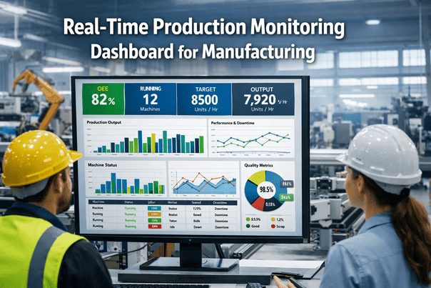
Real-Time OEE Tracking with AI-Powered Dashboards
Turn shift-end reports into shift-during action. See losses the moment they happen, while there's still time to fix the shift instead of just explaining it.
8 hrs
Average delay before a shift-end report reveals a problem
10-20%
OEE improvement reported from live visibility alone
60 sec
Practical refresh window that keeps data current and readable
The Cost of Finding Out Late
The same production problem produces two completely different outcomes depending on when it gets noticed. Here's what an identical slowdown looks like under shift-end reporting versus a live dashboard.
Shift-End Reporting
9:15 AMLine performance drops, no one notices
12:00 PMLosses continue silently through lunch
5:00 PMShift ends, report compiles overnight
Next dayManager reviews report, root cause unclear
Result: full shift of lost output, cause already cold
Real-Time AI Dashboard
9:15 AMDashboard flags performance drop instantly
9:17 AMAlert routes to supervisor with likely cause
9:25 AMSupervisor walks the line, corrects the issue
10:15 AMNext data cycle confirms the fix worked
Result: less than one hour of lost output, cause documented
One Dataset, Three Very Different Views
The mistake most dashboards make is showing everyone the same screen. Operators, supervisors, and plant leadership all need the same underlying data, but at a completely different level of detail and timeframe.
Operator View
Current shift, current line
Live OEE, current stop reason, and a running count of micro-stops on their specific machine — enough to act, not enough to overwhelm.
Supervisor View
Today plus recent trend
Comparative performance across every line on the floor, with alerts ranked by which loss is costing the most output right now.
Plant Manager View
Weekly and monthly trend
Site-wide OEE trend, top recurring loss categories, and which lines are compounding gains versus which ones are stuck.
What a Live Dashboard Catches That a Report Never Will
The most expensive losses in most plants are also the smallest and most frequent — which is exactly why they disappear from end-of-shift paperwork.
40x
Micro-Stops Per Shift
Thirty-second jams happening dozens of times a shift are invisible on a shift report but devastate the performance rate. A live dashboard exposes the pattern immediately, pointing to root causes like misaligned guides or worn components.
Minutes
Reaction Window on Rising Defects
When defect rates start climbing, real-time alerts give operators minutes to adjust temperature, pressure, or speed — not hours to discover hundreds of scrapped units after the fact.
Instant
Rerouting on Unplanned Downtime
When a machine goes down unexpectedly, live visibility lets production control shift work to alternate equipment within minutes, containing the impact on customer orders.
From Alert to Action: How the Loop Closes
01
Detect
Sensors stream availability, performance, and quality data continuously, refreshed on a cadence built for human reaction time, not raw data noise.
02
Explain
Instead of a bare number, the dashboard states the cause: performance down due to a specific run of micro-stops in the last ten minutes.
03
Alert
When OEE drops below a defined threshold, the right person is notified by dashboard, email, or mobile push — by machine, by line, by site.
04
Confirm
The next data cycle shows whether the intervention worked, closing the loop instead of leaving the fix unverified until the next report.
A dashboard that only shows a number is a scoreboard, not a solution. The plants seeing real gains use dashboards that explain the cause and route the fix to the right person before the shift is over.
Expert Insight
Real-time OEE gets a bad reputation because plants deploy it badly. A raw number flashing on a screen every thirty seconds creates anxiety, not insight — operators watch it swing from 67% to 71% to 66% and stop trusting it entirely. The plants that get this right frame the dashboard as plant feedback, not an operator scorecard, and they design the refresh rate around how people actually process information rather than how fast the sensor can report it. Done well, the same live data that causes panic in one plant becomes the reason another plant closes its OEE gap two full quarters faster.
Elena Novak — Plant Digitalization Advisor, former Continuous Improvement Director, 16+ years deploying shop-floor visibility systems
Traditional Reporting vs. AI-Powered Dashboards
| Capability |
Shift-End Reporting |
AI-Powered Dashboard |
Why It Matters |
| Data latency |
Hours to a full shift behind |
Updated within 30 to 60 seconds |
Problems get caught while there's still time to recover the shift |
| Root cause visibility |
Reconstructed from memory after the fact |
Tagged automatically at the moment of the event |
Root cause analysis becomes accurate instead of guessed |
| Audience view |
One static report for everyone |
Role-based views by operator, supervisor, and leadership |
Each person acts on the detail level relevant to their job |
| Alerting |
None — problems surface only in review |
Configurable thresholds trigger instant notification |
Turns the system from a report into an active management tool |
| Accessibility |
Desk-bound spreadsheet or printed sheet |
Responsive dashboard on tablets and phones |
Supervisors act from the floor instead of walking back to a desk |
Frequently Asked Questions
Won't real-time data just create noise and false alarms?
This is a real risk if the refresh rate is set too fast for human reading speed — sub-30-second updates can make numbers swing faster than anyone can process. A well-designed dashboard buffers the refresh to a 30 to 60 second window and pairs every alert with a stated cause rather than a bare percentage, which turns volatility into readable information.
Book a demo to see how alert thresholds are tuned to avoid alarm fatigue.
Will showing live OEE numbers make operators feel watched or blamed?
How the data is framed matters more than the data itself. Plants that present live OEE as an operator scorecard tend to see pushback and even data manipulation, while plants that frame it as plant feedback see operators use it to self-correct. The dashboard is the same either way — the difference is entirely in how leadership introduces and uses it.
Contact support for guidance on rolling out real-time visibility without creating friction.
Does this require rebuilding our existing reporting systems?
No. Real-time dashboards typically sit on top of your existing machine signals and feed structured data back into whatever ERP or reporting stack you already use, rather than replacing it outright. Most installations run alongside current systems during a transition period so nothing breaks while the new visibility layer proves itself.
Book a demo to see how integration works with your current setup.
How fast can we expect to see results after switching to a live dashboard?
Plants that install real-time OEE displays on the production floor commonly report double-digit percentage improvement from visibility alone, before any structured improvement program is layered on top. The mechanism is simple: problems that used to surface a full shift late now surface within minutes, while there's still time in the shift to recover the loss.
Contact support to discuss a realistic rollout timeline for your lines.
Can plant leadership see multiple sites in one place?
Yes. For manufacturers running more than one facility, the same underlying data can roll up into a corporate-level view showing site-wide trends and top recurring loss categories, while individual floors keep their own real-time operator and supervisor screens. This gives leadership comparative visibility without flattening the detail that shift teams actually need.
Book a demo to see a multi-site rollup in action.
Stop Reading About Yesterday's Shift
See availability, performance, and quality the moment they change — with enough context to act, not just a number to react to.