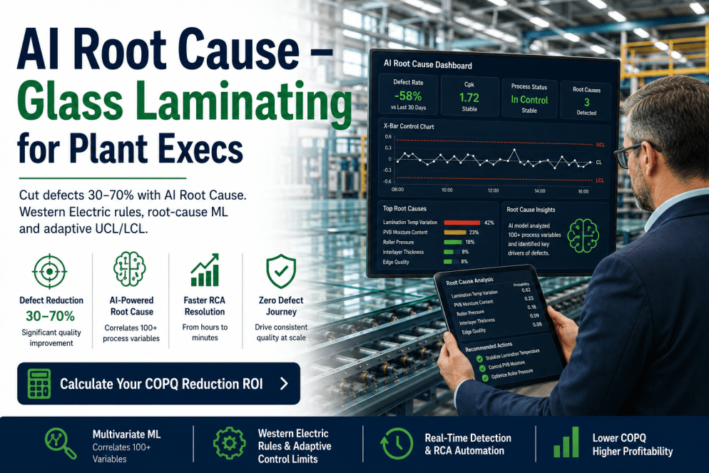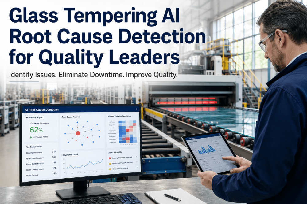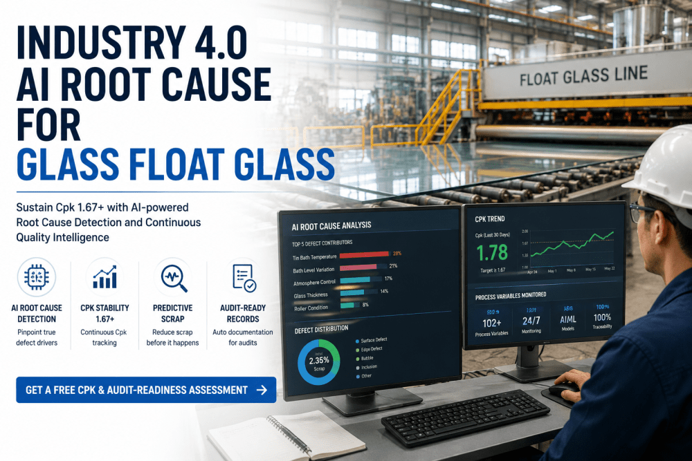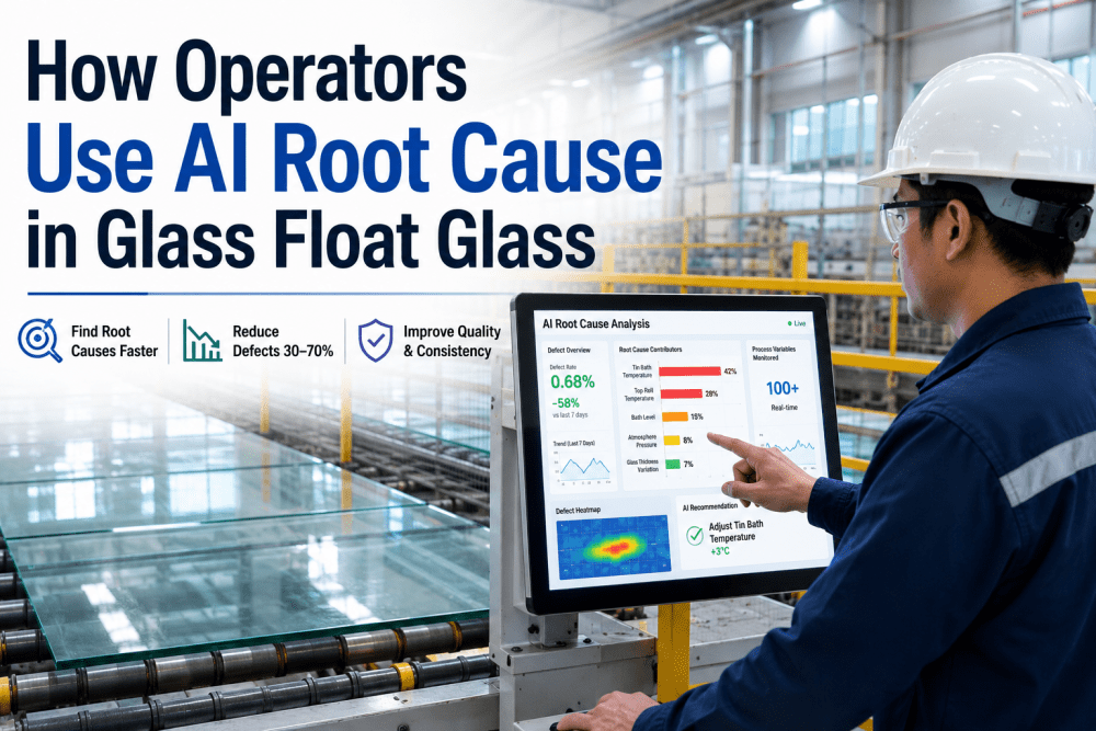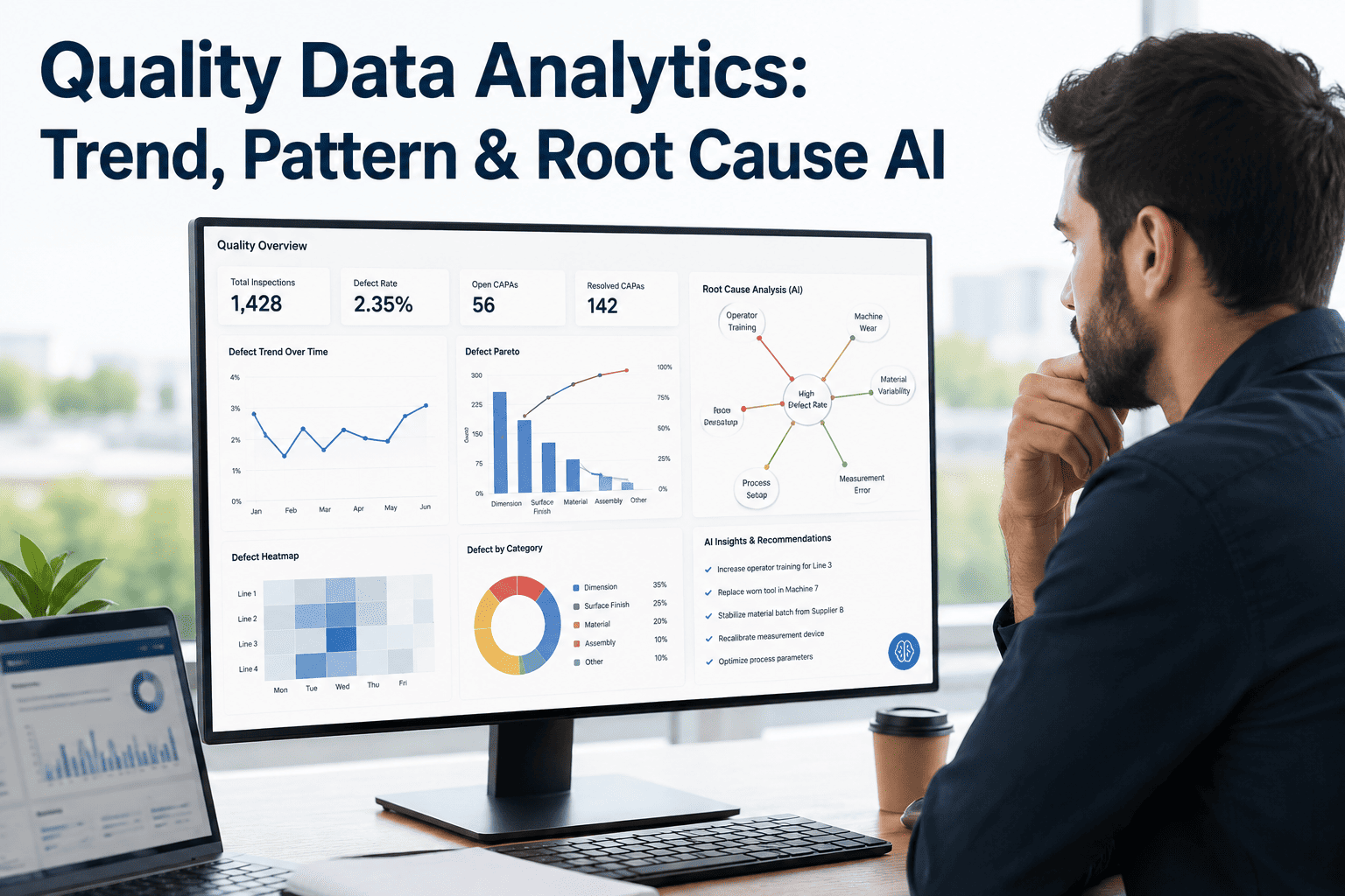
Quality teams generate mountains of data every single shift, from SPC charts and inspection logs to batch records and sensor readings, but most of it sits untouched until an audit or a customer complaint forces someone to dig through it. A scrap review that should take twenty minutes turns into a two-day search across five disconnected systems, because nobody built a way to see a trend forming while it is still forming. By the time a quality engineer can finally name the root cause by hand, dozens more units carrying the same defect have already left the line. Quality data analytics closes that exact gap by applying AI to trend detection, pattern recognition, and automated root cause identification, and you can see how iFactory structures that workflow at ifactory support.
Your Quality Data Already Knows the Answer. It Just Cannot Talk Yet.
AI-driven trend detection, pattern recognition, and automated root cause analysis that turn scattered inspection records into a running explanation of why defects happen, updated continuously instead of once a quarter.
Quality Data Is Not Missing. It Is Scattered and Silent
Ask a plant manager whether they have enough quality data and the answer is almost always yes. Ask them how long it takes to explain why last Tuesday's batch failed, and the answer changes completely. The data exists in an inspection database, a separate SPC tool, a paper traveler that got scanned in later, and a supervisor's memory of what felt different that shift. None of those sources talk to each other, so every investigation starts from zero, rebuilding a timeline that a connected system could have assembled automatically the moment the deviation occurred.
The cost of that silence is not just slower investigations, it is recurring defects. A trend that would have been obvious on a single unified chart stays invisible when it is split across three spreadsheets and two people's inboxes. By the time enough scrap accumulates for someone to notice a pattern, the same root cause has already repeated itself across several shifts, several lots, and sometimes several plants. Quality data analytics exists to put every one of those signals on one timeline, scored and correlated continuously, so a trend gets flagged while it is still a handful of units instead of a full containment event.
Three Layers That Turn Raw Records Into an Explanation
Quality data analytics is not one feature, it is three layers working together, each answering a different question. Trend detection asks what is changing over time. Pattern recognition asks what conditions tend to appear together. Root cause AI asks, once a defect happens, which of those conditions actually caused it. Run in isolation, each layer is useful. Run together on the same dataset, they turn a wall of inspection records into a running explanation your team can act on the same shift it appears, instead of a postmortem written up weeks after the fact.
From Raw Signal to Corrective Action, Without the Manual Handoff
The value of these three layers only shows up once they are connected end to end. A signal that stops at a dashboard nobody checks is no better than the spreadsheet it replaced. The flow below is how a quality event actually moves through the system, from the moment a sensor or inspector first records something out of range to the moment a corrective action gets logged and tracked, with no manual handoff required to move it from one stage to the next.
Run Your Last Quarter's Defect Data Through the Model
Bring a sample of inspection or SPC records to the call and we will walk through what trend detection and root cause ranking would have surfaced in real time.
Manual Analysis Versus a Continuous Analytics Layer
Most quality teams are not choosing between doing root cause analysis and not doing it, they are choosing between doing it well once a quarter or doing it continuously on every deviation. The comparison below is less about which method is smarter and more about which one scales to the volume of data a modern line actually produces. A skilled quality engineer running a manual investigation will usually reach the correct conclusion eventually, but eventually is the problem. Production does not pause while an investigation runs its course, and every hour spent reconstructing a timeline by hand is an hour where the same root cause could keep producing scrap somewhere else on the floor.
| Dimension | Manual Investigation | AI Quality Analytics |
|---|---|---|
| Time to identify root cause | Hours to days, depending on investigator availability | Minutes, ranked automatically as the defect is logged |
| Data sources reviewed | Whichever system the investigator remembers to check | Every connected source, correlated on one timeline |
| Trend visibility | Visible after enough scrap accumulates to notice | Visible as the trend begins to form |
| Consistency across shifts | Varies with who is running the investigation | Same scoring logic applied every time, every shift |
| Review cadence | Typically quarterly or after a customer complaint | Continuous, updated with every new data point |
The Patterns That Rarely Get Caught by a Human Alone
Some defect patterns are genuinely hard for a person to spot, not because the people are not skilled, but because the signal is spread across too many variables for any one investigator to hold in their head at once. A pattern recognition layer does not get tired, does not forget what happened three shifts ago, and does not need the coincidence to repeat five times before it registers as meaningful. It simply keeps every variable in view, all the time, and flags a correlation the first time it crosses a statistical threshold.
None of these patterns are exotic. Most quality engineers have a story about one of them, usually discovered after months of intermittent scrap and a lot of frustrated troubleshooting. The difference an analytics layer makes is timing: instead of a pattern surfacing after enough evidence has piled up for a person to notice, it surfaces the moment the correlation becomes statistically meaningful, often while the affected lot or shift is still in production and can still be corrected before more units are affected.
What Root Cause AI Is Actually Doing Under the Hood
Root cause AI is not a black box that replaces engineering judgment, it is a way of running the same disciplined methods a good quality engineer already trusts, but across every deviation instead of the handful that get escalated. The system builds a fishbone-style map of contributing categories, walks a 5 Why chain automatically using the recorded process data, and flags where a fault tree points to more than one plausible cause so a human reviewer knows exactly where to focus attention first.
This matters most in the cases that look ambiguous on paper. A dimensional defect might trace back to tooling wear, a material lot change, or an operator handoff, and all three could plausibly explain it. A manual review often settles on whichever explanation is easiest to check first, which is not always the correct one. An AI layer weighs all three against the full process history at once, ranks them by statistical strength, and leaves the final call with the engineer, who now starts from a shortlist instead of a guess.
The methodology stays familiar on purpose. Quality teams have trusted fishbone diagrams, 5 Why chains, and fault tree logic for decades because they force a structured search instead of a hunch, and none of that discipline gets thrown away when AI enters the picture. What changes is scale and speed: the same six fishbone categories, man, machine, material, method, measurement, and environment, get populated automatically from live process data instead of a whiteboard exercise reconstructed from memory after the fact. A 5 Why chain that used to take an afternoon of interviews gets built in minutes from timestamped records, and every answer is traceable back to the exact reading that supports it, which makes the finished investigation far easier to defend during an audit or a customer review.
Corrective action tracking closes the loop. A ranked root cause that never turns into a logged action with an owner and a due date is just an interesting observation, not an improvement. Once a cause is confirmed, the system keeps the corrective action visible until it is closed, and feeds the outcome back into the model so the next similar deviation gets ranked with the benefit of what was actually learned. Over months, that feedback loop is what separates a static analytics dashboard from a quality program that keeps getting measurably sharper with every deviation it closes out.
Frequently Asked Questions
Turn Your Quality Data Into a Running Explanation
Bring a sample of your inspection or SPC data to the call and we will show you what trend detection, pattern recognition, and root cause ranking would surface on your own line.