A spaghetti diagram is the simplest tool in lean manufacturing that also happens to produce the most uncomfortable moments for plant managers. You follow a single part or operator with a pen on a floor plan, and the line crisscrosses itself so many times that the result looks exactly like what the tool is named after. That visual alone is enough to start conversations about why material travels four hundred feet to cover sixty feet of actual work distance, but the diagram only shows the shape of the problem. Combining it with value stream mapping adds the time dimension, showing not just where the waste is but how long each piece of waste has been silently draining capacity from your operation. You can book a demo to see how iFactory digitizes both methods and layers them together.
Your Floor Plan Tells a Story About Waste That No Spreadsheet Can Capture
Spaghetti diagrams expose excessive material travel. Value stream maps expose excessive waiting time. Together they form a complete picture of where your production flow is losing hours, feet, and dollars every single shift.
What a Spaghetti Diagram Actually Reveals That No Other Tool Shows
A spaghetti diagram is not a flow chart and it is not a process map. It is a physical trace of movement overlaid on a spatial layout, which means it captures something that routing sheets and work instructions completely ignore: the actual distance and direction material or people travel through physical space to complete a sequence of work. The patterns below are the most common findings when teams first draw a spaghetti diagram on their actual floor plan, and every single one of them represents cost that does not appear in any standard production report.
Spaghetti Diagram vs Value Stream Map: What Each One Captures That the Other Cannot
These two tools are frequently confused or treated as interchangeable, but they measure fundamentally different dimensions of production waste. The spaghetti diagram measures space and movement. The value stream map measures time and information flow. Using one without the other gives an incomplete picture that leads to layout changes that improve travel distance but not cycle time, or process improvements that reduce wait time but not handling cost. The table below maps exactly what each tool captures so you can see where the gaps appear when you rely on only one.
| Dimension Measured | Spaghetti Diagram | Value Stream Map | Combined Insight |
|---|---|---|---|
| Physical travel distance | Primary strength, measured in feet or meters | Not captured directly | Know exactly how far and where |
| Cycle time per step | Not captured | Primary strength, measured in seconds | Know how long each station takes |
| Wait time between steps | Visible as pauses but not timed | Captured as inventory queue time | See where material sits idle and why |
| Backtracking and crossing paths | Immediately visible as line overlap | Not visible on the map | Quantify the cost of going backward |
| Information flow gaps | Not captured | Captured via communication timelines | See if delays are physical or informational |
| WIP accumulation points | Visible as clustering on floor plan | Captured as inventory between steps | Know where and how much buffer builds up |
| Operator walking distance | Traced directly by following the person | Not captured unless explicitly added | Measure labor waste from poor layout |
The Seven Types of Flow Waste That a Spaghetti Diagram Exposes on Every Plant Floor
Lean manufacturing identifies seven forms of waste, and at least five of them show up as visible patterns on a spaghetti diagram. The visual signatures below are what experienced practitioners look for when they walk a floor with a printed plan and a pen, and recognizing them quickly is what separates a useful diagram from a drawing that gets filed and forgotten.
Material moving across the facility because workstations that should be adjacent are separated by aisles, offices, or storage areas that were placed between them during previous layout iterations.
Material arriving at a station that is not ready to process it, creating a holding pattern that shows up as a dense knot of lines on the diagram where multiple paths converge and stop.
Operators walking to get tools, materials, or information that are not positioned within arm's reach of the work area, which appears as small frantic scribbles around a single point on the floor plan.
Parts returning to a station for a second operation that could have been completed in a single setup, or moving to a separate inspection station that could be integrated into the process step itself.
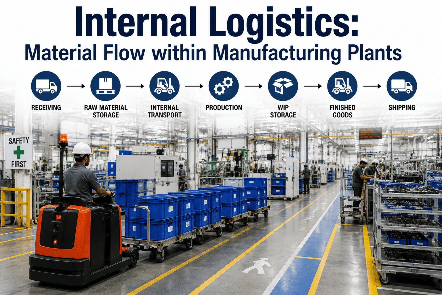
Every side trip to a raw material rack, WIP staging area, or finished goods buffer adds distance that exists solely because the plant produces or stores more than the immediate next step can consume.
Rework paths are the most visually obvious pattern on a spaghetti diagram because the line literally goes backward, and each backtrack represents a part that consumed full process time but produced no usable output.
When multiple product paths cross each other in shared aisles or staging areas, the resulting congestion creates unpredictable transit times that show up as cycle time variation downstream even though no single step is malfunctioning.
How to Build a Spaghetti Diagram That Actually Leads to Layout Changes
Most spaghetti diagrams fail not because the tool is weak but because the mapping process is sloppy. Teams draw approximate paths from memory instead of walking the floor, they trace one part instead of a representative sample, and they produce a diagram that looks dramatic but cannot be translated into specific layout actions. The process below is the method that produces diagrams capable of driving real decisions.
Obtain a scaled drawing of the plant floor with all workstations, aisles, doors, columns, and fixed obstacles marked. A vague sketch will produce a vague diagram that cannot support precise distance calculations or layout alternatives.
Choose parts that represent different product families, different routing sequences, and different volume levels. Tracing only the highest-volume part will miss flow patterns that affect the majority of your SKUs and lead to a layout that solves one problem while creating three others.
Physically follow each part from receiving through every operation to shipping, drawing a continuous line on the floor plan and recording the time at each station arrival and departure. Memory is not reliable for this step because people mentally edit out the detours they have learned to ignore.
Overlay all traced paths on a single floor plan using different colors or line weights for each part family. The resulting composite diagram reveals shared congestion points, crossing conflicts, and common detours that are invisible when each path is drawn on a separate sheet.
Calculate the total distance traveled for each path, count the number of direction reversals, identify the longest single segments, and tally the number of crossings. Converting the visual pattern into numbers is what turns an interesting drawing into a business case for layout investment.
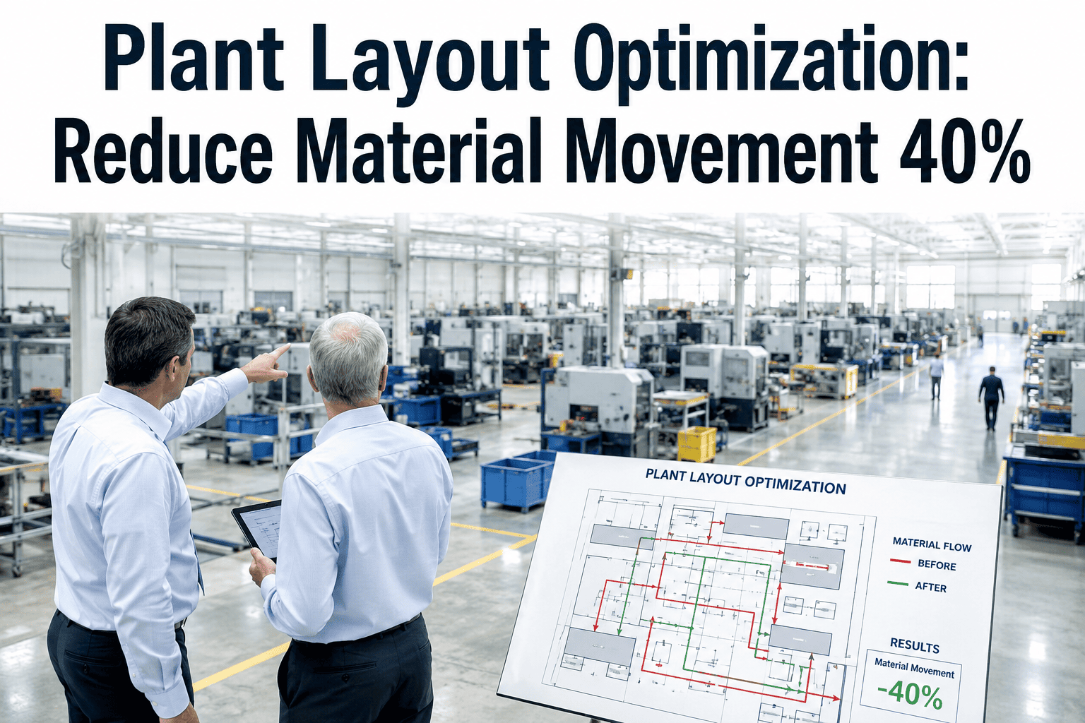
Use the quantified findings to reposition workstations, eliminate intermediate storage points, separate pedestrian and forklift paths, and consolidate operations that currently require multiple visits to the same station. Every layout change should directly target a specific pattern measured in the previous step.
How Value Stream Mapping Builds on What the Spaghetti Diagram Starts
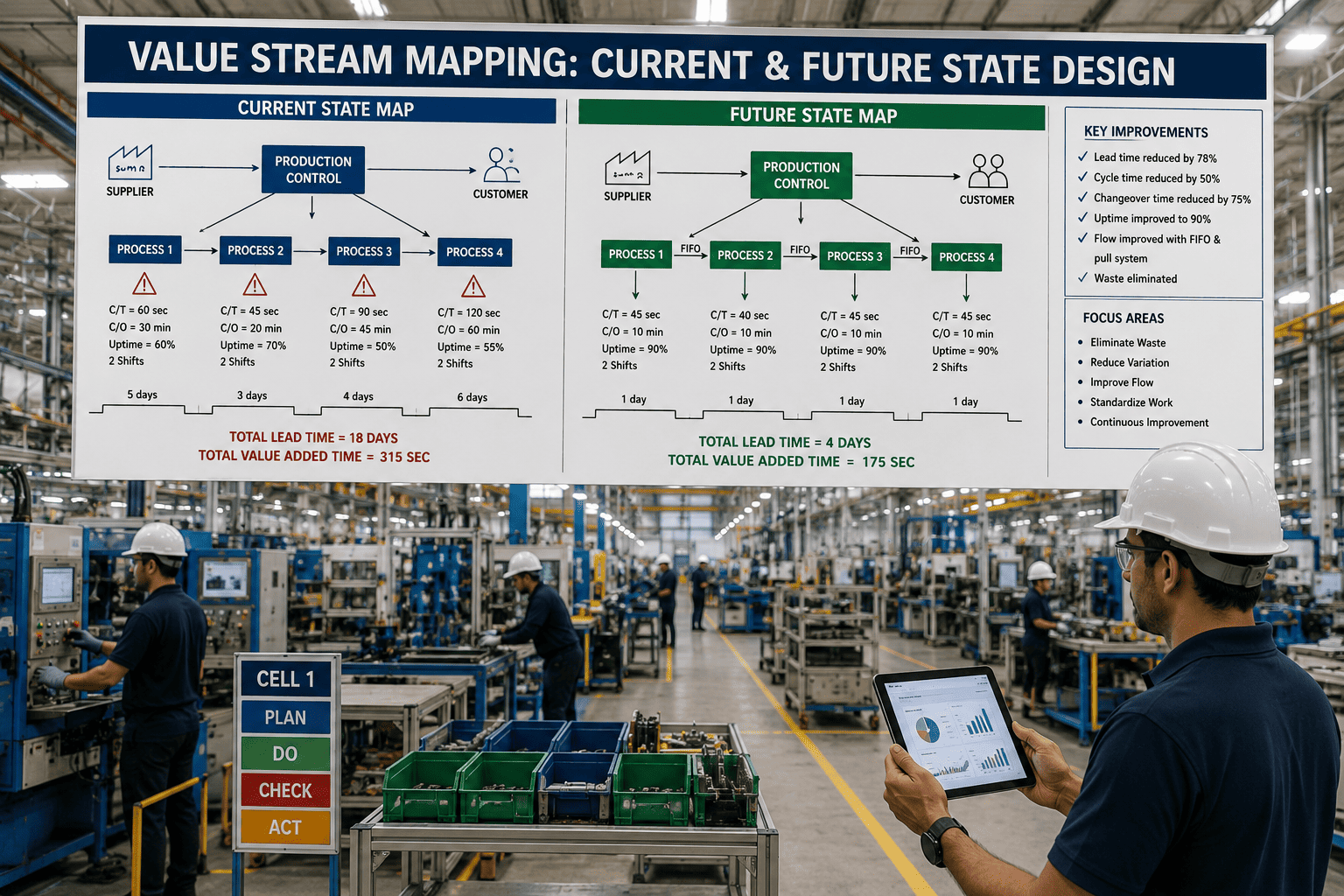
The spaghetti diagram tells you where material goes. The value stream map tells you how long it sits at each stop and why. When you layer the VSM timeline onto the spaghetti diagram layout, you get a combined view that shows not just the physical path of waste but the temporal cost of every detour, every queue, and every backtrack. The visualization below represents what that combined view looks like for a typical manufacturing process where the value-adding time is a small fraction of the total lead time.
See Your Spaghetti Diagram Generated Digitally From Production Data
iFactory builds flow maps from your routing data and work order history, then layers value stream timing on top so you see both the distance waste and the time waste in one view.
Why Manual Diagrams Fail at Scale and What Digital Flow Analysis Delivers Instead
A hand-drawn spaghetti diagram on a printed floor plan is an excellent exercise for a single product family on a single shift. The problem starts when you need to trace twenty product families, compare layouts across three facilities, or update the diagram every time a workstation moves. The limitations of paper and pen force teams to make shortcuts that undermine the accuracy of the entire exercise, and those shortcuts are what digital flow analysis eliminates entirely.
Mistakes That Turn a Spaghetti Diagram Into a Useless Drawing Instead of an Action Tool
These errors are so common that most lean practitioners have seen them repeated across dozens of facilities. The pattern is always the same: the team invests time in the mapping exercise, produces a dramatic-looking diagram, presents it to management, and then nothing changes because the diagram does not contain the information needed to make specific layout decisions. Each mistake below explains what goes wrong and how to avoid it.
People draw what they think the path looks like, which means they unconsciously skip the detours, backtracks, and side trips that happen every day but have become invisible through familiarity. The result is a clean-looking diagram that understates the actual waste by 30-50%.
The most common product gets a reasonable path because the plant was partially arranged around it, but the other fifteen product families that share the same equipment end up with terrible flow that never gets measured or addressed because it was not on the diagram.
A dramatic-looking spaghetti diagram creates urgency but no business case. Without converting the visual into total feet traveled, number of backtracks, and estimated handling cost per part, the diagram becomes a conversation piece that cannot secure budget for layout changes.
If the floor plan does not show temporary staging areas, moved workstations, or blocked aisles that currently exist on the real floor, the traced path will not match reality and any layout redesign based on that mismatched diagram will solve problems that do not actually exist.
The spaghetti diagram identifies the problem but does not solve it. Teams that treat the mapping exercise as the endpoint rather than the starting point end up with a file full of diagrams and no actual reduction in material travel distance because no one designed the optimized layout that should come next.
The spaghetti diagram shows where material goes but not how long it waits at each stop. Without layering on cycle times and queue times from a VSM, you might eliminate a long travel segment only to discover that the real bottleneck was the waiting time at the destination, not the distance to get there.
What Spaghetti Diagrams Consistently Reveal Across Different Manufacturing Sectors
Certain flow patterns appear so reliably in specific industries that experienced practitioners can predict the major findings before the first line is drawn. These patterns exist because the equipment, regulations, and historical growth paths within each sector tend to create the same types of layout inefficiencies. Recognizing your sector's typical pattern helps you focus the mapping effort on the areas most likely to contain significant waste.
Extreme path variation between jobs because each order follows a different routing through shared equipment. The spaghetti diagram looks less like a single tangled line and more like a web covering the entire floor, which makes it impossible to optimize for a single flow path and forces a cell-based or product-family-based layout strategy instead.
Segregation requirements between raw and cooked zones, allergen controls, and cold chain boundaries force material to travel through dedicated corridors and pass-through walls that add enormous distance. The spaghetti diagram typically shows paths doubling back through hygiene barriers that cannot be removed but can be repositioned to reduce total travel.
High-volume repetitive paths that should be clean but are corrupted by offline quality checks, rework loops, and kanban pickup routes that cross active production paths. The diagram shows a generally linear flow with frequent small detours that individually seem minor but collectively add up to significant handling time across thousands of parts per shift.
Regulatory gowning zones, cleanroom transitions, and quarantine holding areas create mandatory path segments that cannot be shortened but can be consolidated. The spaghetti diagram reveals that parts spend more time moving between classification boundaries than they spend in actual processing, which is a cost of compliance that can still be minimized through smarter layout of the boundary infrastructure.
Outcomes Reported From Combined Spaghetti Diagram and VSM Analysis Projects
The figures below reflect results tracked across manufacturing facilities that completed both spatial flow mapping and value stream timing analysis, then implemented layout and process changes based on the combined findings. Each facility measured its own before-and-after performance over comparable production periods.
Questions Manufacturing Engineers Ask About Spaghetti Diagrams and Value Stream Mapping
Stop Drawing Spaghetti Diagrams by Hand and Start Seeing Flow Waste in Real Time
iFactory's platform generates spaghetti diagrams and value stream maps from your production data, calculates the cost of every wasted foot and wasted minute, and simulates optimized layouts before you move a single machine.