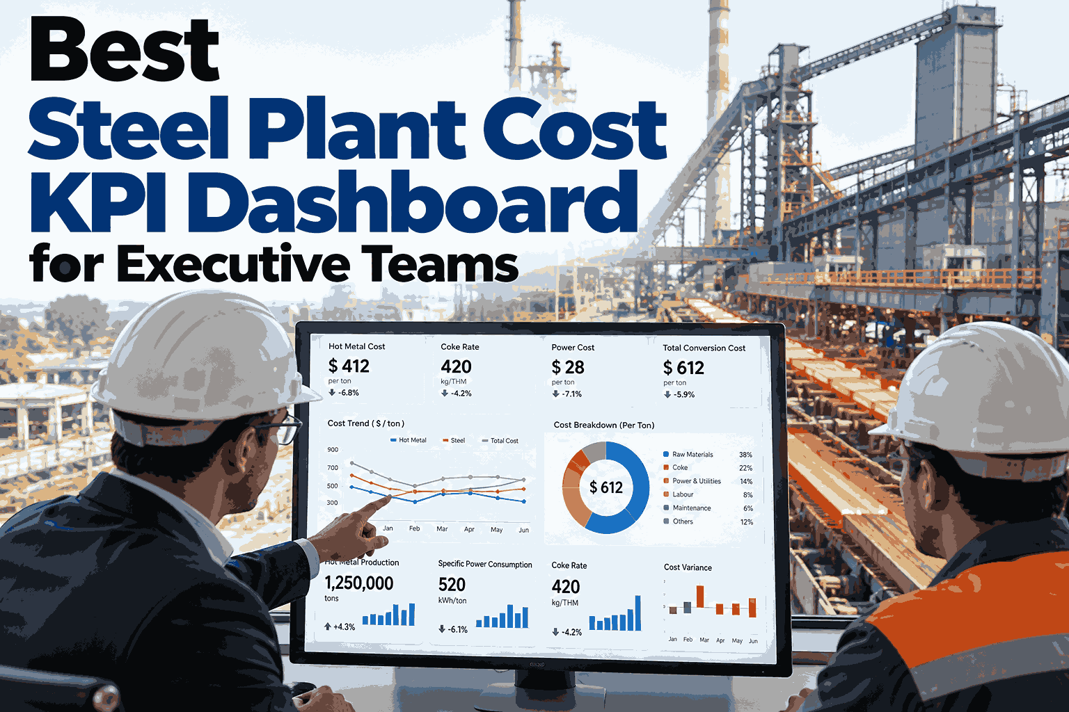
Executive teams do not lack cost data. They lack one trusted number they can read in thirty seconds and act on before the month closes. In most steel plants, cost per tonne arrives as a long pack, assembled by hand, argued over in the meeting and out of date by the time a decision is made. A good cost KPI dashboard replaces that pack with a single scorecard that shows where cost stands, how far it is from target and which driver is responsible. Leadership teams that want to see what that looks like on their own numbers can ask iFactory AI's team to sketch a scorecard for their plant.
One Screen for Cost Per Tonne, Variance and the Driver Behind It
iFactory AI builds a live leadership scorecard from plant data, so executives read the same trusted number the shop floor is working to.
Anatomy of the Scorecard
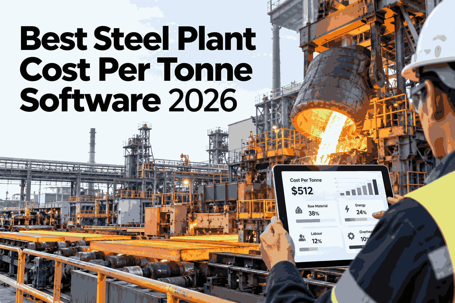
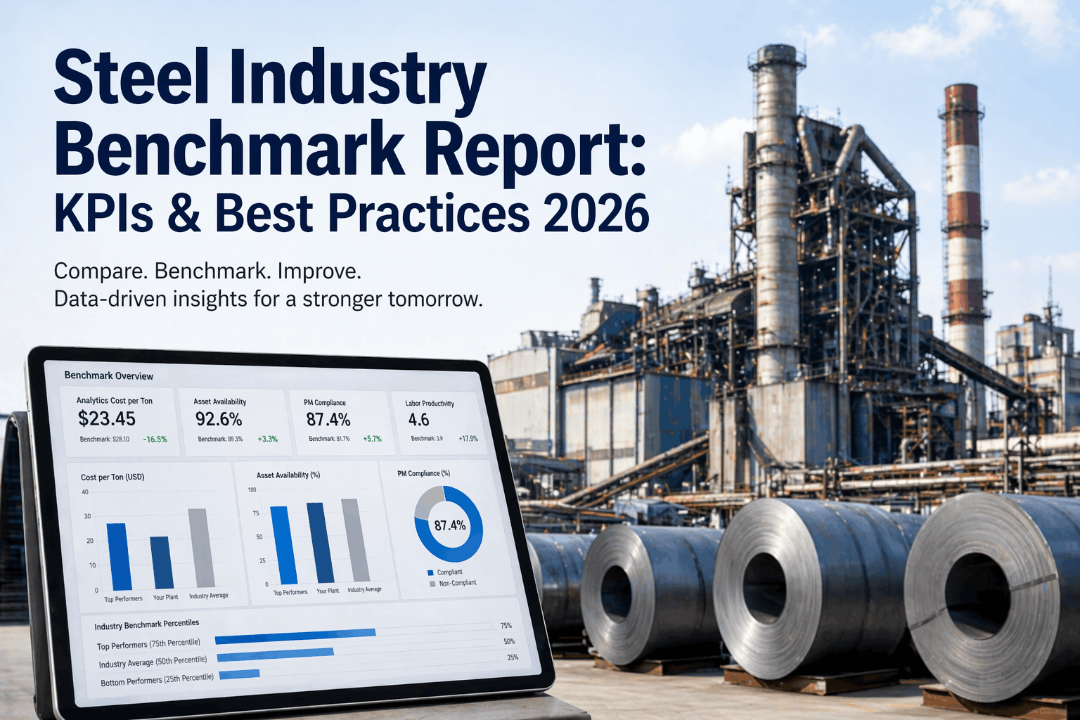
A leadership scorecard works when it is built in zones: a headline, a ranking of causes and a trend. The mock-up below uses illustrative values, with cost indexed to a target of 100.
Three Levels, One Number
The scorecard should not look the same for everyone. Each level sees the same cost figure, cut at the depth where they can act on it.
See Your Own Plant on One Leadership Screen
Book a 30-minute session and iFactory AI will show a live scorecard built from your cost, yield and consumption data.
The KPIs That Earn a Place
A scorecard with forty measures is a report, not a scorecard. These seven cover most of what an executive team needs to steer cost.
| KPI | What It Shows | Why It Matters | Refresh |
|---|---|---|---|
| Cost per tonne | Total cost over tonnes produced | The headline every other number explains | Per heat or shift |
| Variance to target | Gap against budget or plan | Shows urgency and direction | Per shift |
| Driver contribution | Share of the gap by cause | Points attention at the right bucket | Per shift |
| Yield | Saleable output from input metal | Lost yield is lost tonnes and cost | Per heat |
| Energy per tonne | Power and fuel used per tonne | A large and controllable cost line | Hourly |
| Conversion cost | Cost to process, excluding raw material | Reveals efficiency and maintenance effects | Daily |
| Margin per tonne | Selling price less cost per tonne | Links cost to business outcome | Daily |
From Target to Actual: The Driver Waterfall
Variance is easier to act on when it is split into its parts. The waterfall below starts at target and shows how each driver moved the total. Values are illustrative and the axis starts at 90.
100
+3
+2
+2
-1
106
A Review Rhythm Around the Scorecard
A scorecard only changes results when it drives a routine. Each rhythm asks a different question.
Questions the Scorecard Should Answer in Seconds
The test of a good dashboard is whether it removes the follow-up meeting.
A Composite Scenario: The Meeting That Stopped Reconciling
A leadership team spent most of its monthly cost review agreeing which figures were right. The bars show how the meeting time was split, with illustrative figures.
Where iFactory AI Fits
The data behind a good scorecard is scattered across ERP, MES and plant systems. iFactory AI joins it and keeps it current.
Live Cost Build
Cost per tonne is rebuilt as heats close, with no manual month-end assembly.
Ranked Drivers
Variance is split by cause, so the largest contributor is always at the top.
Role-Based Views
Executives, department heads and shift leads each see the depth they need.
Action Tracking
Every off-target driver carries an owner and a due date visible to leadership.
Frequently Asked Questions
How many KPIs should an executive scorecard carry?
Fewer than most plants expect. Five to eight measures on the first screen is usually enough, with everything else one click deeper. Too many measures dilute attention, and leaders start reading the ones they already like. The first screen should always hold cost per tonne, variance to target, driver contribution and margin. Support can share a starter KPI set that plants adapt to their route.
How do we agree what target to measure against?
Start from the approved budget and split it by product group and unit so each figure has a fair comparison. Many plants also keep a stretch target and last year's actual as reference lines. The important point is that everyone reads the same target. Once the scorecard is live, gaps in the target itself become obvious and can be corrected in the monthly review.
Can the dashboard show cost by shift and by unit?
Yes. Cost is tied to heats, and heats are tied to units, shifts and grades, so the same figure can be cut any of those ways. That is what turns a headline variance into an action, because a team can act on furnace 2 night shift but not on the plant average. See a shift-level drill-down in a short walkthrough using your own structure.
Will this replace our finance cost report?
No. Finance still owns the audited monthly close, and the scorecard works alongside it. The scorecard gives leadership a live operational view between closes, built from the same cost centers and rules so the two reconcile. Finance teams usually benefit too, since fewer hours go into assembling the pack and more into explaining the real movements.
How long before leadership sees a working scorecard?
Full turnkey delivery takes six to twelve weeks, but useful views usually appear earlier as data sources are connected and mapped. A first version with cost per tonne and variance can be shown while the deeper driver rules are still being calibrated. Ask the support team for a rollout plan matched to your systems and shifts.
Give Your Leadership Team One Number They Can Trust
iFactory AI turns plant data into a live scorecard that shows cost, variance and cause on one screen. Book a walkthrough to see it on your own data.