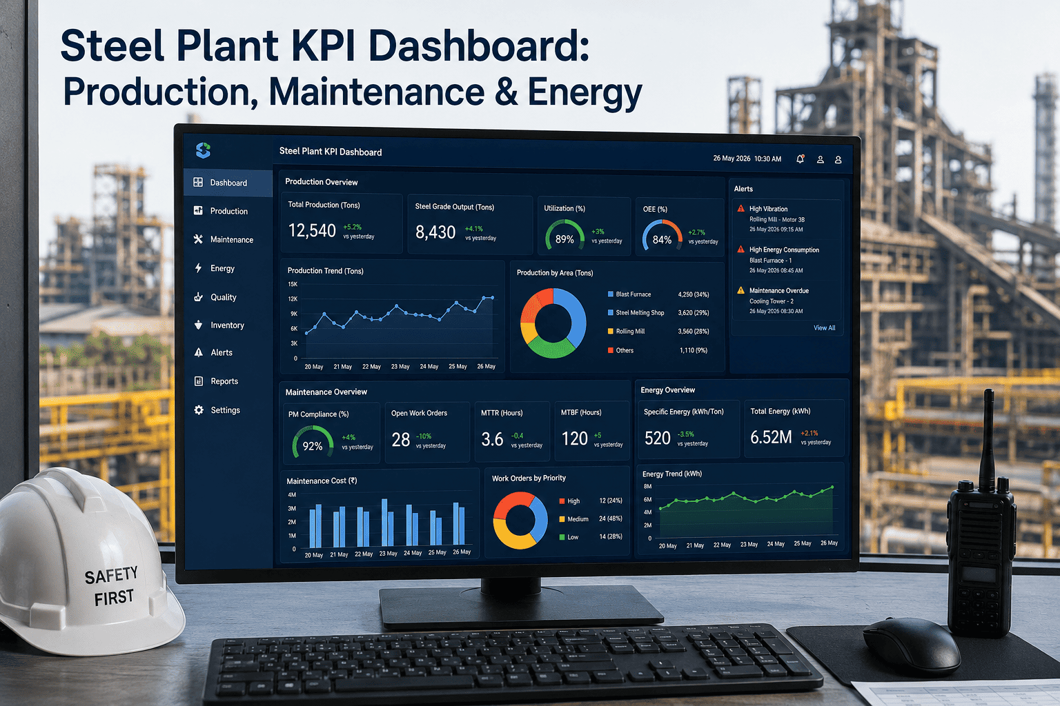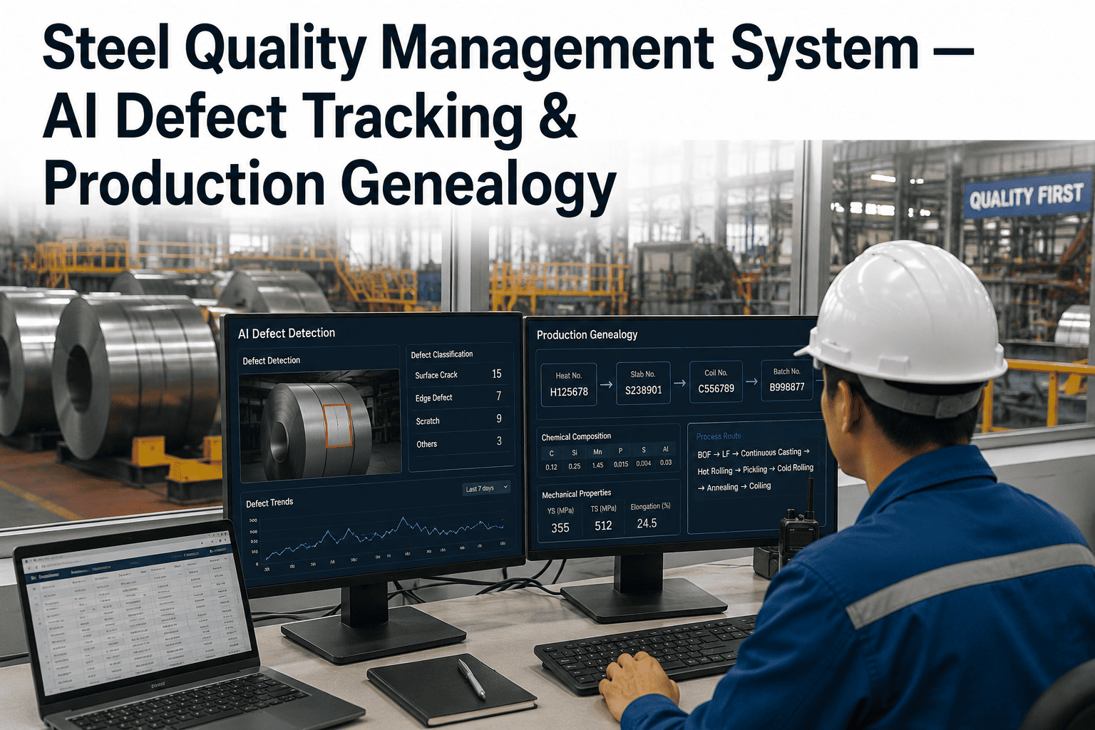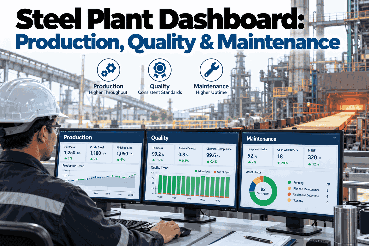
A plant manager walking into a Monday morning review typically pulls from three separate reports — a production summary, a quality report, and a maintenance status update — each compiled by a different team, on a different schedule, often showing numbers as of different points in time. Getting a single, trustworthy picture of how the plant actually performed last week means manually reconciling all three, a task that eats into the time that should be spent deciding what to do about what the numbers show. Steel producers ready to stop reconciling and start deciding can Book a Demo to see how a unified dashboard brings production, quality, and maintenance into one live view.
Why Three Separate Reports Never Add Up to One Clear Picture
Production, quality, and maintenance reports are each internally consistent and individually useful, but stacking three separately compiled documents next to each other rarely produces the coherent operational picture plant leadership actually needs to make good decisions. Each report is compiled on its own schedule, often by staff working from their own department's system with its own definition of what counts as a shift, a batch, or an incident, and reconciling these differences into a single narrative requires someone to manually cross-reference numbers that were never designed to line up automatically. By the time that reconciliation happens, often during the review meeting itself, the plant has already moved a day or more past whatever the reports actually describe.
What a Unified Dashboard Actually Combines
A genuinely unified steel plant dashboard does more than display three separate charts side by side on the same screen — it structures production, quality, and maintenance data around shared dimensions like equipment, shift, and time period so the numbers can be compared and correlated directly rather than requiring a viewer to mentally cross-reference three disconnected panels. This structural difference is what separates a true unified dashboard from a simple aggregation of existing departmental reports repackaged into a single document.
Production Metrics
Output volume, throughput rate, and schedule adherence tracked by line and shift, giving a real-time view of whether the plant is meeting its production targets across every active line.
Quality Metrics
Defect rates, inspection results, and rework volume tracked by product and line, correlated against the same equipment and shift dimensions used in production and maintenance panels.
Maintenance Metrics
Equipment condition, open work orders, and planned versus reactive maintenance ratio tracked against the same equipment identifiers referenced in production and quality data.
Real-Time KPIs: What Changes When Data Stops Being Stale
The value of a unified dashboard compounds significantly once the underlying data moves from a periodic batch update to a genuinely real-time or near-real-time feed, since the entire premise of using a dashboard to guide same-day operational decisions depends on the numbers reflecting what is actually happening on the floor right now rather than what happened yesterday or last week. A production supervisor checking a dashboard mid-shift needs current throughput and quality numbers to decide whether an intervention is warranted before the shift ends, not a summary that will only be accurate once the shift is already over and the opportunity to act on it has passed.
Real-time data also changes how maintenance and quality issues get caught and escalated. A dashboard showing a quality defect rate climbing on a specific line, correlated in the same view against that line's equipment condition status, lets a supervisor connect the two signals immediately rather than discovering the correlation days later when separate reports finally get compared. This immediacy is precisely what separates a dashboard that genuinely changes day-to-day operational behavior from one that simply provides a nicer-looking version of the same delayed information the plant was already working with under the old reporting process.
Trend Visualization: Seeing the Story Behind the Numbers
A single point-in-time number rarely tells the full story a plant manager needs to make a good decision, and trend visualization — showing how a metric has moved over the past days, weeks, or months rather than just its current value — reveals whether a number represents a genuine emerging problem, a normal fluctuation, or an improvement already underway that a single snapshot would miss entirely. A defect rate that looks concerning in isolation might actually represent a meaningful improvement compared to where it stood a month earlier, and without the trend context, a viewer has no way to distinguish that improving trajectory from a static, unchanging problem.
| View Type | Single Snapshot | Trend Visualization |
|---|---|---|
| Distinguishing normal variation from a real problem | Difficult — no historical context | Clear — deviation from established pattern is visible |
| Recognizing gradual improvement or degradation | Not possible from a single number | Directly visible as the trend line moves |
| Correlating events across production, quality, and maintenance | Requires manual cross-referencing | Aligned time axes make correlation visible at a glance |
| Supporting a confident go/no-go decision | Limited — lacks supporting context | Strong — trajectory informs the decision directly |
Drill-Down Analytics: From the Headline Number to the Root Cause
A dashboard's top-level KPIs answer the question of what is happening, but plant leadership also needs a fast path to why, and this is where drill-down capability separates a genuinely useful dashboard from one that simply displays numbers without supporting the investigation that inevitably follows an unusual reading. A plant-wide defect rate ticking upward should let a viewer click directly into that number and see which specific line, shift, or product is driving the change, then continue drilling into the specific equipment or process parameters correlated with that line's deviation, all without leaving the dashboard to open a separate system or request a special report from another department.
Plant-Wide KPI
The top-level dashboard view shows aggregate production, quality, and maintenance KPIs across the entire plant, giving leadership an immediate read on overall performance.
Line and Shift Breakdown
Drilling into a specific metric reveals performance broken down by production line and shift, isolating where a deviation from the plant-wide trend is actually occurring.
Equipment and Process Detail
Further drill-down surfaces the specific equipment condition and process parameters correlated with the isolated line or shift, connecting the headline number to a likely root cause.
Supporting Records
The most granular level links directly to the underlying work orders, inspection records, or process logs, giving investigators the primary source data behind the dashboard's summary view.
Designing Dashboards for Different Roles
A single dashboard configuration rarely serves every role in the plant equally well, since a plant manager reviewing overall performance trends needs a fundamentally different view than a production supervisor managing a specific shift or a maintenance planner prioritizing the week's work orders. Building role-specific views on top of the same underlying unified data — rather than maintaining separate, disconnected dashboards for each role — lets every user get the level of detail relevant to their decisions while still drawing from the same consistent, correlated data foundation that makes cross-departmental conversations possible when a plant manager and a maintenance planner need to discuss the same underlying issue.
Getting this role-based design right typically requires direct input from the people who will actually use each view daily, since a dashboard designed purely from a specification document tends to miss the specific, practical details that make a view genuinely fast to use during a busy shift versus merely comprehensive in theory. Plants that involve floor supervisors and maintenance planners directly in dashboard design, rather than treating it as a purely IT-led specification exercise, consistently produce views that see higher daily engagement than dashboards designed without that frontline input.
Rolling Out a Unified Dashboard Without Disrupting Existing Reporting
Transitioning from three separate departmental reports to a unified dashboard works best as a gradual process that runs the new dashboard alongside existing reporting for a defined validation period rather than an abrupt cutover that asks plant leadership to trust an entirely new system on day one. This parallel period lets stakeholders compare the unified dashboard's numbers against the reports they already trust, building confidence in the new system's accuracy while surfacing any data definition mismatches — different ways of counting a shift, a batch, or a defect — that need to be resolved before the dashboard becomes the sole source of truth for plant performance reviews.
Frequently Asked Questions: Steel Plant Dashboards
Does a unified dashboard require replacing the underlying production, quality, and maintenance systems?
No — a well-designed dashboard draws data from whatever underlying systems the plant already uses for production, quality, and maintenance tracking, connecting to each through its existing interface rather than requiring those source systems to be replaced. The dashboard functions as a unifying layer on top of existing infrastructure rather than a replacement for it, which significantly lowers the barrier to adoption compared to a full system replacement project. Plants can Book a Demo to see how the dashboard connects to a typical existing system landscape.
How is a unified dashboard different from simply exporting three reports into one shared document?
A genuine unified dashboard structures production, quality, and maintenance data around shared dimensions — the same equipment identifiers, the same shift definitions, the same time periods — so the data can be correlated and drilled into directly, whereas combining three separately compiled reports into one document still leaves the underlying numbers disconnected and requires the same manual cross-referencing the unified approach is meant to eliminate. The structural data alignment underneath the dashboard is what actually delivers the value, not simply the visual act of placing three panels on the same screen.
Can different departments have different levels of access to the same unified dashboard?
Yes — role-based access controls let a dashboard show the appropriate level of detail to each user, with production supervisors seeing operational detail relevant to their shift and lines, while plant leadership sees aggregated performance across the full facility, all drawing from the same underlying correlated data foundation. This access control is typically configured during the initial rollout and can be adjusted as organizational roles and reporting needs evolve over time.
What happens if production, quality, and maintenance teams define the same metric differently, such as what counts as a shift?
Reconciling these definitional differences is one of the most important steps in building a genuinely unified dashboard, and it typically happens during the data model alignment phase before the dashboard goes live, establishing a single agreed definition for shared concepts like shift boundaries, batch identifiers, and defect categories that all three data sources then reference consistently. Contact iFactory Support for guidance on resolving definitional mismatches across your existing production, quality, and maintenance systems.
How long does it typically take to design and deploy a unified dashboard for a mid-sized steel plant?
Most mid-sized plants complete an initial unified dashboard deployment within eight to twelve weeks, including data source connection, dimension alignment across production, quality, and maintenance data, and the parallel validation period against existing reports, though the timeline depends considerably on how much data model reconciliation work is needed between the underlying systems before the dashboard's correlations can be trusted. Plants with cleaner, already-standardized underlying data typically move through deployment faster than plants starting from significantly fragmented departmental reporting practices.