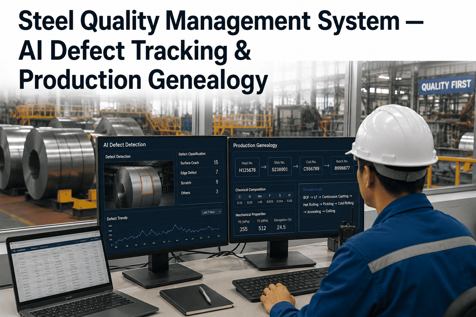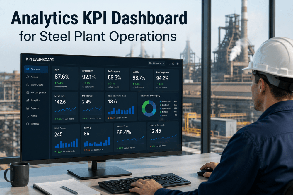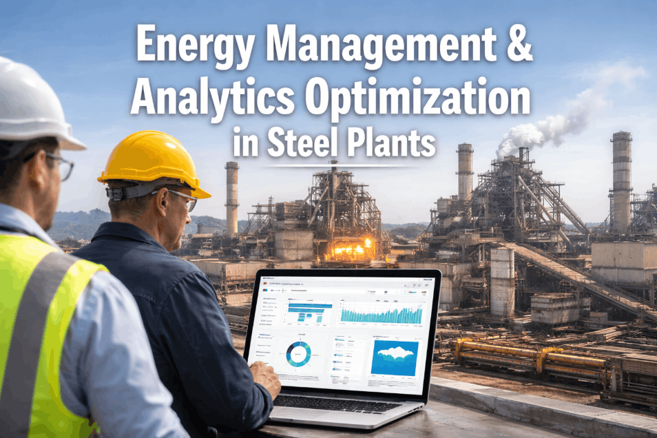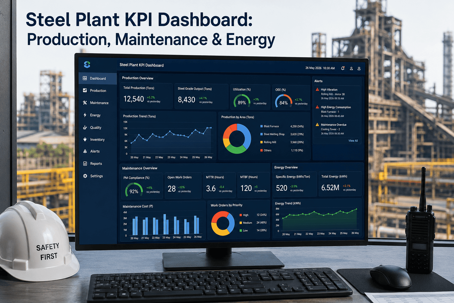
Most steel plants already collect the numbers that matter, production tons, maintenance hours, energy consumed per ton, they just collect them in five different systems that never talk to each other. A shift supervisor pulls one report, the maintenance planner pulls another, and by the time anyone compares them the shift is already over and the decision window has closed. The fix is not another spreadsheet, it is a role-based KPI dashboard that shows each person exactly the numbers they are accountable for, updated in near real time, without forcing them to reconcile five sources by hand. Plants that get this right start every shift meeting with facts on a screen instead of a debate about whose report is right, and the fastest way to see what that looks like on your own production data is to book a demo.
One Steel Plant, Three Different Dashboards, One Shared Set of Numbers
Production throughput, maintenance effectiveness, and energy intensity are three separate conversations in most steel plants today. iFactory unifies them into a single data layer, then presents each role the exact view they need to act on, without burying an operator in metrics meant for a plant manager.
The Cost of Dashboards That Do Not Talk to Each Other
A rolling mill can be hitting its tonnage target while its energy intensity per ton quietly climbs, and nobody notices until the monthly utility bill lands on a manager's desk. Similarly, a maintenance team can be closing work orders on schedule while the underlying mean time between failures on a critical furnace is steadily degrading, invisible in a system that only reports counts, not trends. These are not rare edge cases, they are the normal condition in a plant where production, maintenance, and energy data live in three separate systems maintained by three separate teams.
The practical cost shows up in slow decisions. When a plant manager has to request a report, wait for someone to compile it from multiple sources, and then interpret conflicting numbers before acting, a problem that could have been caught in an hour instead runs for a full shift or longer. Steel margins are thin enough that this kind of lag compounds fast, particularly on energy-intensive processes like reheating furnaces and rolling mills where even small intensity drifts translate into real cost.
Three Roles, Three Views, One Underlying Truth
The mistake most plants make when building a dashboard is designing one screen and pushing it to everyone. An operator does not need a monthly energy trend line, and a plant manager does not need a live tap temperature reading. A well-designed KPI system starts from the decision each role actually makes, then works backward to the exact metrics needed to make it, nothing more.
Production, Maintenance, and Energy Are Not Separate Dashboards, They Are One Story
Treating these three domains as independent reporting streams is exactly what causes the blind spots described earlier. A unified dashboard instead treats them as three lenses on the same operating reality, so a dip in throughput can be immediately checked against a maintenance event or an energy anomaly on the same timeline, instead of requiring someone to manually cross-reference three separate exports.
See Your Own Production, Maintenance, and Energy Data in One View
iFactory connects to the systems you already run and builds the role-based dashboard layer on top, without requiring a rip-and-replace of existing plant systems.
A Practical Build Sequence That Does Not Stall in Month Two
Dashboard projects tend to stall when a team tries to model every metric in the plant before showing anyone a working screen. A sequence that starts narrow and expands based on what people actually use, avoids the trap of building extensive reporting that nobody ever opens because it never matched a real decision in the first place.
What Changes Once the Three Pillars Are Actually Connected
The comparison below reflects the operational difference plants report after moving from siloed reporting to a connected KPI structure, not a hypothetical projection. None of it requires new production equipment, it comes from making existing data visible to the right person at the right moment.
| Decision Point | Siloed Reporting | Unified KPI Dashboard |
|---|---|---|
| Spotting a throughput dip | Noticed at end-of-shift report, cause unclear | Flagged live, cross-checked against maintenance and energy data instantly |
| Maintenance backlog review | Monthly manual export reviewed in a separate meeting | Visible continuously alongside its production impact |
| Energy intensity drift | Discovered on the monthly utility invoice | Tracked per shift against historical baseline |
| Cross-plant comparison | Manually compiled quarterly, often inconsistent | Standardized and available on demand |
The Measurable Difference of a Connected Dashboard Layer
These figures describe what changes in daily operating rhythm once production, maintenance, and energy data live in one connected system rather than three disconnected ones, based on how plants describe their own before-and-after experience.
Questions Plant Leaders Ask Before Building a KPI Dashboard
Turn Three Disconnected Reports Into One Trusted Dashboard
iFactory unifies production, maintenance, and energy data into role-based views your operators, supervisors, and plant managers will actually use every day.