Benchmarking Textile Defect Rates Against Industry Standards
By James Smith on August 6, 2026
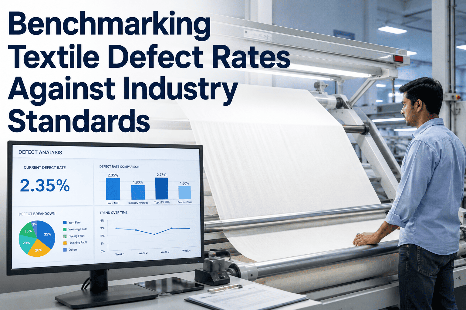
A mill reporting "12 points per 100 yards" and a mill reporting "340 defects per million meters" could be describing fabric of nearly identical quality, or fabric that differs by a factor of three — and neither number means anything in isolation without knowing which metric convention applies, which fabric segment the benchmark comes from, and how that segment's standards have shifted over the past several years. Textile defect rate benchmarking is complicated by exactly this kind of metric fragmentation: three commonly used measurement systems, each valid within its own context, none directly interchangeable without a defined conversion, and industry benchmark figures that vary dramatically by fabric type, end use, and customer tier. Comparing your mill's defect rate to "the industry standard" without controlling for all of these variables produces a comparison that is worse than useless — it actively misleads. Book a session with the iFactory textile quality benchmarking team to get a defect rate comparison that actually reflects your specific fabric segment and customer tier.
Fabric Rejection · Defect Rate Benchmarking
Benchmarking Textile Defect Rates: Points, DPM, and Rejection Percentage Against Real Industry Standards
Three measurement systems, segment-specific benchmarks, and the conversion logic that lets you compare your mill's actual performance against a standard that means something — not a generic industry figure stripped of context.
Points, DPM, and Rejection Percentage — What Each Actually Measures
The confusion around textile defect rate benchmarking begins with the fact that three fundamentally different measurement philosophies coexist across the industry, each dominant in different regions, customer relationships, and fabric segments. None is objectively superior — each answers a slightly different question about fabric quality.
Points per 100 Square Yards
Four Point System — ASTM D5430
Assigns 1 to 4 points per defect based on defect length (with a maximum of 4 points regardless of severity beyond 9 inches), summed and normalized to a 100 square yard basis. Dominant in North American apparel and home textile trade. Answers: "How many quality-weighted defects does a standard-size roll contain?"
Defects per Million Metres (DPM)
Common in Asian and European mills
A simple count-based metric — total defects (regardless of severity weighting, or with a separate severity classification applied) divided by total fabric length produced, scaled to a per-million-metre basis. Answers: "Across our total production volume, how frequently does a defect occur?" Widely used for process capability tracking rather than individual roll grading.
Rejection Percentage
Roll or lot-level pass/fail rate
The percentage of produced rolls or lots that fail to meet first-quality acceptance criteria and are downgraded to second-quality, seconds, or scrap. Answers the commercial question directly: "What fraction of what we make can we sell at full price?" The metric most directly tied to revenue impact, but the least granular for process improvement purposes.
Metric Conversion
How the Three Metrics Relate — and Why Direct Conversion Is Approximate, Not Exact
A precise mathematical conversion between points/100 yards, DPM, and rejection percentage does not exist, because each metric weights defect severity, defect frequency, and lot-level aggregation differently. However, empirical relationships derived from large-scale industry data provide useful approximate conversion ranges for benchmarking purposes — sufficient to translate a competitor or customer benchmark stated in one system into a comparable figure in another.
Points per 100 sq yd
Approx. DPM Equivalent
Approx. Rejection %
Quality Tier
≤15
120–180
<1.5%
Premium / Critical Application
16–25
180–280
1.5–3%
First Quality — Strong Standard
26–40
280–450
3–6%
First Quality — Acceptable Standard
41–60
450–650
6–10%
Marginal — Second Quality Risk
>60
>650
>10%
Below Standard — Systemic Issue
These conversion ranges are empirically derived approximations, not fixed formulas — the actual relationship varies by defect type distribution (a fabric with many small defects converts differently than one with fewer large defects) and by the specific severity weighting each mill or customer applies within their point system.
Segment-Specific Benchmarks
Industry Benchmark Ranges by Fabric Segment — Why "The Industry Standard" Is Segment-Dependent
The single biggest error in textile defect rate benchmarking is comparing a mill's performance against a generic cross-industry average rather than the benchmark specific to its fabric segment and customer tier. A technical textile mill and a fast-fashion apparel mill operate under structurally different quality economics, and their appropriate benchmarks differ accordingly.
Fabric Segment
Typical Industry Range
Strong Performance
Leading Benchmark
Primary Cost Driver
Fast-fashion apparel
35–55 pts/100yd
20–30 pts/100yd
<18 pts/100yd
High mix, fast cycles limit process stabilization time
Premium / branded apparel
20–35 pts/100yd
12–20 pts/100yd
<10 pts/100yd
Customer visual inspection tolerance is very low
Home textiles (sheeting, upholstery)
25–45 pts/100yd
15–25 pts/100yd
<12 pts/100yd
Large surface area amplifies visibility of shade/pattern defects
Denim
30–50 pts/100yd
18–28 pts/100yd
<15 pts/100yd
Heavy fabric construction masks some defects but amplifies others (slubs, bars)
OEM audit standards and long product life require exceptional consistency
Leading benchmark figures represent the performance level demonstrated by top-decile mills in each segment using modern quality systems — including AI vision inspection — rather than a theoretical ideal. These are achieved, documented figures, not aspirational estimates.
Get a Benchmark That Actually Applies to Your Fabric
iFactory Compares Your Defect Rate Against the Correct Segment and Customer Tier — Not a Generic Average
Most mills have never seen a defect rate benchmark controlled for their specific fabric type, construction, and customer tier. iFactory's benchmarking assessment normalizes your current performance across all three measurement systems and compares it against the segment-specific standard that actually applies to your production.
Why Yesterday's Acceptable Defect Rate May Not Satisfy Today's Customer
Textile quality benchmarks are not static — they have tightened measurably over the past decade, driven by three converging forces: brand-level quality consciousness increasing as consumers gained more visibility into product quality through e-commerce reviews, AI-driven inspection technology making tighter tolerances economically achievable at scale (removing the historical excuse that tighter standards were prohibitively expensive to enforce), and increasing global competition among mills making quality a primary differentiator where price competition has compressed margins. A mill benchmarking against a five-year-old standard is very likely benchmarking against a bar that has since moved.
2016–2018
Typical premium apparel first-quality threshold around 30–35 points/100 sq yd was commercially acceptable across most customer relationships
2019–2022
Threshold tightened to 22–28 points as brand quality audits intensified and e-commerce return-rate visibility pressured retailers to push tighter mill standards
2023–2026
Leading premium apparel customers now expect 12–18 points as standard, with AI vision inspection making this economically achievable without proportional cost increase — mills still operating at legacy 25–30 point performance face growing competitive and customer-retention risk
Gap Diagnostic
Interpreting Your Position — What a Gap to Benchmark Actually Means
Once your defect rate is correctly positioned against the appropriate segment benchmark, the size and nature of any gap should drive a specific response rather than a general "try harder" directive. The framework below connects gap magnitude to a proportionate improvement approach.
Within 15% of Leading Benchmark
Focus on targeted continuous improvement — identify the top two or three defect categories driving the residual gap and address them individually rather than pursuing a broad quality initiative. AI vision inspection at this stage typically shifts from detection to fine-grained root cause correlation.
15–40% Above Leading Benchmark
Indicates specific systemic issues — likely concentrated in one or two process stages or defect categories rather than distributed evenly. A structured root cause investigation across the defect Pareto, supported by correlation analysis against process parameters, typically identifies the concentrated cause.
40%+ Above Leading Benchmark
Suggests foundational quality system gaps — inconsistent inspection standards, inadequate process control instrumentation, or a defect classification catalog that has never been formalized. Addressing this scale of gap typically requires quality system infrastructure investment before process-specific improvements will show sustained results.
Benchmarking KPIs
Six Metrics for Managing an Ongoing Defect Rate Benchmarking Programme
Segment-Adjusted Defect Rate
Trend: converging to leading benchmark
Your current defect rate expressed in the metric system matching your primary customer relationships, tracked against the correct segment benchmark rather than a generic industry average.
Multi-Metric Consistency
Target: within expected conversion range
Whether your points/100yd, DPM, and rejection percentage figures fall within the expected empirical conversion relationship. A significant deviation indicates either a measurement methodology inconsistency or a genuine shift in defect severity distribution worth investigating.
Benchmark Recency
Target: updated annually
How recently your comparison benchmark was validated against current industry data. Given documented benchmark drift, a comparison figure more than 18 to 24 months old risks measuring your performance against a standard that has already moved.
Customer Tier Alignment
Target: 100% mapped
Percentage of your customer relationships with an explicitly documented, tier-appropriate defect rate expectation rather than a single blanket internal quality target applied uniformly regardless of customer requirements.
Gap Closure Rate
Trend: decreasing gap
Rate of improvement toward the leading benchmark over successive quarters. Should show measurable, sustained progress if the diagnostic-driven improvement approach is being applied — a stalled gap closure rate indicates the current improvement initiatives are not addressing the actual root cause concentration.
Second Quality Value Loss
Trend: decreasing
Revenue difference between first-quality and second-quality/downgraded pricing, multiplied by rejection volume. The direct financial translation of the rejection percentage metric — the number that ultimately justifies benchmarking programme investment to finance leadership.
Benchmarking Practitioner Perspective
“
The question I hear most often from mill quality directors is some version of "are we good or bad?" — and the honest answer is that the question cannot be answered without first establishing which fabric segment, which customer tier, and which measurement system applies. I have seen mills celebrate a defect rate that was genuinely excellent for a fast-fashion commodity fabric but would have been considered a serious quality failure for a premium branded product, simply because nobody had connected the number to the right comparison group. I have also seen the reverse — quality teams demoralized by comparing their perfectly respectable performance against a benchmark figure lifted from a completely different fabric category with fundamentally different tolerance requirements. Getting the comparison right is not a pedantic exercise. It changes what the organization believes about its own performance, which changes whether leadership invests in further improvement or concludes the current state is acceptable. The single highest-value thing a benchmarking exercise can do is simply establish the correct comparison group before anyone draws a conclusion from the number.
Camila Vasconcelos-Whitfield
Textile Quality Benchmarking Analyst · 20 years in global textile quality systems across apparel, home textile, and technical textile manufacturing · Former Director of Quality Benchmarking, international textile sourcing organization · Contributor to multiple cross-industry textile quality benchmarking studies
Which defect rate metric should our mill adopt as our primary internal standard if we currently don't use any of the three consistently?
The correct primary metric depends most heavily on your dominant customer base and region rather than any inherent superiority of one system over another. Mills primarily serving North American apparel and home textile customers should adopt the Four Point System (points per 100 square yards) as their primary standard, since this is the metric their customers will use in acceptance testing and dispute resolution. Mills primarily serving Asian or European customers, or operating with a strong process-capability improvement focus, often find DPM more useful because it aggregates cleanly across production volume without the lot-size normalization the point system requires. Rejection percentage should be tracked regardless of which detailed metric is primary, because it is the metric most directly comprehensible to commercial and finance stakeholders. Most mature quality organizations ultimately track all three, using the point system or DPM for process-level analysis and rejection percentage for executive and customer-facing reporting. For guidance on which primary metric fits your specific customer portfolio, book a session with the iFactory textile quality team.
How reliable are published industry benchmark figures, and where do they actually come from?
Published industry benchmark figures vary considerably in reliability depending on their source. Figures published by standards bodies (ASTM, ISO working groups) and major industry trade associations tend to be derived from large, methodologically consistent datasets and are generally reliable as directional references, though they are often published with a multi-year lag behind current market conditions given the benchmark drift discussed above. Figures cited in vendor marketing materials, individual consultant presentations, or informal industry conversation should be treated with more caution, since sample sizes, measurement methodology, and segment definition are frequently unstated or inconsistent. The most reliable benchmark for your specific situation is typically built from your own customer relationships — the defect rate thresholds specified in your actual customer quality agreements represent a genuinely applicable, currently valid standard, since customers set these thresholds based on their own competitive and quality requirements. Supplementing customer-specific thresholds with broader segment benchmark data provides useful context for understanding your competitive position beyond your existing customer base.
Does moving from manual inspection to AI vision inspection change how our defect rate should be measured or benchmarked?
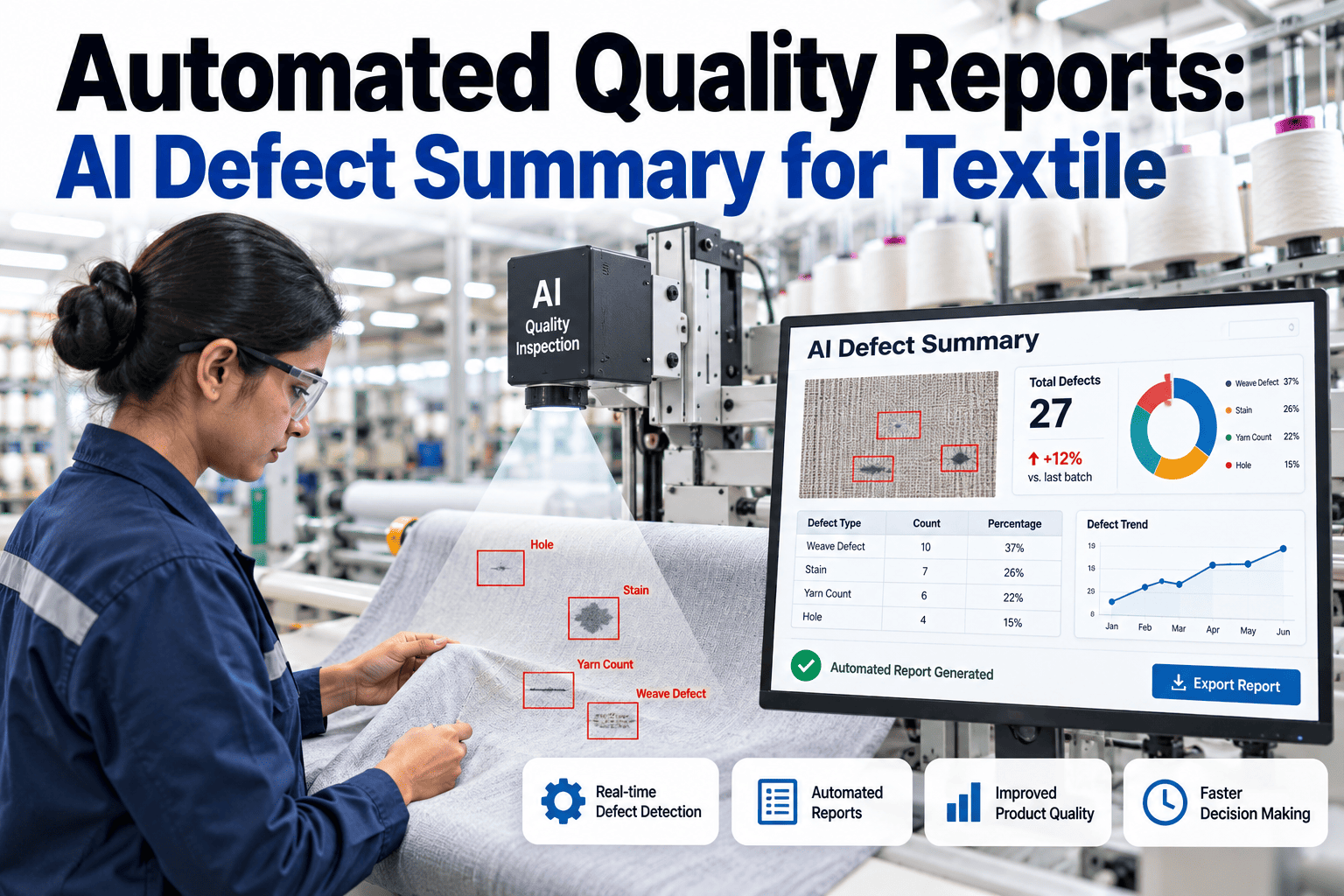
AI vision inspection typically reveals a defect rate that is measurably higher than what manual inspection previously reported for the identical fabric — not because AI inspection makes the fabric worse, but because it detects a higher percentage of actual defects present, including subtle defects that human inspectors miss due to fatigue, inconsistent attention, or simple visual limitation at production line speeds. This creates an important benchmarking consideration during transition: comparing a post-AI-inspection defect rate against a pre-AI-inspection historical baseline, or against another mill's manually inspected figure, is not a like-for-like comparison. The correct approach during and after a transition to AI inspection is to establish a new baseline under the AI system before evaluating improvement trends, and when benchmarking against external figures, to confirm whether those figures reflect manual or AI-assisted inspection methodology. Over time, as AI vision inspection becomes the industry standard rather than the exception, this discrepancy will diminish, but during the current transition period it remains a meaningful factor in accurate benchmark comparison. Contact our support team to discuss baseline recalibration methodology for your inspection transition.
How often should we re-benchmark our defect rate against industry standards, given that benchmarks drift over time?
A formal re-benchmarking exercise — reviewing current segment-specific industry data and comparing your performance against updated figures — should occur at minimum annually, with a more frequent quarterly internal review of your trend against your own historical performance and any documented customer standard changes. The annual cadence aligns reasonably well with the pace at which meaningful industry-wide benchmark shifts tend to occur; more frequent formal re-benchmarking against external data rarely reveals significant movement, while less frequent re-benchmarking risks the multi-year drift illustrated in the benchmark timeline above, where a mill can fall meaningfully behind current expectations without any single review point flagging it clearly. Beyond the calendar-based cadence, any significant change in your customer portfolio — onboarding a new premium customer, or a shift in a major existing customer's own quality requirements — should trigger an immediate benchmark review specific to that relationship rather than waiting for the next scheduled cycle.
Our defect rate looks reasonable on paper but we still receive frequent customer quality complaints — what could explain this discrepancy?
This pattern typically indicates a mismatch between what your internal metric is measuring and what your customer actually experiences, and several specific causes are worth investigating in sequence. First, check whether your defect classification catalog's severity weighting matches your customer's actual sensitivity — a defect category that scores low points in your internal system may be exactly the type of flaw that specific customer's end product is most sensitive to, meaning your aggregate point score understates the commercial risk. Second, confirm your sampling methodology genuinely reflects full production rather than a biased subset — inspection sampling that inadvertently favors easier-to-inspect fabric sections or specific shifts can produce a defect rate that looks better than what customers actually receive across full production. Third, investigate whether defects are concentrated in specific lots or time periods that get diluted in an aggregate monthly or quarterly figure — a mill with an excellent average defect rate but several severely defective outlier lots will generate customer complaints disproportionate to what the average suggests, since the customer experiences individual lots, not your rolling average. Book a diagnostic session to review your specific metric-to-complaint discrepancy pattern.
Know Your Actual Position — Not a Guess Against a Generic Average
Get a Defect Rate Benchmark Controlled for Your Fabric Segment, Customer Tier, and Inspection Methodology
iFactory's textile quality benchmarking assessment normalizes your current defect performance across points/100yd, DPM, and rejection percentage, compares it against the correct segment-specific standard, and produces a diagnostic-driven improvement roadmap sized to the actual magnitude of your gap.