Most textile executives still start their week with seven different reports from seven different systems, none of which were built to talk to each other, and by the time they're compiled the numbers are already a few days stale. Meanwhile 89% of manufacturing executives say they plan to bring AI into their operations, and 69% have already started, precisely because the cost of a delayed decision compounds fast across multiple plants, shifts, and product lines. An executive dashboard that unifies production, quality, energy, maintenance, and ESG into one live view changes what a Monday morning actually looks like. Book a demo to see your own operation on one screen.
Executive Analytics · AI Insights
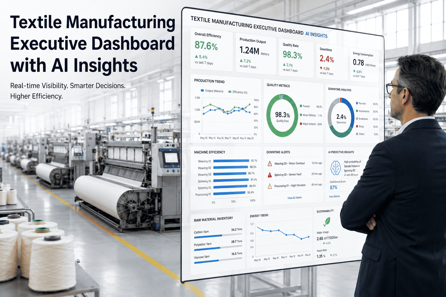
One Screen. Every Plant. No Stale Numbers.
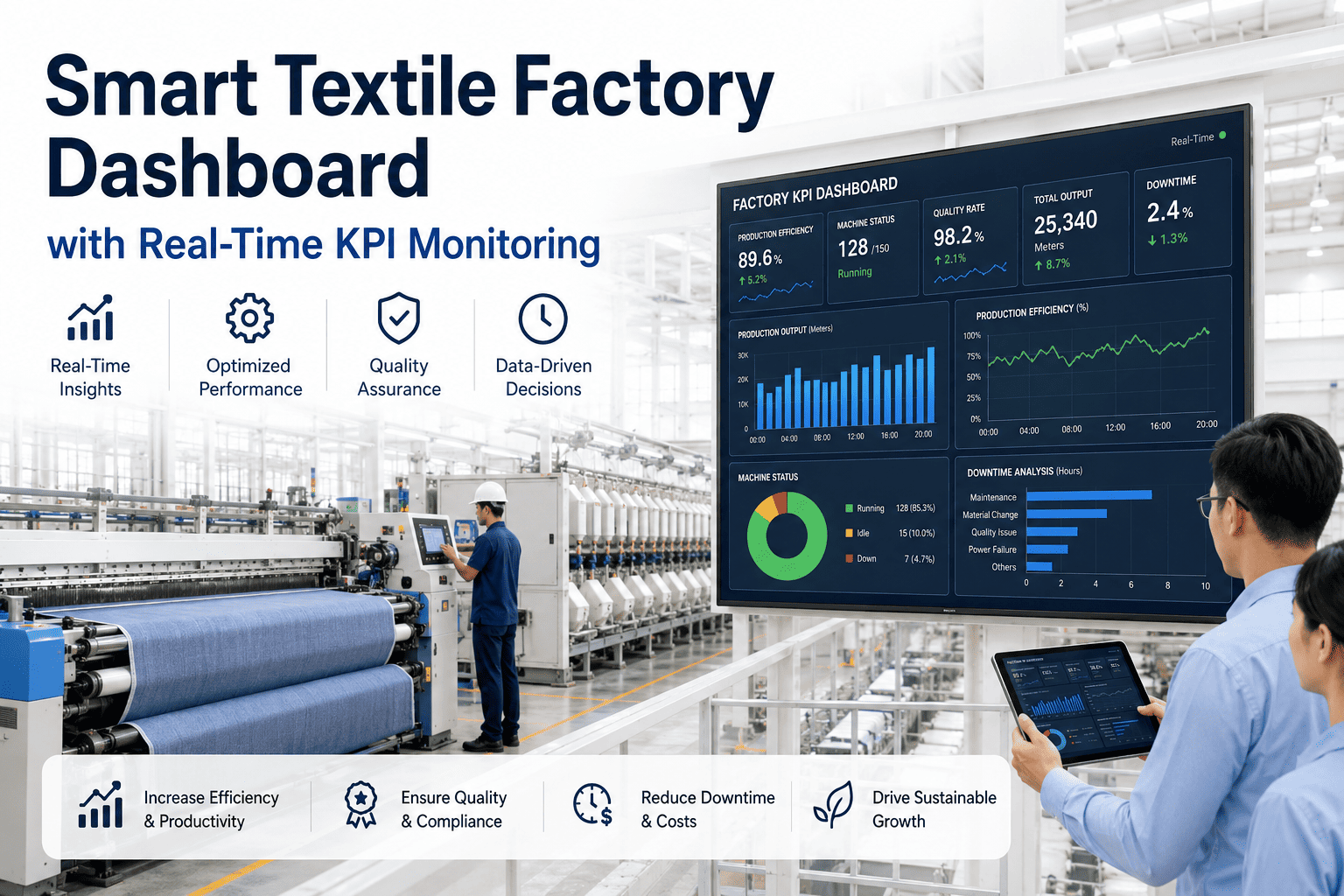
A single live dashboard across production, OEE, quality, energy, maintenance, ESG, and risk, with AI-generated insights that explain what changed and why before you have to ask.
Seven Views, One Pane of Glass
Executives don't need more dashboards — they need fewer, wider ones. Each tile below pulls from a different operational system but renders on a single screen, refreshed continuously.
Production
94.2%
Schedule attainment across all sites
OEE
71.8%
Blended group average, live
Quality
97.4%
First-pass yield this week
Energy
+6.1%
Consumption per unit vs. last month
Maintenance
12
Open critical work orders group-wide
ESG
-8.3%
Water intensity, year to date
Risk
3 Flags
Sites currently behind delivery commitments
What the AI Insight Feed Actually Looks Like
Instead of forcing an executive to interpret seven raw charts, the system writes out what changed, why it likely happened, and what needs attention, in plain operational language.
Production
Plant D fell 4.2 points below its weekly target, concentrated entirely on the second shift of the dyeing line. Root cause traces to two unplanned stops tied to a recurring valve fault.
Energy
Group energy intensity rose 6.1% this month, driven almost entirely by extended dye cycle times at Plant B rather than a broad efficiency decline.
Quality
First-pass yield improved to 97.4% following the shade-correction changes rolled out at Plant A two weeks ago — the same change has not yet been applied at Plant C.
Risk
Three sites are trending behind their delivery commitments for the current order book, with Plant D's valve fault the most likely driver if left unresolved for another week.
A dashboard that only shows numbers still requires someone to interpret them. One that explains the "why" turns a Monday review into a decision meeting instead of a data-reading exercise.
Before and After a Unified Executive View
The shift isn't just about having more data — it's about how quickly that data turns into a decision.
| Factor |
Siloed Reporting |
Unified AI Dashboard |
Impact |
| Data freshness |
Days old by the time it's reviewed |
Live, continuously refreshed |
Decisions made on current reality |
| Cross-site comparison |
Manually compiled in spreadsheets |
Standardized and automatic |
Hours saved every reporting cycle |
| Root cause visibility |
Requires follow-up calls to plants |
Surfaced directly in the insight feed |
Faster corrective action |
| ESG reporting |
Assembled separately at period-end |
Tracked continuously alongside operations |
Audit-ready at any time |
| Risk detection |
Found after delivery dates slip |
Flagged while there's time to react |
Fewer missed commitments |
Field Insight
The executives who get the most value out of a unified dashboard aren't the ones staring at more charts — they're the ones who stopped needing to. A well-built AI insight feed does the first pass of interpretation for you, so the executive's actual job becomes deciding what to do about a problem instead of first discovering that the problem exists.
VP of Operations, Multi-Site Textile Manufacturing Group
Frequently Asked Questions
How does the AI decide which insights are worth surfacing to an executive?
The system is tuned to prioritize deviations that are both statistically meaningful and operationally significant, rather than flagging every minor fluctuation in the data. It weighs factors like how far a metric has moved from its normal range, how many sites or shifts are affected, and whether the pattern is likely to compound if left unaddressed. This keeps the insight feed focused on the handful of things that actually deserve executive attention each week rather than burying them in noise.
Book a demo to see a live insight feed built from your own operational data.
Do we need to replace our existing plant-level systems to use this?
No. The executive dashboard is designed to sit above your existing production, quality, energy, and maintenance systems, pulling data from each rather than requiring you to standardize on a single vendor across every plant. This matters especially for groups that have grown through acquisition and inherited a mix of different systems at different sites, since replacing all of them simultaneously is rarely realistic.
Contact support to review integration options for your current systems.
How current is the data actually shown on the dashboard?
Most operational metrics, production counts, machine status, and quality checks refresh continuously throughout the shift, so the dashboard reflects what's happening on the floor within minutes rather than days. Some metrics, like certain ESG figures tied to utility billing cycles, naturally update on a slightly longer cadence because that's how the underlying source data arrives. The dashboard makes this distinction clear so nobody mistakes a monthly figure for a live one.
Book a demo to see refresh rates for each metric category.
Can different executives see different views depending on their role?
Yes. A group CEO typically wants the seven-tile summary view across all sites, while a regional operations director usually needs to drill into specific plants, shifts, or product lines within their remit. The same underlying data supports both views, so nobody has to reconcile numbers between a summary report and a detailed one because they were pulled from different systems.
Contact support to set up role-based views for your leadership team.
How long does it typically take to get a unified dashboard live across a multi-plant group?
A first working view covering two or three priority plants is usually achievable within three to four weeks, since it mainly involves connecting to existing data sources rather than building new infrastructure. Extending that to a full group, along with tuning the AI insight thresholds to your specific operation, typically takes six to ten weeks depending on how many distinct systems need to be connected. Most groups see clear value well before the full rollout is complete.
Book a demo for a rollout timeline specific to your group's size.
Stop Reviewing Last Week's Numbers on Monday
One live view across every plant, with AI insights that explain the "why" before you have to ask.