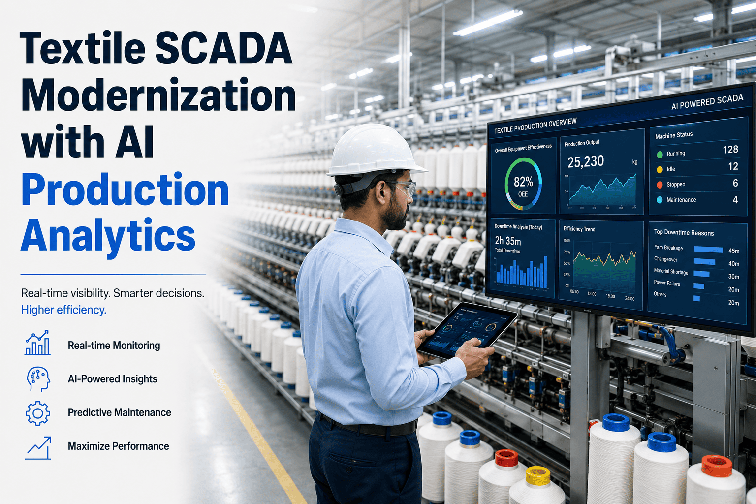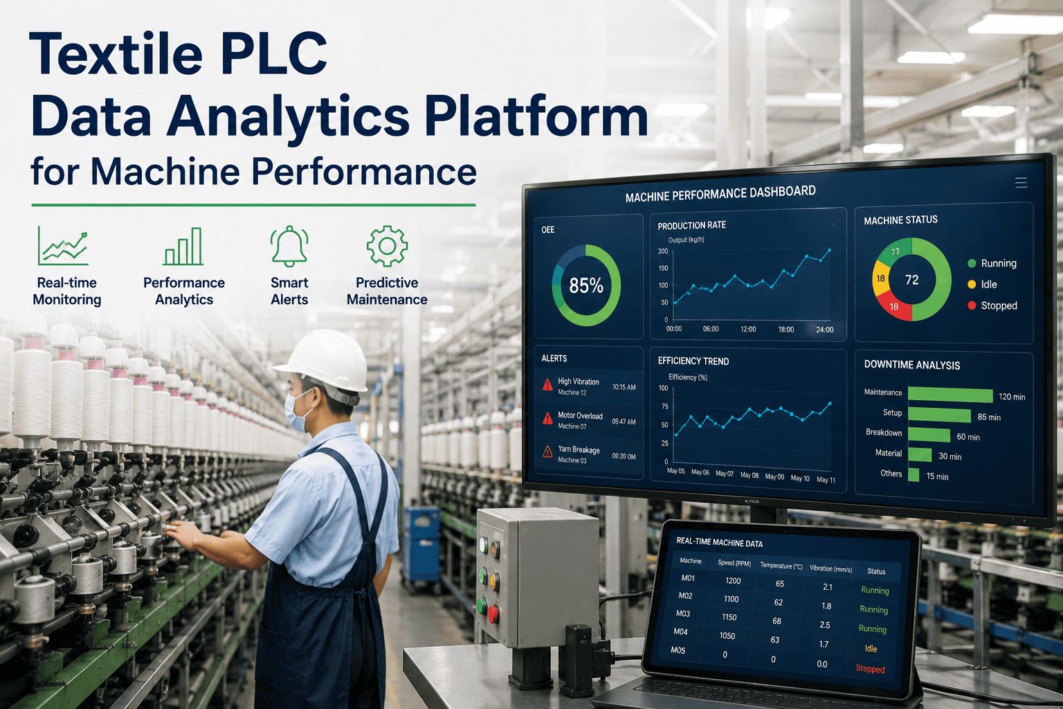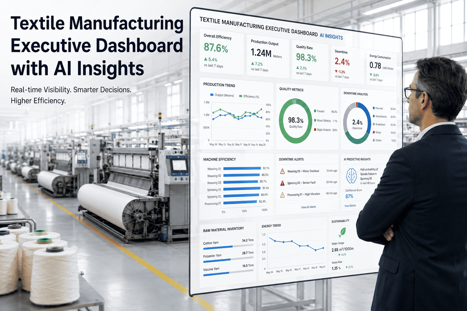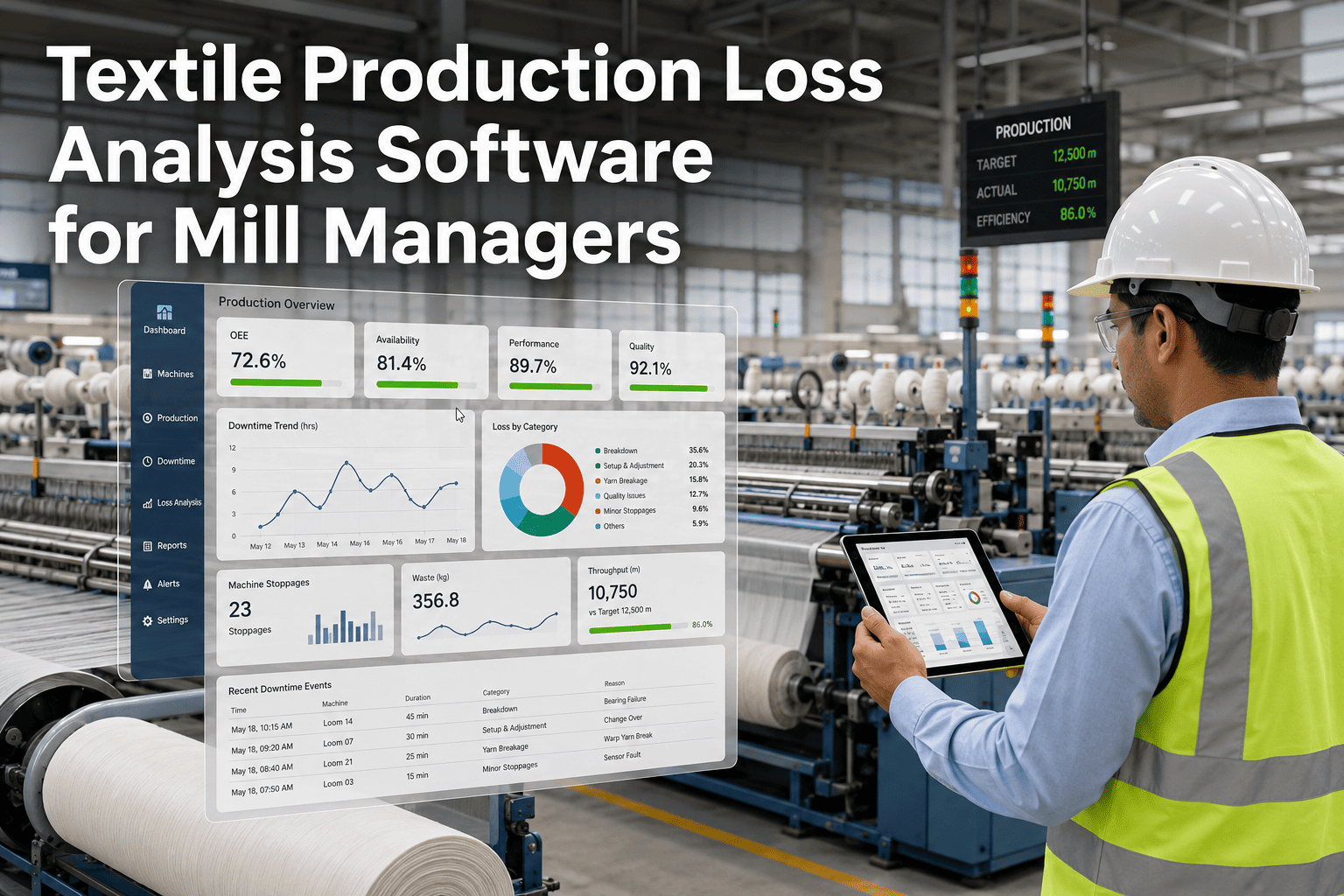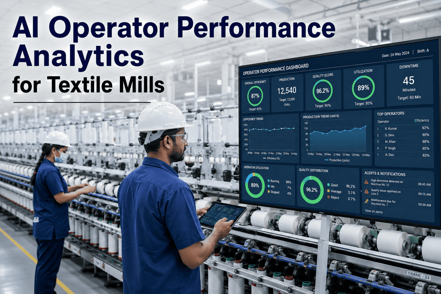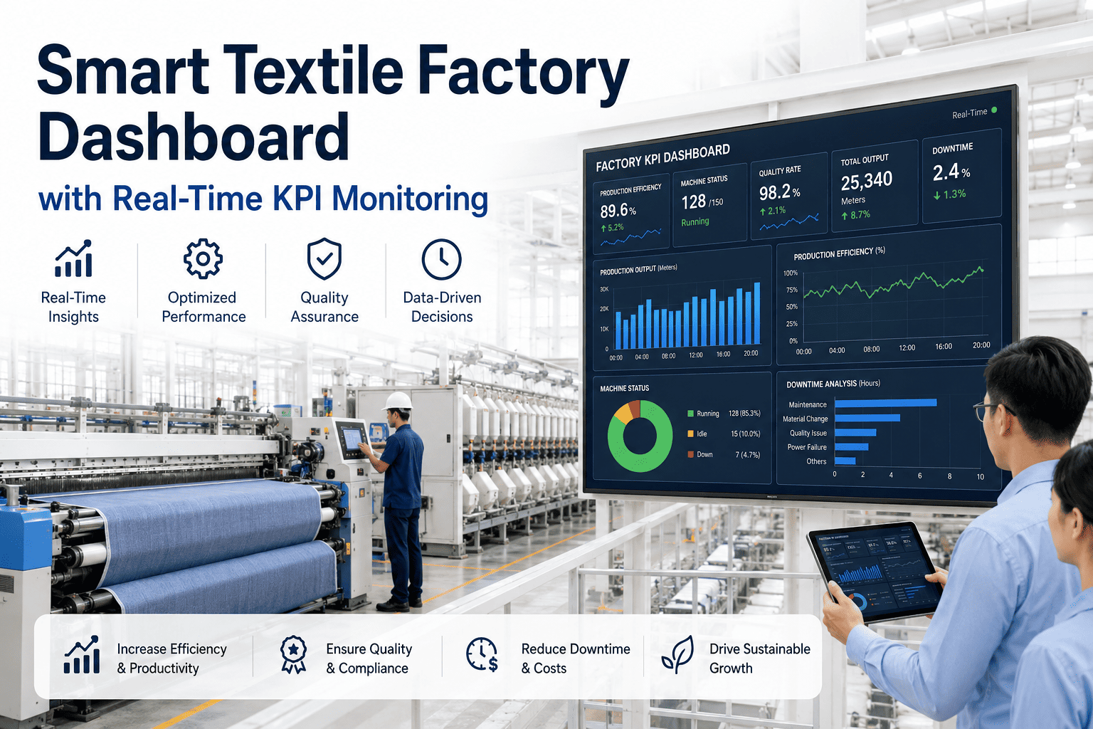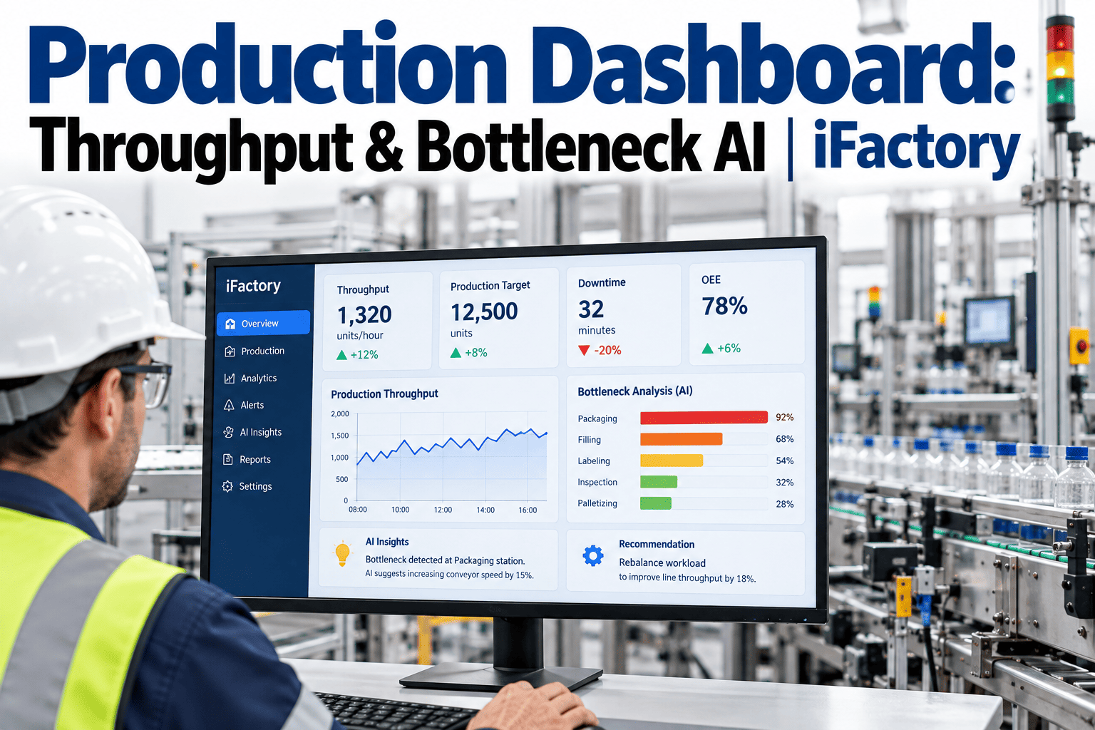
Textile mills often run their weekly production review the same way: loom efficiency comes from one spreadsheet, dyeing output from another, and finishing counts from a supervisor's notebook, and someone has to reconcile all three before the numbers mean anything. By the time a queue backup in the dye house or a slow changeover in weaving shows up in that Friday meeting, three or four days of lost throughput have already passed, and nobody can pin down exactly when the slowdown started. A live production dashboard that pulls machine-level throughput into one view turns that lag from days into minutes, so a plant manager can see which department is actually holding back the rest of the line before it costs a shipment date. You can book a demo to see how iFactory maps throughput and bottleneck signals across every department on one screen.
See Which Department Is Actually Slowing the Line, Not Just Which One Looks Busy
iFactory brings spinning, weaving, dyeing, finishing, and packing throughput onto one live timeline, so the bottleneck shows up as a flagged department instead of a guess in the weekly review.
A Bottleneck Rarely Announces Itself in a Single Number
Most mills already track output somewhere for every department, but the numbers usually live in separate systems, get pulled on different schedules, and use different units — meters for weaving, kilograms for dyeing, pieces for finishing. That's manageable when everything is running normally.
The problem shows up the moment one department starts falling behind. Without a shared timeline, a slowdown in dyeing looks like a dyeing problem for a week before anyone realizes weaving upstream had already piled up work-in-process that dyeing simply couldn't absorb.
Manual logs and end-of-shift entries mean the dashboard a manager reviews in the morning reflects yesterday's line, not the one running right now.
Meters, kilograms, and pieces don't compare directly, so spotting which stage is actually the constraint takes manual conversion before any comparison is possible.
Without WIP and queue data linking departments together, a backlog building in one stage looks unrelated to the slowdown appearing downstream a day later.
The constraint department on a night shift with different staffing or a different fabric mix is often not the same one flagged during the day shift review.
Watching Throughput Taper as Fabric Moves Through the Mill
A throughput dashboard's most useful view is a simple one: every department shown side by side, each sized to its actual output relative to rated capacity for the current shift. The stage running furthest below its own capacity is the bottleneck, and it's rarely the slowest machine on paper — it's the stage that everything else is now waiting on.
Once dyeing is flagged this way, the useful next question isn't "how do we speed up dyeing forever" — it's what changed today. A batch queue delay, a color-change setup, or a machine running below its normal rate all look identical on a weekly report but need completely different fixes.
How Different Reporting Approaches Actually Perform
Mills typically move through three stages of maturity in how they catch a bottleneck, and each stage changes how much throughput is lost before the constraint gets addressed.
| Method | Detection Latency | Update Frequency | Root-Cause Visibility |
|---|---|---|---|
| Manual Shift Report | 1-3 days | Once per shift or day | Low — output only, no cause |
| Static OEE Dashboard | Same day | Hourly to daily | Moderate — per-machine, not per-line |
| Real-Time Bottleneck AI | Minutes | Continuous | High — cross-department with WIP context |
Five Signals That Separate a Real Bottleneck from Normal Noise
Raw output means little on its own; comparing it to what the department is rated to produce is what reveals a genuine shortfall.
A growing pile of work waiting ahead of a department is often the earliest sign of a constraint, showing up before output numbers even move.
Aggregated downtime hides which specific machine or line is driving the department's shortfall, so stoppage needs to be tracked at the equipment level.
Frequent color or style changes can consume a large share of available time without a single stoppage being logged as downtime.
A department that performs well on day shift but consistently underperforms on night shift points to a staffing or handover issue, not a machine one.
Common Mistakes That Hide the Actual Constraint
A department that ran well for six hours and poorly for two shows an acceptable average, masking exactly the window where the bottleneck occurred.
The slowest individual machine isn't always the constraint if it has enough buffer stock; the real constraint is whichever stage the rest of the line is waiting on.
Focusing only on machine-running time skips the hours fabric spends simply waiting between stages, which can be a larger loss than any single stoppage.
Ranking departments against a single mill-wide target ignores that spinning, weaving, and dyeing naturally run at very different rated speeds.
Finding a Dyeing Bottleneck Before It Reached the Shipment Date
A mid-sized mill's weekly report showed dyeing running at what looked like a normal utilization rate, since the number was averaged across the full week. Orders started slipping their promised ship dates, and the initial assumption was a demand spike rather than a production issue.
A shift-level throughput view showed dyeing dropping to roughly 55-60 percent of capacity specifically during a run of frequent shade changes, a pattern the weekly average had smoothed over completely. Batching similar shades together and adjusting the changeover sequence brought dyeing back above 80 percent of capacity within the same week.
Building a Dashboard That Flags the Constraint Early
Map every department's rated capacity in the same comparable unit, even if daily production is still recorded in meters, kilograms, or pieces.
Track queue and WIP levels between departments, not just output within each one, so a building backlog shows up before throughput visibly drops.
Break throughput data down by shift and by machine rather than relying on daily or weekly averages that can smooth over a real slowdown.
Review which department was flagged as the constraint at least weekly, since the bottleneck in a textile mill regularly shifts with order mix and shade changes.