Every plant floor generates data every second — machine states, OEE scores, stop events, cycle times. The question isn't whether to capture it. It's how often the right person should see it, in what form, and at what cadence. Most US manufacturers get this wrong in the same direction: they over-invest in real-time pipelines for people who don't make real-time decisions, and under-invest in the structured daily summaries that actually drive executive action. The result is dashboards that exhaust operators with noise, confuse supervisors with volatility, and still fail to give plant directors the clean weekly view they need to report to the board. Getting refresh rate right is not a technical decision — it is an organizational one, and this guide gives you the framework to make it.
Stop Guessing. See Your Entire Operation at the Right Cadence.
iFactory gives every role the right refresh rate — seconds for operators, minutes for supervisors, daily for executives — from one platform.
Faster Is Not Always Better
Most manufacturers default to real-time because the technology allows it. But dashboard refresh rate should align with the decision cycle of the person reading it — not your pipeline's maximum throughput. A dashboard refreshing faster than someone can act generates noise. One refreshing slower than decisions need produces stale-data errors that cost real money.
Too Fast
Numbers shift while the operator is still reading them. OEE jumps 67% → 71% → 66% mid-thought. Noise, not signal.
Right Cadence
Operators: 30–60 sec. Supervisors: 5–15 min. Executives: daily. Each matched to how decisions actually get made.
Too Slow
A stop count from 3 minutes ago means operators intervene on already-resolved issues — or miss active ones entirely.
Three Audiences. Three Refresh Rates.
Building one dashboard for all three is the most common — and most expensive — mistake in manufacturing analytics. Each role needs its own view, its own cadence, and its own display context.
Operators & Line Leads
Shop floor · ambient glance
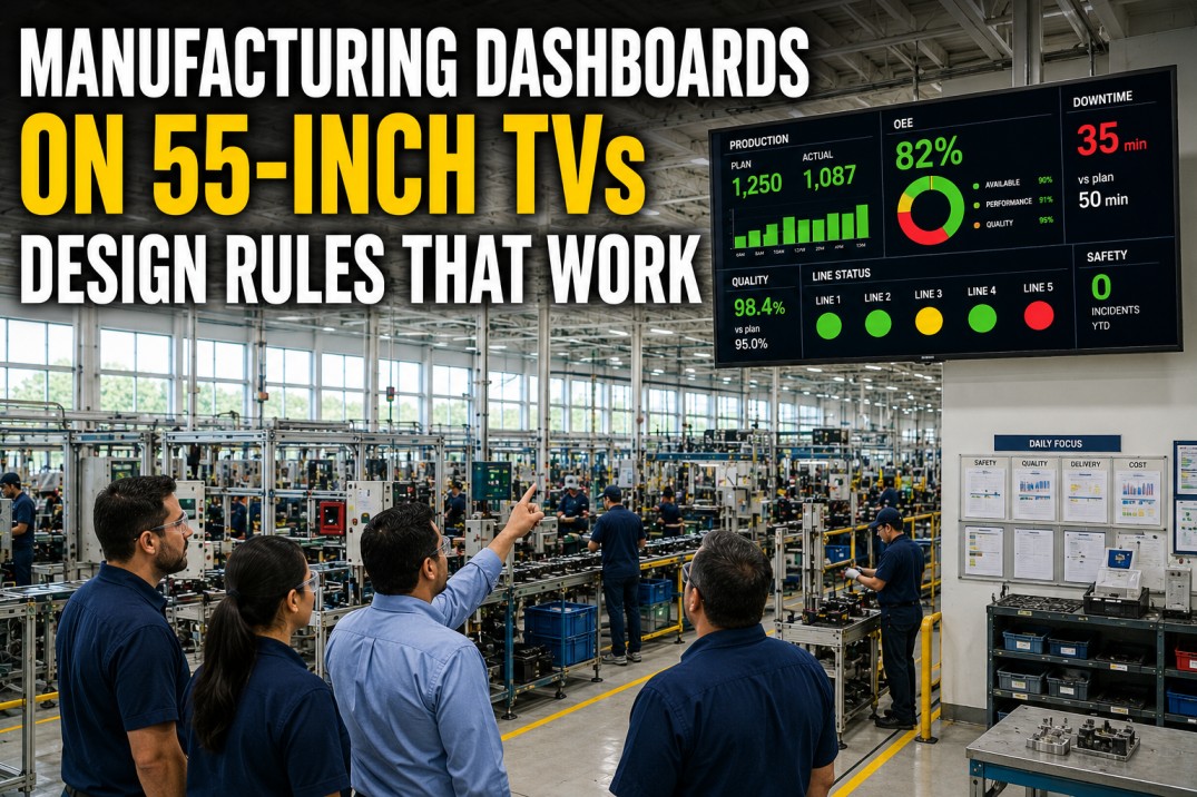
Operators walk the floor and absorb data in 1–3 second glances. Their decision cycle is 1–3 minutes: check, notice, respond, repeat. Sub-30-second refresh creates visual noise; over 2-minute refresh leaves them acting on stale state.
Supervisors & Plant Managers
Multi-line oversight · trend focus
Supervisors aggregate across lines and track patterns — not moment-by-moment state. Continuous refresh creates distraction. A 10-minute cycle matches active shift management without producing stale-data risk on trend-level decisions.
Executives & Ops Directors
Strategic review · scheduled meetings
Executives review 4–8 high-level financial and operational KPIs in a meeting context. Decisions cycle weekly. Running a real-time pipeline for an exec dashboard adds infrastructure cost for a refresh cadence nobody uses.
Refresh Rate by Metric Type
Not every KPI on the same dashboard needs the same cadence. A tiered architecture assigns each metric its own refresh interval — balancing real-time responsiveness with system load and readability.
| KPI Tier | Example Metrics | Refresh Rate | Rationale |
|---|---|---|---|
| Critical State | Machine running/stopped, alarm status | 2 – 5 sec | Equipment state changes require immediate operator awareness |
| Operational | Live OEE, stop count, parts/hr, cycle time | 30 – 60 sec | Matches operator decision cycles; buffers variance without noise |
| Trend | 24-hr trendlines, downtime Pareto, shift summary | 5 – 15 min | Pattern-level decisions don't require second-level data |
| Historical | Week-over-week OEE, cost-per-part by job | Hourly / Daily | Aggregation and reconciliation must complete before display |
| Executive | Throughput vs. forecast, scrap cost, OTD rate | Daily / Weekly | Decision cadence is weekly; real-time pipeline adds cost, no benefit |
The Real Cost of Getting It Wrong
Mismatched refresh rates carry a compounding cost — in missed interventions, inflated infrastructure spend, and decisions made on the wrong data.
- Alarm fatigue erodes the signal value of critical alerts
- Numbers shift mid-read, increasing cognitive load and error rate
- Real-time pipelines for every KPI inflate infrastructure cost
- Wallboard dashboards become unreadable information walls
- Operators act on stop counts from 3 minutes ago
- Short repeated stoppages stay invisible; root cause analysis chases symptoms
- Defects propagate across hundreds of units before detection
- Missed windows convert to unplanned overtime and delivery failures
5 Steps to the Right Refresh Rate
Use this framework to set the correct cadence for any KPI on any dashboard in your facility — before you build, not after you deploy.
Identify the Decision Maker
Who reads this dashboard? Operator, supervisor, or executive? Each has a different decision cycle. Designing without specifying the audience guarantees a dashboard that serves no one well.
Define the Decision Cycle
How often does this person need to act on the data? Operator = 1–3 min cycle → 60-sec refresh. Executive = weekly cycle → daily refresh. Match the interval to the cycle, not to technical capability.
Assess the Cost of Delay
Can a 2-minute lag trigger a defect batch, a missed stoppage, or a delivery failure? If yes, the KPI is operational and requires near-real-time. If no, slower refresh reduces cost without degrading decision quality.
Tier Your KPIs by Volatility
Group metrics: critical state (2–5 sec), operational (30–60 sec), trend (5–15 min), historical (hourly/daily). Assign each group its own interval rather than a single blanket rate across the entire board.
Build Separate Views Per Audience
Resist the impulse to cram operators, supervisors, and executives onto one 20+ KPI screen. Each audience needs its own dashboard, in its own location, refreshing at its own rate.
Purpose-Built for US Manufacturing
iFactory Delivers the Right Refresh Rate for Every Role — Out of the Box
Role-based architecture gives operators second-level machine state, supervisors 5-minute trend panels, and executives a daily digest — all pre-configured with no extra data engineering.
How iFactory Structures Refresh Across Your Org
iFactory's analytics engine separates refresh logic by role and KPI tier — not a global setting, but a purpose-built cadence for every level of your org chart.
Live Shop Floor View
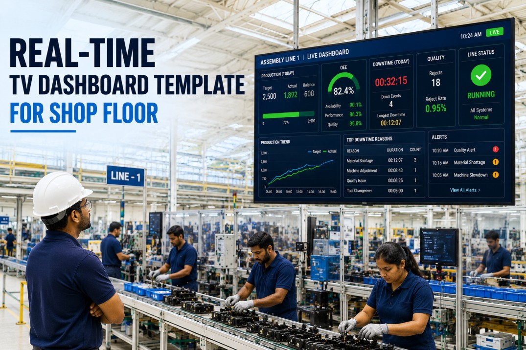
Machine state, OEE, stop count, and active exceptions update in seconds on any wallboard or mobile device — built for 1–3 second floor glances.
Refreshes in secondsSupervisor Trend Panels
Shift trendlines, downtime Pareto, and KPI-vs-plan comparisons refresh every 5–10 minutes — designed for multi-line pattern recognition.
5 – 10 min cadenceExecutive Daily Digest
Throughput vs. forecast, scrap cost, and weekly OEE trend — delivered as a clean daily summary aligned to how exec decisions actually get made.
Daily deliveryTiered Alert Logic
Critical machine alerts fire within seconds. Trend-based alerts batch to prevent alarm fatigue. Each tier maps to the right response time for its audience.
Zero alert fatigueCommon Questions
Is real-time always better than daily for manufacturing dashboards?
No. Real-time is better only when the decision it supports requires current-state data. Operator dashboards benefit from 30–60 second refresh because their decisions cycle at 1–3 minutes. Executive dashboards need daily refresh because decisions cycle weekly. Applying real-time to an exec dashboard adds infrastructure cost with zero decision benefit.
What is the optimal refresh rate for an OEE dashboard on the shop floor?
30–60 seconds is the practical sweet spot for most operational OEE dashboards. Sub-30-second refresh produces numbers that change faster than operators can read them. 60-second refresh buffers real operational variance into a clear, actionable snapshot that supports decisions without creating noise.
Can different KPIs on the same dashboard refresh at different rates?
Yes — and it is the recommended architecture. Critical machine state can update every 2–5 seconds while trending data refreshes every 30–60 seconds and historical comparisons update every 5 minutes. Tiered refresh by KPI volatility balances real-time responsiveness with system load and readability.
Why do most manufacturers set the wrong refresh rate?
Refresh rate is typically set to match technical capability rather than human decision cycles. Teams assume faster is better and build real-time pipelines for every KPI regardless of whether the audience benefits. The result: visual noise for operators, inflated infrastructure spend, and exec dashboards that still fail to deliver reconciled daily data.
Does iFactory support both real-time and daily dashboards from one platform?
Yes. iFactory's analytics layer supports role-specific views with separate refresh logic per KPI tier. Live shop floor dashboards refresh in seconds. Supervisor panels refresh every 5–10 minutes. Executive summaries deliver as daily digests — all from a single platform, without separate data pipelines or additional tools.
You've read the framework. Here's the next step.
See iFactory's Tiered Refresh Architecture in Action
A 30-minute demo with a manufacturing analytics specialist — live plant data, your use case, no slide decks. See operator wallboards at 60-second refresh, supervisor panels at 5-minute intervals, and the executive daily digest built for your facility.
No credit card · No IT project · Up and running in 30 days