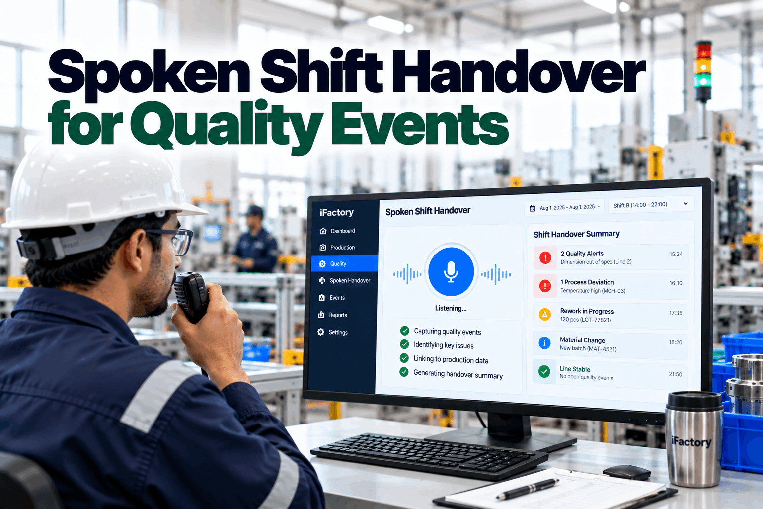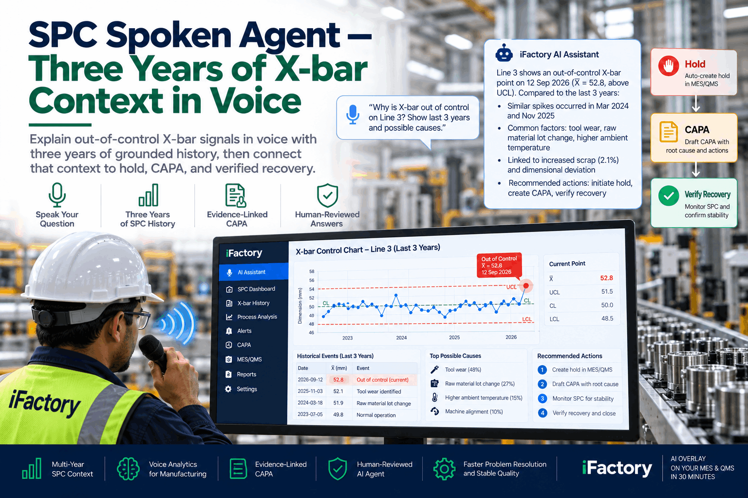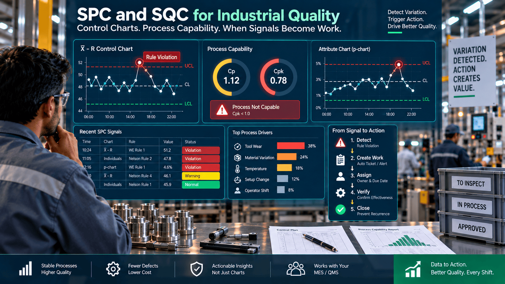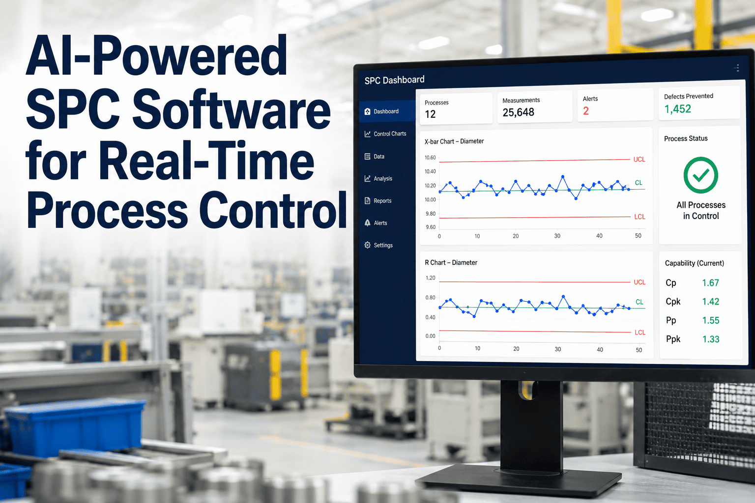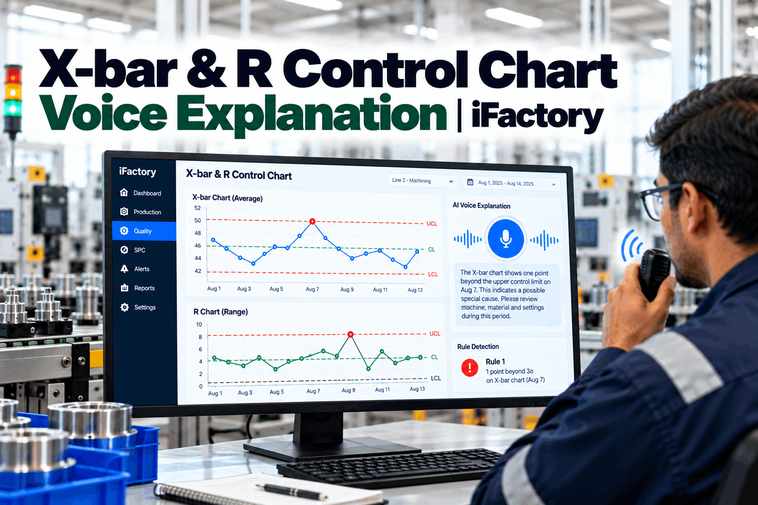
A process engineer looks at an X-bar chart holding steady and an R chart quietly rising, and the shift lead asks whether that is a problem worth acting on. The chart is technically stable — no rule flags — but the spread is growing, and someone has to explain what that means to a supervisor who does not read control charts every day. iFactory AI overlays your MES, QMS, historian, and SPC stack with a spoken explanation layer that turns X-bar and R chart movement into plain-language review — with context on lot, machine, recipe, and shift — so the engineer, the supervisor, and the operator can act on the same understanding. Book a 30-minute walkthrough of an X-bar and R chart reviewed by voice with full context.
Center and spread are two questions on the same chart. A voice explanation makes both readable to the supervisor at the line — with the reviewer still deciding what to do.
At a Glance
Why Center and Spread Deserve a Joint Reading
An X-bar chart shows how the process center is behaving over time. An R chart shows how the process spread is behaving over time. Read together, they tell a fuller story than either one alone. A stable X-bar with a stable R is a healthy process. A drifting X-bar with a stable R is a shift in center — the process is producing consistent parts but not to the target. A stable X-bar with a rising R is a growing spread — the process is centered but producing more variable parts, which often precedes a formal rule flag on the X-bar chart. A drifting X-bar with a rising R is trouble on both fronts.
The trap is reading only one chart. Many reviews focus on the X-bar because that is what most operators are trained to watch, and quietly ignore the R chart until it produces its own flag. By that time, the spread has often been rising for several subgroups, and the process may already be producing parts that are not fit for the downstream specification. A joint reading — and a voice explanation that makes the joint reading legible to a supervisor — catches the early signal.
What a Voice Explanation Should Cover
What iFactory Delivers
iFactory reads the X-bar and R charts your SPC engine already draws and explains them in plain language for the people on the line.
X-bar center and R spread read together for the same subgroups.
What the pattern means for the part, in words a supervisor can act on.
Lot, machine, recipe and shift for the window being explained.
Ask whether spread is growing on a characteristic and hear it at the line.
The engineer's decision and reasoning stored with the chart window.
Past explanations new engineers can study for similar patterns.
Bring one recent chart with an interesting center or spread pattern. We walk through the voice explanation, the context assembly, and the preserved review record — beside your existing SPC and MES.
Where Spoken Analytics Fits in Control-Chart Review
Spoken analytics does not interpret the chart on its own. It draws on the SPC engine that already produces the chart, adds context from the MES, historian, and QMS, and drafts a plain-language explanation the engineer or supervisor can confirm, edit, or override. The reviewer still owns the interpretation and the action. The layer speeds the review by putting the joint reading and the context in front of the reviewer, preserves the outcome so the record supports later review, and surfaces recurring patterns for CI cadence.
For plants with many charts and few dedicated engineers, this is often the difference between charts that get reviewed and charts that get watched only after a rule flag. A shift lead who understands the joint reading can act earlier, and a searchable record of prior reviews helps new engineers learn how experienced ones interpreted similar patterns. Over time, the archive itself becomes a training asset — new engineers can walk through prior reviews and see how the process, the chart movement, the context, and the outcome all fit together, which shortens the learning curve for interpreting charts on their own.
The workflow also helps bridge the gap between statistical process control as a discipline and process control as a daily practice. SPC textbooks describe rules and control limits; daily practice requires deciding what to do about them under time pressure with incomplete information. A voice explanation paired with context helps translate the textbook framework into a shift-floor decision, and the preserved record keeps the translation honest — anyone can review later how the interpretation was reached and whether it matched the outcome.
Frequently Asked Questions
Because center and spread are two questions on the same process, and reading only one can miss an early signal that the other one is telling.
The process is centered but the spread is growing — often an early signal that a formal rule flag is coming on the X-bar chart if nothing is adjusted.
No. It drafts a plain-language reading, adds context, and hands the interpretation to the engineer or supervisor for decision and sign-off.
By turning the joint reading into plain language and pairing it with the lot, machine, recipe, and shift context they already know.
By preserving reviewer decisions with rationale so recurring center or spread patterns become visible across many reviews.
An X-bar and R chart tell a joint story about the process. A voice explanation makes that story accessible to everyone who needs to act on it — with the reviewer still owning the decision.