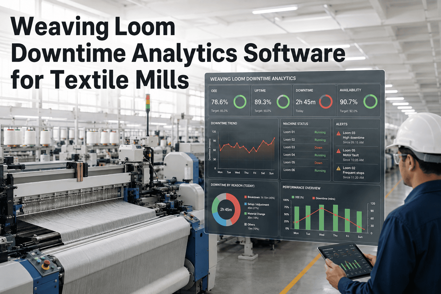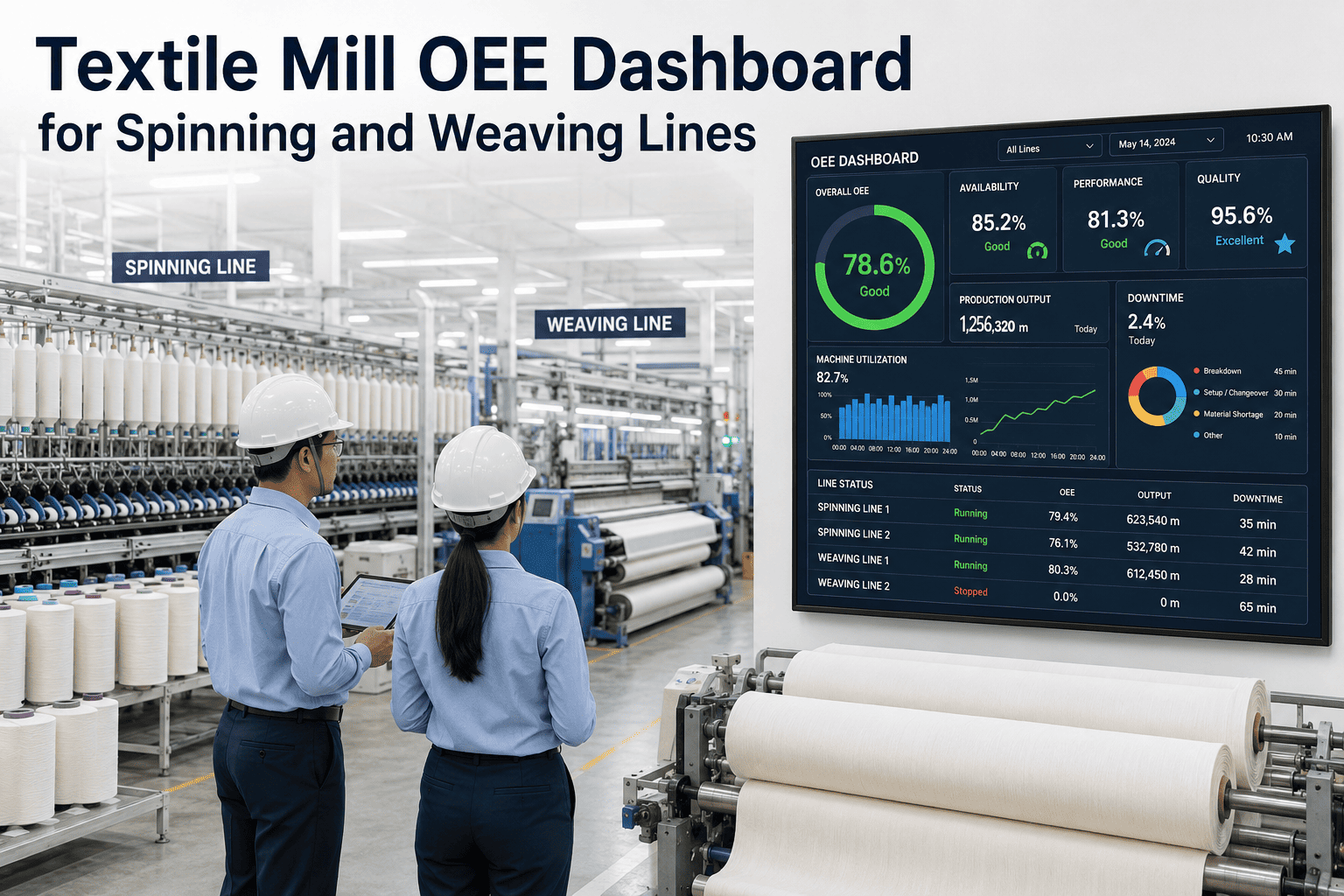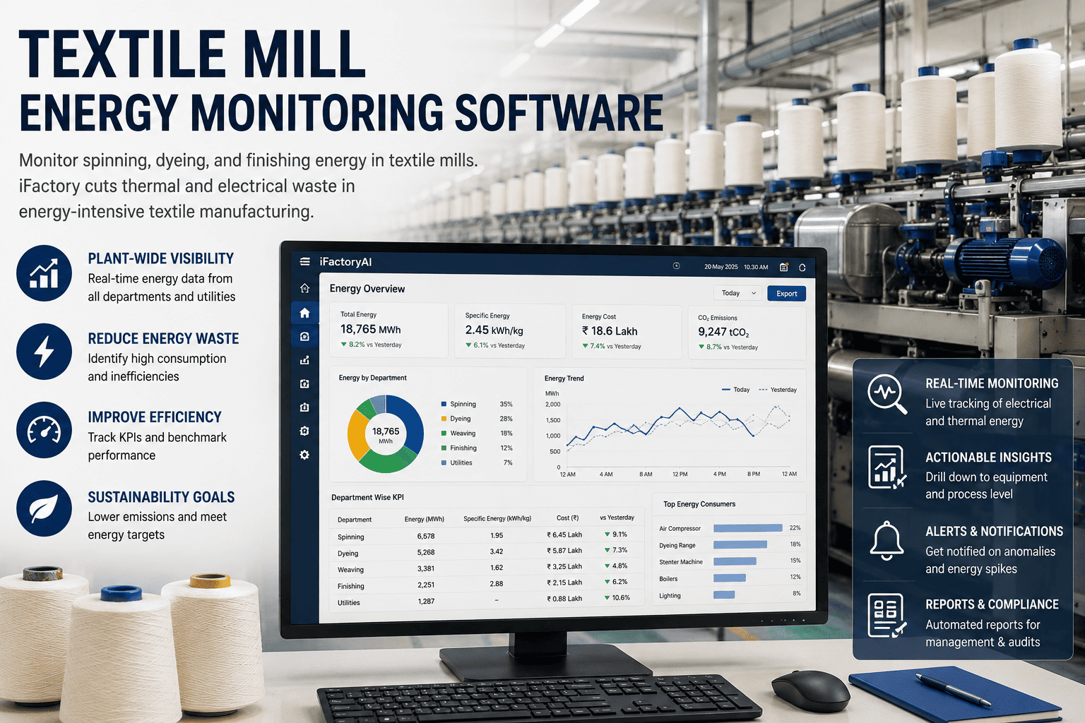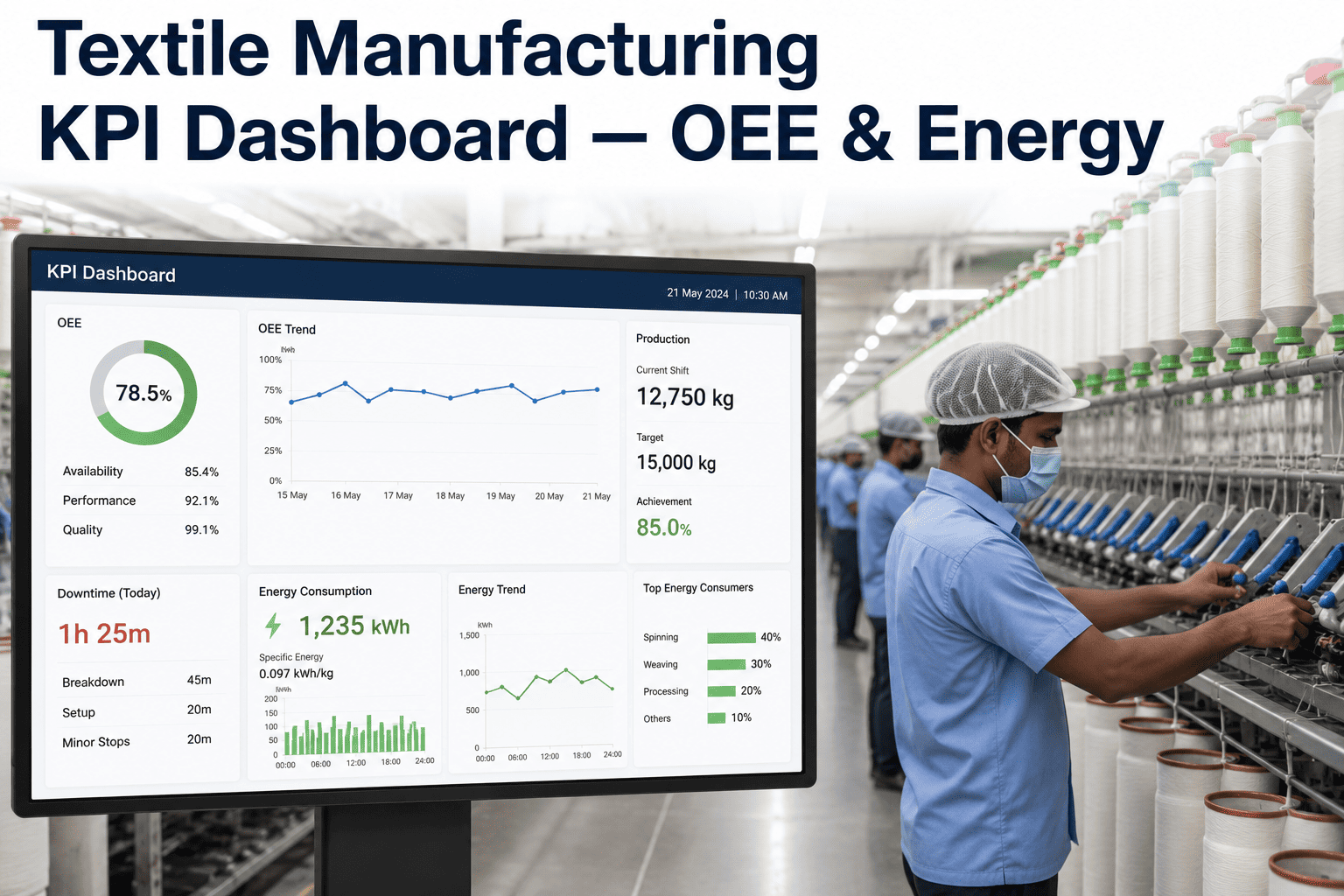
Ask ten mill managers how last week's production actually went and you will likely get ten different numbers, each pulled from a different spreadsheet, a different shift report, or a different person's memory. Meanwhile OEE, waste percentage, energy per kilogram, and water per meter are quietly telling the real story of where a textile plant is bleeding margin, but only if someone is pulling all four into one place and looking at them together instead of in isolation. A live KPI dashboard turns that scattered picture into one number everyone in the plant trusts and can act on the same shift, not the following Monday.
iFactory pulls OEE, waste, energy, and water data into a single live dashboard your whole team can trust.
Where a Textile Mill's OEE Actually Stands Today
World-class OEE sits around 85%, but most discrete and process manufacturers, textile mills included, run somewhere between 55% and 65% without a live system telling them exactly where the gap comes from. That gap is not one problem, it is a mix of changeover time, unplanned stops, quality rejects, and speed loss, each of which needs its own visibility to fix.
The Five KPIs Every Mill Dashboard Should Track Together
Individually, each of these metrics tells only part of the story. Tracked together on one screen, they reveal cause and effect that no single number can show on its own. Book a demo to see all five running live against your own production data.
| KPI | What It Reveals | Typical Industry Range |
|---|---|---|
| OEE | Availability × performance × quality combined | 55%–65% typical, 85%+ world class |
| Waste / Scrap % | Material lost to rejects and rework | 5%–8% at unmanaged mills |
| Energy per kg | Power consumed per unit of output | Varies by process, dyeing highest intensity |
| Water per meter | Wet-process water efficiency | Tracked against ESG reduction targets |
| First-Pass Yield | Good units produced without rework | Each 1% gain cuts rework labor 2–3% |
Why a 60% OEE Costs More Than It Looks Like On Paper
A 60% OEE on a two-million-dollar production line means that line delivers 1.2 million dollars in output while still consuming full operating costs, labor, energy, and overhead included. The remaining 40% is not idle capacity sitting quietly, it is wasted labor hours, wasted energy, and wasted material that a plant paid for and never converted into shippable fabric. Most mills discover, once OEE, waste, and energy are visible on the same dashboard, that the biggest single driver of low OEE is not the slowest loom, it is excessive changeover time that nobody had measured consistently before.
One live dashboard for OEE, waste, energy, and water, trusted by every level of the plant from the floor to the leadership meeting.
What Changes Once the Dashboard Goes Live
Most mills already have a dashboard of some kind. The difference is whether it is built once from a static export and quietly ignored within a few months, or whether it updates in real time and becomes the screen every shift actually opens.
Shift-by-shift and machine-by-machine comparison replaces a single plant-wide average that hides which lines are actually underperforming.
Downtime Pareto analysis surfaces the top three or four causes eating capacity, instead of a long list nobody has time to review.
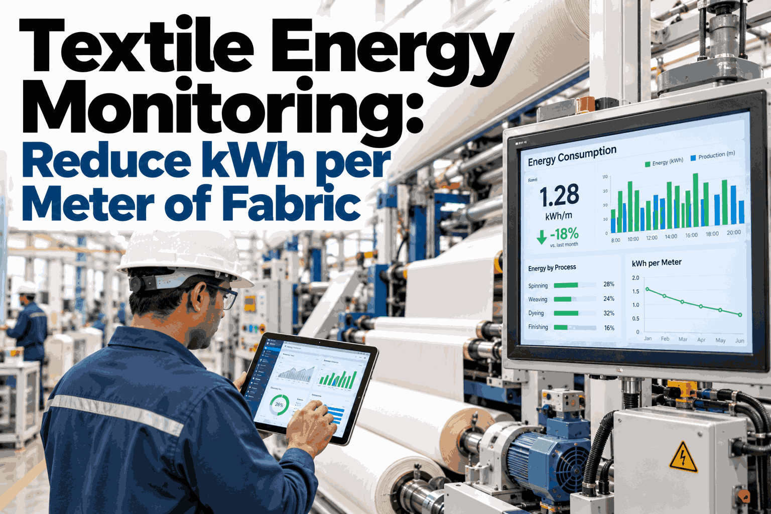
Energy and water intensity are tracked per unit of output, not per calendar month, so a spike is visible the shift it happens.
Quality rejection data links directly to the specific machine and shift that produced it, closing the loop between OEE and waste.
Frequently Asked Questions
What counts as a good OEE score for a textile mill specifically?
The general manufacturing benchmark applies to textiles as well: 85% is considered world class, 60% is fairly typical, and anything near 40% usually signals a mill that has just started measuring consistently rather than a mill with unusually poor equipment. Textile-specific factors like frequent style changeovers and yarn quality variation tend to push realistic near-term targets toward the 70–75% range before world class becomes achievable.
How does the dashboard get its data without extra manual entry?
Machine controllers, loom terminals, and utility meters feed the dashboard directly, which is what makes it update in real time instead of depending on someone typing numbers into a spreadsheet at shift end. Where a machine has no digital output at all, lightweight sensors are added to capture runtime and stop data without requiring a full machine replacement.
Can the dashboard connect energy and water use to specific production runs?
Yes, and this is one of the more valuable views for a mill pursuing ESG or sustainability targets. Energy per kilogram and water per meter are calculated against actual output rather than calendar time, so a dyeing run that used more water than expected shows up immediately rather than blending into a monthly average. Book a demo to see energy and water intensity tracked against your own product mix.
Will this replace the reports we already send to leadership?
Most mills replace the manual report compilation process rather than the report itself, since the same OEE, waste, and energy figures leadership already reviews are now generated automatically and consistently instead of assembled by hand from multiple sources. The reporting format stays familiar; what changes is that everyone is looking at the same number instead of reconciling different exports.
How long does it take to get a working dashboard live on the floor?
Most mills have a functioning dashboard covering their highest-priority lines within the first few weeks, with additional machines and metrics added as data connections are validated. The rollout is typically phased by department or line rather than attempted all at once, so weaving can go live before dyeing without waiting on the rest of the plant.
Stop reconciling spreadsheets before Monday's meeting. Get one dashboard everyone trusts.