Ask a plant manager how the kilns, mills, and utilities are performing today, and the honest answer at most cement plants involves opening four or five separate systems, calling two different shift supervisors, and still not having a complete picture until the end-of-shift report arrives. That fragmented view is the single biggest reason small equipment issues get discovered hours after they start, once they have already affected throughput, quality, or energy consumption. Book a demo to see how a unified dashboard changes that.
One Screen. Every Kiln, Mill, and Utility. Real Numbers, Not Yesterday's Report.
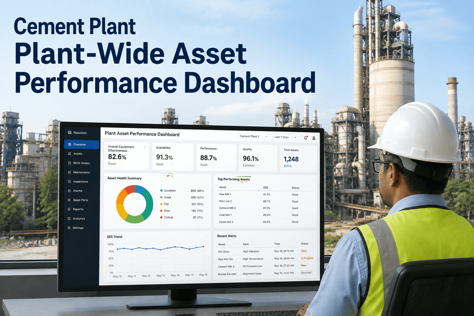
iFactory pulls live data from across your cement plant into a single AI-powered dashboard, so equipment performance, energy consumption, and maintenance status are visible the moment they change instead of the moment someone writes them down.
When Every Department Has a Different Number, Nobody Trusts Any of Them
A typical cement plant runs separate systems for kiln DCS data, mill vibration monitoring, utility energy metering, and a CMMS for work orders, none of which talk to each other in real time. Production reports one throughput figure, maintenance tracks a different equipment availability figure, and energy management reports a third number for specific energy consumption. When leadership asks a simple question, how is the plant performing this week, the answer takes hours to assemble and often contains numbers that quietly contradict each other because they were pulled at different times from different systems.
A plant-wide dashboard solves this by consolidating live data into a single source of truth that every department references. Instead of reconciling numbers after the fact, production, maintenance, and energy teams look at the same figures updated in real time, which turns daily standups from a data-gathering exercise into an actual discussion about what to do next.
The problem compounds as a plant grows more complex. Adding a new production line, a new energy meter, or a new CMMS module often means adding yet another isolated screen rather than extending the picture anyone already has. Over several years this produces a patchwork of dashboards, spreadsheets, and printed shift logs that no single person fully understands, and troubleshooting a cross-system issue, such as a mill vibration trend that correlates with a specific energy spike, becomes a manual investigation instead of something visible at a glance. Consolidating that patchwork into one coherent view is less about adding new sensors and more about finally making use of the data a plant is already generating every second of every shift.
Six Data Streams Consolidated Into One Live View
From Raw Sensor Data to a Decision-Ready Dashboard in Four Steps
iFactory connects to the systems you already run and builds a live dashboard around your plant's actual asset structure within weeks, not months.
The Same Data, Framed Differently for Every Role on the Floor
A dashboard that shows everyone the exact same screen tends to overwhelm operators with metrics they cannot act on and frustrate plant managers who have to scroll past operational detail to find the summary they actually need. iFactory instead builds role-specific views from the same underlying data.
This role-based approach also changes how quickly new problems get noticed. An operator staring at a process screen all shift is well positioned to catch a sudden deviation, while a maintenance planner reviewing trend data once a day is better positioned to catch a slow degradation building over weeks. Designing separate views around how each role actually works, rather than forcing everyone through the same generic screen, means each type of problem gets caught by the person best positioned to catch it, instead of relying on one overloaded dashboard to somehow serve every purpose at once.
| Role | Primary View | Key Actions Enabled |
|---|---|---|
| Kiln Operator | Real-time process parameters and alarm status | Adjust operating conditions before a deviation escalates |
| Maintenance Planner | Equipment health trends linked to open work orders | Prioritize repairs based on condition, not complaint order |
| Energy Manager | Specific energy consumption trends by process area | Identify which equipment is driving rising energy cost |
| Plant Manager | Plant-wide summary of availability, output, and cost | Make daily production and staffing decisions with current data |
Five Mistakes That Turn a Dashboard Into Just Another Screen Nobody Checks
Plants that invest in a dashboard and still end up back at spreadsheets within a year usually fall into one or more of the same recognizable traps. None of these mistakes are about the underlying technology being wrong, they are about design choices that make a technically capable tool practically useless for the people who are supposed to rely on it every shift.
What Plants Typically See After Consolidating Their Data
The improvements tend to show up first in how quickly meetings happen, then in how quickly problems get addressed. Once everyone stops spending the first fifteen minutes of a shift handover reconciling whose numbers are correct, that time gets redirected toward actually discussing what changed and why.
Common Questions About Plant-Wide Asset Dashboards
Does this replace our existing DCS or CMMS system?
No, the dashboard is designed to sit on top of your existing systems rather than replace them. iFactory integrates with the DCS, PLC, CMMS, and metering infrastructure a plant already has running and pulls that data into a consolidated view, so operators and engineers do not need to learn an entirely new control system or migrate historical records. The goal is to solve the visibility problem created by having several disconnected systems, not to add another isolated system to the pile. Most plants keep their existing systems of record exactly as they are and simply gain a unified layer on top for reporting, trending, and alerting. Book a demo to see how integration works with your specific systems.
How long does it take to get a dashboard running after signing up?
Timelines vary based on how many systems need to be connected and how standardized the existing data already is, but most cement plants see an initial working dashboard within a few weeks of starting integration, with role-specific views and alerting refined over the following month as usage patterns become clear. Plants with well-organized DCS tag naming and a modern CMMS tend to move fastest, while plants with older, poorly documented instrumentation may need additional time for data mapping. Either way, the process is iterative: an early version goes live quickly and gets refined based on what operators and managers actually find useful once they start using it daily.
Can different departments see different levels of detail?
Yes, this is one of the core design principles behind the dashboard rather than an optional add-on. Role-based views mean an operator sees real-time process parameters relevant to their station, a maintenance planner sees equipment health trends tied to the work order backlog, and a plant manager sees a plant-wide summary without needing to filter through operational detail that does not affect their decisions. Access can also be scoped so that sensitive cost or energy data is only visible to the roles that need it, while operational performance data remains broadly visible to the teams running the equipment day to day.
What happens when a metric goes outside its normal operating range?
The dashboard is built to alert, not just display. When a tracked metric, whether it is a kiln temperature drifting outside its target band or a mill vibration reading climbing steadily over several shifts, crosses a defined threshold, the relevant team receives a notification rather than having to notice the change by watching the screen continuously. This shifts the workflow from passive monitoring, where someone has to be looking at the right moment, to active alerting, where the system surfaces the deviation as soon as it happens. Alert thresholds can be tuned per asset so that normal operating variation does not generate constant false alarms. Contact support to discuss alert configuration for your specific equipment.
Does the dashboard work across multiple plants if we operate more than one facility?
Yes, the same consolidation principle that unifies data within a single plant extends across multiple facilities for organizations that operate more than one cement plant. A corporate-level view can compare availability, energy consumption, and output across sites using consistent metric definitions, which solves a common problem where each plant historically calculated the same KPI slightly differently, making cross-plant comparison unreliable. Individual plant teams still get their site-specific detailed view, while leadership gains a comparable, apples-to-apples summary across the full portfolio. Book a demo to see the multi-plant view configured for your organization.
Give Every Role in Your Plant the Numbers They Actually Need, Live
iFactory turns scattered DCS, CMMS, and metering data into one dashboard your whole plant can trust, updated in real time instead of reconstructed at the end of every shift.