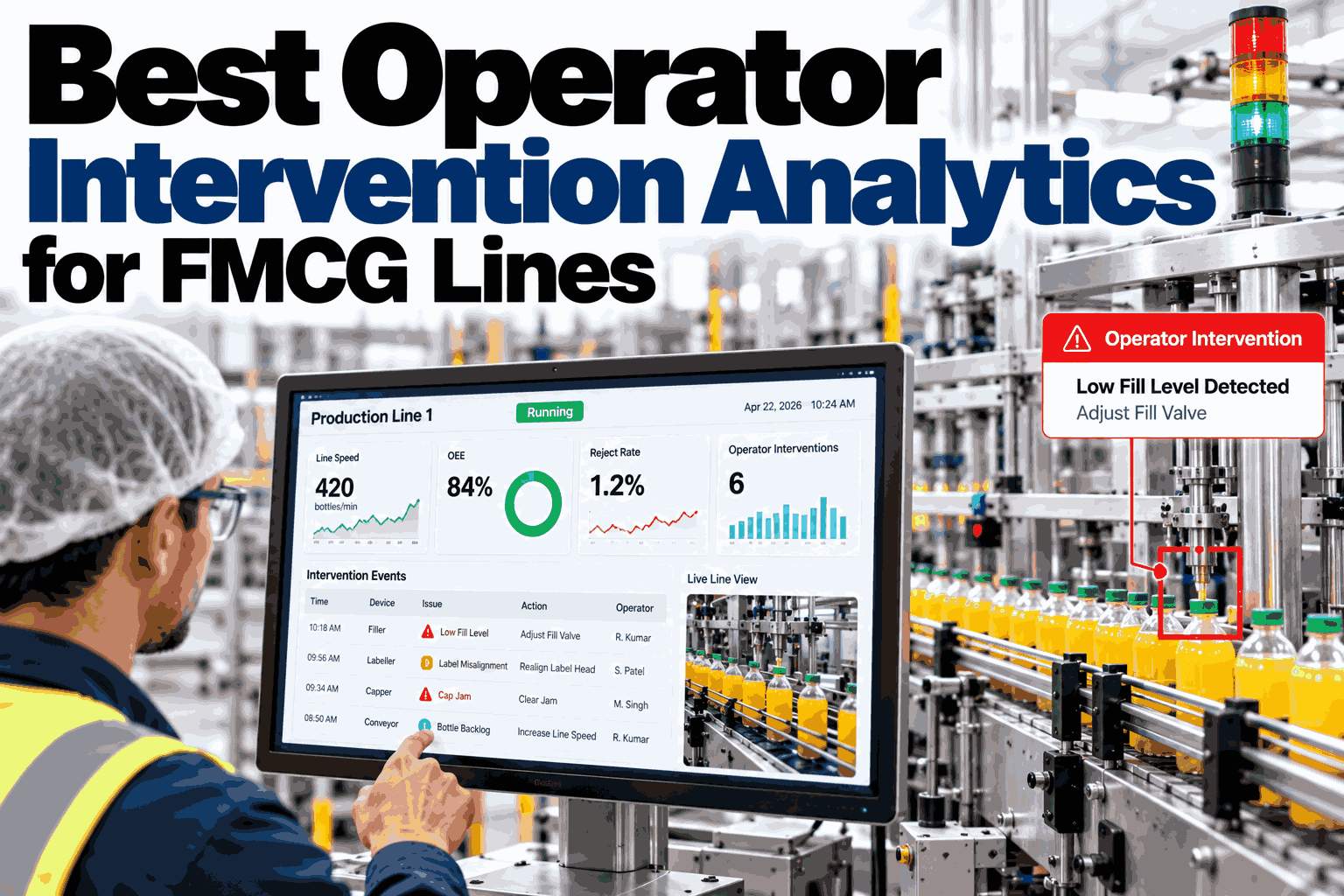
Every time an operator reaches into a running machine to clear a jam, nudge a guide, or reset a sensor, that touch gets recorded somewhere, if it gets recorded at all. Most plants treat these interventions as routine housekeeping, worth noting but not worth analyzing. In practice, a rising count of touches on the same station is often the clearest early warning a line gives before a real breakdown, well before any alarm fires, and you can see how that pattern shows up on your own stations with our team.
Early warning signal
Operator Touches Are Telling You a Station Is Failing, Weeks Early
Frequency, duration, and outcome of every operator intervention, tracked as a leading indicator so a station gets attention before it actually breaks down.
Intervention count rising ahead of a breakdown
Week 1
Week 2
Week 3
Week 4
Assumption versus reality
What Plants Usually Assume About Operator Touches
Most of the assumptions around operator intervention are reasonable on the surface, but they miss what the data actually shows once touches are tracked over time.
Assumption: a quick manual clear means nothing serious happened.
Reality: the same station needing repeated quick clears is the clearest early signal of developing wear.
Assumption: intervention frequency is mostly about operator habit.
Reality: frequency usually tracks the equipment, since the pattern follows the station even across different operators and shifts.
Assumption: if the line is still running, there is no urgency.
Reality: rising touch counts often precede a full stoppage by two to four weeks, giving a real window to act.
What to track
The Three Dimensions That Make Intervention Data Useful
A single intervention count on its own is a weak signal. Tracking it alongside two other dimensions is what turns raw touches into something predictive.
Frequency
How often a station is touched per shift, and whether that count is climbing week over week.
Duration
How long each intervention takes, since a growing clear time often signals a harder-to-reach developing fault.
Outcome
Whether the touch cleared the issue cleanly or needed a second attempt, which reveals whether the real cause was addressed.
The warning window
The Four-Week Pattern That Usually Precedes a Breakdown
Across most FMCG lines, the climb from a normal touch count to a full station breakdown follows a recognizable curve rather than appearing suddenly.
Week 1
Touch count sits at its usual baseline, nothing stands out in a daily review.
Week 2
A modest rise appears, easy to dismiss as a one-off busy week on that station.
Week 3
The rise continues across multiple shifts and operators, no longer explainable as a single bad week.
Week 4
Touch count peaks shortly before a full stop, often with outcome quality also dropping at the same time.
Catching this pattern at week two or three, instead of after the breakdown, is the entire value of tracking intervention data as a leading indicator.
See This Pattern Applied to Your Own Stations
Share your recent intervention logs and we will show you which stations are already climbing this curve.
Reading outcomes
What Different Intervention Outcomes Actually Mean
Not every logged intervention carries the same weight. The outcome of the touch tells you how close the station is to a harder failure.
| Outcome | What it usually means | Recommended response |
| Cleared without a stop |
Minor, likely normal operating variation |
Log and monitor frequency trend |
| Cleared, but required a full stop |
Developing issue beginning to affect output |
Flag for maintenance review this week |
| Required a second intervention shortly after |
First fix did not address the real cause |
Escalate for root cause investigation |
| Operator unable to clear, escalated |
Fault has progressed beyond routine handling |
Prioritize immediate maintenance attention |
A station moving down this table over successive touches, from clean clears toward escalations, is the clearest sign the four-week pattern is already underway.
How it works
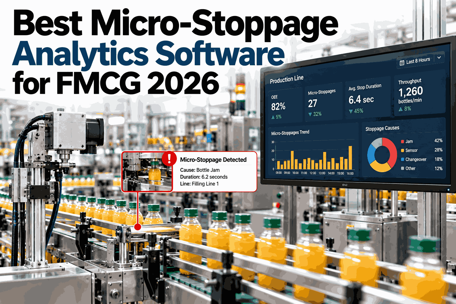
How Micro-Stop Analytics Turns Touches Into an Early Warning
Capturing this pattern reliably requires the same kind of structured logging behind micro-stop and jam root cause analysis, applied specifically to operator touches.
1
Every operator intervention is logged against the specific station, not just the line.
2
Frequency, duration, and outcome are tracked together per station, per week.
3
A rising trend across any two of the three dimensions triggers an early flag.
4
Jam root cause data is cross-checked to confirm whether the trend points to one specific developing fault.
Frequently asked questions
What Plants Ask About Operator Intervention Data
Does tracking interventions mean monitoring individual operators?
No, the value is in the pattern at the station level across operators and shifts, since a station needing more touches regardless of who is running it points to the equipment, not to any one person's performance.
Ask support how station-level tracking works on your line.
How early can a developing fault actually be caught this way?
Many stations show a detectable rise in touch frequency two to four weeks before a full stoppage, though the exact window depends on the type of equipment and how consistently interventions are being logged today.
Review your own warning window with our team.
What if operators are not currently logging interventions consistently?
Inconsistent logging is common at the start, and simplifying the capture process, often down to a single tap at the station, usually improves consistency quickly once operators see it does not add real time to their shift.
Discuss a simpler capture method with our specialists.
How is this different from standard downtime tracking?
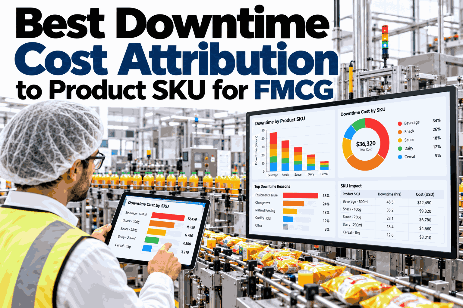
Standard downtime tracking usually only captures stops long enough to register as downtime, while intervention tracking captures the shorter manual touches that happen before a stop ever occurs, which is exactly where the early warning lives.
See the difference on a live station on a call.
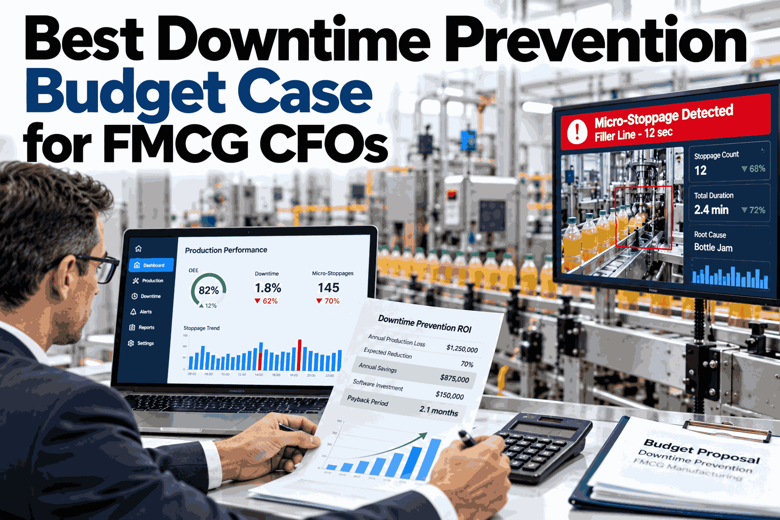
Can this data help justify a maintenance budget request?
Yes, a documented rising intervention trend on a specific station gives maintenance planning a concrete, dated pattern to point to, which is usually a stronger justification than a general sense that a machine feels like it is struggling.
Pull a trend report for your next planning cycle.
Catch the warning before the breakdown
Turn Operator Touches Into a Real Early Warning System
Book a session with iFactory AI to see how frequency, duration, and outcome data would flag developing faults on your own stations.