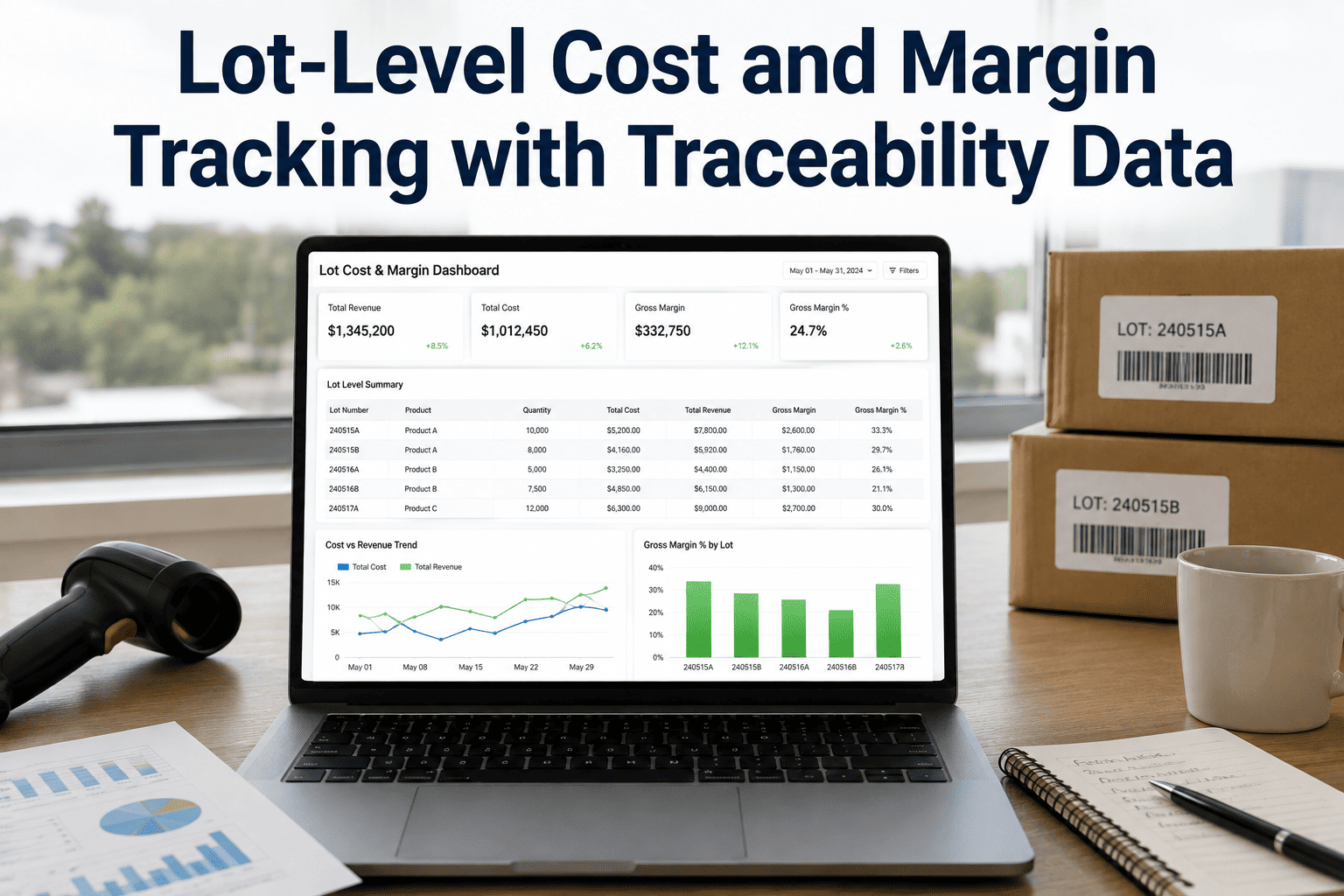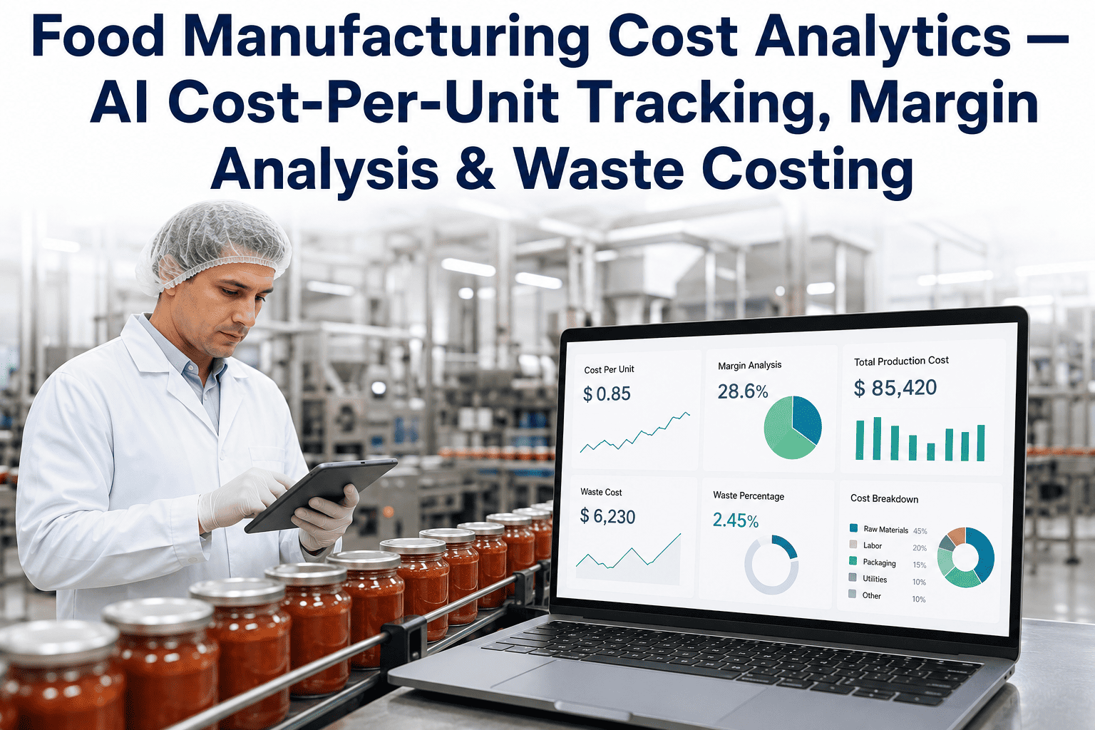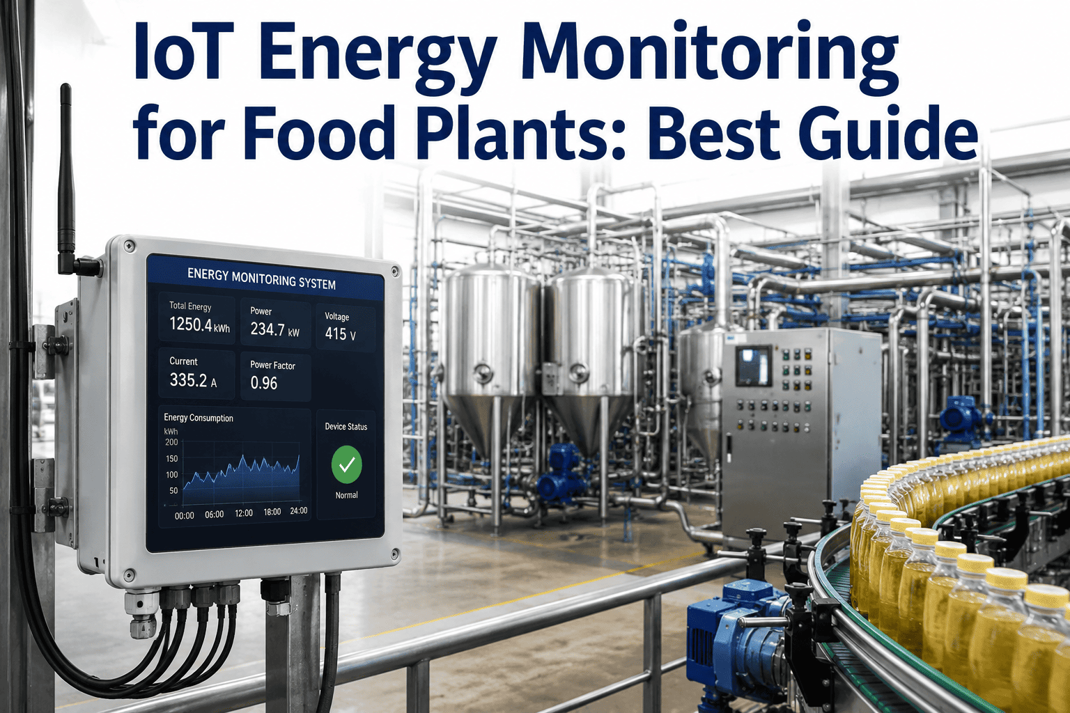
Most food plants know their total electric bill down to the dollar and almost nothing about where that energy actually went. A single utility meter at the building service entrance tells a plant manager what was spent, but nothing about which production line, which piece of equipment, or which shift drove that cost — which means every energy reduction initiative starts from a guess rather than data. IoT energy sub-metering changes that by breaking total plant consumption down to the line, equipment, and even shift level, turning an opaque monthly bill into a detailed map of exactly where energy is being spent and exactly where waste is hiding. You can book a demo to see this sub-metering breakdown running against a real food plant's production floor.
Why a Single Utility Meter Tells You Almost Nothing Useful
A whole-building utility meter answers exactly one question well: how much did the plant spend on electricity last month. It answers almost nothing else that actually matters for cost reduction — which production line consumed the most, whether a specific piece of equipment is running less efficiently than it used to, or whether last Tuesday's overtime shift actually justified its energy cost against the additional output produced. Without that visibility, energy reduction initiatives default to broad, unfocused efforts — turning off lights, adjusting thermostats — that rarely address where the real consumption is concentrated.
This lack of granularity also makes it nearly impossible to hold any specific team or process accountable for energy performance. A plant manager who wants to know whether a recent equipment upgrade actually delivered the promised efficiency gains, or whether a particular production line's energy intensity is trending in the wrong direction, has no way to answer that question from a single facility-wide number. The bill simply reflects everything happening in the building at once, blending genuine efficiency with genuine waste into a figure too coarse to separate the two.
Food manufacturing in particular tends to have energy consumption concentrated in a relatively small number of high-draw systems — refrigeration, compressed air, thermal processing equipment, and motor-driven production lines — meaning the majority of a plant's electric bill often traces back to a handful of identifiable sources. Sub-metering makes those sources visible instead of leaving them buried inside an aggregate number that changes only with total production volume and weather-driven refrigeration load. Refrigeration deserves particular attention in this context, since cold storage and process cooling loads in food plants often represent one of the largest and most consistently running electrical loads in the entire facility, making even modest efficiency losses in that system meaningful in absolute dollar terms over a full year of continuous operation.
Building a Sub-Metering Structure That Actually Answers Questions
Effective sub-metering isn't about installing as many meters as possible — it's about structuring metering points so the resulting data actually maps to decisions a plant manager can act on. A well-designed hierarchy breaks consumption down progressively, from the whole facility to the specific equipment level. Plants that skip this structured approach and instead meter whatever happens to be convenient or accessible often end up with a scattered collection of data points that don't add up to a coherent picture of where energy actually goes. Book a demo to see how this hierarchy maps to your specific plant layout.
Most plants find the greatest immediate value sits at Level 2, since department and line-level breakdowns are usually enough to identify which parts of the facility deserve the deeper Level 3 equipment metering investment. Jumping straight to comprehensive equipment-level metering across the entire plant, without first using department-level data to prioritize, often means spending metering budget on assets that turn out to be minor contributors to overall energy cost — while the facility's actual largest consumers remain under-instrumented simply because nobody knew to prioritize them.
Why kWh Per Unit Matters More Than Total Consumption
Total energy consumption naturally rises and falls with production volume, which makes raw kWh numbers nearly useless for tracking genuine efficiency improvement or decline. A plant running more volume this month than last will show higher total consumption even if it's actually operating more efficiently per unit produced — and the reverse is just as misleading when volume drops. This is a common trap for facilities teams reporting energy performance to leadership: a rising total kWh number looks bad on a chart even when it reflects a completely healthy increase in production output, and a falling number can mask a genuine efficiency problem simply because volume happened to drop at the same time.
The table below illustrates why this distinction matters in practice, walking through four common scenarios a plant might encounter and showing how total kWh and kWh-per-unit trends can tell completely different, sometimes contradictory stories about what actually happened operationally during a given period.
| Scenario | Total kWh Trend | kWh Per Unit Trend | What Actually Happened |
|---|---|---|---|
| Production volume increases 15% | Rises | Flat or improves | Efficiency held steady or improved despite higher output |
| Production volume decreases 10% | Falls | Rises | Fixed energy loads spread across less output — efficiency actually declined |
| Equipment degradation develops | May appear flat | Rises steadily | Equipment consuming more energy per unit of work as condition degrades |
| Process optimization implemented | May stay similar | Falls | Genuine efficiency gain, only visible when normalized to output |
The practical implication of this table is straightforward: any energy performance reporting that doesn't normalize for production volume is, at best, incomplete, and at worst actively misleading to whoever is reading it. A facilities team that wants credit for genuine efficiency improvement, or that wants to catch genuine degradation before it becomes expensive, needs kWh-per-unit tracking as the primary metric — with total kWh retained mainly for utility billing verification rather than as the headline efficiency indicator it's often treated as by default.
Peak Demand Charges — The Cost Most Plants Underestimate
Many food plants pay a demand charge based on their single highest 15-minute consumption interval each billing period, on top of the standard per-kWh energy charge. This structure means a brief spike in consumption — several large motors starting simultaneously, or a compressor bank cycling on during peak refrigeration load — can meaningfully raise the entire month's electric bill, independent of total energy consumed. What makes this particularly frustrating for plant managers is that the spike driving the charge might last only fifteen minutes out of an entire month, yet its cost impact persists across the full billing cycle regardless of how briefly it actually occurred. Book a demo to see how demand charge exposure shows up in your specific billing structure.
The financial upside of managing demand charges effectively is often underappreciated relative to its complexity, which is genuinely low compared to most other cost reduction initiatives. Unlike efficiency improvements that require capital investment in new equipment, demand management is frequently achievable through scheduling and sequencing changes alone — operational adjustments that cost little to implement once the underlying consumption pattern driving the charge has actually been identified through granular, real-time data. A facility that discovers its monthly demand peak consistently occurs during a specific ten-minute window each morning, driven by a predictable combination of equipment startups, has identified a problem that a shift supervisor can often solve directly, without waiting on a capital project or an external contractor.
Where Sub-Metering Data Typically Reveals Hidden Waste
Once granular consumption data is available, certain waste patterns tend to surface repeatedly across food manufacturing facilities. Recognizing these common patterns helps plant teams know what to look for once their own sub-metering data starts coming in, rather than staring at a dashboard full of numbers without a clear sense of what constitutes a problem worth investigating versus normal operating variation.
What's notable about all four of these waste patterns is that none of them require new capital equipment to fix — a leak gets repaired, equipment gets shut off during breaks, a condenser gets cleaned, a pump gets resized or a variable frequency drive gets added. The barrier to addressing them has rarely been cost; it's been visibility. Without granular data pinpointing exactly where these issues exist, they remain invisible inside an aggregate energy bill that shows the symptom — elevated cost — without ever identifying which specific cause is actually responsible.