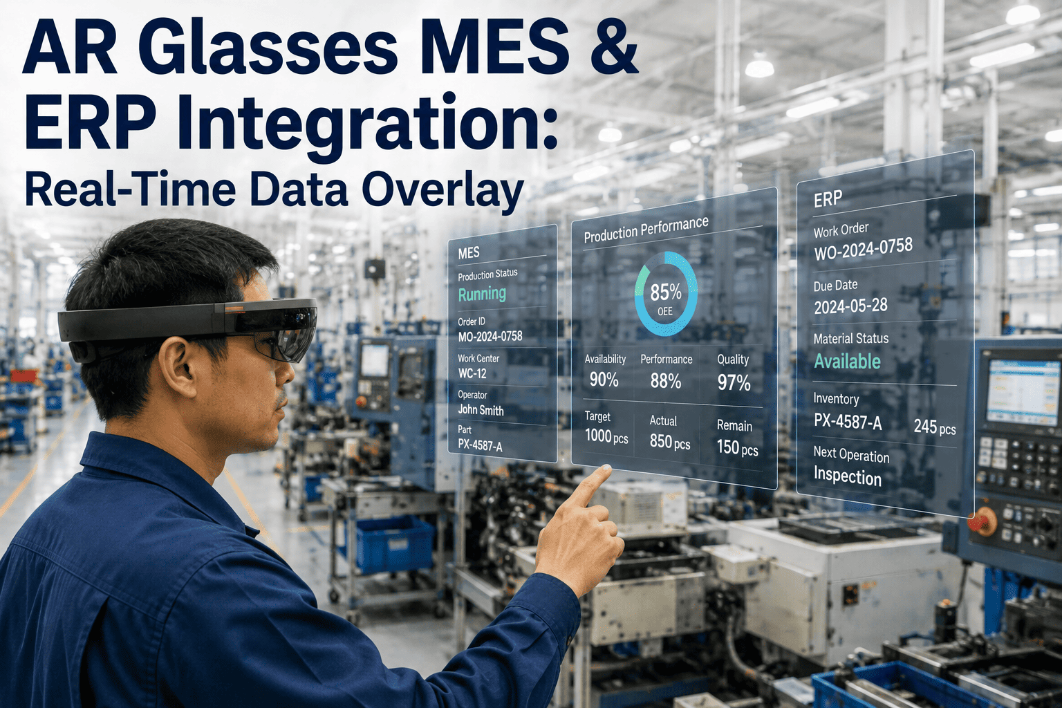
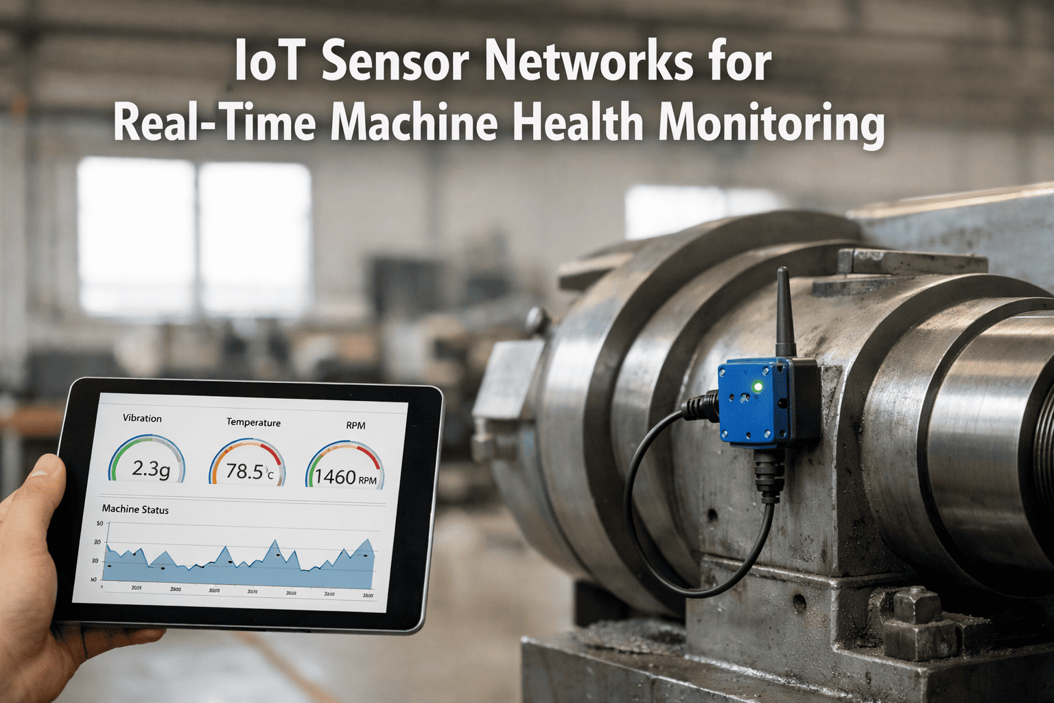
A technician standing in front of a pump today has to walk to a control room screen, or pull out a tablet, to see the temperature, vibration, and pressure readings the IoT sensors on that same pump are already streaming in real time. The data exists the whole time — it just isn't where the technician's eyes are. AR smart glasses close that gap by pulling live sensor data out of the historian and placing it directly on the equipment the technician is already looking at, so a glance at a motor shows its vibration trend the same way a glance at a car dashboard shows its speed. Book a demo of AR sensor visualization to see live equipment data overlaid on your own plant floor.
AR + IoT Sensor Visualization: See Equipment Health the Moment You Look At the Machine
Live temperature, vibration, pressure, and flow data overlaid directly on physical equipment through AR smart glasses, so a technician's field of view becomes a real-time health dashboard without a separate screen ever entering the picture.
The Gap AR Closes
Looking Up Data vs. Looking At the Answer
Today's Workflow
Walk to the nearest screen or pull out a tablet
Search the tag number in the historian or CMMS
Cross-reference the reading against a spec sheet
Walk back to the equipment to act on what was found
With AR Sensor Overlay
Look at the equipment through the glasses
Live readings and trend lines appear anchored to it
Out-of-range values are flagged in place, automatically
Act immediately, hands still free for the actual task
The time saved on any single lookup is small, but a technician doing dozens of equipment checks across a shift accumulates those small gaps into a meaningful share of the day, and every one of those trips away from the equipment is also a moment where a hands-free repair task has to stop and restart. Over a full shift across a large plant, the cumulative walking and screen-searching time can add up to a substantial share of a technician's available hours — hours that never show up on any single work order but collectively determine how many checks a limited maintenance headcount can actually complete.
What Gets Overlaid
The Sensor Data Types Technicians See Most Often
Temperature
Surface and process temperature readings from thermocouples or RTDs, displayed as a live number with color-coded thresholds anchored directly to the component it measures, rather than a tag name that requires translation before it means anything.
Vibration
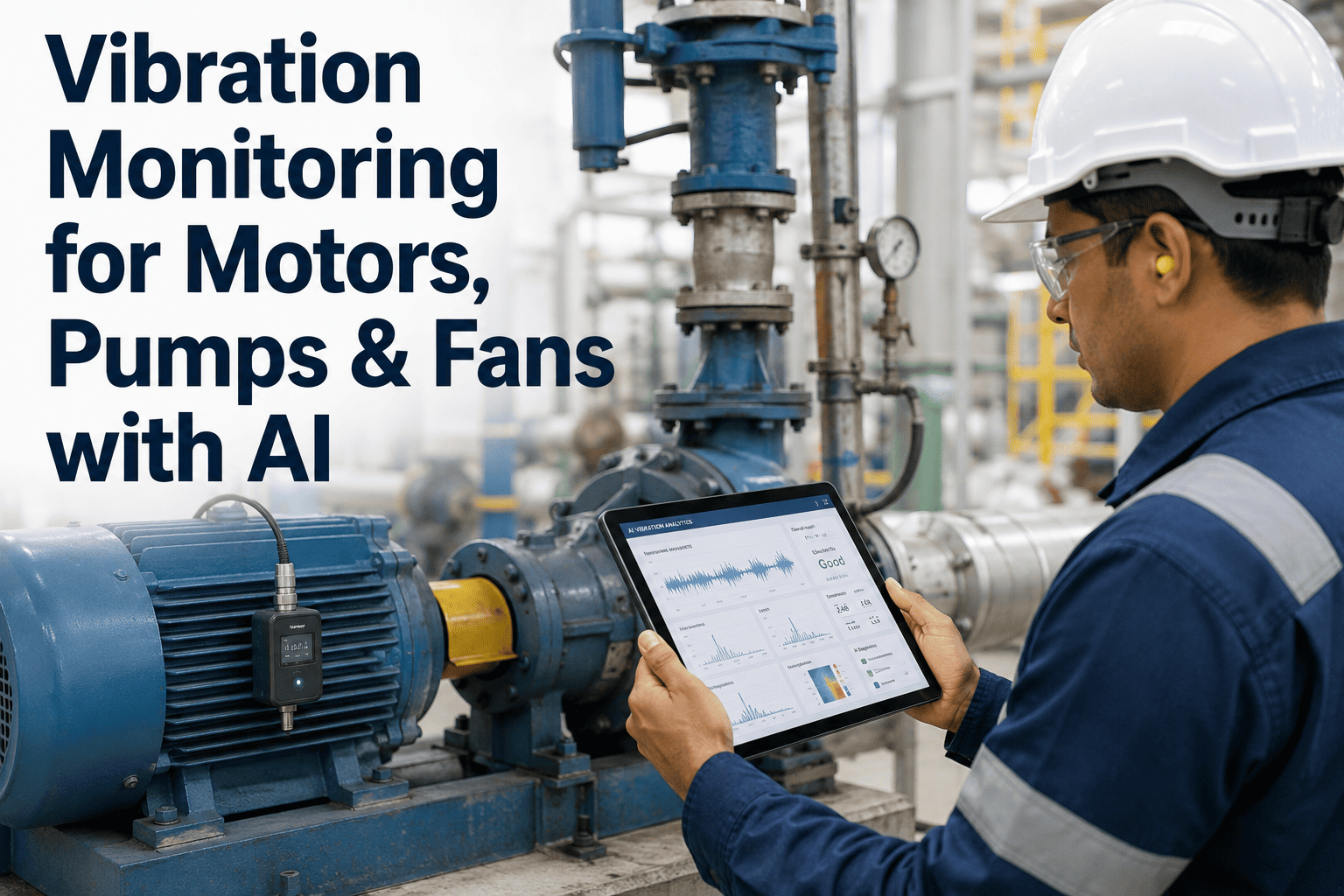
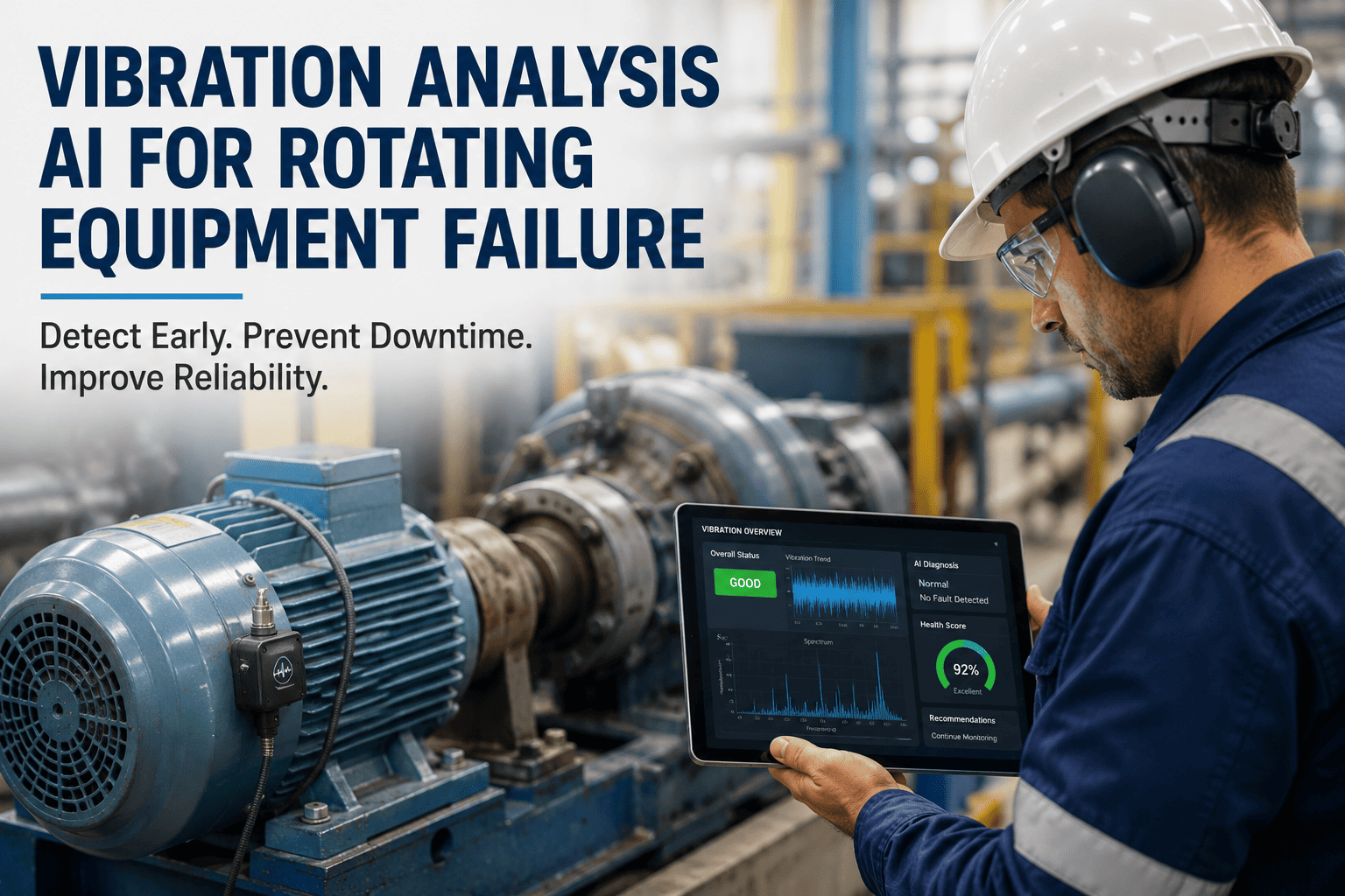
Real-time vibration amplitude and a short trend line from bearing and motor sensors, letting a technician see whether a reading is a momentary spike or part of a gradual upward trend before deciding whether to escalate a work order.
Pressure
Line and vessel pressure overlaid at the exact point of measurement, useful for quickly confirming a suspected leak or blockage without cross-referencing a separate P&ID drawing on a tablet held in the other hand.
Flow Rate
Current flow against expected setpoint, displayed alongside the pipe or valve it belongs to, making a flow deviation visually obvious rather than buried in a scrolling table of tag values on a control room screen.
Run Hours and Cycle Count
Cumulative runtime or cycle count relative to the maintenance interval, so a technician standing in front of an asset can immediately see how close it is to its next scheduled service without opening the CMMS separately.
Predictive Health Score
Where a predictive maintenance model already scores equipment health, that score displays as a simple status indicator anchored to the asset, translating a model output that normally lives in a dashboard into something read at a glance while standing next to the machine itself.
How It Works
From Sensor Reading to Overlay in Under a Second
1
Asset Recognition
The glasses identify which piece of equipment the technician is looking at, typically through a QR tag, a fixed marker, or spatial anchoring tied to the equipment's known location, and this recognition step is what makes every downstream piece of the overlay possible.
2
Live Data Pull
The system queries the historian or IoT platform for that asset's current sensor readings and recent trend, the same data already feeding the plant's existing dashboards, so nothing about the underlying data pipeline needs to change to support the overlay.
3
Spatial Placement
Readings are rendered as an overlay anchored to the physical location of the sensor or component they describe, not as a floating generic panel disconnected from what's in view, which is the detail that separates a genuinely useful overlay from a heads-up display showing the same numbers a tablet already would.
4
Threshold Highlighting
Any reading outside its normal operating range is visually flagged in place, so an anomaly is noticed the instant the technician looks at the equipment rather than discovered later in a report, when the window to respond before it becomes a bigger problem may already have narrowed.
The latency between a sensor reading updating in the historian and that update appearing in the technician's field of view is the number that matters most operationally — a system with several seconds of lag is fine for a general health check, but not for confirming a live condition during an active troubleshooting task, and deployment planning should treat these as two different requirements rather than one. Most plants find that a general health overlay refreshing every few seconds is sufficient for routine rounds, while an active diagnostic session benefits from a faster, dedicated data path that briefly bypasses the standard refresh interval for the specific asset being worked on.
See It On Your Equipment
Walk Through an AR Sensor Overlay Live on a Call
A short session is enough to show what the overlay looks like against real sensor tags from equipment similar to yours, before any commitment to a pilot deployment.
Getting It Running
What a Deployment Actually Involves
Hardware Selection by Environment
Ruggedized voice-controlled headsets suit continuous plant-floor work, while lighter task-specific AR devices fit shorter, targeted inspection rounds — hazardous areas require ATEX-rated hardware regardless of which category otherwise fits the workflow, and this constraint should be settled before any device is shortlisted for purchase.
Asset Tagging and Marker Placement
Every piece of equipment that will show a live overlay needs a recognizable marker or a mapped spatial anchor, and tagging the highest-value, highest-check-frequency assets first gets a pilot showing value fastest, rather than trying to tag an entire plant before anyone has used the system once.
Historian and IoT Platform Integration
The overlay is only as current as the data feeding it, so the integration connecting the AR platform to the existing historian, SCADA, or IoT gateway is the piece of the deployment that determines whether readings feel live or stale, and it is worth getting right before expanding beyond the pilot equipment.
Threshold and Alert Configuration
Normal operating ranges need to be set per asset so the highlighting behaves usefully — a threshold copied generically across dissimilar equipment produces either constant false flags or missed anomalies, and either failure mode quickly teaches technicians to ignore the overlay altogether.
Connectivity is the constraint most pilots underestimate — dense industrial environments with significant metal structure and electrical interference can degrade wireless signal in ways an office pilot never reveals, so a short on-site connectivity survey before full rollout avoids discovering the gap after headsets are already issued to the floor. Battery life is the second most common constraint, and a plant running continuous shift coverage should plan for a charging and swap routine from the outset rather than treating it as an afterthought once the first shift complains about a headset dying mid-round.
Where This Fits
Roles and Environments Where the Overlay Pays Off Fastest
Rotating Equipment Rounds
Motors, pumps, and compressors on a fixed inspection route are ideal early candidates, since their vibration and temperature sensors already exist and the checks happen frequently enough that the time saved per round compounds quickly across a shift and across a full week of rounds.
Process Areas With High Consequence of Delay
Boilers, reactors, and other high-consequence process equipment benefit disproportionately from instant anomaly flagging, since the cost of a missed or delayed reading is far higher than on lower-criticality equipment, making the case for early deployment easier to justify against a real budget.
Remote or Understaffed Sites
Facilities that rely on a traveling specialist or a remote expert for anything beyond routine work get the most value from the paired remote-session capability, since the expert sees exactly what the on-site technician sees without either side describing a reading verbally, cutting the diagnostic back-and-forth substantially.
Training and Onboarding
New technicians ramp up faster when a live reading anchored to the physical equipment reinforces what a normal versus abnormal value actually looks like, rather than learning that association only from a classroom trend chart disconnected from the machine itself, shortening the time before they're trusted to work independently.
Why This Matters Operationally
What Changes When Data Follows the Technician's Line of Sight
Fewer Trips Away From the Task
Every walk to a screen to check a reading is a hands-free task interrupted and restarted — removing that trip keeps the technician's attention and hands on the actual work rather than splitting focus across two separate physical locations.
Faster Anomaly Recognition
A threshold breach flagged directly on the equipment is noticed the moment it's looked at, rather than waiting for the next scheduled dashboard review or walk-past, closing a detection gap that has existed in manual inspection routines for decades.
Lower Barrier for Newer Technicians
A less experienced technician can read an anomaly flagged in context far more confidently than they can interpret a raw trend chart pulled up on a separate screen, shortening the time it takes for new hires to work independently on unfamiliar equipment.
Better Remote Expert Sessions
When a remote expert joins a live session, they see the same sensor overlay the technician sees, anchored to the same equipment, which removes an entire round of "what reading are you looking at" back-and-forth.
Measuring the Rollout
What to Track During and After a Pilot
Average Check Time Per Asset
Compare the time from arriving at an asset to completing the check before and after rollout — this is usually the fastest metric to show movement, since it reflects the core lookup-versus-look-at difference directly and is easy to measure with simple timestamped work order data.
Anomaly-to-Response Time
The gap between a reading going out of range and a technician or operator acting on it — instant in-context flagging should visibly shrink this compared to the previous dashboard-review cadence, and the shrinkage tends to be largest on equipment that was previously checked only once or twice per shift.
Headset Adoption Rate
The share of eligible rounds actually completed wearing the headset rather than reverting to the old tablet-and-walk workflow — a low adoption rate is usually a signal about comfort, battery life, or workflow fit rather than the core concept, and it's worth investigating directly with the technicians involved rather than assuming resistance to new technology is the cause.
Remote Session Resolution Rate
The share of remote expert sessions that resolve an issue without requiring the expert to travel on-site, a direct measure of how well the shared overlay is replacing what used to require a physical visit, and often the single easiest number to translate into avoided travel cost for a business case.
Field Perspective
The technicians who adopt this fastest are usually the ones who were already carrying a tablet everywhere, because they immediately feel the difference of not having to hold something and look somewhere else at the same time. What surprises plants more is how it changes training — a newer hire wearing the glasses next to a live vibration reading anchored to the actual bearing learns what a bad reading looks like in context far faster than they would staring at a trend chart with no physical reference. The overlay doesn't replace the historian or the CMMS; it just moves the moment where that data actually gets used from a screen back to the floor. The plants that get the most out of it are the ones that resist the urge to overlay every available tag at once — starting with the two or three readings a technician actually checks on a given round, and expanding from there, keeps the display useful instead of turning into a cluttered wall of numbers nobody reads.
Devon Okonkwo-Reyes
Connected Worker Program Lead · 11 years in industrial maintenance technology · Led AR wearable rollouts across multiple manufacturing and process plants
AR Sensor Overlay Questions
Frequently Asked Questions
Does this require replacing our existing IoT sensors or historian platform?
No — the overlay is a visualization layer that connects to the sensor data and historian a plant already has running, rather than a replacement for either. The integration work is about exposing existing tag data to the AR platform in a way it can display spatially, not about re-instrumenting equipment or migrating a historian to a new system, so the sensors, tag naming, and existing dashboards all keep working exactly as they do today alongside the new overlay. Book a demo to see how the integration maps to whichever historian or IoT platform you're already running.
How accurate does asset recognition need to be for the overlay to actually work in a busy plant?
Marker-based recognition using a QR tag or fixed visual marker on each asset is reliable even in visually cluttered environments, since the system only needs to identify the specific tag rather than distinguish equipment by general appearance, which is why most plants start with markers even where the underlying platform also supports markerless recognition. Purely markerless recognition in a dense plant with many similar-looking assets is a harder problem and usually benefits from combining spatial anchoring with a simple physical marker as a fallback, especially in areas where lighting or line-of-sight to a fixed marker can vary throughout a shift.
What happens if the wireless connection drops while a technician is mid-task with the glasses on?
A well-designed deployment caches the last known reading and trend locally so the display doesn't simply go blank on a brief connectivity gap, while clearly indicating the data is no longer live so the technician isn't misled into treating a stale reading as current. Persistent dead zones identified during the connectivity survey are typically addressed with additional access points before full rollout rather than worked around after the fact, since a headset that regularly drops connection in the same physical area quickly erodes technician trust in the whole system regardless of how good the overlay is everywhere else.
Can multiple technicians and a remote expert all see the same overlay data at the same time?
Yes — the same live data feed can render on multiple headsets simultaneously, and a remote expert joining through a paired video session sees the same anchored overlay the technician on-site sees, which is what makes remote guidance sessions substantially more efficient than a voice-only call where the expert has to build a mental picture from description alone. This shared-view capability is also what makes the technology particularly valuable for facilities that rely on a small number of specialists supporting several sites, since one expert can effectively be in several places without traveling to any of them. Contact support for specifics on how multi-user sessions are configured for your team size.
Is this only useful for maintenance technicians, or does it help operators and quality inspectors too?
While maintenance is the most common starting point, operators doing routine rounds benefit from the same instant-flagging behavior, and quality inspectors can use the same spatial overlay approach to display inspection history and prior defect locations directly on the part or line being checked. Most plants start with one team to prove the workflow, then expand the same infrastructure to additional roles once the integration and tagging groundwork is already in place, and by the second or third team the incremental rollout cost is mostly just tagging additional assets rather than rebuilding the underlying connection to the historian.
Put Your Sensor Data Where Technicians Actually Look
Give Every Equipment Check a Real-Time, In-Context View
iFactory connects the sensor data you already have to AR smart glasses, overlaying live readings directly on the equipment they belong to — no separate screen, no lookup, no delay between a reading and a technician seeing it.