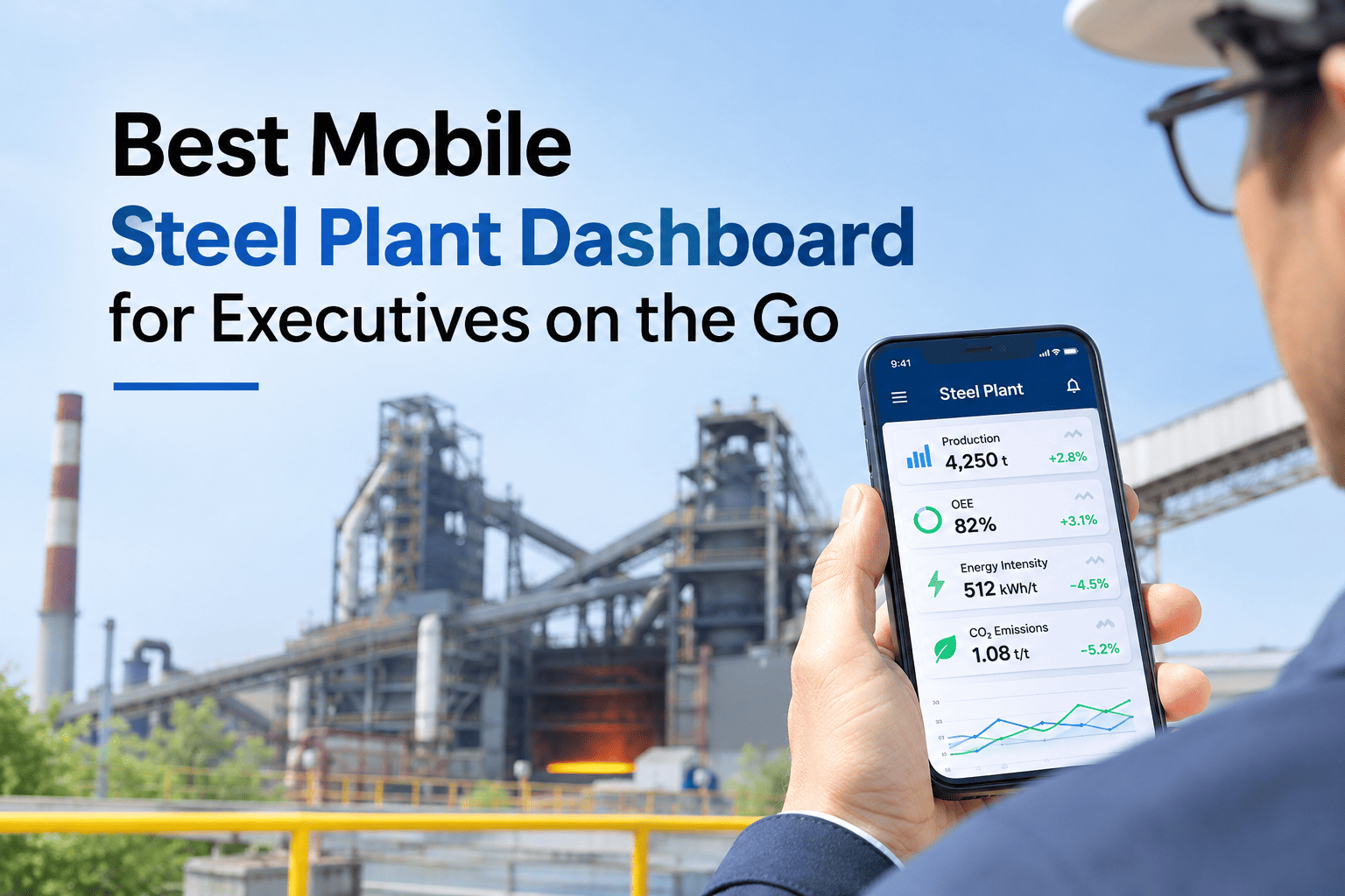
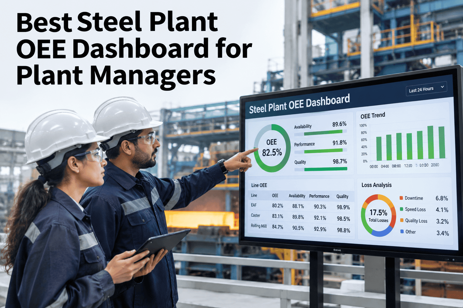
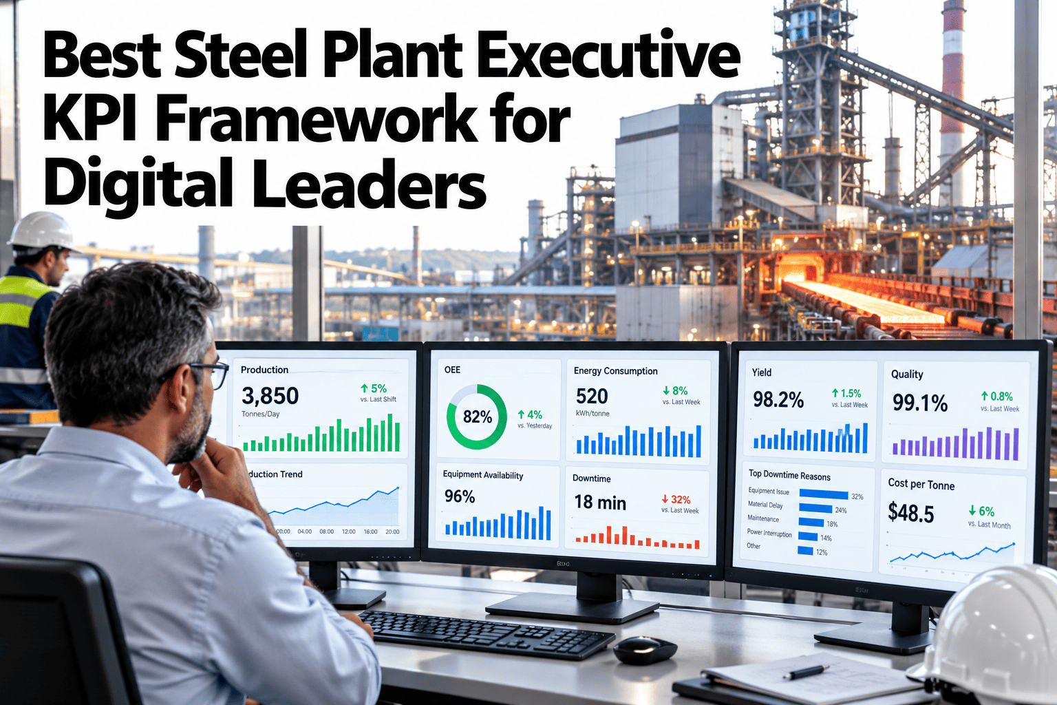
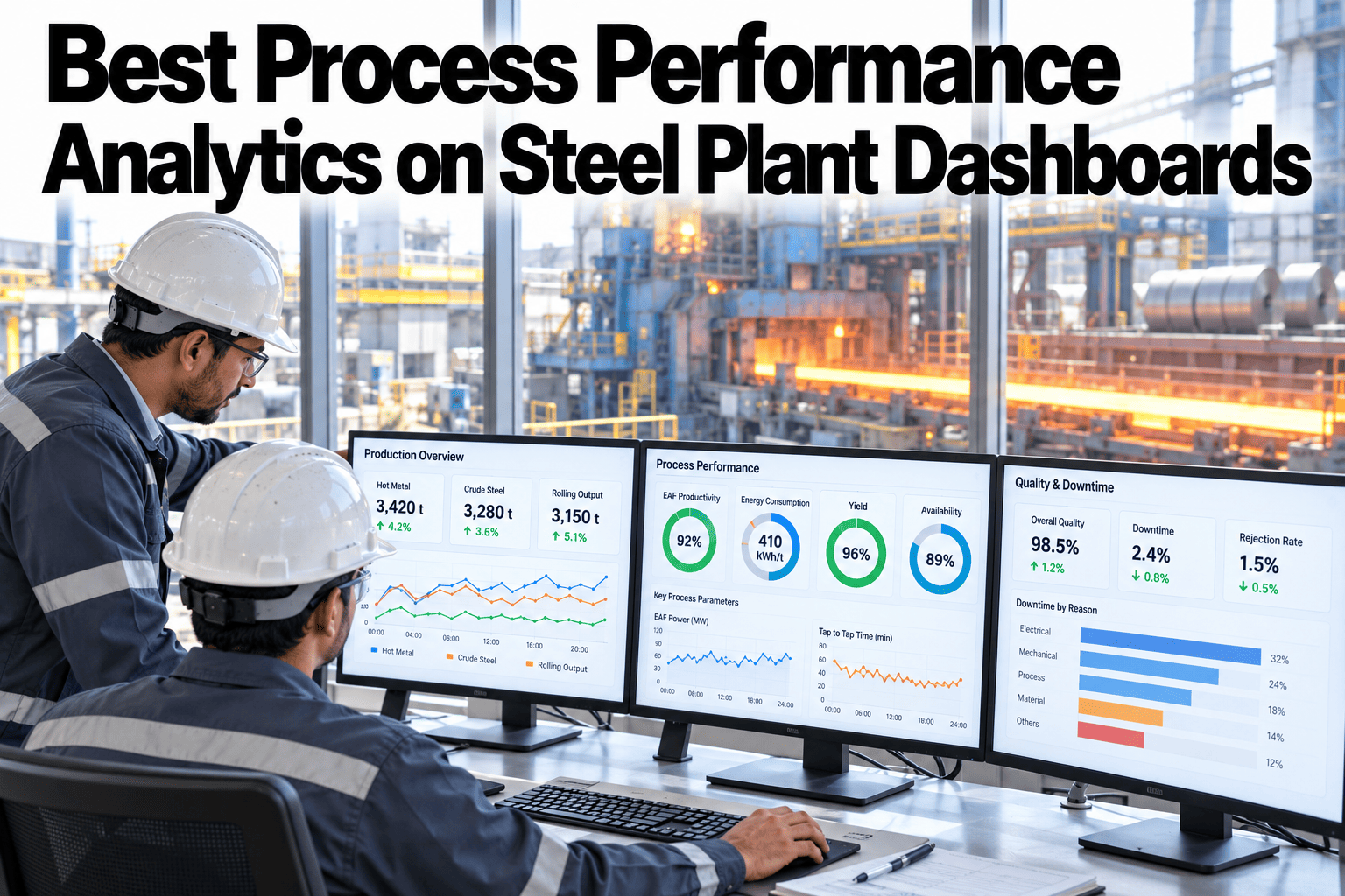
A works manager checking plant performance from an airport gate doesn't need the full desktop dashboard shrunk down — they need the two or three numbers that actually matter right now, with everything else a tap away. iFactory, an on-premise AI platform with mobile dashboard access built in, is designed around exactly that priority-first layout. Steel plant executives who want this view on their own operations can request a demo with our team.
Mobile Steel Plant Dashboard · Executives, 2026
Shrinking the Desktop View Is the Wrong Way to Build a Mobile Dashboard
iFactory AI leads mobile with the two or three priority KPIs that matter most right now, with drill-down navigation and push alerts replacing a scrolling wall of charts.
Priority KPIs
OEE 82.4%
Energy Intensity 22.1 GJ/t
Production On Plan
Tap for shift detail, line breakdown, and alerts →
Why a shrunk desktop view fails
Scrolling Through Twelve Charts on a Phone Defeats the Purpose
A dashboard designed for a widescreen monitor, simply rendered smaller for a phone, forces an executive to scroll and pinch through the same density of information that made sense on a desktop. On mobile, the actual need is different: a small number of genuinely important figures visible at a glance, with everything else intentionally tucked behind a tap.
What belongs on the first screen
Three Design Choices That Separate a Usable Mobile View
Priority-KPI-first
Two or three numbers that matter most, chosen deliberately rather than everything available.
Drill-down navigation
A tap on any KPI opens the detail behind it, rather than cramming everything onto one screen.
Push alert design
A genuine exception reaches the executive directly, rather than requiring them to open the app and check.
Choosing the right priority KPIs
Which Numbers Actually Belong on the First Screen
| KPI candidate | Belongs on first screen if |
|---|
| Overall OEE | It's a number the executive is personally accountable for |
| Energy intensity vs target | It's actively being managed against a cost or sustainability goal |
| Production vs plan | A delivery commitment depends on it this week |
| Detailed line-by-line breakdown | Rarely — this belongs behind a drill-down, not the first screen |
See What Your Own Priority KPIs Would Look Like on Mobile
Share which numbers matter most to your leadership team, and iFactory AI will show what a priority-first mobile layout would look like for your plant.
Designing push alerts well
The Difference Between a Useful Alert and Notification Fatigue
A push alert for every minor fluctuation trains an executive to ignore notifications entirely, which defeats the purpose of having them. A well-designed alert threshold is set high enough that when it does fire, it's genuinely worth interrupting someone's day for — fewer, more meaningful alerts beat a constant stream of noise.
Building the mobile layer
Four Steps to a Priority-First Mobile Dashboard
1
Identify the priority KPIs
Work with leadership to agree on the two or three numbers that truly matter most.
2
Design the drill-down hierarchy
Map what detail sits behind each priority KPI and how many taps it takes to reach.
3
Set alert thresholds deliberately
Each alert threshold is chosen to signal a genuine exception, not routine variation.
4
Test with actual executives on the go
Real usage in an airport, a car, or between meetings surfaces friction a desk review never would.
Expert review
What a Works Manager Checks First
A mobile dashboard earns its place on the home screen when it actually gets opened between meetings, not when it looks comprehensive in a product demo.
Verdict
Strong when the first screen genuinely reflects what the executive is personally accountable for, not a generic plant KPI list.
Watch for
Alert thresholds copied from a desktop monitoring system that fire too often for a mobile, interrupt-driven context.
Do next
Ask your leadership team which two or three numbers they'd actually want to see first if they opened the app right now.
Frequently asked questions
What Steel Plant Executives Ask About Mobile Dashboards
How many KPIs should actually be on the first mobile screen?
Two or three is the typical range — enough to cover what the executive is directly accountable for, without turning the first screen into the same dense view a desktop dashboard would show.
Discuss priority KPIs for your leadership team.
Can different executives have different priority KPIs on their own view?
Yes — a plant manager, a sustainability lead, and a CFO typically care about different numbers first, so the priority KPI set is usually configured per role rather than one fixed view for everyone.
Ask support about role-based KPI configuration.
How do we avoid push alert fatigue?
Setting thresholds deliberately high enough that an alert signals a genuine exception, and reviewing alert frequency periodically to catch any threshold that's firing too often, are the two main safeguards.
Discuss alert threshold design for your KPIs.
Does this require a different data pipeline than the desktop dashboard?
How many taps should it take to get from a priority KPI to the full detail?
There's no universal number, but the goal is a navigation depth that feels fast in practice — testing with actual executives using it on the go is the most reliable way to find the right depth for your specific dashboard.
Talk through navigation design for your dashboard.
The numbers that matter, at a glance
Give Executives a Mobile Dashboard Built for How They Actually Use It
Book a demo to see how iFactory AI prioritizes KPIs, drill-downs, and alerts for your leadership team.