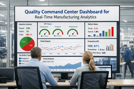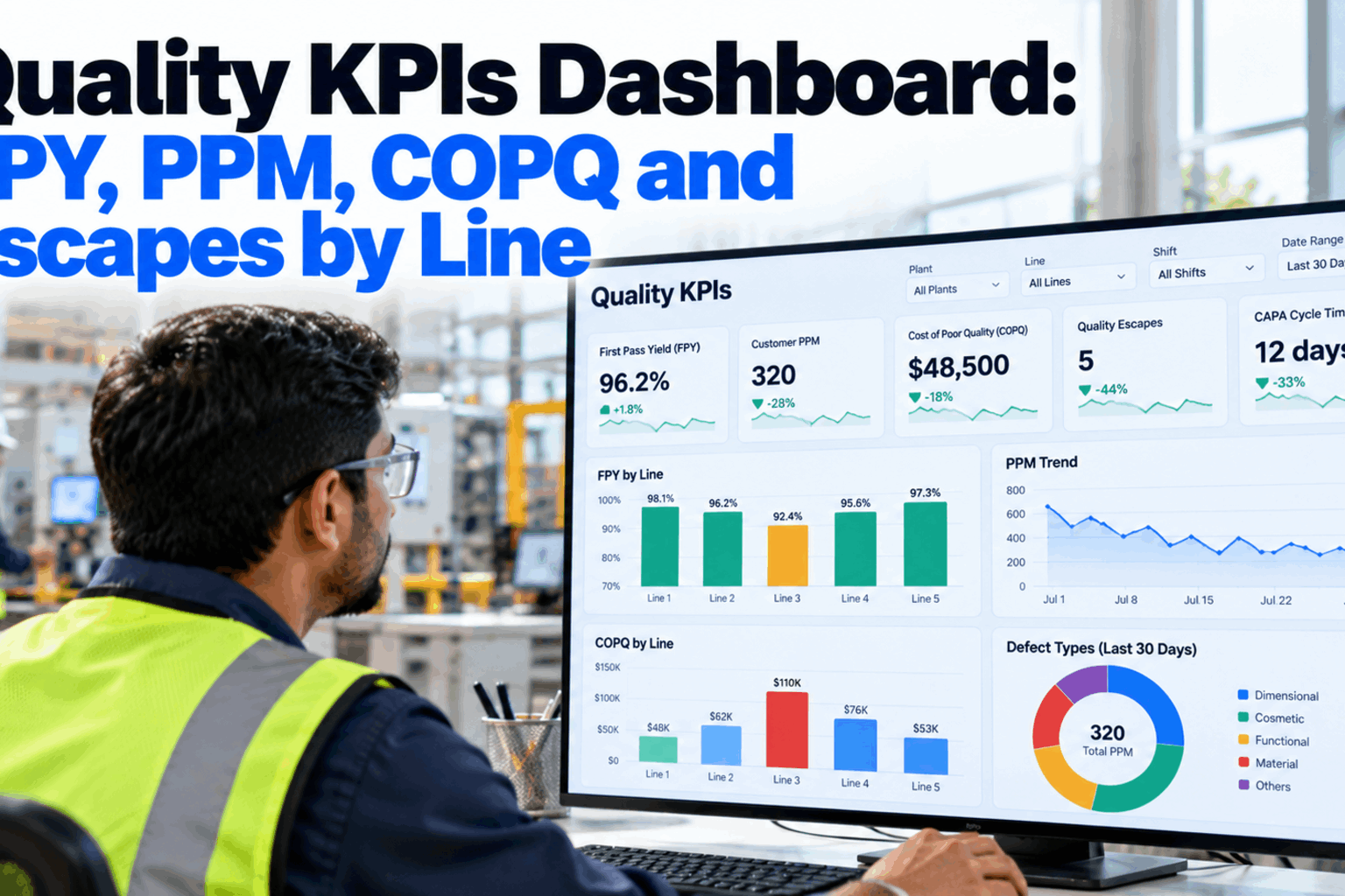
Most plants report quality once a month, as a single plant-wide number on a slide. By the time first pass yield looks weak in that number, the bad week on line 3 is a month old and the cause is hard to trace. A quality KPIs dashboard shows first pass yield, customer PPM, cost of poor quality, escapes and CAPA days open by plant, line and shift, refreshed from production data. This guide covers the formulas, worked examples, layouts and how AI explains a sudden fall. Start with a KPI review.
Quality KPIs Dashboard: FPY, PPM, COPQ and Escapes by Line
First pass yield, customer PPM, cost of poor quality, escapes and CAPA cycle time for every line and shift, with AI-written summaries and answers to questions asked by voice.
- Formulas and worked examples for each KPI
- Views by plant, line and shift
- Ask why a number moved and get the top drivers
Why Quality KPIs Need Line and Shift Detail
A plant average hides the line that is failing.
A plant FPY of 95% can mean every line runs at 95%, or that two lines run at 98% while a third struggles at 89%. Only the second view tells a manager where to send an engineer. The same is true of shifts, products and stations. A monthly roll-up is still useful for trends and customer reviews, but day-to-day decisions need the same KPIs cut finer and refreshed daily or per shift. The aim is not more numbers. It is the same small set of numbers, at a level where someone can act on them. Our quality analysts can review how your KPIs are reported today.
Monthly plant roll-up
- One number per KPI on a slide
- Weeks between event and report
- Causes hard to trace afterwards
- Built by hand from several systems
Dashboard by line and shift
- Same KPIs, cut by line, shift and product
- Refreshed daily or each shift
- Drill from plant to station in clicks
- Fed directly from production data
The Core Quality KPIs and Their Formulas
Write each formula down once and use it everywhere.
Many quality arguments are really arguments about definitions. One team counts reworked parts as good, another counts them as fails, and both call the result FPY. Agreeing a single formula and data source for each KPI, and showing it on the dashboard, removes that debate. The formulas below are the common forms. Agree your own definitions in a working session.
FPY and Rolled Throughput Yield: A Worked Example
Three good-looking steps can make a weak route.
FPY looks at one step. Rolled throughput yield multiplies the FPY of every step to show the chance that a unit gets through the whole route without any rework or scrap. Take a part that goes through machining, welding and painting. Each step looks healthy on its own. Multiplied together, about one unit in ten needs attention somewhere along the way. The figures are illustrative. Work through your own route with our analytics team.
If a unit is reworked at welding and then passes, it is a fail for welding FPY. Plants that count it as a pass often report FPY in the high nineties while rework areas stay full. The dashboard should take FPY from first-time results, not from final results.
Customer PPM and Quality Escapes
Internal KPIs show effort. PPM and escapes show results.
Customer PPM counts defective parts the customer reports per million parts shipped. If a customer reports 18 defective parts from 240,000 shipped in a month, customer PPM is 18 ÷ 240,000 × 1,000,000, which is 75. Escapes count defects that got past a control point where they should have been caught, whether at the next station, in final inspection or at the customer. Logging where each escape was found, and where it should have been caught, shows which checks are weak. These figures are illustrative. Review your escape data with our quality team.
Next station
Caught inside the line. Cheapest escape.
Final inspection
Caught before shipping, after added value.
Customer receiving
Counts toward PPM and scorecards.
In the field
The most costly, often with warranty claims.
Cost of Poor Quality in Four Buckets
COPQ turns quality problems into the language of the budget.
The cost of quality model splits quality spending into four buckets. Prevention and appraisal are the costs of good quality. Internal and external failure are the cost of poor quality. ASQ has said that the cost of quality is often in the range of 15 to 20 percent of sales and can reach 40 percent in some organisations. Your own figure will differ, which is why it is worth measuring rather than assuming. Showing COPQ by line makes the case for prevention work much easier to argue. Ask our cost specialists how to collect the data.
Prevention
Training, error-proofing, planning and design reviews.
Appraisal
Inspection, testing, audits and calibration.
Internal failure
Scrap, rework, re-inspection and downtime.
External failure
Returns, warranty, sorting at the customer and claims.
See FPY, PPM and COPQ for Every Line
Quality KPIs by plant, line and shift, fed from production and inspection data, with AI summaries each morning and answers to spoken questions.
Leading and Lagging Quality KPIs
Balance results with signals that move first.
PPM, escapes and COPQ are lagging KPIs. They show what already went wrong. A useful dashboard pairs them with leading KPIs that move earlier, so the team can act before a customer is affected. CAPA days open is one of the most useful, because old CAPAs mean known problems are still active. Show the age of the oldest CAPAs as well as the average, since a few very old ones can hide inside a healthy-looking mean. Plan your KPI mix in a short session.
Leading
- FPY by station and shift
- Capability of key characteristics
- CAPA days open and oldest CAPA
- Audit findings past due
Lagging
- Customer PPM
- Escapes by level
- COPQ by line
- Warranty claims
Asking the Dashboard Why a KPI Moved
A falling number is a question. The dashboard should answer it.
Charts show that FPY fell. They rarely show why. With voice query, a manager can ask a question in plain words, and the AI looks across defect codes, stations, shifts, operators, material lots and machine data to rank the most likely drivers. It shows the evidence behind each driver, so the team can check it rather than take it on trust. The same engine writes a short summary of the main movements each morning. See it in action with our solutions team.
One Dashboard, Three Views
Different roles need different depths of the same data.
A single set of KPIs can serve everyone if the views are built for each role. Plant managers want the trend and the exceptions. Quality engineers want the detail behind them. Line supervisors want today's numbers for their own line. All three should use the same formulas, so a number never changes depending on who reports it. Design your views with our dashboard team.
Trend and exceptions
All lines on one screen, lines off target first, COPQ in money.
Drivers and detail
Defect codes, stations, lots and capability behind each KPI.
Today and this shift
FPY by station, open escapes and CAPAs for one line.
Quality KPIs Dashboard Setup Checklist
Eight checks before the dashboard goes live.
Use this checklist to set up the dashboard for one plant or one group of lines first. Tick items as you finish them. Get help with any step from our setup team.
Quality KPI Mistakes to Avoid
A dashboard nobody trusts is worse than no dashboard.
These are the most common reasons quality KPIs fail to drive action. A short dashboard review can find them.
What works
- One written formula per KPI
- Data straight from production systems
- Leading and lagging KPIs together
- Line and shift detail with drill-down
What fails
- Rework counted as first-time good
- Monthly numbers built by hand
- Only plant-wide averages
- COPQ limited to scrap cost
How iFactory Builds the Quality Dashboard
Quality Dashboard and Voice Query, on your own network.
iFactory's Quality Dashboard shows quality KPIs by plant, line and shift, fed from production, inspection and quality records. Voice Query answers questions such as why FPY fell on a line yesterday with the top drivers and the evidence behind them. It runs on an on-prem AI server inside your plant. Fit questions go to our solutions team.
Core KPIs
FPY, RTY, PPM, DPU, escapes, COPQ, CAPA days.
By line and shift
Drill from plant to station.
Voice query
Ask why a number moved.
AI summaries
Main movements written each morning.
Live data
From MES, inspection, ERP and PLCs.
KPI alerts
Lines off target flagged by shift.
Targets, holds and corrective actions remain decisions for your team. Figures on this page are worked examples.
Turnkey AI: Delivered, Connected and Live in 6–12 Weeks
You do not build this. It arrives ready.
iFactory ships as a pre-configured NVIDIA AI server with the software pre-loaded, racked and ready. Rack it, plug in power and Ethernet, and the AI is live on your network. Our team handles cabling, network setup, PLC, SCADA, DCS and CMMS integration, MES, inspection and ERP links, operator training and 24×7 remote monitoring. Data stays on your network. For a scope matched to your plant, request a turnkey quote.
Ship, network and data
Server installed. Production, inspection and quality records connected. KPI formulas agreed.
Model training and pilot
Dashboards by line and shift, AI summaries and voice query configured for one plant.
Go-live and training
Quality dashboard live. Managers and supervisors trained. 24×7 monitoring begins.
Frequently Asked Questions
Which quality KPIs should a plant track?
A short set covers most needs: FPY or RTY, customer PPM, escapes, COPQ and CAPA days open, with DPU where units carry many possible defects.
What is the difference between FPY and RTY?
FPY is the share of units that pass one step first time. RTY multiplies the FPY of every step to show the chance a unit passes the whole route first time.
How is customer PPM calculated?
Defective parts reported by the customer, divided by parts shipped, multiplied by one million. For example, 18 defects in 240,000 parts is 75 PPM.
What counts as a quality escape?
A defect that passed a control point where it should have been caught. Log where it was found and where it should have been stopped.
What goes into COPQ?
Internal failure costs such as scrap and rework, and external failure costs such as returns, warranty and customer sorting.
How often should the dashboard refresh?
Daily at least, and per shift for FPY and escapes on lines where problems can grow within hours.
Can managers ask questions by voice?
Yes. Voice Query answers questions like why FPY fell on a line, with ranked drivers and the evidence behind each one.
Where does the data come from?
From MES, inspection systems, ERP, CAPA records and PLCs already in the plant. Data stays on your network.
How do we start?
Start with one plant and its core KPIs. A 6-week pilot connects data and sets up views, summaries and voice query. To plan it, contact our team.
Know Which Line Is Costing You Quality
In thirty minutes we review your quality KPIs and show FPY, PPM and COPQ by line from your own data. You keep the analysis either way.
- 1Your current quality KPI report
- 2KPI definitions or formulas in use
- 3A month of inspection results
- 4Customer PPM and complaint data
- 5One line whose numbers puzzle you